Checkbox
Give users a clear way to make selections, such as agreeing to terms or choosing multiple items from a list.
Anchor to propertiesProperties
- Anchor to accessibilityLabelaccessibilityLabelstring
A label used for users using assistive technologies like screen readers. When set, any children or
labelsupplied will not be announced. This can also be used to display a control without a visual label, while still providing context to users using screen readers.- Anchor to checkedcheckedbooleanDefault: false
Whether the control is active.
- Anchor to commandcommand'--auto' | '--show' | '--hide' | '--toggle'Default: '--auto'
Sets the action the
should take when this clickable is activated.See the documentation of particular components for the actions they support.
--auto: a default action for the target component.--show: shows the target component.--hide: hides the target component.--toggle: toggles the target component.--copy: copies the target ClipboardItem.
- Anchor to commandForcommandForstring
ID of a component that should respond to activations (e.g. clicks) on this component.
See
commandfor how to control the behavior of the target.- Anchor to defaultCheckeddefaultCheckedbooleanDefault: false
Whether the control is active by default.
- Anchor to disableddisabledbooleanDefault: false
Disables the control, disallowing any interaction.
- Anchor to errorerrorstring
Indicate an error to the user. The field will be given a specific stylistic treatment to communicate problems that have to be resolved immediately.
- string
A unique identifier for the element.
- Anchor to labellabelstring
Visual content to use as the control label.
- Anchor to namenamestring
An identifier for the control that is unique within the nearest containing
Formcomponent.- Anchor to requiredrequiredbooleanDefault: false
Whether the field needs a value. This requirement adds semantic value to the field, but it will not cause an error to appear automatically. If you want to present an error when this field is empty, you can do so with the
errorproperty.- Anchor to valuevaluestring
The value used in form data when the control is checked.
Anchor to eventsEvents
- Anchor to changechange((event: CallbackEventListener<typeof tagName>) => void) | null
A callback that is run whenever the control is changed.
CallbackEventListener
(EventListener & { (event: CallbackEvent<TTagName, TEvent>): void; }) | nullCallbackEvent
TEvent & { currentTarget: HTMLElementTagNameMap[TTagName]; }Code
Examples
Code
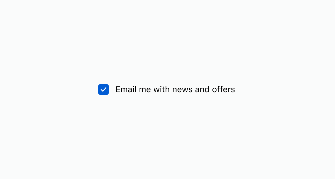
Default
<s-checkbox defaultChecked label="Email me with news and offers"></s-checkbox>
Preview