 A simple react component to format multiple email as the user types.

A simple react component to format multiple email as the user types.
- Simple code
- No dependency
- Small size
- Simple customization
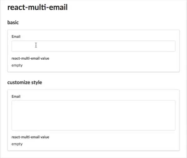
npm install react-multi-emailimport * as React from 'react'; import { ReactMultiEmail, isEmail } from 'react-multi-email'; import 'react-multi-email/dist/style.css'; interface Props {} function BasicExample(props: Props) { const [emails, setEmails] = React.useState<string[]>([]); const [focused, setFocused] = React.useState(false); return ( <form> <h3>Email</h3> <ReactMultiEmail placeholder='Input your email' emails={emails} onChange={(_emails: string[]) => { setEmails(_emails); }} autoFocus={true} onFocus={() => setFocused(true)} onBlur={() => setFocused(false)} getLabel={(email, index, removeEmail) => { return ( <div data-tag key={index}> <div data-tag-item>{email}</div> <span data-tag-handle onClick={() => removeEmail(index)}> × </span> </div> ); }} /> <br /> <h4>react-multi-email value</h4> <h3>Focused: {focused ? 'true' : 'false'}</h3> <p>{emails.join(', ') || 'empty'}</p> </form> ); } export default BasicExample;| Property | Type | Default | Description |
|---|---|---|---|
| id | string | ||
| emails | string[] | ||
| onChange | (emails: string[]) => void; | ||
| enable | ({ emailCnt }: { emailCnt: number }) => boolean; | ||
| onDisabled | () => void; | ||
| onChangeInput | (value: string) => void; | ||
| onFocus | () => void; | ||
| onBlur | () => void; | ||
| onKeyDown | (evt: React.KeyboardEvent) => void; | ||
| onKeyUp | (evt: React.KeyboardEvent) => void; | ||
| noClass | boolean | ||
| validateEmail | (email: string) => boolean | Promise; | ||
| enableSpinner | boolean | ||
| style | React.CSSProperties | ||
| getLabel | ( email: string, index: number, removeEmail: (index: number, isDisabled?: boolean) => void, ) => React.ReactNode; | ||
| className | string | '' | |
| inputClassName | string | '' | |
| placeholder | string | React.ReactNode; | ||
| autoFocus | boolean; | ||
| spinner | () => React.ReactNode; | ||
| delimiter | string; | '[ ,;]' | |
| autoComplete | string | undefined | ||
| initialInputValue | string | undefined | '' | |
| disableOnBlurValidation | boolean | undefined | false | |
| inputValue | string | undefined | undefined |
If you don't mind, don't forget to press "star" before leaving.