ListItem
ListItems are used to display rows of information, such as a contact list, playlist, or menu. They are very customizable and can contain switches, avatars, badges, icons, and more.
Usage
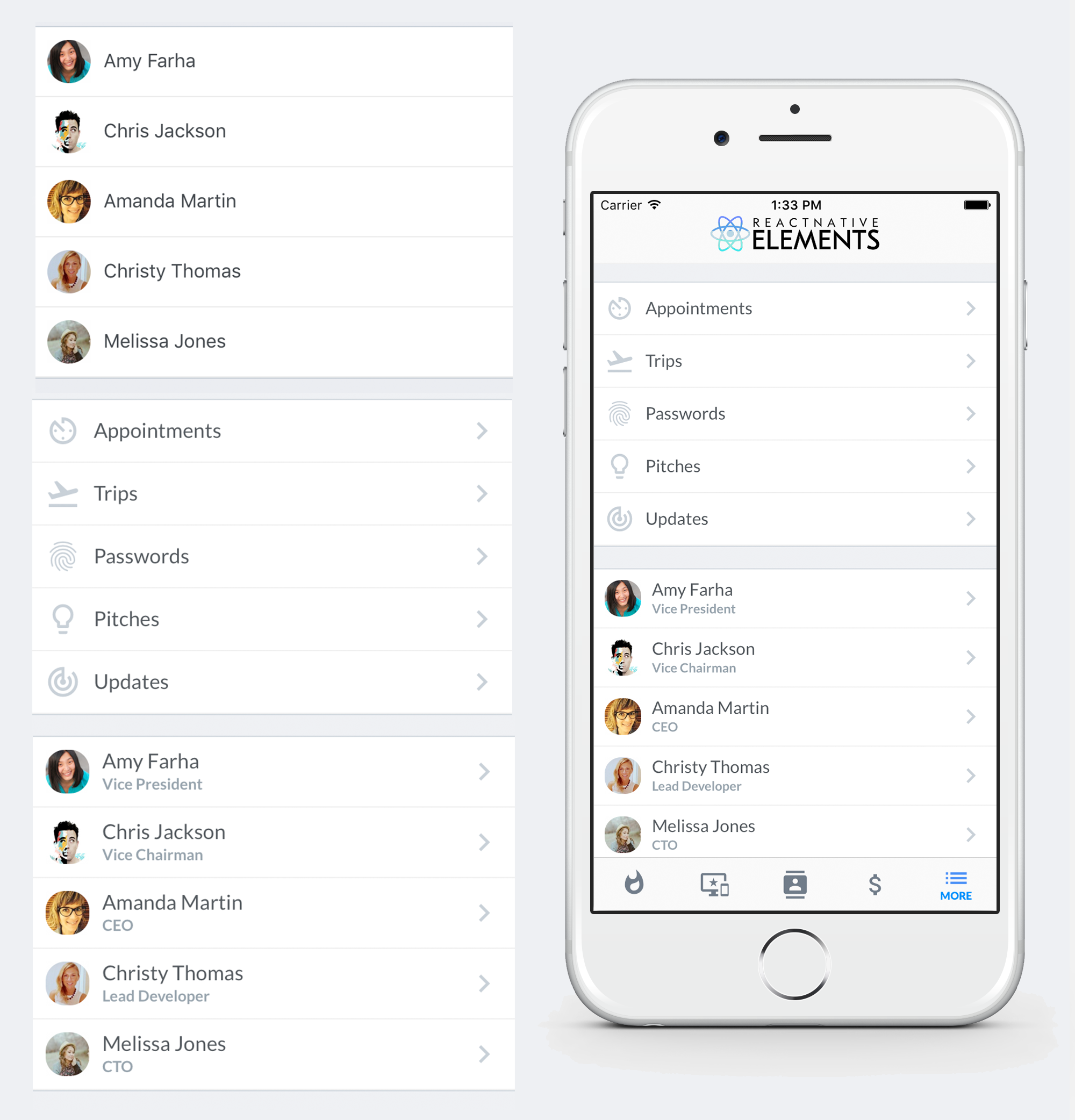
Using Map Function - Implemented with avatar
import { ListItem } from 'react-native-elements'

const list = [
 {
 name: 'Amy Farha',
 avatar_url: 'https://s3.amazonaws.com/uifaces/faces/twitter/ladylexy/128.jpg',
 subtitle: 'Vice President'
 },
 {
 name: 'Chris Jackson',
 avatar_url: 'https://s3.amazonaws.com/uifaces/faces/twitter/adhamdannaway/128.jpg',
 subtitle: 'Vice Chairman'
 },
 ... // more items
]

<View>
 {
 list.map((l, i) => (
 <ListItem
 key={i}
 leftAvatar={{ source: { uri: l.avatar_url } }}
 title={l.name}
 subtitle={l.subtitle}
 bottomDivider
 />
 ))
 }
</View>
Using Map Function - Implemented with link and icon
import { ListItem } from 'react-native-elements'

const list = [
 {
 title: 'Appointments',
 icon: 'av-timer'
 },
 {
 title: 'Trips',
 icon: 'flight-takeoff'
 },
 ... // more items
]

<View>
 {
 list.map((item, i) => (
 <ListItem
 key={i}
 title={item.title}
 leftIcon={{ name: item.icon }}
 bottomDivider
 chevron
 />
 ))
 }
</View>
Using RN FlatList - Implemented with link and avatar
import { ListItem } from 'react-native-elements'

const list = [
 {
 name: 'Amy Farha',
 avatar_url: 'https://s3.amazonaws.com/uifaces/faces/twitter/ladylexy/128.jpg',
 subtitle: 'Vice President'
 },
 {
 name: 'Chris Jackson',
 avatar_url: 'https://s3.amazonaws.com/uifaces/faces/twitter/adhamdannaway/128.jpg',
 subtitle: 'Vice Chairman'
 },
 ... // more items
]

keyExtractor = (item, index) => index.toString()

renderItem = ({ item }) => (
 <ListItem
 title={item.name}
 subtitle={item.subtitle}
 leftAvatar={{ source: { uri: item.avatar_url } }}
 bottomDivider
 chevron
 />
)

render () {
 return (
 <FlatList
 keyExtractor={this.keyExtractor}
 data={list}
 renderItem={this.renderItem}
 />
 )
}
Using RN FlatList - Implemented with custom avatar component.
import { ListItem } from 'react-native-elements'

const list = [
 {
 name: 'Amy Farha',
 subtitle: 'Vice President'
 },
 {
 name: 'Chris Jackson',
 avatar_url: 'https://s3.amazonaws.com/uifaces/faces/twitter/adhamdannaway/128.jpg',
 subtitle: 'Vice Chairman'
 },
 ... // more items
]

keyExtractor = (item, index) => index.toString()

renderItem = ({ item }) => (
 <ListItem
 title={item.name}
 subtitle={item.subtitle}
 leftAvatar={{
 source: item.avatar_url && { uri: item.avatar_url },
 title: item.name[0]
 }}
 bottomDivider
 chevron
 />
)

render () {
 return (
 <FlatList
 keyExtractor={this.keyExtractor}
 data={list}
 renderItem={this.renderItem}
 />
 )
}
ListItem implemented with custom View for Subtitle
import { ListItem } from 'react-native-elements'

render () {
 return (
 <ListItem
 title='Limited supply! Its like digital gold!'
 subtitle={
 <View style={styles.subtitleView}>
 <Image source={require('../images/rating.png')} style={styles.ratingImage}/>
 <Text style={styles.ratingText}>5 months ago</Text>
 </View>
 }
 leftAvatar={{ source: require('../images/avatar1.jpg') }}
 />
 )
}

styles = StyleSheet.create({
 subtitleView: {
 flexDirection: 'row',
 paddingLeft: 10,
 paddingTop: 5
 },
 ratingImage: {
 height: 19.21,
 width: 100
 },
 ratingText: {
 paddingLeft: 10,
 color: 'grey'
 }
})
Badges

Example badge usage
<ListItem
 ...
 badge={{ value: 3, textStyle: { color: 'orange' }, containerStyle: { marginTop: -20 } }}
/>
Linear gradient + Scale feedback

import TouchableScale from 'react-native-touchable-scale'; // https://github.com/kohver/react-native-touchable-scale
import LinearGradient from 'react-native-linear-gradient'; // Only if no expo

<ListItem
 Component={TouchableScale}
 friction={90} //
 tension={100} // These props are passed to the parent component (here TouchableScale)
 activeScale={0.95} //
 linearGradientProps={{
 colors: ['#FF9800', '#F44336'],
 start: [1, 0],
 end: [0.2, 0],
 }}
 ViewComponent={LinearGradient} // Only if no expo
 leftAvatar={{ rounded: true, source: { uri: avatar_url } }}
 title="Chris Jackson"
 titleStyle={{ color: 'white', fontWeight: 'bold' }}
 subtitleStyle={{ color: 'white' }}
 subtitle="Vice Chairman"
 chevron={{ color: 'white' }}
/>;
Props
Also receives all TouchableHighlight props
ComponentcontainerStylecontentContainerStylerightContentContainerStylechevroncheckmarkonPressonLongPresstitletitleStyletitlePropssubtitlesubtitleStylesubtitlePropsrightTitlerightTitleStylerightTitlePropsrightSubtitlerightSubtitleStylerightSubtitlePropsleftIconrightIconleftAvatarrightAvatarleftElementrightElementswitchinputbuttonGroupcheckBoxbadgedisableddisabledStyletopDividerbottomDividerViewComponentpad
Reference
Component
replace element with custom element (optional)
| Type | Default |
|---|---|
| View or TouchableHighlight (default) if onPress method is added as prop | component |
containerStyle
additional main container styling (optional)
| Type | Default |
|---|---|
| object (style) | none |
contentContainerStyle
additional wrapper styling (title and subtitle container)
| Type | Default |
|---|---|
| object (style) | none |
rightContentContainerStyle
additional wrapper styling (right title and subtitle container)
| Type | Default |
|---|---|
| object (style) | none |
chevron
set it to true or custom icon props if you want a chevron (optional)
| Type | Default |
|---|---|
| boolean OR {...Icon props} OR React element or component | none |
checkmark
set it to true or custom icon props if you want a checkmark (optional)
| Type | Default |
|---|---|
| boolean OR {...Icon props} OR React element or component | none |
onPress
onPress method for link (optional)
| Type | Default |
|---|---|
| function | none |
onLongPress
onLongPress method for link (optional)
| Type | Default |
|---|---|
| function | none |
title
Main title of list item
| Type | Default |
|---|---|
| string OR React element | none |
titleStyle
Add additional styling
| Type | Default |
|---|---|
| Text style | none |
titleProps
provide all props from react-native Text component
| Type | Default |
|---|---|
| {...Text props} | none |
subtitle
subtitle text or custom view (optional)
| Type | Default |
|---|---|
| string OR React element | none |
subtitleStyle
Add additional styling
| Type | Default |
|---|---|
| Text style | none |
subtitleProps
provide all props from react-native Text component
| Type | Default |
|---|---|
| {...Text props} | none |
rightTitle
Show up a title on the right side of the list item
| Type | Default |
|---|---|
| string OR React element | none |
rightTitleStyle
add additional styling
| Type | Default |
|---|---|
| Text style | none |
rightTitleProps
provide all props from react-native Text component
| Type | Default |
|---|---|
| {...Text props} | none |
rightSubtitle
Show up a subtitle on the right side of the list item
| Type | Default |
|---|---|
| string OR React element | none |
rightSubtitleStyle
Add additional styling
| Type | Default |
|---|---|
| Text style | none |
rightSubtitleProps
provide all props from react-native Text component
| Type | Default |
|---|---|
| {...Text props} | none |
leftIcon
displays an icon on the left (optional)
| Type | Default |
|---|---|
| {...Icon props} OR component | none |
rightIcon
displays an icon on the right (optional)
| Type | Default |
|---|---|
| {...Icon props} OR component | none |
leftAvatar
displays an Avatar on the left (optional)
| Type | Default |
|---|---|
| {...Avatar props} OR component | none |
rightAvatar
displays an Avatar on the right (optional)
| Type | Default |
|---|---|
| View style (object){...Avatar props} OR component | none |
leftElement
Add any element on the left side of the list item
| Type | Default |
|---|---|
| React element | none |
rightElement
Add any element on the right side of the list item
| Type | Default |
|---|---|
| React element | none |
switch
add a switch to the right side. (object with the props of the react-native Switch component)
| Type | Default |
|---|---|
| {...Switch props} | none |
input
add an Input on the right side (object with the props of the React Native Elements Input component)
| Type | Default |
|---|---|
| {...Input props} | none |
buttonGroup
add a button group on the right side (object with the props of the React Native Elements ButtonGroup component)
| Type | Default |
|---|---|
| {...ButtonGroup props} | none |
checkBox
add a checkbox on the right side (object with the props of the React Native Elements CheckBox component)
| Type | Default |
|---|---|
| {...CheckBox props} | none |
badge
add a badge on the right side (object with the props of the React Native Elements Badge component)
| Type | Default |
|---|---|
| {...Badge props} | none |
disabled
If true the user won't be able to perform any action on the list item.
| Type | Default |
|---|---|
| boolean | none |
disabledStyle
Specific styling to be used when list item is disabled.
| Type | Default |
|---|---|
| object (style) | none |
topDivider
Add divider at the top of the list item
| Type | Default |
|---|---|
| boolean | false |
bottomDivider
Add divider at the bottom of the list item
| Type | Default |
|---|---|
| boolean | false |
ViewComponent
Container for linear gradient (for non-expo user)
| Type | Default |
|---|---|
| component | View |
pad
adds spacing between the leftComponent, the title component & right component
| Type | Default |
|---|---|
| number | 16 |