
Animated Alert View written in Swift, which can be used as a UIAlertView or UIAlertController replacement with nice customization features.
 _
_ 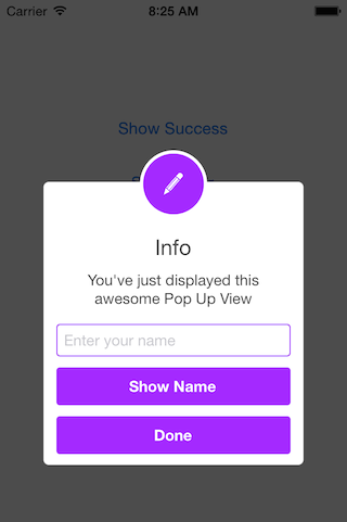
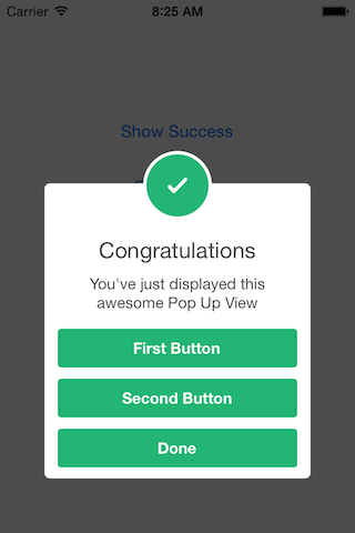
// Get started SCLAlertView().showInfo("Important info", subTitle: "You are great")let alertViewResponder: SCLAlertViewResponder = SCLAlertView().showSuccess("Hello World", subTitle: "This is a more descriptive text.") // Upon displaying, change/close view alertViewResponder.setTitle("New Title") // Rename title alertViewResponder.setSubTitle("New description") // Rename subtitle alertViewResponder.close() // Close viewSCLAlertView().showError("Hello Error", subTitle: "This is a more descriptive error text.") // Error SCLAlertView().showNotice("Hello Notice", subTitle: "This is a more descriptive notice text.") // Notice SCLAlertView().showWarning("Hello Warning", subTitle: "This is a more descriptive warning text.") // Warning SCLAlertView().showInfo("Hello Info", subTitle: "This is a more descriptive info text.") // Info SCLAlertView().showEdit("Hello Edit", subTitle: "This is a more descriptive info text.") // Edit SCLAlertView().showTitle( "Congratulations", // Title of view subTitle: "Operation successfully completed.", // String of view duration: 2.0, // Duration to show before closing automatically, default: 0.0 completeText: "Done", // Optional button value, default: "" style: .success, // Styles - see below. colorStyle: UIColorFromRGB(0xA429FF), colorTextButton: .white )// SCLAlertView.SCLAppearanc has more than 15 different properties to customize. See below. let appearance = SCLAlertView.SCLAppearance( kTitleFont: UIFont(name: "HelveticaNeue", size: 20)!, kTextFont: UIFont(name: "HelveticaNeue", size: 14)!, kButtonFont: UIFont(name: "HelveticaNeue-Bold", size: 14)!, showCloseButton: false ) let alert = SCLAlertView(appearance: appearance)let alertView = SCLAlertView() alertView.addButton("First Button", target:self, selector:Selector("firstButton")) alertView.addButton("Second Button") { print("Second button tapped") } alertView.showSuccess("Button View", subTitle: "This alert view has buttons")let appearance = SCLAlertView.SCLAppearance( showCloseButton: false ) let alertView = SCLAlertView(appearance: appearance) alertView.showSuccess("No button", subTitle: "You will have hard times trying to close me")let appearance = SCLAlertView.SCLAppearance( showCloseButton: false ) let alertView = SCLAlertView(appearance: appearance) alertView.showWarning("No button", subTitle: "Just wait for 3 seconds and I will disappear", duration: 3)let appearance = SCLAlertView.SCLAppearance( showCircularIcon: false ) let alertView = SCLAlertView(appearance: appearance) alertView.showSuccess("No icon", subTitle: "This is a clean alert without Icon!")let appearance = SCLAlertView.SCLAppearance( showCircularIcon: true ) let alertView = SCLAlertView(appearance: appearance) let alertViewIcon = UIImage(named: "IconImage") //Replace the IconImage text with the image name alertView.showInfo("Custom icon", subTitle: "This is a nice alert with a custom icon you choose", circleIconImage: alertViewIcon)// Add a text field let alert = SCLAlertView() let txt = alert.addTextField("Enter your name") alert.addButton("Show Name") { print("Text value: \(txt.text)") } alert.showEdit("Edit View", subTitle: "This alert view shows a text box")// Example of using the view to add two text fields to the alert // Create custom Appearance Configuration let appearance = SCLAlertView.SCLAppearance( kTitleFont: UIFont(name: "HelveticaNeue", size: 20)!, kTextFont: UIFont(name: "HelveticaNeue", size: 14)!, kButtonFont: UIFont(name: "HelveticaNeue-Bold", size: 14)!, showCloseButton: false, dynamicAnimatorActive: true ) // Initialize SCLAlertView using custom Appearance let alert = SCLAlertView(appearance: appearance) // Creat the subview let subview = UIView(frame: CGRect(x: 0,y: 0,width: 216,height: 70)) let x = (subview.frame.width - 180) / 2 // Add textfield 1 let textfield1 = UITextField(frame: CGRect(x: x,y: 10,width: 180,height: 25)) textfield1.layer.borderColor = UIColor.green.cgColor textfield1.layer.borderWidth = 1.5 textfield1.layer.cornerRadius = 5 textfield1.placeholder = "Username" textfield1.textAlignment = NSTextAlignment.center subview.addSubview(textfield1) // Add textfield 2 let textfield2 = UITextField(frame: CGRect(x: x,y: textfield1.frame.maxY + 10,width: 180,height: 25)) textfield2.isSecureTextEntry = true textfield2.layer.borderColor = UIColor.blue.cgColor textfield2.layer.borderWidth = 1.5 textfield2.layer.cornerRadius = 5 textfield1.layer.borderColor = UIColor.blue.cgColor textfield2.placeholder = "Password" textfield2.textAlignment = NSTextAlignment.center subview.addSubview(textfield2) // Add the subview to the alert's UI property alert.customSubview = subview _ = alert.addButton("Login") { print("Logged in") } // Add Button with visible timeout and custom Colors let showTimeout = SCLButton.ShowTimeoutConfiguration(prefix: "(", suffix: " s)") _ = alert.addButton("Timeout Button", backgroundColor: UIColor.brown, textColor: UIColor.yellow, showTimeout: showTimeout) { print("Timeout Button tapped") } let timeoutValue: TimeInterval = 10.0 let timeoutAction: SCLAlertView.SCLTimeoutConfiguration.ActionType = { print("Timeout occurred") } _ = alert.showInfo("Login", subTitle: "", timeout: SCLAlertView.SCLTimeoutConfiguration(timeoutValue: timeoutValue, timeoutAction: timeoutAction))// Button kButtonFont: UIFont buttonCornerRadius : CGFloat showCloseButton: Bool kButtonHeight: CGFloat // Circle Image showCircularIcon: Bool kCircleTopPosition: CGFloat kCircleBackgroundTopPosition: CGFloat kCircleHeight: CGFloat kCircleIconHeight: CGFloat // Text kTitleFont: UIFont kTitleTop:CGFloat kTitleHeight:CGFloat kTextFont: UIFont kTextHeight: CGFloat kTextFieldHeight: CGFloat kTextViewdHeight: CGFloat // View kDefaultShadowOpacity: CGFloat kWindowWidth: CGFloat kWindowHeight: CGFloat shouldAutoDismiss: Bool // Set this false to 'Disable' Auto hideView when SCLButton is tapped fieldCornerRadius : CGFloat contentViewCornerRadius : CGFloat disableTapGesture: Bool // set this to true if adding tableview to subViewenum SCLAlertViewStyle: Int { case success, error, notice, warning, info, edit, wait, question }// Animation Styles public enum SCLAnimationStyle { case noAnimation, topToBottom, bottomToTop, leftToRight, rightToLeft }SCLAlertView is available through
To install add the following line to your Podfile:
pod 'SCLAlertView' To install add the following line to your Cartfile:
github "vikmeup/SCLAlertView-Swift" "master"
I tried to build an easy to use API, while beeing flexible enough for multiple variations, but I'm sure there are ways of improving and adding more features, so feel free to collaborate with ideas, issues and/or pull requests.
- More animations
- Performance tests
Has been developed initially for the Scroll Feed app
- Design @SherzodMx Sherzod Max
- Development @vikmeup Viktor Radchenko
- Improvements by @bih Bilawal Hameed, @rizjoj Riz Joj