A prototyping component library build for Vue.js
<v1-grid /> <v1-grid size="8x8" /> // Default: 12x10 <v1-grid gap="0" /> // Default: 10 <v1-grid guides /> // Shows guides to help build cells <v1-grid flat /> // Makes all cells flat (no background)<v1-cell /> <v1-cell size="2x4" /> // WxH: size="2,4" and size="2 4" also work <v1-cell x="1" /> // Default: 0 <v1-cell y="3" /> // Default: 0 <v1-cell flat /> // Removes background color <v1-cell middle /> // Vertically aligns content in middle <v1-cell bottom /> // Vertically aligns content in bottom <v1-cell border /> // Adds border to all sides of cell <v1-cell borderTop /> // Adds border to top of cell <v1-cell borderRight /> // Adds border to right of cell <v1-cell borderBottom /> // Adds border to bottom of cell <v1-cell borderLeft /> // Adds border to left of cell<v1-text /> <v1-text rows="5" /> // Default: 3 <v1-text center /> // Centers rows <v1-text justify /> // Makes rows full width
<v1-image /> <v1-image width="100px" /> // Default: 100% <v1-image height="100px" /> // Default: 200px <v1-image round /> // Makes circle if width equals height <v1-image center /> // Centers horizontally
<v1-avatar /> <v1-footer count="5" /> // Default: 1
Works best in a vertically narrow cell
<v1-nav /> <v1-nav links="5" /> // Default: 4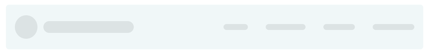
Works best in a vertically narrow cell
<v1-footer /> <v1-footer links="5" /> // Default: 4
Shows a filled line chart.
<v1-chart /> <v1-chart height="300" /> // Default: 200 <v1-chart margin="100" /> // Horizontal margin, Default: 50
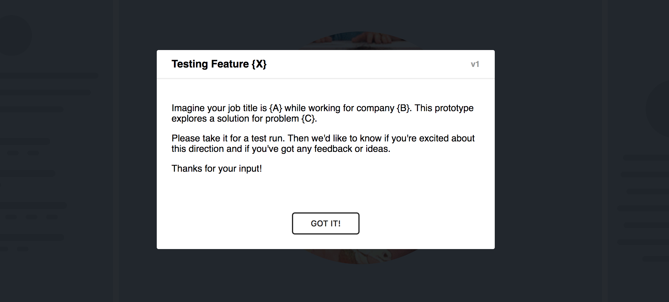
Shows a model explaining the prototype. Helps your users get into the right mind set.
Works best if you include it before
<v1-grid>.
<v1-intro title="Testing Feature {X}" version="v1"> <p>Imagine your job title is {A} while working for company {B}. This prototype explores a solution for problem {C}.</p> <p>Please take it for a test run. Then we'd like to know if you\'re excited about this direction and if you've got any feedback or ideas.</p> <p>Thanks for your input!</p> </v1-intro> <v1-grid />