This repository was archived by the owner on Sep 11, 2024. It is now read-only.
Iterate Spaces admin UX around room management #5977
Merged
Conversation
This file contains hidden or bidirectional Unicode text that may be interpreted or compiled differently than what appears below. To review, open the file in an editor that reveals hidden Unicode characters. Learn more about bidirectional Unicode characters
jryans approved these changes May 5, 2021
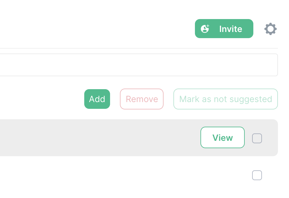
| @t3chguy looks great, I just have 4 notes:
|
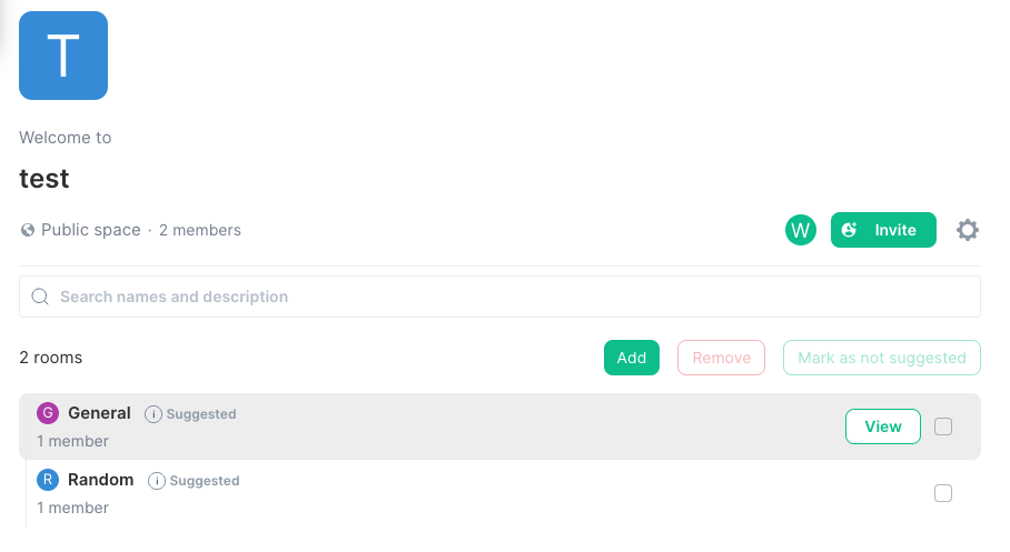
It is indeed global, its a button will fix the button size issue and the untrapped behaviour of the join button click
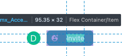
The |
… button leaking to parent
… t3chguy/fix/17176 � Conflicts: � src/components/structures/SpaceRoomDirectory.tsx
… t3chguy/fix/17176
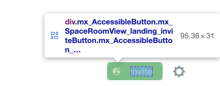
| Its 32px here :L
I'll give it an explicit rem line-height which should make it more consistent |
| Fixed it for that specific button but a more general solution would be good in the future - opened element-hq/element-web#17197 to track it |
niquewoodhouse approved these changes May 7, 2021
Sign up for free to subscribe to this conversation on GitHub. Already have an account? Sign in.
3 participants
Add this suggestion to a batch that can be applied as a single commit. This suggestion is invalid because no changes were made to the code. Suggestions cannot be applied while the pull request is closed. Suggestions cannot be applied while viewing a subset of changes. Only one suggestion per line can be applied in a batch. Add this suggestion to a batch that can be applied as a single commit. Applying suggestions on deleted lines is not supported. You must change the existing code in this line in order to create a valid suggestion. Outdated suggestions cannot be applied. This suggestion has been applied or marked resolved. Suggestions cannot be applied from pending reviews. Suggestions cannot be applied on multi-line comments. Suggestions cannot be applied while the pull request is queued to merge. Suggestion cannot be applied right now. Please check back later.
Fixes element-hq/element-web#17176