Dial Pad UI bug fixes #5786
Dial Pad UI bug fixes #5786
Conversation
res/css/views/voip/_DialPad.scss Outdated
| text-align: center; | ||
| vertical-align: middle; | ||
| line-height: 40px; | ||
| color: #15191e; |
There was a problem hiding this comment.
There might be a suitable colour for this in one of the theme files (e.g. _dark.scss). Could you please take a look if there is one?
There was a problem hiding this comment.
There are a few i could find but they're not properly labelled .
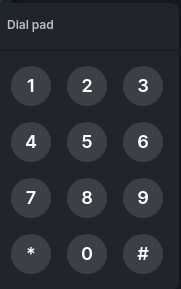
Also they light theme doesn't have these issues so it might get a bit messy , I think I could just update the $theme-button-bg-color in _dark.css . But that is very likely to effect some menu backgrounds
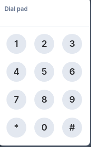
So it becomes consistent with light theme. Something like this:
So it becomes consistent(Like orignal Light theme)
There was a problem hiding this comment.
Changing the value of $theme-button-bg-color isn't a good idea. The consistency would be great. If there really isn't anything suitable, you could perhaps add a new colour (both to _light.scss and _dark.scss)?
There was a problem hiding this comment.
I just added $dialpad-button-bg-color to all the themes(it wasn't compiling without all of them) for the case. I hope this would be alright
 turt2live left a comment
There was a problem hiding this comment.
code looks fine, though a designer will have to take a look to confirm the sizing and such.
 gaelledel left a comment
There was a problem hiding this comment.
Awesome! Could we follow these visual specs here for both Light and dark themes?
https://www.figma.com/file/xqclx5H9SHRh3T4K6S4rGo/Community?node-id=0%3A1
The scroll bar implementation should be removed. Instead I suggest a different interaction mechanism similar to Skype
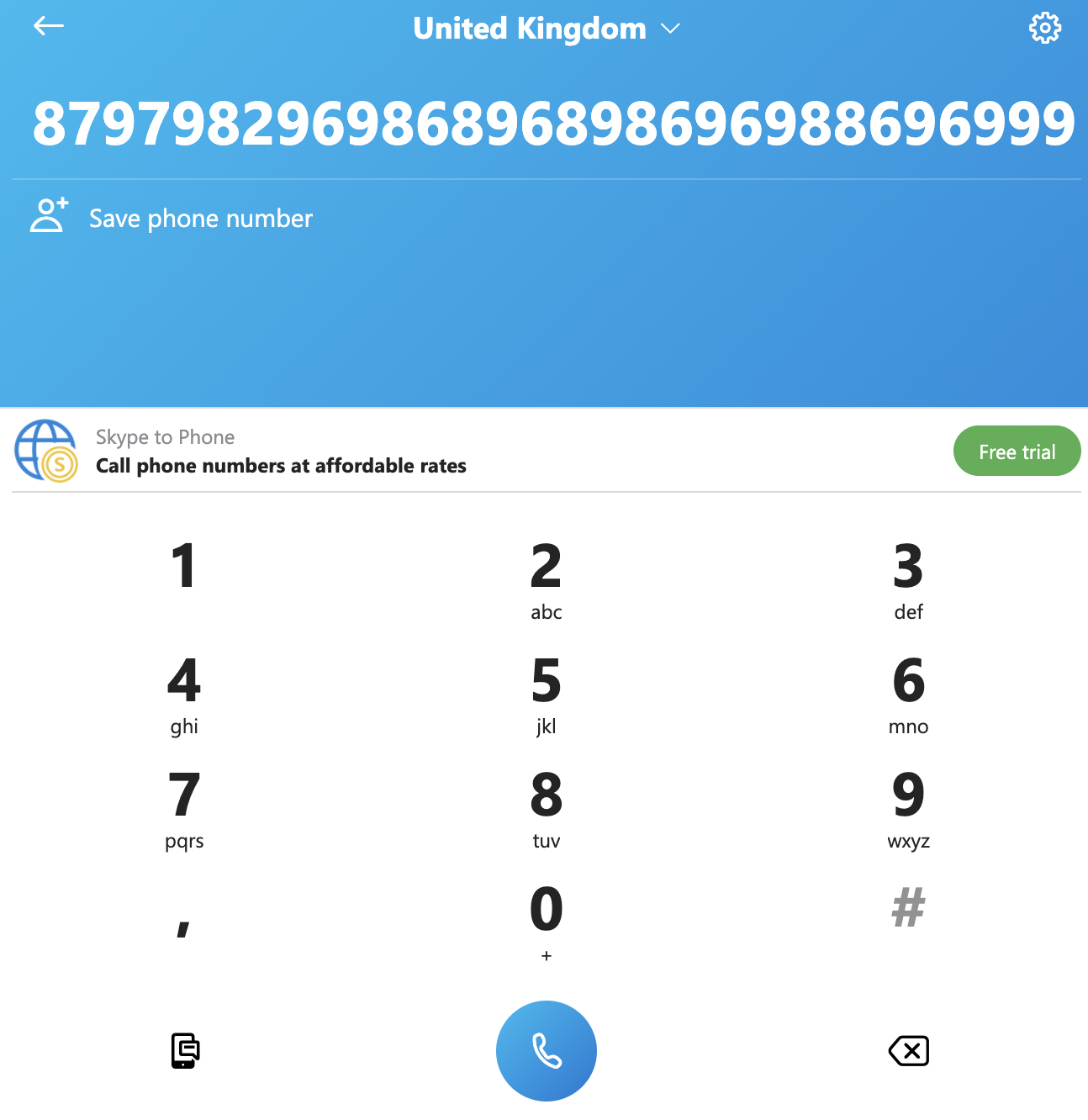
Essentially, the first number inside the row would be rolling towards the left everytime a new character is entered.
Users can then interact with the numbers row using the arrow keys, delete, space bar etc...
You can test out how it works on Skype to have a clearer picture of what I am referring to.
| @gaelledel Added the color schemes and the RTL rolling digits and dropped the scrollbar |

| This now has the necessary approvals, so merging. It predates the github action check, so I'm going to assume it's fine without this. |
1 similar comment
| This now has the necessary approvals, so merging. It predates the github action check, so I'm going to assume it's fine without this. |
The field had RTL direction set on it, which meant symbols, like *, appeared at the beginning of the field instead of the end. RTL was introduced in #5786, however its removal seems to have had no adverse affects from testing.
The field had RTL direction set on it, which meant symbols, like *, appeared at the beginning of the field instead of the end. RTL was introduced in #5786, however its removal seems to have had no adverse affects from testing.
Fixes element-hq/element-web/issues/16761 and element-hq/element-web/issues/16737
A scrollbar was implemented in the dialled section to fix the bug
For element-hq/element-web/issues/16761 a basic color change was done as stated in the second option in the issue
Signed-off-by : Ayush Pratap Singh ayushpratap16@gmail.com