A sliding multi-level navigation drawer menu written in vanilla javascript;
Use basic HTML, javascript, and CSS to create a tiered navigation suitable for narrow or wide screens
By Jim Keller, Eastern Standard
https://www.easternstandard.com
- Fully ADA / WCAG 2.0 / Section 508 compliant - supports keyboard navigation, tabbing, and aria labels
- Extremely customizable - see the options list below
- No dependencies
- ES6 compatible
- Useful for both simple or extremely deep menus
-
If using npm, simply run "npm install traversable_menu". Otherwise, add traversable_menu.css and traversable_menu.js to your project
-
Add the markup for your menu:
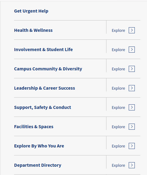
<div id="primary-menu" class="traversable-menu"> <div class="menu__panel"> <div class="menu__panel__title"><!-- automatically replaced with javascript --></div> <ul> <li class="menu__item"> <a href="#" class="menu__item__link">About Us</a> </li> <li class="menu__item"> <a href="#" class="menu__item__link">Academics</a> <a href="#" class="menu__panel__trigger--child">Explore ></a> <div class="menu__panel"> <div class="menu__panel__title"></div> <a href="#" class="menu__panel__trigger--top"></a> <a href="#" class="menu__panel__trigger--parent">Up a level (this gets replaced in JS)</a> <ul> <li class="menu__item"> <a href="#" class="menu__item__link">Sub item to Academics</a> </li> </ul> </div> </li> <li class="menu__item"><a href="#" class="menu__item__link">Another item with no children</a></li> </ul> </div> </div> - Initialize traversable menu using basic options:
<script> document.addEventListener("DOMContentLoaded", function() { let traversable = new TraversableMenu( { 'panel_title_first': 'Traversable Menu Example' // many additional options here; see below } ); traversable.initializeFromHTML("#primary-menu") }); </script> - You're done
Please note that options are nested the same way they are below, like so:
selectors: { //selector options here }, classes: { //classes options here }, triggers: { //trigger options here } ...etc selector for an individual menu panel - usually one level of the menu
default: .menu__panel
selector for the trigger element that goes one level deeper
default: .menu__panel__trigger--child
selector for the trigger element that moves one level up
default: .menu__panel__trigger--parent
selector for the trigger element that goes back to the top
default: .menu__panel__trigger--top
selector for the title for a panel
default: .menu__panel__title
selector for container that holds multiple panels. This should be your top-level selector.
default: .traversable-menu
selector for the currently active link, i.e. the page the user is on
default: .menu__item--active
selector for whether the current link is part of the active menu trail
default: .menu__item--active-trail
selector for an individual menu item (almost always an li tag)
default: .menu__item
selector for the actual menu item link (almost always an a tag)
default: .menu__item__link
Tabbing will be disabled on elements matching this selector when the menu panel is closed
default: a
class to set on top-level container after menu is initialized
default: traversable-menu--initialized
class that gets set on a panel when it is actively displayed
default: menu__panel--active
class that gets set on any panel that's in the active trail
default: menu__panel--active-trail
class that is set on any panel that is a parent of the current panel
default: menu__panel--child-open
class to set when a panel should be shown immediately, rather than animating in
default: -show-immediat
class to set on each panel that tells you the depth. [:n:] is replaced with the depth of the panel
default: menu__panel--depth-[:n:]
text to be set on the panel_trigger_parent. [:previous-title:] is automatically replaced with the parent menu's title
default: Up to [:previous-title:] menu
text to be set on the "up to top" trigger
type: string
default: Up to Main Menu
the depth at which to start showing 'up to main menu' link
type: integer
default: 2
whether to automatically remove 'up to main menu' link if the depth is less than triggers.top_depth
type: boolean
default: true
if panel_title_first is set, use that as our "top_text" at the first level below the topmost panel
type: boolean
default: false
the role attribute to set on the panel container
type: string
default: menubar
the role attribute to set on an individual panel
type: string
default: menu
the role attribute to set on a menu item
type: string
default: menuitem
set focus to first menu item link when panel is shown using keyboard
type: boolean
default: true
called before the panels are initialized. Passes the TraversableMenu object to the function as a parameter
type: function
default: none
called after the panels are initialized. Passes the TraversableMenu object to the function as a parameter
type: function
default: none
set to true to see debug messages
default: false
whether to automatically scroll to the top of the panel (so that the user doesn't land in the middle of a child panel)
type: boolean
default: true
hether to automatically determine the height of each individual panel
type: boolean
default: true
whether to automatically set the panel container height
type: boolean default: true
The duration of the "slide" animation in milliseconds. Should match your CSS.
type: integer
default: 350
the title of the first panel
type: string
default: none
title of subsequent panels. [:menu-title:] will be replaced by the text of the link that expands to show the menu
type: string
default: [:menu-title:]
whether to automatically traverse (on initialize) to the menu item identified by the menu_item_active selector above
type: boolean
default: true
by default, auto traverse shows siblings of the current page. Increase this number to have it automatically traverse deeper
type: integer default: 0
hide errors if no panel container is found
type: boolean
default: true
The below is just for a visual guide as to how the options are nested. The values here are just for example purposes, you almost certainly don't want to use them.
<script> document.addEventListener("DOMContentLoaded", function() { var traversable = new TraversableMenu( { selectors: { 'panel': '.my-menu-panel-selector', 'panels_container': '#my-menu-panels' }, classes: { 'panel_active': '.active' }, triggers: { 'parent_text': 'Click to see the [:previous-title] menu' }, accessibility: { 'container_role': 'menubar' }, callbacks: { panels { initialize { after: function( traversable_menu_obj ) { //perhaps do something here after the panels are initialized } } } } 'panel_title_first': 'Traversable Menu Example' // many additional options here; see below } ); }); </script>