


Animated circular progress components for React Native project, with all pure React Native API
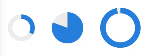
import AnimatedCircularProgress from 'react-native-animated-circular-progress'; <AnimatedCircularProgress backgroundColor='red' color='green' startDeg={45} endDeg={120} radius={60} innerRadius={40} duration={1000} />;You also use CircularProgress without inner Circle
<AnimatedCircularProgress startDeg={45} endDeg={120} innerRadius={0} duration={300} style={{ marginTop: 10 }} />| Name | Description | Type | Required | Default Value |
|---|---|---|---|---|
| backgroundColor | The background color of CircularProgress | String | '#eeeeee' | |
| color | The color of CircularProgress | String | '#1e88e5' | |
| startDeg | Start degree of CircularProgress, where animation start (0-360) | Number | 0 | |
| endDeg | End degree of CircularProgress, where animation end (0-360), greater than startDeg | Number | 360 | |
| radius | Radius of outer CircularProgress | Number | 100 | |
| innerRadius | Radius of inner CircularProgress | Number | 80 | |
| innerBackgroundColor | Background color of inner CircularProgress | String | transparent | |
| duration | Time in ms, animation processing during this time. Actually animation time is duration / (endDeg - startDeg) smaller than radius | Number | 1000 | |
| children | The children to render inside this component | Node | null | |
| style | The custom styling which will be applied to the container of the children | Style | null |
yarn add react-native-animated-circular-progress
or
npm install react-native-animated-circular-progress
MIT