Easy to use and flexible modal sidebar component for Vue3
- Top, Right, Bottom, Left sides.
- Slots for fixed header and footer areas.
- Body scroll lock included thanks to BSL.
- Calculating of body height on screen resizing. (useful for setting "height: 100%" inside default slot)
- Animation Flexibility via Vue Transition support
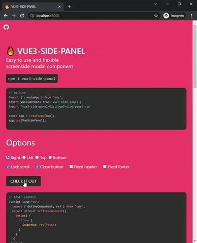
npm i vue3-side-panelor
yarn add vue3-side-panelthen add Vue component for global use
main.ts
import { createApp } from 'vue'; import VueSidePanel from 'vue3-side-panel'; import 'vue3-side-panel/dist/vue3-side-panel.css' const app = createApp(App); app.use(VueSidePanel);or for local usage
App.vue
// ... import { VueSidePanel } from 'vue3-side-panel'; import 'vue3-side-panel/dist/vue3-side-panel.css'; export default defineComponent({ components: { VueSidePanel }, // ... });- #header -- not required (Fixed and non scrolled area)
- #default -- required (Scrolled area)
- #footer -- not required. (Fixed and non scrolled area)
// without fixed areas <VueSidePanel v-model="isOpened"> <div style="height: 100%; background-color: #ccc"> <h2> This is scrolled body! </h2> </div> </VueSidePanel>or
// with the fixed header, footer, custom close button and fixed body scroll <VueSidePanel v-model="isOpened" lock-scroll hide-close-btn > <template #header> <div> <h2> This is fixed header! </h2> <span @click="isOpened = false"> X </span> </div> </template> <template #default> <div style="height: 100%; background-color: #ccc"> <h2> This is scrolled body! </h2> </div> </template> <template #footer> <h2>This is fixed footer!</h2> </template> </VueSidePanel>| Property | Type | Description |
|---|---|---|
| id-name | String | default: 'vsp-container'. ID of div element which contain the all side panels |
| side | 'right' or 'bottom' or 'left' or 'top' | default: 'right'. Screenside for a modal panel |
| rerender | Boolean | default: false By default, the modal is rendered once, and changing v-model simply causes show or hide. You can render modal on opening if set the true value. |
| hide-close-btn | Boolean | default: false Hide the close button component which appears by default |
| no-close | Boolean | default: false Disable the ability to close the panel by clicking on the overlay |
| z-index | Number or 'auto' or undefined | default: 'auto' By default, the component finds and sets the maximum z-index of your DOM. You will disable it if you set a specific value or 'undefined' |
| width | String | default: 'auto' Min-width style property for the side panel. Example: '500px' NOTICE! Works only with 'right' and 'left' values of side option |
| height | String | default: 'auto' Min-height style property for the side panel. Example: '500px'. NOTICE! Works only with 'top' and 'bottom' values of side option |
| lock-scroll | Boolean | default: false Locks the body scroll if you set it to true. NOTICE! For some css frameworks this is not enough. Read the description of the lock-scroll-html option |
| lock-scroll-html | Boolean | default: true Works only with the lock-scroll option. Bulma alike frameworks add "overflow-y: scroll;" option to the html tag and BSL (body-scroll-lock library) stops working after that. This option helps to resolve this problem. You can turn it off if you are not suffering of this issue. |
| transition-name | String or undefined | default: undefined. There are slide-right or slide-left or slide-top or slide-bottom or undefined options to use. Under the hood, selecting undefined simply sets slide-right if the side == 'right' or slide-left if the side == 'left'. Animation works through <Transtion> Vue component. You can use your own transition name to override the default animation. For example: setting transition-name="my-transition" expects you to create at least these classes with your own css .my-transition-enter-active and .my-transition-leave-active. @see https://vuejs.org/guide/built-ins/transition.html |
| overlay-color | String | default: 'black' Color of overlay that you can see under a side panel. This is a CSS style option and it is why you can use a different string format to set a color. For example: rgb(0, 22, 22), #aaa;, white also suit |
| overlay-opacity | Number | default: 0.5 The opacity of the overlay |
| overlay-duration | Number | default: 500 How fast the overlay spawn animation works. ( in milliseconds ) |
| panel-color | String | default: 'white'. The default color of the main container. This is a style option so it can be any string that the browser supports. See 'overlay-color' to find the examples |
| panel-duration | Number | default: 300 This is the same as the overlay-duration option. See above |
| header-class | String | default: '' It will be necessary in cases where you need to change the default styles of a static header block within a panel |
| body-class | String | default: '' It will be necessary in cases where you need to change the default styles of a scrolled body block within a panel |
| footer-class | String | default: '' It will be necessary in cases where you need to change the default styles of a static footer block within a panel |
| Event | Description |
|---|---|
| @opened | Called when opening animation is finished and modal is opened |
| @closed | Called when closing animation is finished and modal is closed |
MIT