Skip to content

Conversation

@shenxianpeng
Copy link
Collaborator

Resolve #80

@shenxianpeng shenxianpeng added the documentation Improvements or additions to documentation label Aug 13, 2022
Copy link
Collaborator

@2bndy5 2bndy5 left a comment

Choose a reason for hiding this comment

The reason will be displayed to describe this comment to others. Learn more.

I guess this should be titled "clean-up README" 😄

@2bndy5
Copy link
Collaborator

2bndy5 commented Aug 13, 2022

Was the icon_large.xcf file (my GIMP project) moved to the .github repo?

@shenxianpeng shenxianpeng changed the title Update README (#80) Clean-up README (#80) Aug 13, 2022
@shenxianpeng
Copy link
Collaborator Author

shenxianpeng commented Aug 13, 2022

Was the icon_large.xcf file (my GIMP project) moved to the .github repo?

No, what is icon_large.xcf used for? You or I move to the .github repo if needed.

@shenxianpeng shenxianpeng merged commit eddec1b into master Aug 13, 2022
@shenxianpeng shenxianpeng deleted the update-readme branch August 13, 2022 10:05
@2bndy5
Copy link
Collaborator

2bndy5 commented Aug 13, 2022

what is icon_large.xcf used for?

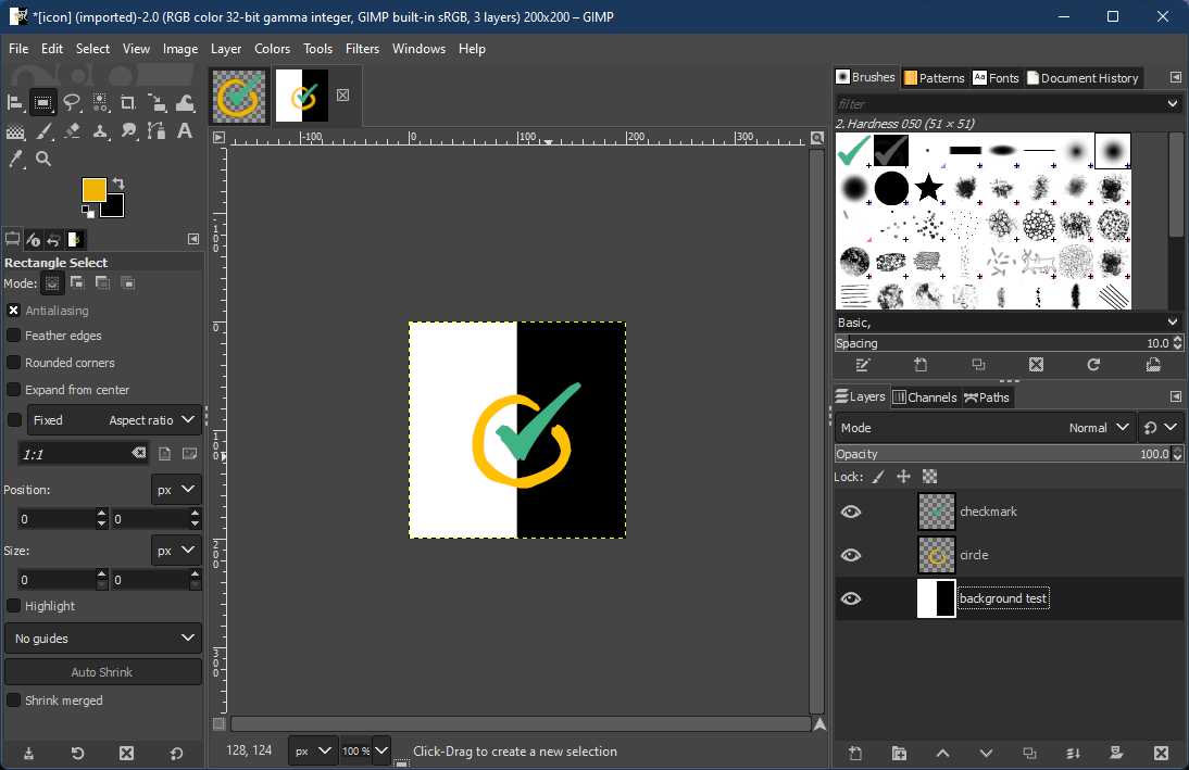
I do all my image manipulation using GIMP. I used the xcf file to save my work on the favicon we've been using:
image

Personally, I like how the yellow circle looks better in dark theme. The current icon is a bit bland in dark theme:
image

@shenxianpeng
Copy link
Collaborator Author

shenxianpeng commented Aug 13, 2022

En, yellow should look good in both dark and default themes, the pre-commit icon is also yellow, but our yellow icon is not sharp enough that's why I want to remove it, see https://github.com/cpp-linter/cpp-linter-action/blob/894a54988abed9f2c7a37f5b54694e819de7f462/docs/images/icon_large.png

If the new yellow icon could display well(sharp and lossless) as the current icon, we can change it to yellow. https://github.com/cpp-linter/cpp-linter-action/blob/894a54988abed9f2c7a37f5b54694e819de7f462/docs/images/icon.png

@2bndy5
Copy link
Collaborator

2bndy5 commented Aug 13, 2022

oh,

  1. I added a slight bevel (with shadow) to the circle so the checkmark would pop out.
  2. I also added a shadow to the check mark to make it seem 3D layered.
  3. There is some slight pixelation around the edges because I scaled it up a bit to reduce the empty space around it. Then I tried to hide that with some bevel shadows.

If you're looking for flat, that's easy.
image

@shenxianpeng
Copy link
Collaborator Author

This yellow circle icon looks great 👍 I would also like to see the flat

@2bndy5
Copy link
Collaborator

2bndy5 commented Aug 13, 2022

I still don't like the empty space around it, but when I scale it up, it gets pixelated.
image

What did you use to create the logo?

@shenxianpeng
Copy link
Collaborator Author

I found the logo from google or Canva, I forgot it 😟

Sign up for free to join this conversation on GitHub. Already have an account? Sign in to comment

Labels

documentation Improvements or additions to documentation

3 participants