
Microeconomics/macroeconomics graphs made with ggplot2
This package allows creating microeconomics or macroeconomics charts in R with simple functions. This package inspiration is reconPlots by Andrew Heiss.
THE PACKAGE IS UNDER HEAVY DEVELOPMENT. WORK IN PROGRESS. You can suggest ideas by submitting an Issue or contributing submitting Pull Requests.
- Finish documentation
- Price control (in
sdcurvefunction) - Allow drawing custom functions
- Add graph for budget constraints
- Fix
linecolargument - Tax graph
- Shade producer and consumer surplus
- Add Edgeworth box
- General equilibrium (suggested by Ilya)
- Prospect theory value function (suggested by @brshallo)
- Neoclassical labor supply (suggested by @hilton1)
- Installation
- Supply curve
- Demand curve
- Supply and demand
- Neoclassical labor supply
- Indifference curves
- Production–possibility frontier
- Tax graph
- Prospect Theory value function
- Laffer curve
- Calculating the intersections
- Citation
# Install the development version from GitHub: # install.packages("devtools") devtools::install_github("R-CoderDotCom/econocharts")The package will be on CRAN as soon as possible
supply() # Default plot 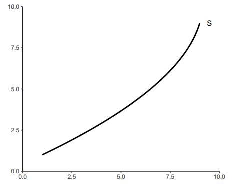
supply(ncurves = 1, # Number of supply curves to be plotted type = "line", # Type of the curve x = c(2, 4, 5), # Y-axis values where to create intersections linecol = 2, # Color of the curves geom = "label", # Label type of the intersection points geomfill = "pink", # If geom = "label", is the background color of the label main = "Supply curve") # Title of the plot 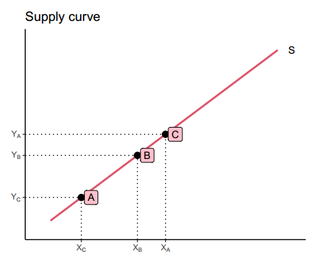
supply(ncurves = 3, # Three supply curves xlab = "X", # X-axis label ylab = "Y", # Y-axis label bg.col = "lightblue") # Background color 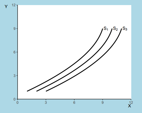
demand(x = 3:6, # Intersections generic = FALSE) # Axis values with the actual numbers 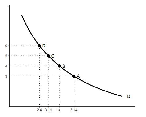
demand(main = "Demand", # Title sub = "curve", # Subtitle xlab = "X", # X-axis label ylab = "Y", # Y-axis label names = "D[1]", # Custom name for the curve geomcol = 2) # Color of the custom name of the curve 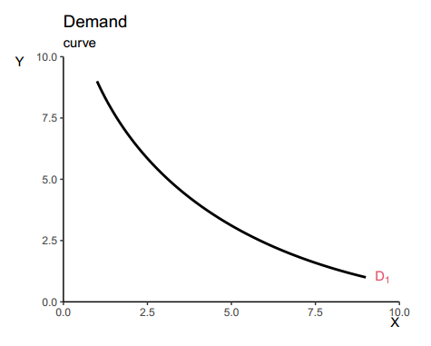
sdcurve() # Default supply and demand plot 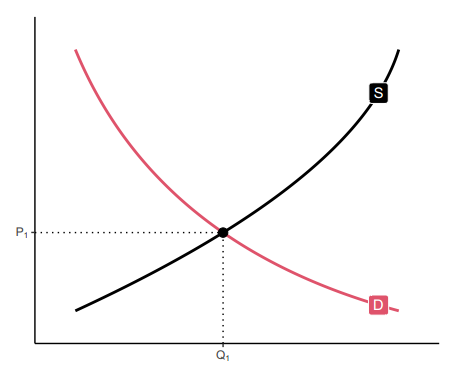
# Custom data supply1 <- data.frame(x = c(1, 9), y = c(1, 9)) supply1 demand1 <- data.frame(x = c(7, 2), y = c(2, 7)) demand1 supply2 <- data.frame(x = c(2, 10), y = c(1, 9)) supply2 demand2 <- data.frame(x = c(8, 2), y = c(2, 8)) demand2 p <- sdcurve(supply1, # Custom data demand1, supply2, demand2, equilibrium = TRUE, # Calculate the equilibrium bg.col = "#fff3cd") # Background color p + annotate("segment", x = 2.5, xend = 3, y = 6.5, yend = 7, # Add more layers arrow = arrow(length = unit(0.3, "lines")), colour = "grey50") 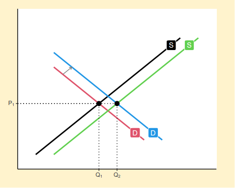
neolabsup(x = c(2, 3, 5, 7), xlab = "Quantity of\n labor supplied", ylab = "Wage rate") 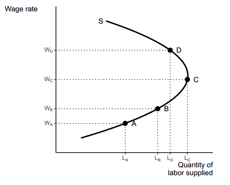
indifference() # Default indifference curve 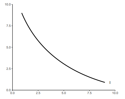
indifference(ncurves = 2, # Two curves x = c(2, 4), # Intersections main = "Indifference curves", xlab = "Good X", ylab = "Good Y", linecol = 2, # Color of the curves pointcol = 2) # Color of the intersection points 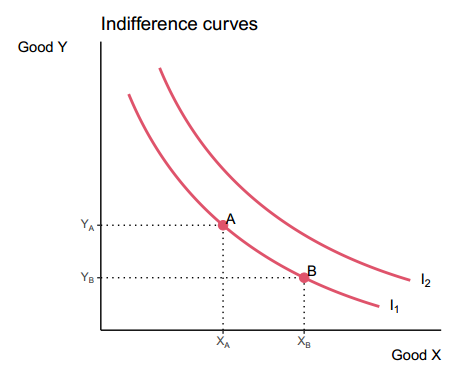
p <- indifference(ncurves = 2, x = c(2, 4), main = "Indifference curves", xlab = "Good X", ylab = "Good Y") int <- bind_rows(curve_intersect(data.frame(x = 1:1000, y = rep(3, nrow(p$curve))), p$curve + 1)) p$p + geom_segment(data = int, aes(x = 0, y = y, xend = x, yend = y), lty = "dotted") + geom_segment(data = int, aes(x = x, y = 0, xend = x, yend = y), lty = "dotted") + geom_point(data = int, size = 3) 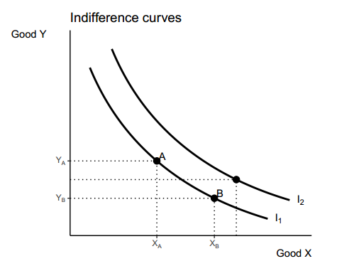
indifference(ncurves = 2, # Two curves type = "pcom", # Perfect complements main = "Indifference curves", sub = "Perfect complements", xlab = "Good X", ylab = "Good Y", bg.col = "#fff3cd", # Background color linecol = 1) # Color of the curve 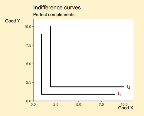
indifference(ncurves = 5, # Five curves type = "psubs", # Perfect substitutes main = "Indifference curves", sub = "Perfect substitutes", xlab = "Good X", ylab = "Good Y", bg.col = "#fff3cd", # Background color linecol = 1) # Color of the curve 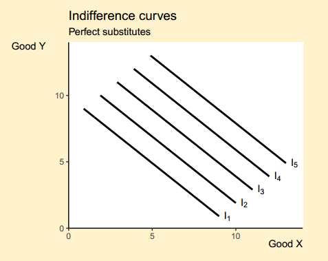
ppf(x = 1:6, # Intersections main = "PPF", geom = "text", generic = TRUE, # Generic axis labels xlab = "X", ylab = "Y", labels = 1:6, acol = 3)$p 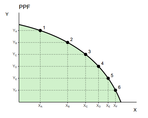
p <- ppf(x = 4:6, # Intersections main = "PPF", geom = "text", generic = TRUE, # Generic labels labels = c("A", "B", "C"), # Custom labels xlab = "BIKES", ylab = "CARS", acol = 3) # Color of the area p$p + geom_point(data = data.frame(x = 5, y = 5), size = 3) + geom_point(data = data.frame(x = 2, y = 2), size = 3) + annotate("segment", x = 3.1, xend = 4.25, y = 5, yend = 5, arrow = arrow(length = unit(0.5, "lines")), colour = 3, lwd = 1) + annotate("segment", x = 4.25, xend = 4.25, y = 5, yend = 4, arrow = arrow(length = unit(0.5, "lines")), colour = 3, lwd = 1) 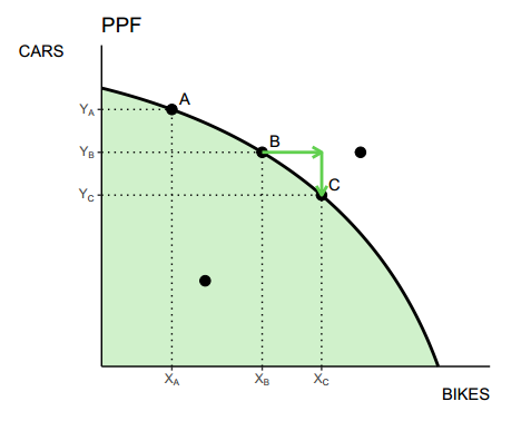
Original function by Andrew Heiss.
# Data demand <- function(Q) 20 - 0.5 * Q supply <- function(Q) 2 + 0.25 * Q supply_tax <- function(Q) supply(Q) + 5 # Chart tax_graph(demand, supply, supply_tax, NULL) 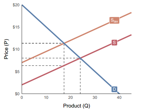
# Chart with shaded areas tax_graph(demand, supply, supply_tax, shaded = TRUE) 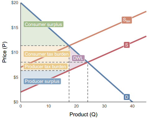
ptvalue(sigma = 0.3, lambda = -2.25, col = 2, # Color of the curve xint = seq(0, 75, 25), # Intersections xintcol = 4, # Color of the intersection segments ticks = TRUE, # Display ticks on the axes xlabels = TRUE, # Display the X-axis tick labels ylabels = TRUE, # Display the Y-axis tick labels by_x = 25, by_y = 50, # Axis steps main = "Prospect Theory Value Function") 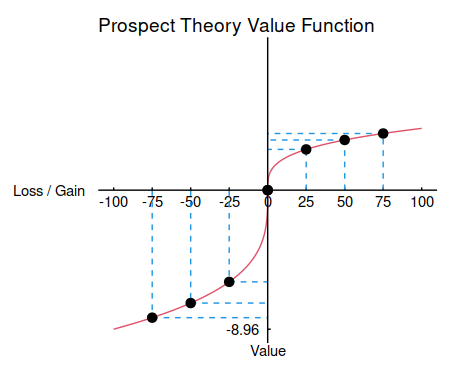
laffer(ylab = "T", xlab = "t", acol = "lightblue", # Color of the area pointcol = 4) # Color of the maximum point 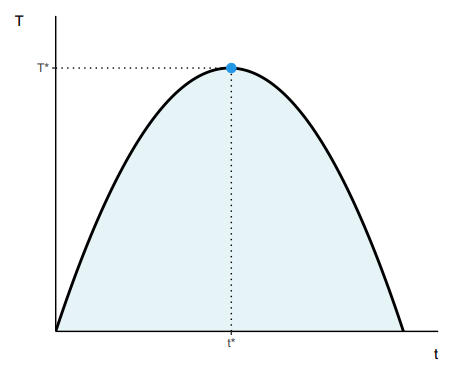
laffer(xmax = 20, # Modify the curve t = c(3, 6, 9), # Intersections generic = FALSE, ylab = "T", xlab = "t", acol = "lightblue", # Color of the area alpha = 0.6, # Transparency of the area pointcol = 4) # Color of the maximum point 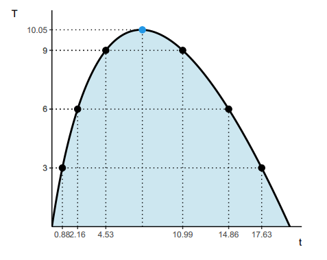
The functions above can have a limited functionality if you want a fully customized plot. The curve_intersection function allows you to calculate the intersection points between two curves. You can use this function to create your custom charts.
Credits to Andrew Heiss for this function and examples.
# Curves curve1 <- data.frame(Hmisc::bezier(c(1, 8, 9), c(1, 5, 9))) curve2 <- data.frame(Hmisc::bezier(c(1, 3, 9), c(9, 3, 1))) # Calculate the intersections curve_intersection <- curve_intersect(curve1, curve2) # Create the chart ggplot(mapping = aes(x = x, y = y)) + geom_line(data = curve1, color = "red", size = 1) + geom_line(data = curve2, color = "blue", size = 1) + geom_vline(xintercept = curve_intersection$x, linetype = "dotted") + geom_hline(yintercept = curve_intersection$y, linetype = "dotted") + theme_classic() 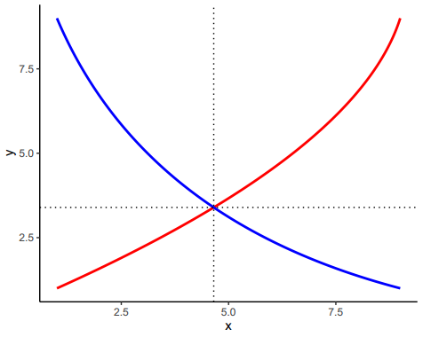
Specify a X-axis range and set empirical = FALSE.
# Define curves with functions curve1 <- function(q) (q - 10)^2 curve2 <- function(q) q^2 + 2*q + 8 # X-axis range x_range <- 0:5 # Calculate the intersections between the two curves curve_intersection <- curve_intersect(curve1, curve2, empirical = FALSE, domain = c(min(x_range), max(x_range))) # Create your custom plot ggplot(data.frame(x = x_range)) + stat_function(aes(x = x), color = "blue", size = 1, fun = curve1) + stat_function(aes(x = x), color = "red", size = 1, fun = curve2) + geom_vline(xintercept = curve_intersection$x, linetype = "dotted") + geom_hline(yintercept = curve_intersection$y, linetype = "dotted") + theme_classic()
To cite package ‘econocharts’ in publications use: José Carlos Soage González and Andrew Heiss (2020). econocharts: Microeconomics and Macroeconomics Charts Made with 'ggplot2'. R package version 1.0. https://r-coder.com/, https://r-coder.com/economics-charts-r/. A BibTeX entry for LaTeX users is @Manual{, title = {econocharts: Microeconomics and Macroeconomics Charts Made with 'ggplot2'}, author = {José Carlos {Soage González} and Andrew Heiss}, year = {2020}, note = {R package version 1.0}, url = {https://r-coder.com/, https://r-coder.com/economics-charts-r/}, } - Facebook: https://www.facebook.com/RCODERweb
- Twitter: https://twitter.com/RCoderWeb