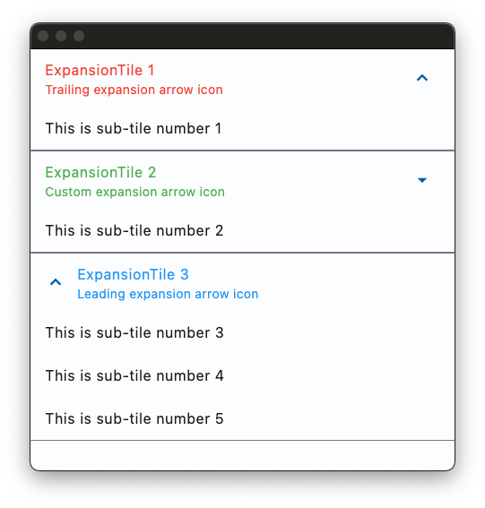
ExpansionTile
A single-line ListTile with an expansion arrow icon that expands or collapses the tile to reveal or hide its children.
Examples

loading...
Properties
affinity
Typically used to force the expansion arrow icon to the tile's leading or trailing edge.
Value is of type TileAffinity and defaults to TileAffinity.PLATFORM.
bgcolor
The color to display behind the sublist when expanded.
controls
The controls to be displayed when the tile expands.
Typically a list of ListTile controls.
controls_padding
Defines the padding around the controls.
Padding value is an instance of Padding.
clip_behavior
The content will be clipped (or not) according to this option.
Value is of type ClipBehavior and defaults to ClipBehavior.NONE.
collapsed_bgcolor
Defines the background color of tile when the sublist is collapsed.
collapsed_icon_color
The icon color of tile's expansion arrow icon when the sublist is collapsed.
collapsed_shape
The tile's border shape when the sublist is collapsed. The value is an instance of OutlinedBorder.
collapsed_text_color
The color of the tile's titles when the sublist is collapsed.
dense
Whether this list tile is part of a vertically dense list. Dense list tiles default to a smaller height.
It is not recommended to set this property to True when in Material3.
Defaults to False.
enable_feedback
Whether detected gestures should provide acoustic and/or haptic feedback. For example, on Android a tap will produce a clicking sound and a long-press will produce a short vibration, when feedback is enabled.
Defaults to True.
expanded_alignment
Defines the alignment of children, which are arranged in a column when the tile is expanded.
Value is of type Alignment.
expanded_cross_axis_alignment
Defines the alignment of each child control within controls when the tile is expanded.
Value is of type CrossAxisAlignment and defaults to CrossAxisAlignment.CENTER.
icon_color
The icon color of tile's expansion arrow icon when the sublist is expanded.
initially_expanded
A boolean value which defines whether the tile is initially expanded or collapsed.
Defaults to False.
leading
A Control to display before the title.
maintain_state
A boolean value which defines whether the state of the controls is maintained when the tile expands and collapses.
Defaults to False.
min_tile_height
The minimum height of the tile.
shape
The tile's border shape when the sublist is expanded.
Value is of type OutlinedBorder.
show_trailing_icon
Whether to show the trailing icon (be it the default icon or the custom trailing, if specified and visible).
Defaults to True.
subtitle
Additional content displayed below the title.
Typically a Text control.
text_color
The color of the tile's titles when the sublist is expanded.
tile_padding
Defines the tile's padding. Default value is padding.symmetric(horizontal=16.0).
Padding value is an instance of Padding class.
title
A Control to display as primary content of the tile.
Typically a Text control.
trailing
A Control to display after the title.
Typically an Icon control.
visual_density
Defines how compact the control's layout will be.
Value is of type VisualDensity.
Events
on_change
Fires when a user clicks or taps the list tile.
on_long_press
Fires when the user long-presses on this list tile.