Plugins
DateTimePicker
@nativescript/datetimepicker
A plugin that provides the UI elements DatePickerField, TimePickerField and DateTimePickerFields for picking a date and a time. The DatePickerField and TimePickerField components extend the TextField view, while the DateTimePickerFields extends the GridLayout layout container that contains instances of the DatePickerField and TimePickerField components. There is also a DateTimePicker class which provides static methods pickDate() and pickTime() that can be called to show the same dialog picker as the fields.
Contents
Installation
npm install @nativescript/datetimepickerUse @nativescript/datetimepicker
Core
Register the plugin namespace with Page's
xmlnsattribute providing your prefix (datetimefor example) and setting its value to the plugin name.xml<Page xmlns="http://schemas.nativescript.org/tns.xsd" xmlns:datetime="@nativescript/datetimepicker" ></Page>Access the
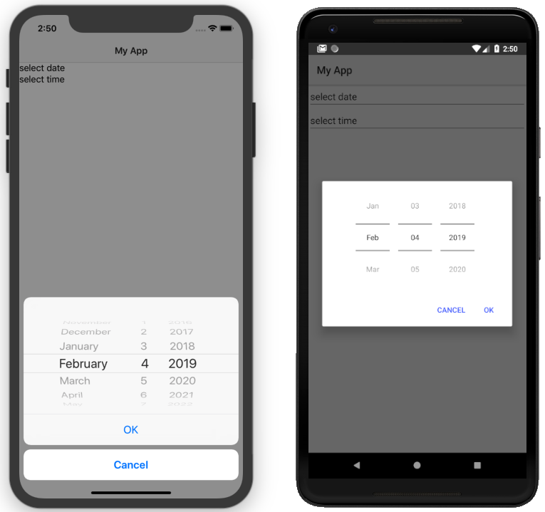
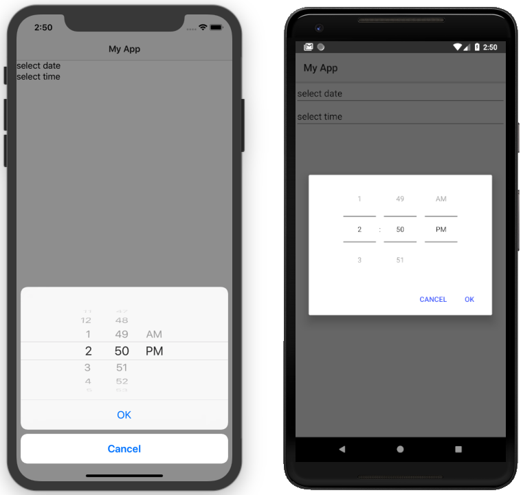
datePickerFieldview through the prefix.xml<Page xmlns="http://schemas.nativescript.org/tns.xsd" xmlns:datetime="@nativescript/datetimepicker" > <datetime:DatePickerField hint="select date"></datetime:DatePickerField> <datetime:TimePickerField hint="select time"></datetime:TimePickerField> <datetime:DateTimePickerFields hintDate="select date" hintTime="select time" ></datetime:DateTimePickerFields> </Page>
Angular
Register the plugin by adding the plugin's
NativeScriptDateTimePickerModuleto theimportsarray of the module that contains the component where you want to use theDatePickerField:tsimport { NativeScriptDateTimePickerModule } from '@nativescript/datetimepicker/angular' @NgModule({ imports: [ NativeScriptCommonModule, NativeScriptDateTimePickerModule, // ... ], // ... })Use
DatePickerFieldin markup as follows:xml<DatePickerField hint="select date"></DatePickerField> <TimePickerField hint="select time"></TimePickerField> <DateTimePickerFields hintDate="select date" hintTime="select time" ></DateTimePickerFields>
Vue
Once the plugin has been installed, register it with your app project, in the
main.tsfile for global access.tsimport DateTimePicker from '@nativescript/datetimepicker/vue' import Home from './components/Home.vue' const app = createApp(Home).use(DateTimePicker) app.start()Use the
DatePickerFieldin atemplateas follows:xml<DatePickerField hint="select date" /> <TimePickerField hint="select time" /> <DateTimePickerFields hintDate="select date" hintTime="select time" />
Svelte
Once you have installed the plugin, register the DateTimePickerFields with your app, in the app.ts file.
registerNativeViewElement( 'dateTimePickerFields', () => require('@nativescript/datetimepicker').DateTimePickerFields, )Next, use the picker in markup by adding the dateTimePickerFields element.
<dateTimePickerFields hintDate="pick a date" hintTime="pick time"></dateTimePicker>Set the selected date and time
To set the selected time of the TimePickerField, use the time property.
<TimePickerField time="01:00"></TimePickerField>The DatePickerField and DateTimePickerFields components both use the date property to set their selected date(and the time for DateTimePickerFields) value.
<DatePickerField date="2019/02/24"></DatePickerField> <DateTimePickerFields date="2019/02/24 01:00"></DateTimePickerFields>Change the picker titles and buttons labels
To change the titles and the button labels of the picker's popups, use the pickerOkText, pickerCancelText and pickerTitle properties.
<DatePickerField hint="tap to choose" pickerOkText="Approve" pickerCancelText="Reject" pickerTitle="Confirm predefined date selection" pickerDefaultDate="2019/05/15" ></DatePickerField>The DateTimePickerFields has the additional pickerTitleDate for the date picker title and the pickerTitleTime for the time picker title.
<DateTimePickerFields hintDate="tap to choose date" hintTime="tap to choose time" pickerOkText="Approve" pickerCancelText="Reject" pickerTitleDate="Confirm predefined date selection" pickerTitleTime="Confirm predefined time selection" pickerDefaultDate="2019/05/15 22:00" autoPickTime="true" ></DateTimePickerFields>Set localization
To localize the DatePickerField and DateTimePickerFields components, use the locale property.
<DatePickerField locale="en_GB" hint="select date"></DatePickerField> <!-- DateTimePickerFields --> <DateTimePickerFields locale="de_DE" hintDate="datum auswählen" hintTime="zeit wählen" pickerOkText="Bestätigen" pickerCancelText="Stornieren" pickerTitleDate="Datum auswählen" pickerTitleTime="Zeit wählen" ></DateTimePickerFields>Format the date and time
Aside from the default formats that are dependent on the value of the locale property, you can add your custom format that can include ordering of the date/time values and also custom text. To customize the date format, use the dateFormat property.
<DatePickerField date="2019/02/24" dateFormat="'my date': dd-MMMM-yyyy" ></DatePickerField>The TimePickerField will determine whether to use 12 or 24 hour format (for formatting of the selected time in the field and for the values of the hour spinner) based on the selected region in the settings of the iOS device and based on the Use 24-Hour Format setting of the Android device. To change the default setting on Android, you need to use the timeFormat property and to change the setting on iOS, you need to use the locale property.
<TimePickerField time="16:00" timeFormat="h:mm a" locale="en_US" ></TimePickerField>For the DateTimePickerFields picker, use the same properties( dateFormat, timeFormat and locale) for custom date and time formats.
<DateTimePickerFields date="2019/02/24 16:00" timeFormat="h:mm a" locale="en_US" ></DateTimePickerFields>Set the minimum and maximum dates
To set the minimum and maximum dates, use the minDate and maxDate properties for the DatePickerField and DateTimePickerFields components.
<DatePickerField minDate="2020/02/02" maxDate="2021/02/02" hint="tap to select" ></DatePickerField> <!-- DateTimePickerFields --> <DateTimePickerFields minDate="2020/02/02" maxDate="2021/02/02" hintDate="tap to select date" hintTime="tap to select time" ></DateTimePickerFields>Set the layout of DateTimePickerFields pickers
To lay out the picker fields in the horizontal(default) or vertical direction, use the orientation property.
<DateTimePickerFields hintDate="select date" hintTime="select time" orientation="vertical" ></DateTimePickerFields>Style the pickers with CSS
You can use CSS to style the DatePickerField and the TimePickerField pickers. The same styling applies to the pickers contained in DateTimePickerFields component. The picker supports changing its colors through the following predefined CSS classes:
date-time-picker: picker background and title text color)date-time-picker-spinners: background and text color of the date/time selecting spinnersdate-time-picker-buttons: background and text color of the OK/Cancel buttonsdate-time-picker-button-okanddate-time-picker-button-cancel: to provide a separate style for each button.
Note
that the iOS native implementation has limited capabilities for the buttons background colors. When a button is marked as a Cancel button, its background is always white and can't be changed. If you really need a cancel button with another color, you can pass a background color through the designated cancel button class, however this will change the picker layout and place the cancel button along with the OK button and they will both have the same background color.
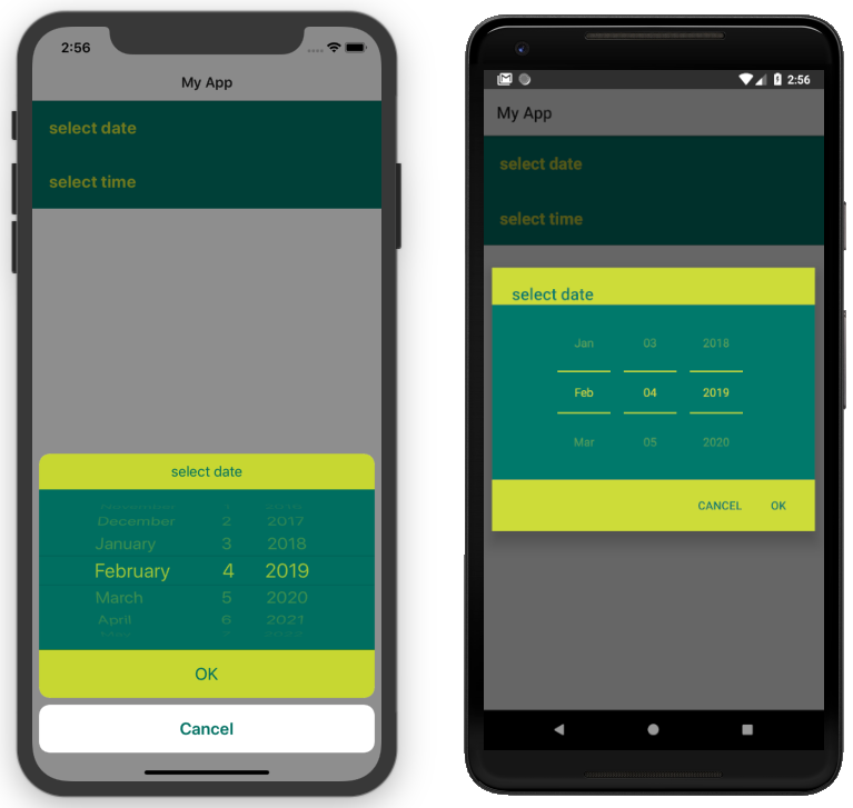
timepickerfield, datepickerfield { padding: 12 4; } timepickerfield.apply-css, datepickerfield.apply-css { color: #cddc39; background-color: #00796b; font-size: 20; font-weight: bold; padding: 20; } .date-time-picker.apply-css { color: #00796b; background-color: #cddc39; } .date-time-picker-spinners.apply-css { color: #cddc39; background-color: #00796b; } .date-time-picker-buttons.apply-css { color: #00796b; }To apply styles at runtime when opening the DateTimePicker you can do the following:
import { DateTimePicker, DateTimePickerStyle, } from '@nativescript/datetimepicker' import { Application, View } from '@nativescript/core' function createPicker(args: EventData) { const dateTimePickerStyle = DateTimePickerStyle.create(args.object as any) // This example handles styling the calendar for light and dark mode of the device settings if (Application.systemAppearance() === 'dark') { // style for dark mode dateTimePickerStyle.buttonsBackgroundColor = new Color('#202125') dateTimePickerStyle.dialogBackgroundColor = new Color('#202125') dateTimePickerStyle.titleTextColor = new Color('#fff') dateTimePickerStyle.buttonsTextColor = new Color('#0067a6') dateTimePickerStyle.spinnersBackgroundColor = new Color('#202125') dateTimePickerStyle.spinnersTextColor = new Color('#fff') } else { // style for light mode dateTimePickerStyle.buttonsBackgroundColor = new Color('#fff') dateTimePickerStyle.dialogBackgroundColor = new Color('#fff') dateTimePickerStyle.titleTextColor = new Color('#0067a6') dateTimePickerStyle.buttonsTextColor = new Color('#0067a6') dateTimePickerStyle.spinnersBackgroundColor = new Color('#fff') dateTimePickerStyle.spinnersTextColor = new Color('#0067a6') } DateTimePicker.pickDate( { context: (args.object as View)._context, minDate: new Date((new Date() as any) - 1), title: 'DatePicker', okButtonText: 'Okay', cancelButtonText: 'Cancel', locale: 'es', }, dateTimePickerStyle, ).then((result) => { // handle the result }) }Create custom pickers manually
Internally DatePickerField and TimePickerField call the pickDate and pickTime methods of the DateTimePicker class which are public. You can create custom pickers by calling those methods manually. The pickDate method accepts DatePickerOptions, while the pickTime method accepts TimePickerOptions.
function onPickDateTap(args: EventData) { const dateToday = new Date() const dateTomorrow = new Date( dateToday.getFullYear(), dateToday.getMonth(), dateToday.getDate() + 1, ) const dateNextWeek = new Date( dateToday.getFullYear(), dateToday.getMonth(), dateToday.getDate() + 7, ) DateTimePicker.pickDate({ context: args.object._context, date: dateTomorrow, minDate: dateTomorrow, maxDate: dateNextWeek, okButtonText: 'OK', cancelButtonText: 'Cancel', title: 'choose date', locale: 'en_GB', }).then((selectedDate) => { if (selectedDate) { this.dateText = this.getFormattedDate(selectedDate) } }) }function onPickTimeTap(args: EventData) { const dateToday = new Date() const dateTomorrow = new Date( dateToday.getFullYear(), dateToday.getMonth(), dateToday.getDate() + 1, ) dateTomorrow.setHours(8) dateTomorrow.setMinutes(0) DateTimePicker.pickTime({ context: args.object._context, time: dateTomorrow, okButtonText: 'OK', cancelButtonText: 'Cancel', title: 'choose time', locale: 'en_GB', is24Hours: true, }).then((selectedTime) => { if (selectedTime) { this.timeText = this.getFormattedTime(selectedTime) } }) }API
DatePickerField
| Property | Type | Description |
|---|---|---|
date | Date | The date the picker field is currently displaying. When used in markup, the provided string will be passed to the Date constructor to create a new Date object. |
minDate | Date | The minimum date the picker field can select. |
maxDate | Date | The maximum date the picker field can select. |
locale | string | Identifier of a locale that will be used to localize the names of the month names and also the order of the spinners (with en_GB first spinner is day, with en_US first spinner is month) (default is based on the device’s locale settings). |
hint | string | Gets or sets the hint text. Hint is the text that is displayed in the field when date is null. |
dateFormat | string | Format used for the text in the picker field (on android used as a pattern for a SimpleDateFormat, on iOS used as a dateFormat for NSDateFormatter, default is generated by the current value of the locale property). |
pickerTitle | string | Text that will be displayed as title of the picker, default is undefined. |
pickerOkText | string | Text for the confirmation button of the picker (default is OK on iOS, localized version of OK on android (based on the devices locale settings)). |
pickerCancelText | string | Text for the cancel button of the picker (default is Cancel on iOS, localized version of Cancel on android (based on the devices locale settings)). |
TimePickerField
| Property | Type | Description |
|---|---|---|
time | Date | The time the picker field is currently displaying. If it is in ISO 8601 format, it is passed to the JS Date constructor. |
locale | string | Gets or sets a locale for displaying the date in the field, and also for the picker. Default value is undefined, meaning that the format will be based on the device's settings. |
hint | string | Gets or sets the hint text. Hint is the text that is displayed in the field when time is null. |
timeFormat | string | Format used for the text in the picker field (on Android used as a pattern for a SimpleDateFormat, on iOS used as a dateFormat for NSDateFormatter, default is generated by the current value of the locale property), the format will also be used on Android to determine whether the picker will be in 12 or 24 hour format. |
pickerTitle | string | Text that will be displayed as title of the picker, default is undefined. |
pickerOkText | string | Text for the confirmation button of the picker (default is OK on iOS, localized version of OK on android (based on the devices locale settings). |
pickerCancelText | string | Text for the cancel button of the picker (default is Cancel on iOS, localized version of Cancel on Android (based on the devices locale settings)). |
DateTimePickerFields
| Property | Type | Description |
|---|---|---|
date | Date | The date the picker fields are currently displaying. |
minDate | Date | Gets or sets the min date. Note that this property only affects the date component. |
maxDate | Date | Gets or sets the max date. Note that this property only affects the date component. |
locale | string | Gets or sets a locale for displaying the date in the field, and also for the picker. Default value is undefined, meaning that the format will be based on the device's settings.Note that changing the locale will not affect the pickerOkText, pickerCancelText and pickerTitle or hint properties |
dateFormat | string | Format used for the text in the picker field (on Android used as a pattern for a SimpleDateFormat, on iOS used as a dateFormat for NSDateFormatter, default is generated by the current value of the locale property). |
timeFormat | string | Format used for the text in the picker field (on android used as a pattern for a SimpleDateFormat, on iOS used as a dateFormat for NSDateFormatter, default is generated by the current value of the locale property), the format will also be used on Android to determine whether the picker will be in 12 or 24 hour format. |
pickerTitleDate | string | Text that will be displayed as title of the picker when the date component is tapped. |
pickerTitleTime | string | Text that will be displayed as title of the picker, when the time component is tapped. |
pickerOkText | string | Text for the confirmation button of the picker (default is OK on iOS, localized version of OK on android (based on the devices locale settings)). |
pickerCancelText | string | Text for the Cancel button of the picker (default is Cancel on iOS, localized version of Cancel on Android (based on the devices locale settings)). |
autoPickTime | boolean | Value that indicates whether the time component should be assigned a value as soon as a date is picked by the date component. Defaults to false. |
orientation | 'horizontal' | 'vertical' | Value that indicates how the date and time components will be arranged, default is "horizontal", which means that they will be on the same row. |
hintDate | string | Text displayed in the date component when date is null. |
hintTime | string | Text displayed in the time component when date is null. |
DateTimePicker Class
| Method | Return Type | Description |
|---|---|---|
pickDate(options: DatePickerOptions, style?: DateTimePickerStyle) | Promise<Date> | Picks a date from a dialog picker initialized with the provided options and styled with the optionally provided style. |
pickTime(options: TimePickerOptions, style?: DateTimePickerStyle) | Promise<Date> | Picks a time from a dialog picker initialized with the provided options and styled with the optionally provided style. |
DatePickerOptions
| Property | Type | Description |
|---|---|---|
context | any | View's context. Obtained from the _context property of a View instance. |
date | Date | Optional: The date that will be displayed in the picker, (if not provided, the picker will display today). |
minDate | Date | Optional: The minimum date that can be selected. |
maxDate | Date | Optional: The maximum date that can be selected. |
locale | string | Optional: Identifier of a locale that will be used to localize month names and am/pm texts. |
title | string | Optional: Text that will be displayed as title of the picker. |
okButtonText | string | Optional: Text for the confirmation button of the picker (default is OK on iOS, localized version of OK on android (based on the devices locale settings)). |
cancelButtonText | string | Optional: Text for the cancel button of the picker (default is Cancel on iOS, localized version of Cancel on android (based on the devices locale settings)). |
TimePickerOptions
| Property | Type | Description |
|---|---|---|
context | any | View's context. Obtained from the _context property of a View instance. |
time | Date | Optional: The time that will be displayed in the picker, (if not provided, the picker will display now). |
is24Hours | boolean | Optional: This value will be used only on Android to determine whether the picker will be in 12 or 24 hour format. |
locale | string | Optional: Identifier of a locale that will be used to localize month names and am/pm texts. |
title | string | Optional: Text that will be displayed as title of the picker. |
okButtonText | string | Optional: Text for the confirmation button of the picker (default is OK on iOS, localized version of OK on android (based on the devices locale settings)). |
cancelButtonText | string | Optional: Text for the cancel button of the picker (default is Cancel on iOS, localized version of Cancel on android (based on the devices locale settings)). |
DateTimePickerStyle
| Property | Type | Description |
|---|---|---|
titleTextColor | Color | Color to be used for the title text. |
dialogBackgroundColor | Color | Color to be used as a background of the dialog picker. |
spinnersTextColor | Color | Color to be used for the texts of the date/time spinners. |
spinnersBackgroundColor | Color | Color to be used as a background of the date/time spinners. |
buttonsTextColor | Color | Color to be used for the texts of the ok/cancel buttons. |
buttonsBackgroundColor | Color | Color to be used as a background of the ok/cancel buttons. |
buttonOkTextColor | Color | Color to be used for the texts of the ok button. |
buttonOkBackgroundColor | Color | Color to be used as a background of the ok button. |
buttonCancelTextColor | Color | Color to be used for the texts of the cancel button. |
buttonCancelBackgroundColor | Color | Color to be used as a background of the cancel button. |
create(view: View) | DateTimePickerStyle | Creates a style based on any css provided. The parameter is a View with the properly setup css class name. |
License
Apache License Version 2.0
Contributors
