Types
Attributes differ by their binding type to entities. Each type corresponds to its own module in the system.
Thus, attributes are divided into:
- Administrators
- Blocks
- Pages
- Products
- Users
- Forms
- Events
If you created an attribute for pages, you will not be able to use it for products or forms. When trying to bind an attribute to an entity, the system will suggest which attributes you can use in that context.
List of Types
- Image
- List
- Time Interval
- JSON
- String
- Text
- Text with Header
- Integer
- Real Number
- Floating Point Number
- Date and Time
- Date
- Time
- File
- Group of Images
- Switch
- Spam Protection
- Button
- Entity
Features of Types
Some types have their own features that are important to know.
User Attributes
This type of attribute set stores information about the users of your application. You can store login, email, username, address, workplace, etc. Information used for user verification must be explicitly specified in the system. Thus, you must indicate which field will be responsible for the login, which for the password, and which for the email. For the authorization system to work correctly, the user attribute set must contain these three attributes. You can collect other information about the user at your discretion.
Even if you use email as the login, you still need to create both the "login" attribute and the "email" attribute.
A general list of unique capabilities for user attribute fields:
- Use as login
- Use as password
- Use for email notifications
- Use for Push notifications
- Use for SMS notifications
- Use in the registration form
Product Attributes
This type of attribute stores information about products. Additional settings for this type of attribute set allow, for example, to specify which attribute you want to use as the product price.
A general list of unique capabilities for product attribute fields:
- Contains price
- Contains currency
- Contains SKU
- Contains tax rate
General Type Attributes
General type attribute sets do not have additional settings for their fields.
Image
An attribute of type "Image" or "Group of Images" contains one or more image files and provides additional tools for working with files.
Upload Optimization
Attributes related to image uploads have a setting for optimizing image loading. Optimization is enabled by default, so if you want to upload the original image without quality loss, go to the attribute settings and disable this setting.
Preview
If there are multiple image attributes and you want a specific image to be displayed within the system, go to the settings of the corresponding image attribute and enable the "Use as preview in the product list" setting. After that, in the catalog, the selected image will be the main one for the product.
Preview Template
You can add a preview image template to the image attribute. More about preview templates can be found here.
Menu Icon
For an attribute of type Image intended for pages, you can specify that this image will serve as an icon in the menu.
List
An attribute of type "List" contains one or more properties pre-configured in the attribute and used in entities by choice.
List Configuration
Open the editing mode for the attribute of type "List" by clicking the edit icon
In the form for adding a new list property, specify:
- Name - A non-unique string used for internal operations within the OneEntry Platform.
- Value - A string representing the property value.
- Type - The type of the property.
- Additional Value - An optional parameter. If no value was added to the list property, the additional value will be used.
After filling in, click the "Add" button. The new property will be added to the list.
Modifying a List Property
Select the property you want to modify and click the "Edit" button. All data for that property will be added to the form. Modify the property and click the "Edit" button.
Deleting a List Property
Select the property you want to delete and click the "Delete" button. The property will be removed and disappear from the list.
Using an Attribute of Type "List"
After you have configured the list properties, attach the attribute set to the entity that corresponds to its type. Thus, an attribute set of type "Pages" can be attached to a page.
In the attribute field of type "List," you can select one property from the list.
Multi-select for an Attribute of Type "List"
If you need to save more than one property in the attribute, activate the "Allow multiple values selection" function by checking the corresponding box. With this function activated, you can add multiple values to the entity attribute at once.
Time Interval
The "Time Interval" attribute provides the ability to work with a calendar for creating, planning, and managing time intervals. For example, it allows you to create a schedule for a specialist in a beauty salon.
To start configuring, open the editing mode for the attribute of type "Time Interval" by clicking the 'Settings' edit icon.
Date Interval Configuration
On the provided calendar, select the required date interval. To create a 1-day interval, you need to double-click on the desired date.
If there is no need to create multiple intervals, click "Select entire month."
The last day of the month is a special interval that is dynamic and depends on the current month.
After selecting the interval, its configuration will become available.
Interval Options
Every week (available if the duration of the period is a week or less) – repeats the interval every week during the selected month.
Every month – repeats the interval every month in the selected year.
Every year – repeats the interval every year.
These are the three main settings that repeat in other elements of the attribute. They allow you to combine periodicity for selected elements.
What does this mean? For example:
- To create a weekly schedule for the organization for the current year, you only need to select the working week interval (e.g., Monday to Friday) and specify "Every week, every month" in the settings.
- If you want to specify a specific interval for certain dates (e.g., a spring fair taking place from April 7 to April 11) – for the interval 07.04 – 11.04, one setting "Every year" is required.
Automatic Time Period Generation
You can also set time boundaries for the interval. These are time limits defined for each day within the specified interval.
Start period – input field for the start of the time interval.
End period – input field for the end of the time interval.
These boundaries can have a repeating periodicity within the specified range. After clicking the "New Interval" button, you will see:
The selector represents the choice of the duration of the time period within the interval, and by clicking the checkbox, you can create equal periods within this interval.
After configuring the time interval, click the "Save Interval" button to save the changes.
Add intermediate interval – allows you to add intermediate time intervals (e.g., break time). Clicking will open a selector, just like for automatic time period generation.
Exceptions
If you need to introduce special rules for certain dates, simply click on the desired date in the interval on the calendar, after which it will turn red and become available in the "Exceptions" list.
Attention! Without configuring exceptions, it will simply be highlighted in the intervals.
Configuring an exception has options: Every week, Every month, Every year, but there are also additions.
All day – allows you to completely exclude the selected day from the interval. It becomes unavailable for selection in attributes. Or you can close specific time intervals.
By clicking the "settings" button, a modal window will open with all the time periods defined for the date interval, where you can select the excluded time intervals if you do not need the entire day.
"Receive Values" Checkbox Functionality
When this checkbox is enabled during the attribute creation, you will be able to immediately set its values through the calendar. These values will be saved in the attribute set and will be available for retrieval via the API.
How it works:
Filling during attribute creation – after activating the checkbox, a calendar will open where you can select the required values.
Access via API – the entered values will be bound to the attribute and available at the corresponding endpoint in the Attributes Sets request group.
Example of use:
If the attribute is created with the "Receive Values" checkbox enabled, when requesting data via the API, this value will be returned immediately along with other attribute parameters.
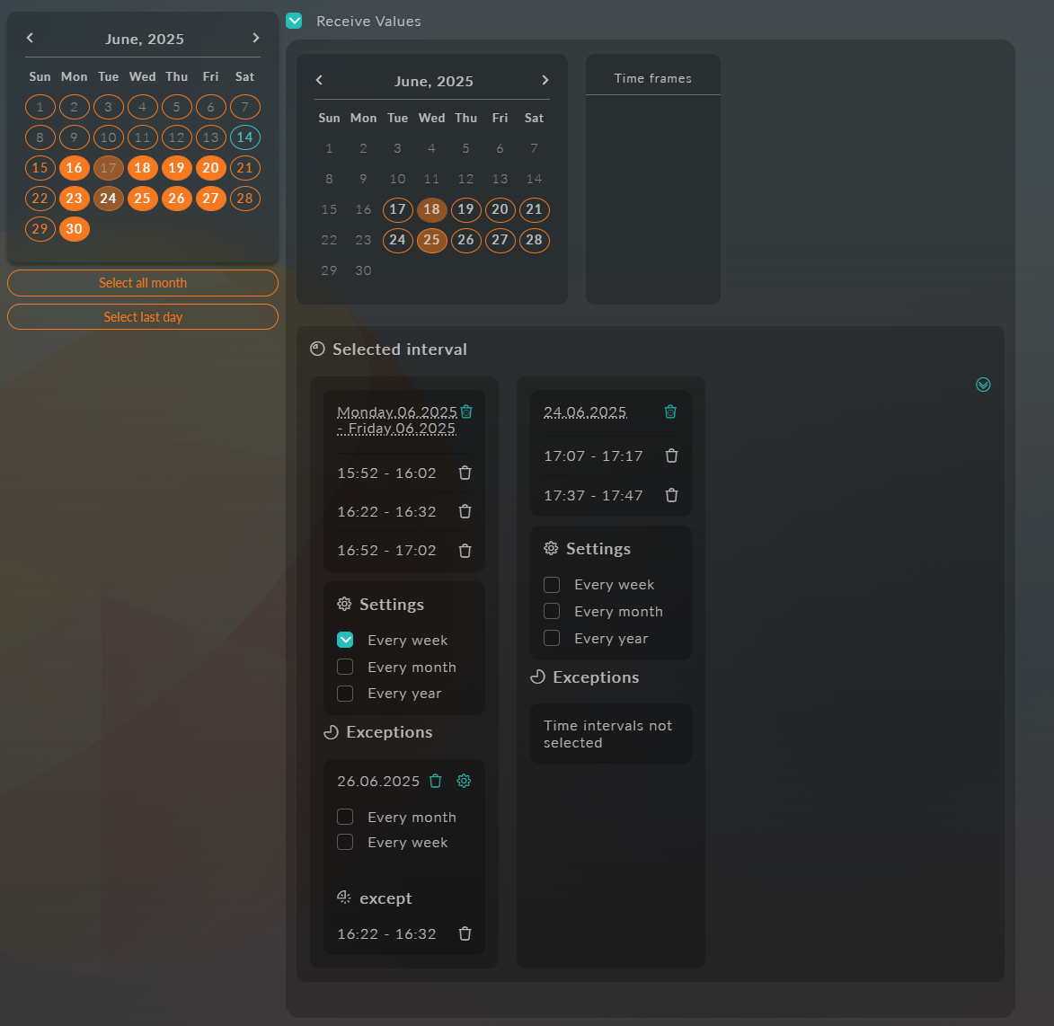
Selection in the Attribute
Working with configured intervals involves selecting the start and end of the period in which the specified time is chosen.
How is this arranged?
First, you need to select the start date and end date in the calendar.
After selecting the interval, it will appear in the list of selected intervals on the right, where you can configure the periodicity "Every week," "Every month," "Every year."
For the specified interval, you can select time periods based on the settings defined earlier.
If you need to exclude certain dates from the selected period, you can also add and configure them.
To do this, simply click on the active interval on the desired date, after which the selection will go to the "Exceptions" list.
Exceptions can be configured for both whole days and specific time intervals.
By default, selecting a date excludes the entire day, but if necessary, you can specify exact time intervals.
To do this, use the settings button: the calendar will be replaced with a list of time slots from which you can select the required exceptions for the selected date.
If you need to cancel an exception but keep its periodicity in other cases, you can click on the generated exception.
(Attention! Clicking on the original exception date will cancel the entire chain of exceptions!) After that, the date will go to the "Except" list of the exception.
Great! Here is an example of the implementation of the created interval:
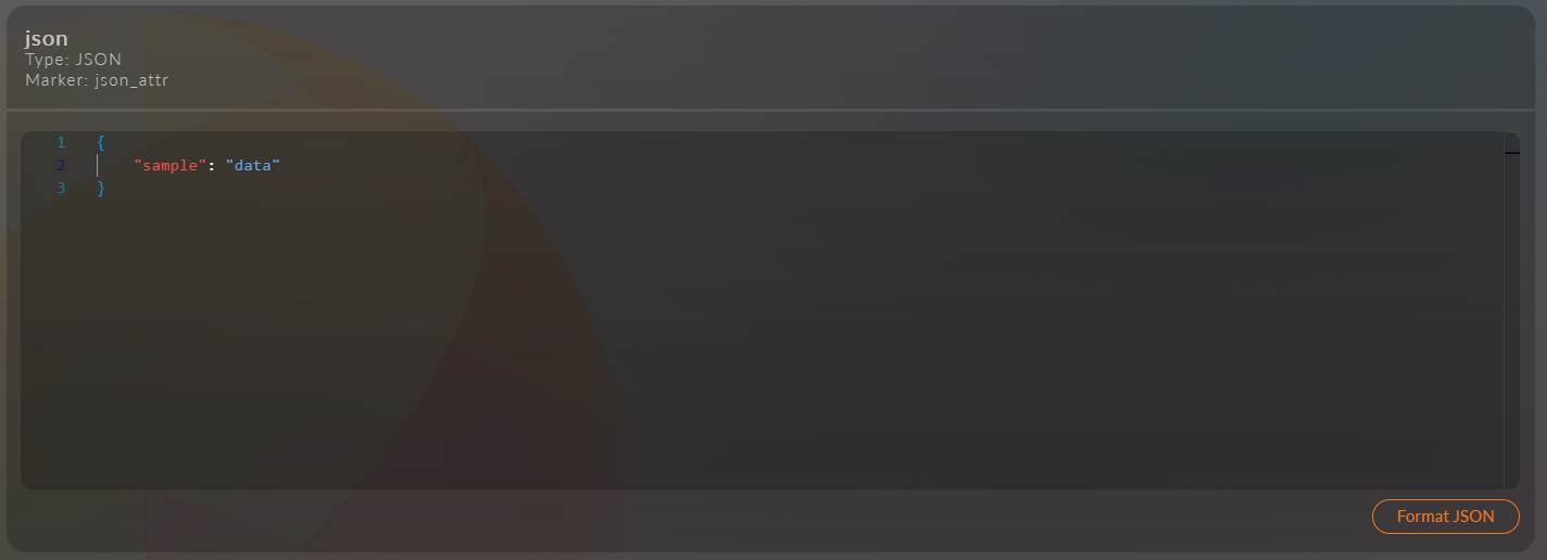
Json
The attribute allows you to store arbitrary data in JSON format.
String
An attribute for storing string values (text of arbitrary length).
Text
A field for entering text with extended capabilities:
- Support for formatting (bold, italic, lists, links)
- Inserting images and tables
- Editing in three modes:
- Visual editor
- Markdown
- Plain text mode
Text with Header
A text block with a header and the same editing capabilities:
- All formatting functions from a regular text field
- An additional field for a header above the text
- Editing in three modes:
- Visual editor
- Markdown
- Plain text mode
Integer
An attribute for storing integer values without a fractional part.
Real Number
A real number with a fractional part.
Floating Point Number
A real number with floating point and limited precision.
A special field for entering floating point numbers.
Date and Time
A field for selecting date and time with a calendar interface.
Date
An attribute for storing only the date (without time).
Time
A field for specifying a time value (hours:minutes).
File
An attribute for uploading and storing files of any type.
Group of Images
An attribute for uploading and managing a collection of images.
Switch
An interface element for selecting one option from the proposed ones. The attribute configuration is identical to the List attribute.
Spam Protection
A special component for protecting forms from spam bots.
Button
An interactive element for performing actions (submitting a form, etc.).
Entity
An attribute for linking to other entities in the system.
An attribute of type "Entity" contains a tree of properties pre-configured in the attribute and used in entities by choice.
Tree Configuration
Open the editing mode for the attribute of type "Entity" by clicking the edit icon
In the form for adding a new list property, specify the data type:
- Pages
- Products
Next, a data selection will become available, depending on the selected type.
Clicking the checkbox will add data to the tree.
After selecting the data, you can change the depth of nesting and the order of the data.