I’m experimenting with making a dropdown-style UI, but I’m not sure how to approach it.
Right now, I have a test UI where clicking a button is supposed to make another frame visible basically expanding the total frame, like a dropdown menu.
The issue is that when I use a UIListLayout, hiding the dropdown frame doesn’t collapse the space it takes up. I’m trying to figure out how to make the layout behave so that, when the dropdown is invisible, the other elements in the UIListLayout move up and sit right next to the button instead of leaving an empty gap.
Maybe you could just make the size on the frame bigger when you click the button instead? I am on my phone so I can’t give some sort of sample script but that might work.
I meant to parent it to whatever’s above Type. Then when clicked you can just parent it to the template and make it visible which will correctly make the cutout in your layout.
Ah that also won’t work because the drop down scrolling frame simply fills up the empty space, removing it will just have a button with empty space,
If I remove that empty space, just have a button then add the scrolling frame onto that, since the scrolling frame goes beyond the parent frames limit it will just expand over the next UI aspect
Wait I don’t understand now. Even with the frame not parented there’s a gap? Sounds ike your Padding attribute on the UIListLayout may be too high then.
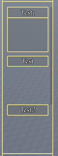
No no, so basically my “Template” frame covers the entire size, The button is placed in the top fraction of that, and the scrolling frame in the bottom fraction
Removing the scrolling frame doesn’t technically change the overall size of the button
I found the easiest way to do this was to create a button for the collapsed menu and then a frame for the expanded menu. One is Visible and the button and title of the frame toggle both settings back and forth.
Every time something happens with the gui a function adjusts the layout by looping through the element in order. It keeps a running total by adding the height of each element and spacing. The AbsoluteSize property will give you the height of each visible element. I also reality check the Visible properties.
I tried to do things with more nesting but I found it all pretty finicky to get it to look right. Doubling up the elements was a lot easier to manage.
Yes, I have two different elements for each menu. A closed TextButton and an expanded Frame.
When showing the menu, tweening can be accomplished by adjusting the height of the Frame to be the same as the button with ClipsDescendants. Toggle the visibilities and then tween it to the desired height.
But it is necessary to adjust the vertical offsets of all the elements lower on the screen so they moves slowly so you probably need your own tween function rather than using it built-in. Basically just adjust the height of the frame and then run the update vertical position function on every update.
And then to hide the menu you’d reverse it. Tween its height back down until it’s the same height as the button and then toggle the visibilities.
Honestly for me I found the tweening didn’t add much. I worked on it but found I preferred just toggling quickly. The context makes it clear what’s happening.
I’ve found ListLayout is great for lists of simpler items but becomes hard to control when the elements within them are Frames with more complex nesting. It’s probably possible to make it work but when I switched to calculating the location of elements in my own code everything seemed a lot smoother.
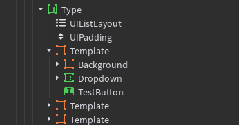
Here’s the relevant part of the explorer. This is all in a ScreenGui. The menus in this case are laid out in a grid. I have one template button that gets duplicated for each of the Emotes/Dots. Below are the Show buttons. They use the same colors and border designs as the menus. The “small” variants are used on mobile so the whole interface takes up less space.