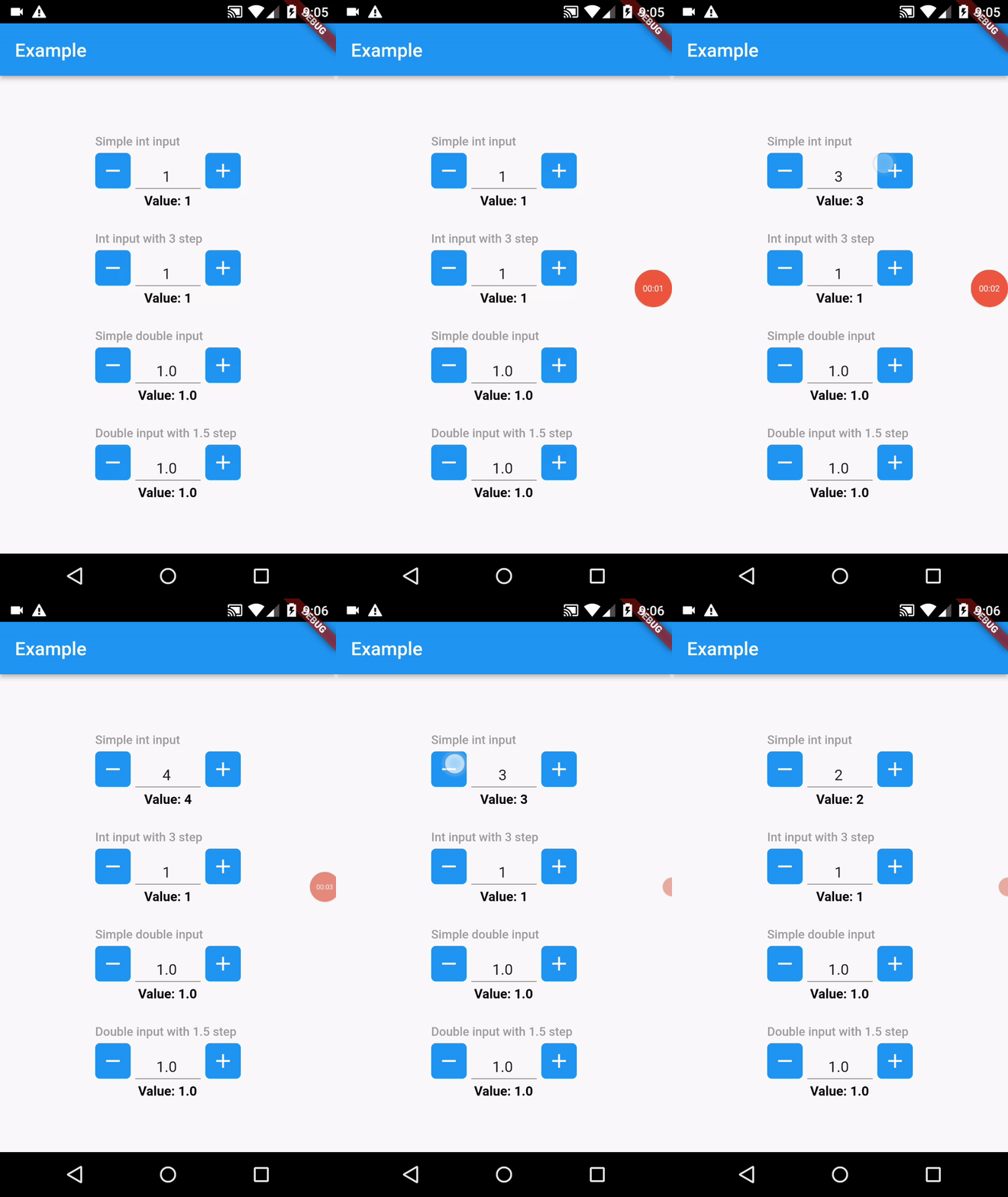
A Flutter plugin to handle number inputs with increment and decrement buttons.
In the pubspec.yaml of your flutter project, add the following dependency:
dependencies: ... quantity_input: ^1.0.2You can create a simple quantity input widget with the following example:
import 'package:flutter/material.dart'; import 'package:quantity_input/quantity_input.dart'; void main() { runApp(MyApp()); } class MyApp extends StatefulWidget { @override State<MyHomePage> createState() => _MyHomePageState(); } class _MyHomePageState extends State<MyHomePage> { int simpleIntInput = 0; @override Widget build(BuildContext context) { return MaterialApp( title: 'Example', theme: ThemeData( primarySwatch: Colors.blue, ), home: SafeArea( child: Scaffold( appBar: AppBar( title: Text('Example') ), body: Center( child: Column( mainAxisSize: MainAxisSize.min, children: [ QuantityInput( value: simpleIntInput, onChanged: (value) => setState(() => simpleIntInput = int.parse(value.replaceAll(',', ''))) ), Text( 'Value: $simpleIntInput', style: TextStyle( color: Colors.black, fontWeight: FontWeight.bold ) ) ] ) ) ) ) ); } }If the value returned by onChanged has tousand separators, it is recommended to remove the commas from String before parsing as shown in example before.
| Attribute | Type | Required | Description | Default value |
|---|---|---|---|---|
| value | int/double | ✔️ | Has to be an int or double depending on QuantityInputType variable | |
| onChanged | Function(String) | ✔️ | Detects changes to the input and sends value through param | |
| step | int/double | ❌ | The value that is incremented or decremented each time the user presses a button | 1 |
| decimalDigits | int | ❌ | The number of decimal places that can be displayed for double input | 1 |
| minValue | int/double | ❌ | Set min value to be displayed in input | 1 |
| maxValue | int/double | ❌ | Set max value to be displayed in input | 100 |
| inputWidth | double | ❌ | The width of the textfield input | 80 |
| buttonColor | Color | ❌ | Sets color for increment and decrement buttons | Primary app color |
| iconColor | Color | ❌ | Sets color for icons inside increment and decrement buttons | Colors.white |
| label | String | ❌ | Sets label for input | |
| readOnly | bool | ❌ | Determines if the input will be readOnly | false |
| acceptsZero | bool | ❌ | If set to true, the input can accept the value 0 | false |
| acceptsNegatives | bool | ❌ | If set to true, the input can accept negative values | false |
| type | QuantityInputType | ❌ | Determines if the input will manage values as int or double | QuantityInputType.int |
| decoration | InputDecoration | ❌ | Sets custom InputDecoration to the widget TextFormField | |
| elevation | double | ❌ | Sets elevation to increment and decrement buttons | 5 |
If you encounter any issue you or want to leave a suggestion you can do it by filling an issue.

