With Compose, you can create shapes that are made from polygons. For example, you can make the following kinds of shapes:
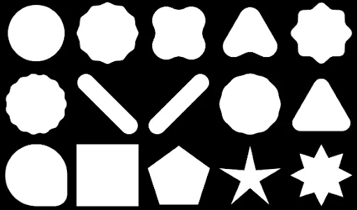
To create a custom rounded polygon in Compose, add the graphics-shapes dependency to your app/build.gradle:
implementation "androidx.graphics:graphics-shapes:1.0.1" This library lets you create shapes that are made from polygons. While polygonal shapes have only straight edges and sharp corners, these shapes allow for optional rounded corners. It makes it simple to morph between two different shapes. Morphing is difficult between arbitrary shapes, and tends to be a design-time problem. But this library makes it simple by morphing between these shapes with similar polygonal structures.
Create polygons
The following snippet creates a basic polygon shape with 6 points in the center of the drawing area:
Box( modifier = Modifier .drawWithCache { val roundedPolygon = RoundedPolygon( numVertices = 6, radius = size.minDimension / 2, centerX = size.width / 2, centerY = size.height / 2 ) val roundedPolygonPath = roundedPolygon.toPath().asComposePath() onDrawBehind { drawPath(roundedPolygonPath, color = Color.Blue) } } .fillMaxSize() )
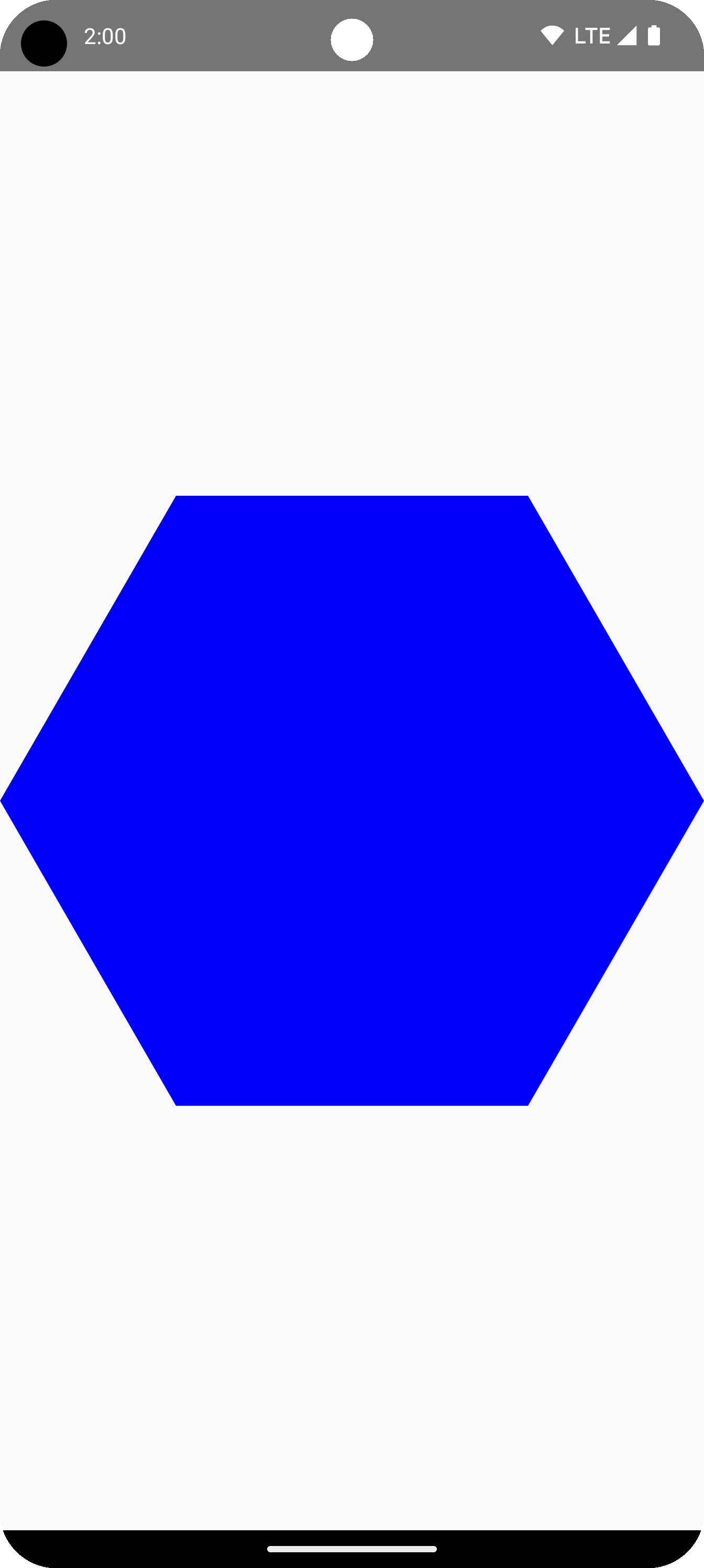
In this example, the library creates a RoundedPolygon which holds the geometry representing the requested shape. In order to draw that shape in a Compose app, you must get a Path object from it to get the shape into a form which Compose knows how to draw.
Round the corners of a polygon
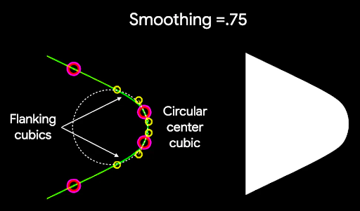
To round the corners of a polygon, use the CornerRounding parameter. This takes two parameters, radius and smoothing. Each rounded corner is made up of 1-3 cubic curves, the center of which has a circular arc shape while the two side ("flanking") curves transition from the shape's edge to the center curve.
Radius
The radius is the radius of the circle used to round a vertex.
For example, the following rounded corner triangle is made as follows:

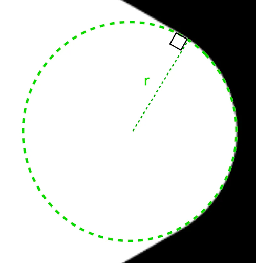
r determines the circular rounding size of rounded corners.Smoothing
Smoothing is a factor which determines how long it takes to get from the circular rounding portion of the corner to the edge. A smoothing factor of 0 (unsmoothed, the default value for CornerRounding) results in purely circular corner rounding. A nonzero smoothing factor (up to the max of 1.0) results in the corner being rounded by three separate curves.
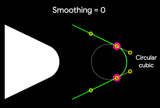
For example, the snippet below illustrates the subtle difference in setting smoothing to 0 versus 1:
Box( modifier = Modifier .drawWithCache { val roundedPolygon = RoundedPolygon( numVertices = 3, radius = size.minDimension / 2, centerX = size.width / 2, centerY = size.height / 2, rounding = CornerRounding( size.minDimension / 10f, smoothing = 0.1f ) ) val roundedPolygonPath = roundedPolygon.toPath().asComposePath() onDrawBehind { drawPath(roundedPolygonPath, color = Color.Black) } } .size(100.dp) )

Size and position
By default, a shape is created with a radius of 1 around the center (0, 0). This radius represents the distance between the center and the exterior vertices of the polygon on which the shape is based. Note that rounding the corners results in a smaller shape since the rounded corners will be closer to the center than the vertices being rounded. To size a polygon, adjust the radius value. To adjust the position, change the centerX or centerY of the polygon. Alternatively, transform the object to change its size, position, and rotation using standard DrawScope transformation functions such as DrawScope#translate().
Morph shapes
A Morph object is a new shape representing an animation between two polygonal shapes. To morph between two shapes, create two RoundedPolygons and a Morph object that takes these two shapes. To calculate a shape between the start and end shapes, provide a progress value between zero and one to determine its form between the starting (0) and ending (1) shapes:
Box( modifier = Modifier .drawWithCache { val triangle = RoundedPolygon( numVertices = 3, radius = size.minDimension / 2f, centerX = size.width / 2f, centerY = size.height / 2f, rounding = CornerRounding( size.minDimension / 10f, smoothing = 0.1f ) ) val square = RoundedPolygon( numVertices = 4, radius = size.minDimension / 2f, centerX = size.width / 2f, centerY = size.height / 2f ) val morph = Morph(start = triangle, end = square) val morphPath = morph .toPath(progress = 0.5f).asComposePath() onDrawBehind { drawPath(morphPath, color = Color.Black) } } .fillMaxSize() )
In the above example, the progress is exactly halfway between the two shapes (rounded triangle and a square), producing the following result:
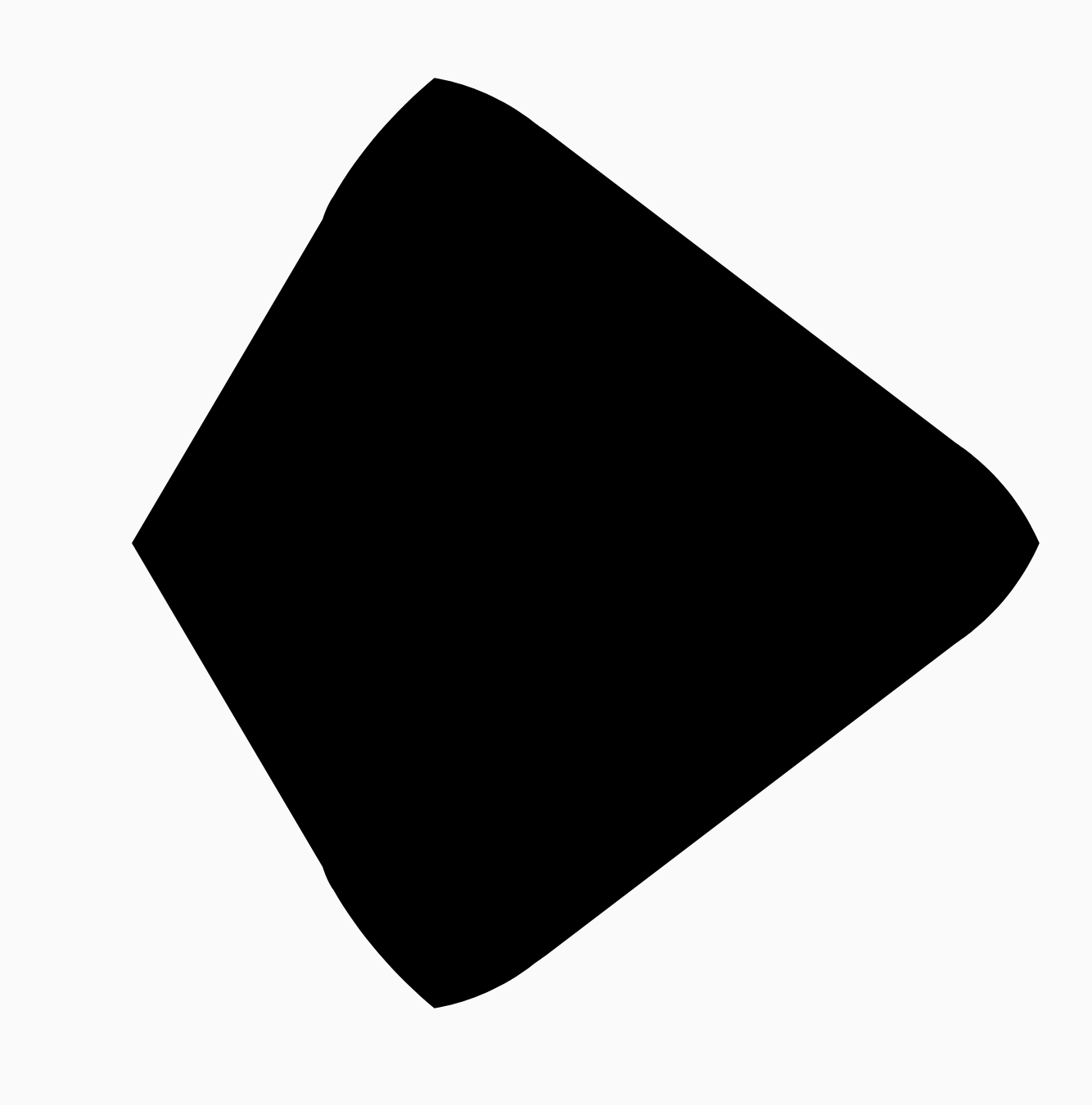
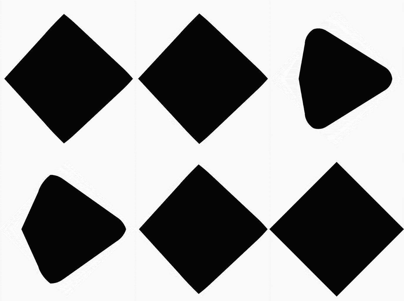
In most scenarios, morphing is done as part of an animation, and not just a static rendering. To animate between these two, you can use the standard Animation APIs in Compose to change the progress value over time. For example, you can infinitely animate the morph between these two shapes as follows:
val infiniteAnimation = rememberInfiniteTransition(label = "infinite animation") val morphProgress = infiniteAnimation.animateFloat( initialValue = 0f, targetValue = 1f, animationSpec = infiniteRepeatable( tween(500), repeatMode = RepeatMode.Reverse ), label = "morph" ) Box( modifier = Modifier .drawWithCache { val triangle = RoundedPolygon( numVertices = 3, radius = size.minDimension / 2f, centerX = size.width / 2f, centerY = size.height / 2f, rounding = CornerRounding( size.minDimension / 10f, smoothing = 0.1f ) ) val square = RoundedPolygon( numVertices = 4, radius = size.minDimension / 2f, centerX = size.width / 2f, centerY = size.height / 2f ) val morph = Morph(start = triangle, end = square) val morphPath = morph .toPath(progress = morphProgress.value) .asComposePath() onDrawBehind { drawPath(morphPath, color = Color.Black) } } .fillMaxSize() )
Use polygon as clip
It's common to use the clip modifier in Compose to change how a composable is rendered, and to take advantage of shadows that draw around the clipping area:
fun RoundedPolygon.getBounds() = calculateBounds().let { Rect(it[0], it[1], it[2], it[3]) } class RoundedPolygonShape( private val polygon: RoundedPolygon, private var matrix: Matrix = Matrix() ) : Shape { private var path = Path() override fun createOutline( size: Size, layoutDirection: LayoutDirection, density: Density ): Outline { path.rewind() path = polygon.toPath().asComposePath() matrix.reset() val bounds = polygon.getBounds() val maxDimension = max(bounds.width, bounds.height) matrix.scale(size.width / maxDimension, size.height / maxDimension) matrix.translate(-bounds.left, -bounds.top) path.transform(matrix) return Outline.Generic(path) } }
You can then use the polygon as a clip, as shown in the following snippet:
val hexagon = remember { RoundedPolygon( 6, rounding = CornerRounding(0.2f) ) } val clip = remember(hexagon) { RoundedPolygonShape(polygon = hexagon) } Box( modifier = Modifier .clip(clip) .background(MaterialTheme.colorScheme.secondary) .size(200.dp) ) { Text( "Hello Compose", color = MaterialTheme.colorScheme.onSecondary, modifier = Modifier.align(Alignment.Center) ) }
This results in the following:
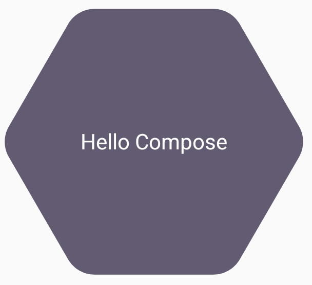
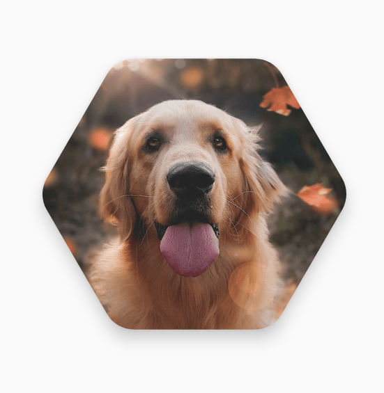
This may not look that different from what was rendering before, but it allows for leveraging other features in Compose. For example, this technique can be used to clip an image and apply a shadow around the clipped region:
val hexagon = remember { RoundedPolygon( 6, rounding = CornerRounding(0.2f) ) } val clip = remember(hexagon) { RoundedPolygonShape(polygon = hexagon) } Box( modifier = Modifier.fillMaxSize(), contentAlignment = Alignment.Center ) { Image( painter = painterResource(id = R.drawable.dog), contentDescription = "Dog", contentScale = ContentScale.Crop, modifier = Modifier .graphicsLayer { this.shadowElevation = 6.dp.toPx() this.shape = clip this.clip = true this.ambientShadowColor = Color.Black this.spotShadowColor = Color.Black } .size(200.dp) ) }
Morph button on click
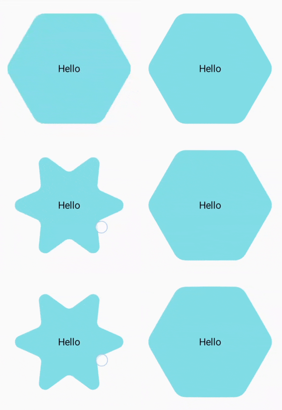
You can use the graphics-shape library to create a button that morphs between two shapes on press. First, create a MorphPolygonShape that extends Shape, scaling and translating it to fit appropriately. Note the passing in of the progress so that the shape can be animated:
class MorphPolygonShape( private val morph: Morph, private val percentage: Float ) : Shape { private val matrix = Matrix() override fun createOutline( size: Size, layoutDirection: LayoutDirection, density: Density ): Outline { // Below assumes that you haven't changed the default radius of 1f, nor the centerX and centerY of 0f // By default this stretches the path to the size of the container, if you don't want stretching, use the same size.width for both x and y. matrix.scale(size.width / 2f, size.height / 2f) matrix.translate(1f, 1f) val path = morph.toPath(progress = percentage).asComposePath() path.transform(matrix) return Outline.Generic(path) } }
To use this morph shape, create two polygons, shapeA and shapeB. Create and remember the Morph. Then, apply the morph to the button as a clip outline, using the interactionSource on press as the driving force behind the animation:
val shapeA = remember { RoundedPolygon( 6, rounding = CornerRounding(0.2f) ) } val shapeB = remember { RoundedPolygon.star( 6, rounding = CornerRounding(0.1f) ) } val morph = remember { Morph(shapeA, shapeB) } val interactionSource = remember { MutableInteractionSource() } val isPressed by interactionSource.collectIsPressedAsState() val animatedProgress = animateFloatAsState( targetValue = if (isPressed) 1f else 0f, label = "progress", animationSpec = spring(dampingRatio = 0.4f, stiffness = Spring.StiffnessMedium) ) Box( modifier = Modifier .size(200.dp) .padding(8.dp) .clip(MorphPolygonShape(morph, animatedProgress.value)) .background(Color(0xFF80DEEA)) .size(200.dp) .clickable(interactionSource = interactionSource, indication = null) { } ) { Text("Hello", modifier = Modifier.align(Alignment.Center)) }
This results in the following animation when the box is tapped:
Animate shape morphing infinitely
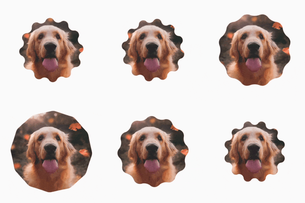
To endlessly animate a morph shape, use rememberInfiniteTransition. Below is an example of a profile picture that changes shape (and rotates) infinitely over time. This approach uses a small adjustment to the MorphPolygonShape shown above:
class CustomRotatingMorphShape( private val morph: Morph, private val percentage: Float, private val rotation: Float ) : Shape { private val matrix = Matrix() override fun createOutline( size: Size, layoutDirection: LayoutDirection, density: Density ): Outline { // Below assumes that you haven't changed the default radius of 1f, nor the centerX and centerY of 0f // By default this stretches the path to the size of the container, if you don't want stretching, use the same size.width for both x and y. matrix.scale(size.width / 2f, size.height / 2f) matrix.translate(1f, 1f) matrix.rotateZ(rotation) val path = morph.toPath(progress = percentage).asComposePath() path.transform(matrix) return Outline.Generic(path) } } @Preview @Composable private fun RotatingScallopedProfilePic() { val shapeA = remember { RoundedPolygon( 12, rounding = CornerRounding(0.2f) ) } val shapeB = remember { RoundedPolygon.star( 12, rounding = CornerRounding(0.2f) ) } val morph = remember { Morph(shapeA, shapeB) } val infiniteTransition = rememberInfiniteTransition("infinite outline movement") val animatedProgress = infiniteTransition.animateFloat( initialValue = 0f, targetValue = 1f, animationSpec = infiniteRepeatable( tween(2000, easing = LinearEasing), repeatMode = RepeatMode.Reverse ), label = "animatedMorphProgress" ) val animatedRotation = infiniteTransition.animateFloat( initialValue = 0f, targetValue = 360f, animationSpec = infiniteRepeatable( tween(6000, easing = LinearEasing), repeatMode = RepeatMode.Reverse ), label = "animatedMorphProgress" ) Box( modifier = Modifier.fillMaxSize(), contentAlignment = Alignment.Center ) { Image( painter = painterResource(id = R.drawable.dog), contentDescription = "Dog", contentScale = ContentScale.Crop, modifier = Modifier .clip( CustomRotatingMorphShape( morph, animatedProgress.value, animatedRotation.value ) ) .size(200.dp) ) } }
This code gives the following fun result:
Custom polygons
If shapes created from regular polygons don't cover your use case, you can create a more custom shape with a list of vertices. For example, you may want to create a heart shape like this:

You can specify the individual vertices of this shape using the RoundedPolygon overload that takes a float array of x, y coordinates.
To break down the heart polygon, notice that the polar coordinate system for specifying points makes this easier than using the cartesian (x,y) coordinate system, where 0° starts on the right hand side, and proceeds clockwise, with 270° at the 12 o'clock position:
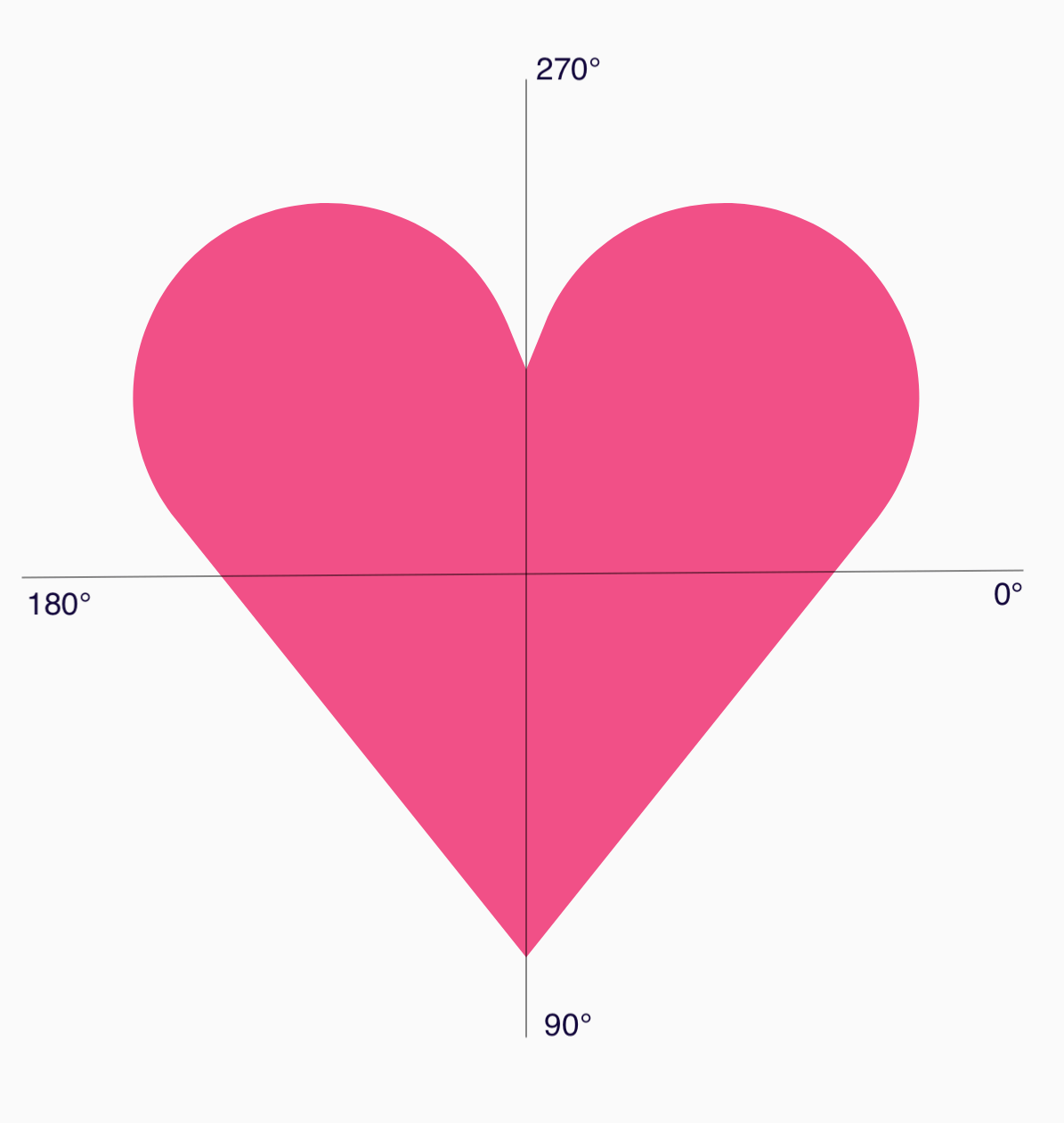
The shape can now be defined in an easier way by specifying the angle (𝜭) and radius from the center at each point:
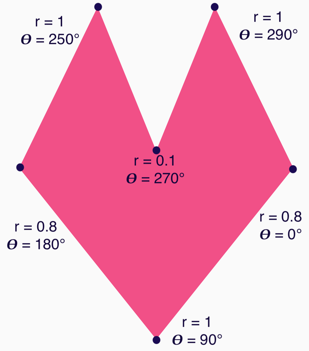
The vertices can now be created and passed to the RoundedPolygon function:
val vertices = remember { val radius = 1f val radiusSides = 0.8f val innerRadius = .1f floatArrayOf( radialToCartesian(radiusSides, 0f.toRadians()).x, radialToCartesian(radiusSides, 0f.toRadians()).y, radialToCartesian(radius, 90f.toRadians()).x, radialToCartesian(radius, 90f.toRadians()).y, radialToCartesian(radiusSides, 180f.toRadians()).x, radialToCartesian(radiusSides, 180f.toRadians()).y, radialToCartesian(radius, 250f.toRadians()).x, radialToCartesian(radius, 250f.toRadians()).y, radialToCartesian(innerRadius, 270f.toRadians()).x, radialToCartesian(innerRadius, 270f.toRadians()).y, radialToCartesian(radius, 290f.toRadians()).x, radialToCartesian(radius, 290f.toRadians()).y, ) }
The vertices need to be translated into cartesian coordinates using this radialToCartesian function:
internal fun Float.toRadians() = this * PI.toFloat() / 180f internal val PointZero = PointF(0f, 0f) internal fun radialToCartesian( radius: Float, angleRadians: Float, center: PointF = PointZero ) = directionVectorPointF(angleRadians) * radius + center internal fun directionVectorPointF(angleRadians: Float) = PointF(cos(angleRadians), sin(angleRadians))
The preceding code gives you the raw vertices for the heart, but you need to round specific corners to get the chosen heart shape. The corners at 90° and 270° have no rounding, but the other corners do. To achieve custom rounding for individual corners, use the perVertexRounding parameter:
val rounding = remember { val roundingNormal = 0.6f val roundingNone = 0f listOf( CornerRounding(roundingNormal), CornerRounding(roundingNone), CornerRounding(roundingNormal), CornerRounding(roundingNormal), CornerRounding(roundingNone), CornerRounding(roundingNormal), ) } val polygon = remember(vertices, rounding) { RoundedPolygon( vertices = vertices, perVertexRounding = rounding ) } Box( modifier = Modifier .drawWithCache { val roundedPolygonPath = polygon.toPath().asComposePath() onDrawBehind { scale(size.width * 0.5f, size.width * 0.5f) { translate(size.width * 0.5f, size.height * 0.5f) { drawPath(roundedPolygonPath, color = Color(0xFFF15087)) } } } } .size(400.dp) )
This results in the pink heart:

If the preceding shapes don't cover your use case, consider using the Path class to draw a custom shape, or loading up an ImageVector file from disk. The graphics-shapes library is not intended for use for arbitrary shapes, but is specifically meant to simplify creation of rounded polygons and morph animations between them.
Additional resources
For more information and examples, see the following resources:
- Blog: The Shape of Things to Come - Shapes
- Blog: Shape morphing in Android
- Shapes Github demonstration
