
What You Will Need
- ActiveReportsJS
Controls Referenced
Tutorial Concept
Build interactive and insightful React Web Reports using ActiveReportsJS, which simplifies chart creation with its powerful Chart Wizard and intuitive React Report Designer. This tutorial walks you through how to select and configure the most effective React Report Types, like scatter plots, pie charts, stacked bars, and line graphs, based on the story your data needs to tell.
Effective web reporting is all about turning raw data into intuitive, insightful visualizations. Whether you're analyzing sales performance, tracking user engagement, or forecasting trends, the right chart type can make or break your ability to convey a story. As a modern, component-based framework, React provides an ideal foundation for creating dynamic and interactive web reports.
But implementing complex visualizations from scratch can be time-consuming. This is where ActiveReportsJS shines—offering a robust charting engine and visual report designer tailored for React and JavaScript applications. With built-in support for a wide range of chart types, the Chart Wizard in ActiveReportsJS empowers developers and analysts to drag, drop, and configure advanced charts easily, accelerating development without sacrificing customization.
In this blog, we will explore:
- Visualization Categories, including:
- Other Chart Types
Visualization Categories
Let's explore the most impactful chart types, grouped by their primary purpose in data visualization. These categories help guide the selection of the best chart type based on the message you want your data to communicate.
- Relationship—The relationship between two or more data values. For example, a chart could display the relationship between weather conditions and the number of customers who visit an establishment. Looking at such a chart, a report reader could quickly realize if there is any correlation between data values, the nature of this correlation, and so on.
- Composition—The composition reveals how parts of the whole compare in size. A composition can be static or change over a period of time. For example, a chart could display winter coat sales in California and Alaska over the course of a year.
- Comparison—The comparison shows how data values compare to each other. This is similar to composition, but the comparison could be applied to data values that are not parts of a whole. For example, this could be a chart displaying the average temperature for each month of the year in California versus Alaska.
Next, we'll look at these categories in more detail and suggest some specific chart types for different scenarios.
Visualization of Relationship
Charts in this category help uncover how variables relate to one another. They're useful for identifying patterns, clusters, and correlations between two or more data dimensions.
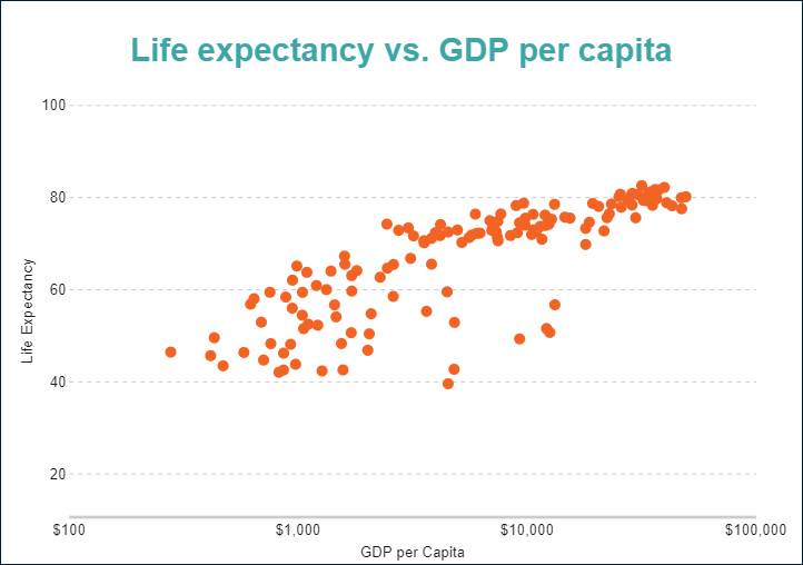
Scatter Charts
Scatter charts plot individual data points along the X and Y axes, making them perfect for exploring relationships and trends in data distribution, like visualizing the correlation between life expectancy and GDP per capita.
Bubble Charts
Taking scatter charts one step further, bubble charts add a third dimension using the size or shape of each bubble. This helps illustrate magnitude in addition to correlation.
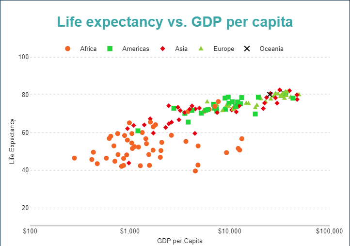
In ActiveReportsJS: Both scatter and bubble plots are easily configured using the Chart Wizard, allowing users to bind multiple dimensions to axes, size, and tooltip fields.
Visualization of Composition
Composition charts show how parts make up a whole, either at a single point in time or across a continuous timeline.
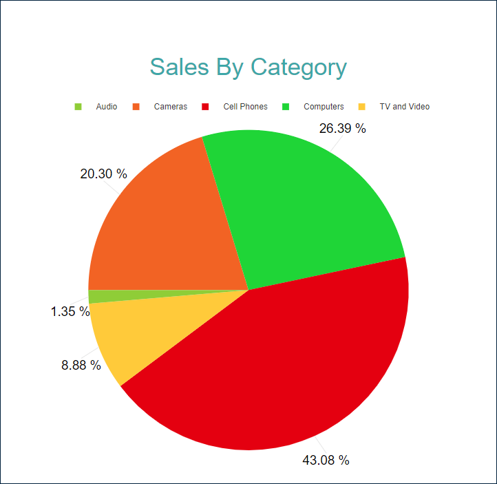
Pie and Doughnut Charts
These circular charts are ideal for displaying percentage breakdowns of a single category. Use them to visualize market share, expense categories, or user demographics.
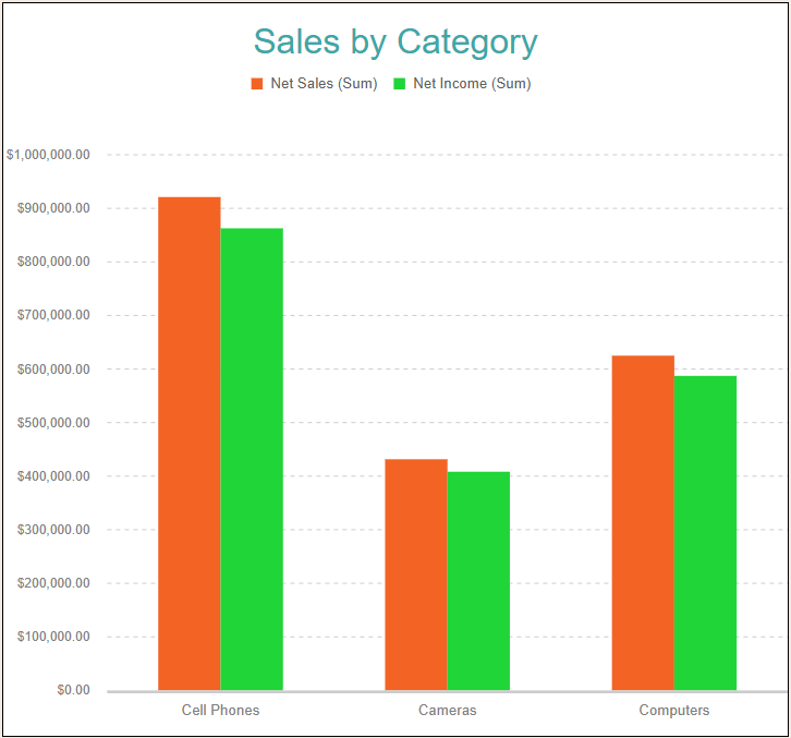
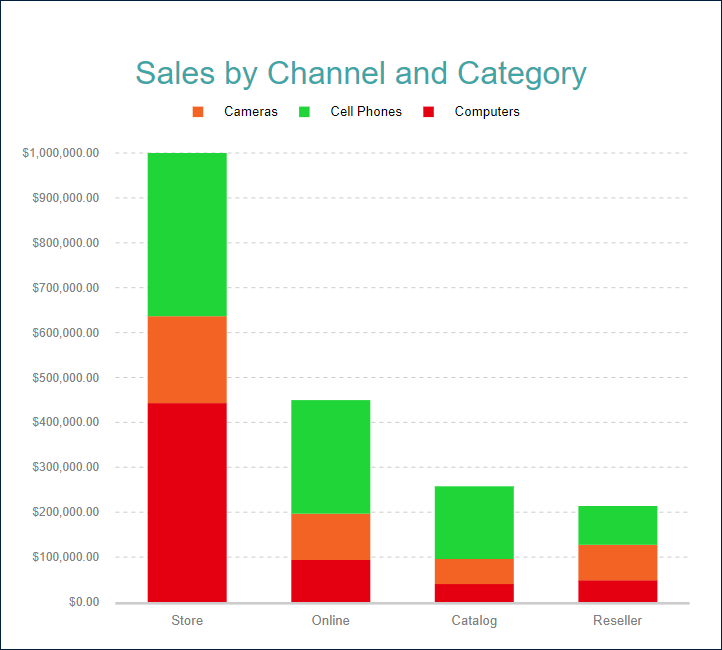
Column and Bar Charts
Bar and column charts make it easy to compare quantities across categories, such as quarterly sales by region or products sold per channel. They're perfect for visual breakdowns.
Stacked Charts
Stacked column or bar charts add a layer of insight by showing how subcategories contribute to total values. Stacked percentage charts show proportional composition, while standard stacked charts show absolute values.
Area Charts
Similar to line charts but with filled areas beneath the lines, these are great for illustrating volume, trends, and cumulative data, like total revenue over time from multiple sources.
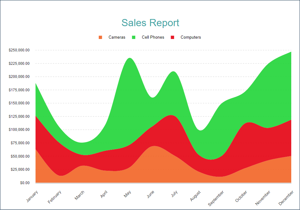
In ActiveReportsJS: Users can toggle between pie, donut, stacked, and area chart types with the visual designer, applying custom color palettes and data labels for clarity.
Visualization of Comparison
These charts help track how values evolve over time or differ across categories, making them a go-to for trend analysis and performance comparisons.
Line Charts
Line plots are perfect for showing how metrics like sales, web traffic, or temperature change over time. They work well when the goal is to emphasize progression or fluctuation.
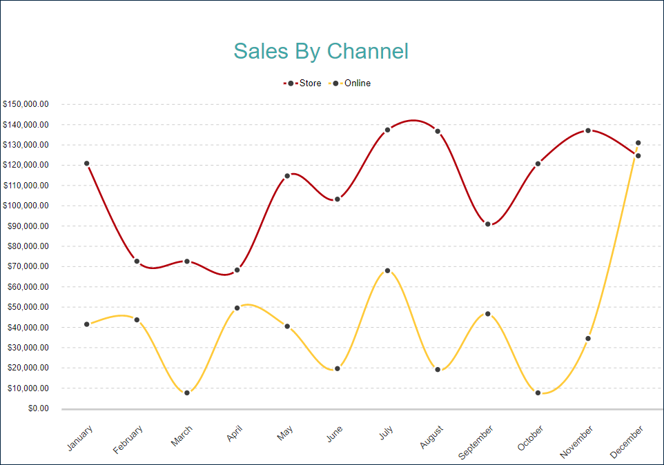
In ActiveReportsJS: Line charts support multiple series, smooth curves, markers, and tooltips. Developers can configure axes, scales, and legends directly within the designer or via code for maximum flexibility.
Other Chart Types
ActiveReportsJS supports several advanced chart types that serve specialized reporting needs:
- Financial Charts: Includes candlestick and OHLC charts for displaying market data like stock price fluctuations.
- Radar Charts: Useful for comparing multivariate data across different categories, such as employee performance ratings or product features.
- Area and Scatter Variants: Radar line, radar area, and radar scatter charts offer alternatives for visualizing complex multidimensional data.
- Spiral and Polar Charts: These are valuable for displaying cyclical or periodic data, such as daily traffic patterns or seasonal trends.
In ActiveReportsJS: These charts can be selected from the plot type dropdown and customized extensively with legends, grid lines, and plot area styling.
Conclusion
Choosing the right chart type is crucial for delivering meaningful insights through web reports. Whether you're illustrating correlations with scatter plots, breaking down data with stacked bars, or tracking trends over time with line charts, each visualization type serves a unique purpose.
With React providing a solid foundation for responsive interfaces and ActiveReportsJS handling the heavy lifting of data visualization, you can build highly interactive, professional-grade reports quickly and efficiently. From common chart types to advanced visualizations, ActiveReportsJS equips React developers with the tools needed to deliver compelling, data-rich reporting experiences.
Check out ActiveReportsJS to implement its reporting chart functionality in your application.
Happy Coding!

Top comments (0)