
I always find myself every now and again creating a "Switch" or "Toggle" component for a client project.
After making them quite a few times I've decided to put my findings down in this post.
They can be super easy to make, and there's a few nuances that go with them. Let's begin.
Note: I've built this using the technologies I use the most:
react,typescriptandstyled-components. But the CSS can be applied to any frontend stack :)
The whole component is built using just 4 components.
import styled from "styled-components"; const Label = styled.label``; const Input = styled.input``; const Switch = styled.div``; const ToggleSwitch = () => { return ( <Label> <span>Toggle is off</span> <Input /> <Switch /> </Label> ); }; ``` This gives us something like this: 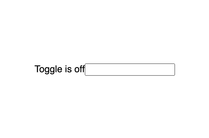 Now we actually don't want to show the `<input>`. But we **do** want it to be of `type="checkbox"`. This allows the user to be able to click on anything inside the `<label>` to trigger the `onChange` event, including our `<span>` element. > Note: It's important here to keep the input in the DOM by setting `opacity: 0` and `position: absolute`. Why? - `opacity: 0` will hide it from the user - `position: absolute` takes the element out of the normal doument flow. - This allows the user to "tab" to the label/input and use the spacebar to toggle the element. ```tsx const Input = styled.input` opacity: 0; position: absolute; `; // Set type to be "checkbox" <Input type="checkbox" /> ``` I'll add a few styles to the `<label>` component, it's wrapping everything, so I want it to be `display: flex` to align the `<span>` and `<Switch />` vertically. The `gap` gives us a straight forward 10px gap between elements, and the `cursor: pointer` gives the user visual feedback saying _"Hey! 👋 you can click me!"_. I'll also add styling to the `<Switch />` element. ```tsx const Label = styled.label` display: flex; align-items: center; gap: 10px; cursor: pointer; `; const Switch = styled.div` width: 60px; height: 32px; background: #b3b3b3; border-radius: 32px; ` ``` We now have something like this: 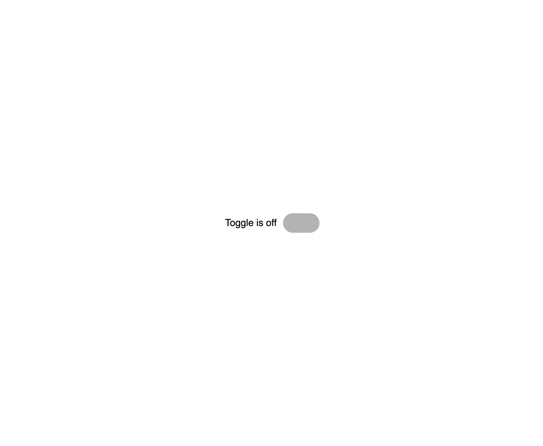 Next up I'm going to create a [pseudo-element](https://developer.mozilla.org/en-US/docs/Web/CSS/Pseudo-elements) on the `<Switch />` element. This will act as our switches "lever". ```tsx const Switch = styled.div` position: relative; /* <-- Add relative positioning */ width: 60px; height: 32px; background: #b3b3b3; border-radius: 32px; padding: 4px; /* <!-- Add padding /* Add pseudo element */ &:before { content: ""; position: absolute; width: 28px; height: 28px; border-radius: 35px; top: 50%; left: 4px; /* <!-- Make up for padding background: white; transform: translate(0, -50%); } `; ``` Now we have something that resembles a toggle switch: 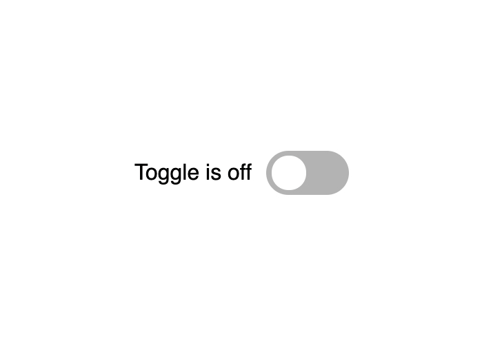 To animate the switch to be in the "on" position when it's pressed I need to move the `const Switch = styled.div` variable declaration to be **above** the `const Input = styled.input` variable. This is so we can reference the `Switch` from within `Input`. Using the `:checked` [pseudo-class](https://developer.mozilla.org/en-US/docs/Web/CSS/Pseudo-elements) selector and the [adjacent sibling combinator](https://developer.mozilla.org/en-US/docs/Web/CSS/Adjacent_sibling_combinator), we can make our switch turn green. ```tsx const Input = styled.input` display: none; &:checked + ${Switch} { background: green; } `; ``` 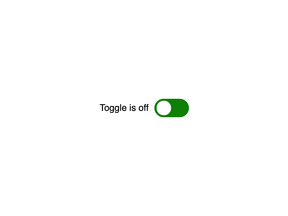 Now in that same nested css structure, we can target the `:before` pseudo-element of the `Switch` element: ```tsx const Input = styled.input` display: none; &:checked + ${Switch} { background: green; &:before { transform: translate(32px, -50%); } } `; ``` 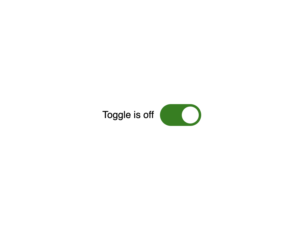 Now all we have to do animate this into action is to add `transition: 300ms` to our `Switch` and the `Switch` `:before` pseudo-element ```tsx const Switch = styled.div` position: relative; width: 60px; height: 28px; background: #b3b3b3; border-radius: 32px; padding: 4px; transition: 300ms all; &:before { transition: 300ms all; content: ""; position: absolute; width: 28px; height: 28px; border-radius: 35px; top: 50%; left: 4px; background: white; transform: translate(0, -50%); } `; ``` I'll add a basic `onChange` handler and `useState` hook to allow us to store the value of the checked input and change the text depending on the value: ```tsx const ToggleSwitch = () => { const [checked, setChecked] = useState(false); // store value const handleChange = (e: ChangeEvent<HTMLInputElement>) => setChecked(e.target.checked) return ( <Label> <span>Toggle is {checked ? 'on' : 'off'}</span> <Input checked={checked} type="checkbox" onChange={handleChange} /> <Switch /> </Label> ); }; ``` And now we have a super simple working switch toggle: Here's a [CodeSandbox link](https://codesandbox.io/s/easy-toggle-tnimz?file=/src/App.tsx) 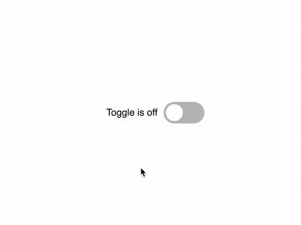 These things can be over-engineered sometimes, and there's also plenty of ways to recreate them. If you wanna follow me on twitter for dev-related tweets [you can find me here](https://twitter.com/karlcodes_) 
Top comments (0)