本文小编为大家详细介绍“怎么使用Python seaborn barplot画图”,内容详细,步骤清晰,细节处理妥当,希望这篇“怎么使用Python seaborn barplot画图”文章能帮助大家解决疑惑,下面跟着小编的思路慢慢深入,一起来学习新知识吧。
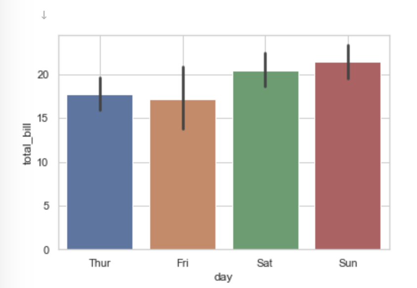
import seaborn as sns import matplotlib.pyplot as plt import numpy as np sns.set_theme() df = sns.load_dataset("tips") #默认画条形图 sns.barplot(x="day",y="total_bill",data=df) plt.show() #计算平均值看是否和条形图的高度一致 print(df.groupby("day").agg({"total_bill":[np.mean]})) print(df.groupby("day").agg({"total_bill":[np.std]})) # 注意这个地方error bar显示并不是标准差
total_bill mean day Thur 17.682742 Fri 17.151579 Sat 20.441379 Sun 21.410000 total_bill std day Thur 7.886170 Fri 8.302660 Sat 9.480419 Sun 8.832122
# import libraries import seaborn as sns import numpy as np import matplotlib.pyplot as plt # load dataset tips = sns.load_dataset("tips") # Set the figure size plt.figure(figsize=(14, 8)) # plot a bar chart ax = sns.barplot(x="day", y="total_bill", data=tips, estimator=np.mean, ci=85, capsize=.2, color='lightblue')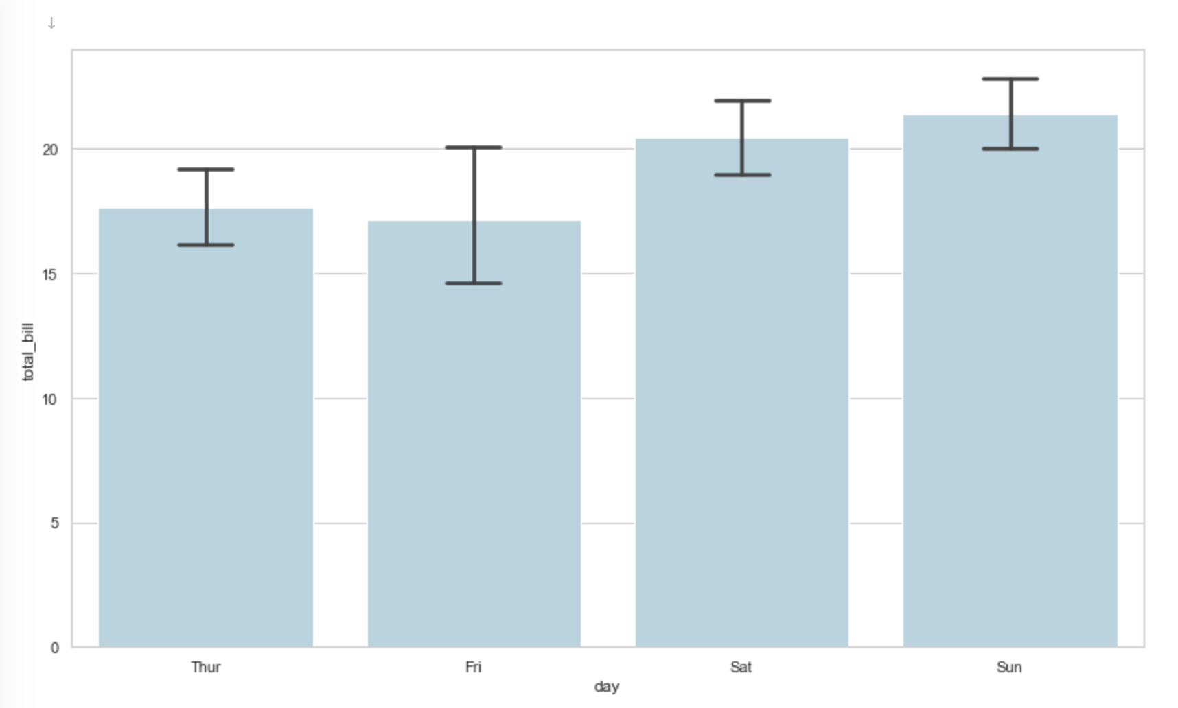
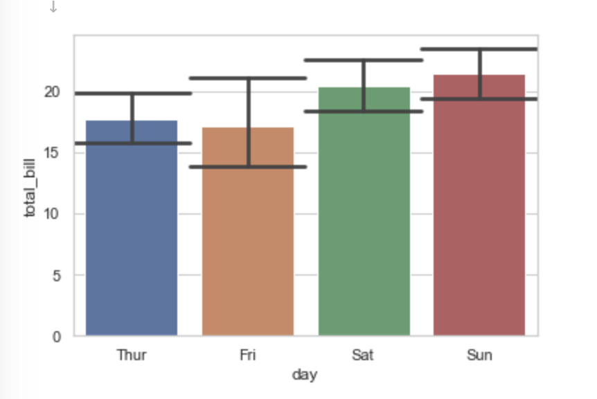
ax=sns.barplot(x="day",y="total_bill",data=df,capsize=1.0) plt.show()
import seaborn as sns import matplotlib.pyplot as plt sns.set_theme() df = sns.load_dataset("tips") #默认画条形图 ax=sns.barplot(x="day",y="total_bill",data=df) plt.show() for p in ax.lines: width = p.get_linewidth() xy = p.get_xydata() # 显示error bar的值 print(xy) print(width) print(p)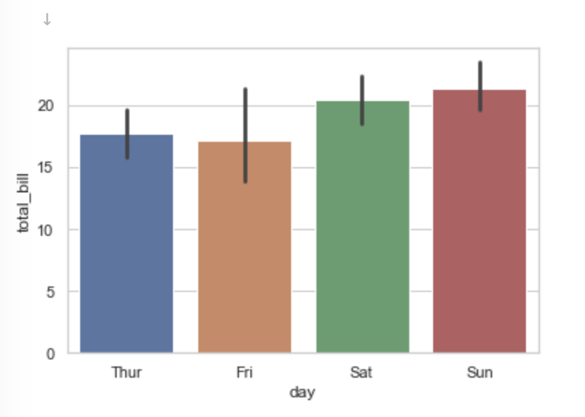
[[ 0. 15.85041935] [ 0. 19.64465726]] 2.7 Line2D(_line0) [[ 1. 13.93096053] [ 1. 21.38463158]] 2.7 Line2D(_line1) [[ 2. 18.57236207] [ 2. 22.40351437]] 2.7 Line2D(_line2) [[ 3. 19.66244737] [ 3. 23.50109868]] 2.7 Line2D(_line3)
fig, ax = plt.subplots(figsize=(8, 6)) sns.barplot(x='day', y='total_bill', data=df, capsize=0.2, ax=ax) # show the mean for p in ax.patches: h, w, x = p.get_height(), p.get_width(), p.get_x() xy = (x + w / 2., h / 2) text = f'Mean:\n{h:0.2f}' ax.annotate(text=text, xy=xy, ha='center', va='center') ax.set(xlabel='day', ylabel='total_bill') plt.show()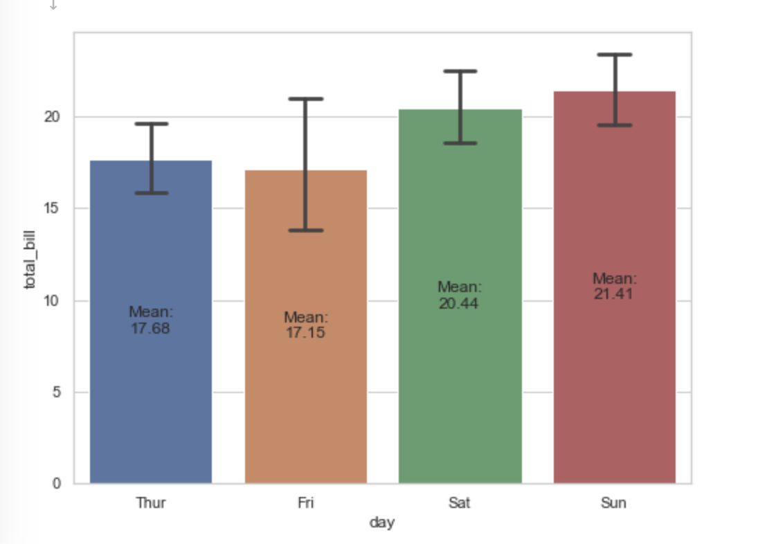
import seaborn as sns import matplotlib.pyplot as plt sns.set_theme() df = sns.load_dataset("tips") #默认画条形图 sns.barplot(x="day",y="total_bill",data=df,ci="sd",capsize=1.0)## 注意这个ci参数 plt.show() print(df.groupby("day").agg({"total_bill":[np.mean]})) print(df.groupby("day").agg({"total_bill":[np.std]}))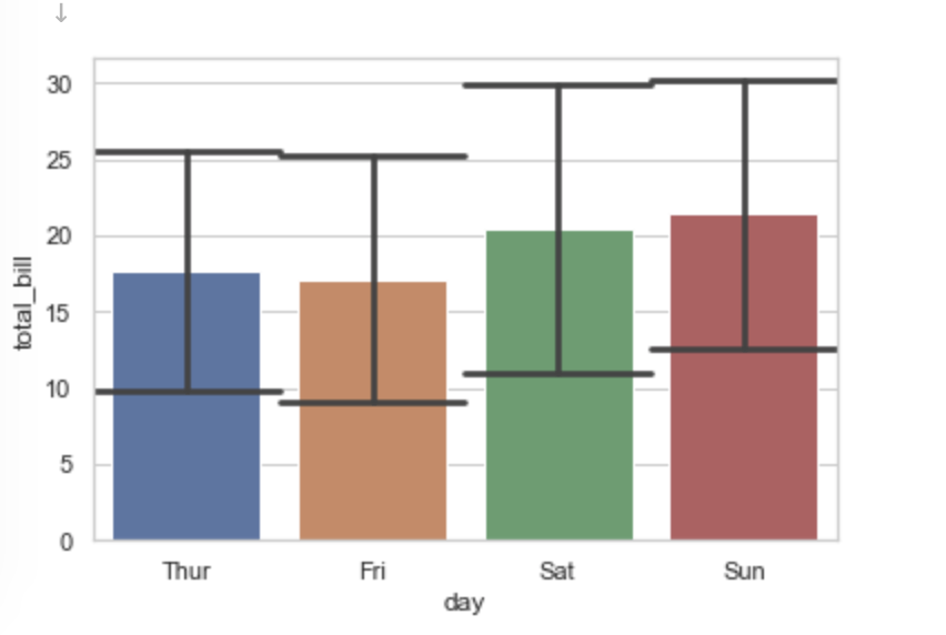
total_bill mean day Thur 17.682742 Fri 17.151579 Sat 20.441379 Sun 21.410000 total_bill std day Thur 7.886170 Fri 8.302660 Sat 9.480419 Sun 8.832122
import seaborn as sns import matplotlib.pyplot as plt sns.set_theme() df = sns.load_dataset("tips") #默认画条形图 sns.barplot(x="day",y="total_bill",data=df,ci=68,capsize=1.0)## 注意这个ci参数 plt.show()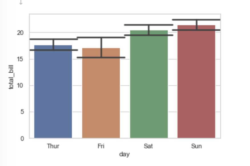
import seaborn as sns import matplotlib.pyplot as plt sns.set_theme() df = sns.load_dataset("tips") #默认画条形图 sns.barplot(x="day",y="total_bill",data=df,ci=95) plt.show() #计算平均值看是否和条形图的高度一致 print(df.groupby("day").agg({"total_bill":[np.mean]}))
total_bill mean day Thur 17.682742 Fri 17.151579 Sat 20.441379 Sun 21.410000
#计算平均值看是否和条形图的高度一致 df = sns.load_dataset("tips") print("="*20) print(df.groupby("day").agg({"total_bill":[np.mean]})) # 分组求均值 print("="*20) print(df.groupby("day").agg({"total_bill":[np.std]})) # 分组求标准差 print("="*20) print(df.groupby("day").agg({"total_bill":"nunique"})) # 这里统计的是不同的数目 print("="*20) print(df.groupby("day").agg({"total_bill":"count"})) # 这里统计的是每个分组样本的数量 print("="*20) print(df["day"].value_counts()) print("="*20)==================== total_bill mean day Thur 17.682742 Fri 17.151579 Sat 20.441379 Sun 21.410000 ==================== total_bill std day Thur 7.886170 Fri 8.302660 Sat 9.480419 Sun 8.832122 ==================== total_bill day Thur 61 Fri 18 Sat 85 Sun 76 ==================== total_bill day Thur 62 Fri 19 Sat 87 Sun 76 ==================== Sat 87 Sun 76 Thur 62 Fri 19 Name: day, dtype: int64 ====================
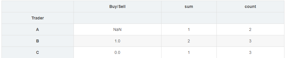
import numpy as np import pandas as pd df = pd.DataFrame({'Buy/Sell': [1, 0, 1, 1, 0, 1, 0, 0], 'Trader': ['A', 'A', 'B', 'B', 'B', 'C', 'C', 'C']}) print(df) def categorize(x): m = x.mean() return 1 if m > 0.5 else 0 if m < 0.5 else np.nan result = df.groupby(['Trader'])['Buy/Sell'].agg([categorize, 'sum', 'count']) result = result.rename(columns={'categorize' : 'Buy/Sell'}) resultBuy/Sell Trader 0 1 A 1 0 A 2 1 B 3 1 B 4 0 B 5 1 C 6 0 C 7 0 C
df = sns.load_dataset("tips") #默认画条形图 def custom1(x): m = x.mean() s = x.std() n = x.count()# 统计个数 #print(n) return m+1.96*s/np.sqrt(n) def custom2(x): m = x.mean() s = x.std() n = x.count()# 统计个数 #print(n) return m+s/np.sqrt(n) sns.barplot(x="day",y="total_bill",data=df,ci=95) plt.show() print(df.groupby("day").agg({"total_bill":[np.std,custom1]})) # 分组求标准差 sns.barplot(x="day",y="total_bill",data=df,ci=68) plt.show() print(df.groupby("day").agg({"total_bill":[np.std,custom2]})) #[外链图片转存失败,源站可能有防盗链机制,建议将图片保存下来直接上传(img-pkCx72ui-1658379974318)(output_24_0.png)]
total_bill std custom1 day Thur 7.886170 19.645769 Fri 8.302660 20.884910 Sat 9.480419 22.433538 Sun 8.832122 23.395703
[外链图片转存失败,源站可能有防盗链机制,建议将图片保存下来直接上传(img-GFyIePmW-1658379974318)(output_24_2.png)]
total_bill std custom2 day Thur 7.886170 18.684287 Fri 8.302660 19.056340 Sat 9.480419 21.457787 Sun 8.832122 22.423114
ax=sns.barplot(x="day",y="total_bill",data=df,ci=95) ax.yaxis.grid(True) # Hide the horizontal gridlines ax.xaxis.grid(True) # Show the vertical gridlines
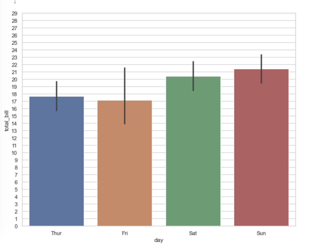
fig, ax = plt.subplots(figsize=(10, 8)) sns.barplot(x="day",y="total_bill",data=df,ci=95,ax=ax) ax.set_yticks([i for i in range(30)]) ax.yaxis.grid(True) # Hide the horizontal gridlines
#estimator 指定条形图高度使用相加的和 sns.barplot(x="day",y="total_bill",data=df,estimator=np.sum) plt.show() #计算想加和看是否和条形图的高度一致 print(df.groupby("day").agg({"total_bill":[np.sum]})) ''' total_bill sum day Fri 325.88 Sat 1778.40 Sun 1627.16 Thur 1096.33 '''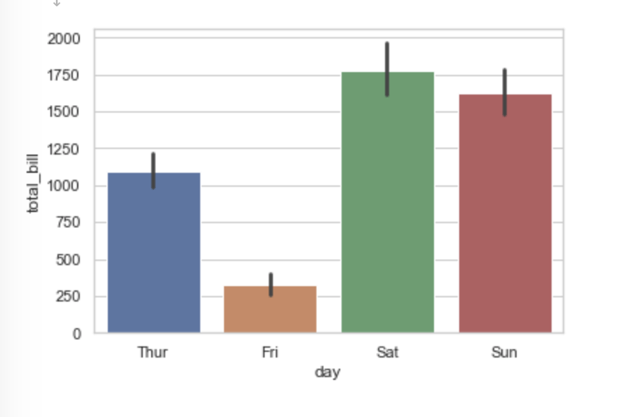
读到这里,这篇“怎么使用Python seaborn barplot画图”文章已经介绍完毕,想要掌握这篇文章的知识点还需要大家自己动手实践使用过才能领会,如果想了解更多相关内容的文章,欢迎关注亿速云行业资讯频道。
免责声明:本站发布的内容(图片、视频和文字)以原创、转载和分享为主,文章观点不代表本网站立场,如果涉及侵权请联系站长邮箱:is@yisu.com进行举报,并提供相关证据,一经查实,将立刻删除涉嫌侵权内容。


