жё©йҰЁжҸҗзӨәГ—
жӮЁеҘҪпјҢзҷ»еҪ•еҗҺжүҚиғҪдёӢи®ўеҚ•е“ҰпјҒ
еҜҶз Ғзҷ»еҪ•Г—
зҷ»еҪ•жіЁеҶҢГ—
зӮ№еҮ» зҷ»еҪ•жіЁеҶҢ еҚіиЎЁзӨәеҗҢж„ҸгҖҠдәҝйҖҹдә‘з”ЁжҲ·жңҚеҠЎжқЎж¬ҫгҖӢ
з”ЁжҲ·зҷ»еҪ•Г—
жӮЁеҘҪпјҢзҷ»еҪ•еҗҺжүҚиғҪдёӢи®ўеҚ•е“ҰпјҒ
д»ҠеӨ©е°Ҹзј–з»ҷеӨ§е®¶еҲҶдә«дёҖдёӢеҫ®дҝЎе°ҸзЁӢеәҸжҖҺд№Ҳе®һзҺ°иҮӘе®ҡд№үеҜјиҲӘж Ҹзҡ„зӣёе…ізҹҘиҜҶзӮ№пјҢеҶ…е®№иҜҰз»ҶпјҢйҖ»иҫ‘жё…жҷ°пјҢзӣёдҝЎеӨ§йғЁеҲҶдәәйғҪиҝҳеӨӘдәҶи§Јиҝҷж–№йқўзҡ„зҹҘиҜҶпјҢжүҖд»ҘеҲҶдә«иҝҷзҜҮж–Үз« з»ҷеӨ§е®¶еҸӮиҖғдёҖдёӢпјҢеёҢжңӣеӨ§е®¶йҳ…иҜ»е®ҢиҝҷзҜҮж–Үз« еҗҺжңүжүҖ收иҺ·пјҢдёӢйқўжҲ‘们дёҖиө·жқҘдәҶи§ЈдёҖдёӢеҗ§гҖӮ
1гҖҒиҰҒе®һзҺ°иҮӘе®ҡд№үеҜјиҲӘж ҸпјҢйҰ–е…Ҳеҫ—еңЁе…ЁеұҖиҝӣиЎҢзӣёе…ій…ҚзҪ®
app.jsonйЎөйқў
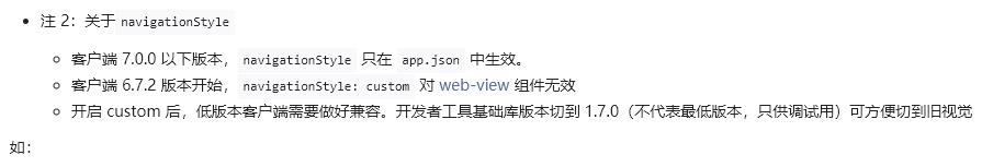
"window": { ... "navigationStyle": "custom" },ж №жҚ®еҫ®дҝЎе°ҸзЁӢеәҸе®ҳж–№ж–ҮжЎЈзҡ„иҜҙжі•пјҢеҸӘжңүе®ўжҲ·з«Ҝ7.0.0д»ҘдёҠзүҲжң¬жүҚж”ҜжҢҒеұҖйғЁйЎөйқўе®һзҺ°иҮӘе®ҡд№үеҜјиҲӘж ҸпјҢ7.0.0д»ҘдёӢзүҲжң¬еҸӘж”ҜжҢҒе…ЁдҪ“йЎөйқўзҡ„иҮӘе®ҡд№үеҜјиҲӘж ҸпјҢиҮӘе·ұйЎ№зӣ®йҮҢйҮҮз”Ёзҡ„жҳҜе°ұжҳҜиҝҷз§Қ
app.jsйЎөйқў
App({ onLaunch: function(options) { var _this = this; //иҮӘе®ҡд№үеҜјиҲӘж Ҹ иҺ·еҸ–и®ҫеӨҮйЎ¶йғЁзӘ—еҸЈзҡ„й«ҳеәҰпјҲдёҚеҗҢи®ҫеӨҮзӘ—еҸЈй«ҳеәҰдёҚдёҖж ·пјҢж №жҚ®иҝҷдёӘжқҘи®ҫзҪ®иҮӘе®ҡд№үеҜјиҲӘж Ҹзҡ„й«ҳеәҰпјү wx.getSystemInfo({ success: (res) => { // еҹәзЎҖеә“ 2.1.0 ејҖе§Ӣж”ҜжҢҒwx.getMenuButtonBoundingClientRect()пјҢдҪҺзүҲжң¬йңҖиҰҒйҖӮй…Қ let custom = wx.getMenuButtonBoundingClientRect() // console.log('зҠ¶жҖҒж Ҹй«ҳеәҰ',res.statusBarHeight) // console.log('еҸідёҠи§’иғ¶еӣҠжҢүй’®зҡ„й«ҳеәҰ', custom.height) // console.log('еҸідёҠи§’иғ¶еӣҠжҢүй’®зҡ„дёҠиҫ№з•Ңеқҗж Ү', custom.top) // console.log('еҸідёҠи§’иғ¶еӣҠжҢүй’®зҡ„дёӢиҫ№з•Ңеқҗж Ү', custom.bottom) _this.globalData.statusBarHeight = res.statusBarHeight _this.globalData.navBarHeight = custom.height + (custom.top - res.statusBarHeight) * 2 } }) }, globalData: { // е…ЁеұҖж•°жҚ® statusBarHeight: 0, navBarHeight: 0, }, })2гҖҒеҲӣе»әиҮӘе®ҡд№үеҜјиҲӘж Ҹ组件пјҢ组件зӣ®еҪ•дёә /components/navbar
navbar.wxmlйЎөйқў
<!-- й»ҳи®Өдёәй»‘иүІзҡ„иҝ”еӣһй”®--> <view class='nav-wrap nav-bgc-class' style='height: {{statusBarHeight + navBarHeight}}px;'> <!-- е·ҰдёҠи§’зҡ„иҝ”еӣһжҢүй’® е…¶дёӯwx:if='{{navbarData.showCapsule}}' жҳҜжҺ§еҲ¶е·ҰдёҠи§’жҢүй’®зҡ„жҳҫзӨәйҡҗи—ҸпјҢ1дёәжҳҫзӨәпјҢ0дёәйҡҗи—Ҹ --> <view class='nav-capsule' style='margin-top: {{statusBarHeight}}px; height: {{navBarHeight}}px;' wx:if='{{navbarData.showCapsule}}' bindtap='_navback'> <image class='back-pre ex-back-pre' src='{{navbarData.backSrc || "/img/back4.png"}}' mode='aspectFill'></image> </view> <!-- дёӯй—ҙзҡ„ж Үйўҳ --> <view class='nav-title nav-title-class' style='margin-top: {{statusBarHeight}}px; height: {{navBarHeight}}px;'>{{navbarData.title}}</view> </view>navbar.jsйЎөйқў
const app = getApp() Component({ // multipleSlots дёә组件ејҖеҗҜеӨҡжҸ’ж§ҪжЁЎејҸ options: { multipleSlots: true, }, // externalClasses дёә组件жҢҮе®ҡеӨҡдёӘеӨ–йғЁж ·ејҸзұ» externalClasses: ['nav-bgc-class', 'nav-title-class','ex-back-pre'], // properties 组件用жқҘеӮЁеӯҳеӨ–йғЁж•°жҚ® properties: { navbarData: { //navbarData з”ұзҲ¶йЎөйқўдј йҖ’зҡ„ж•°жҚ®пјҢеҸҳйҮҸеҗҚеӯ—иҮӘе‘ҪеҗҚ type: Object, value: {}, observer: function (newVal, oldVal) { } }, }, // 组件用жқҘеӮЁеӯҳеҶ…йғЁз§Ғжңүж•°жҚ® data: { // иҮӘе®ҡд№үеҜјиҲӘж Ҹзҡ„й«ҳеәҰ statusBarHeight: app.globalData.statusBarHeight, navBarHeight: app.globalData.navBarHeight }, // attachedеҮҪж•° еҪ“组件иҝӣе…ҘйЎөйқўиҠӮзӮ№ж ‘ж—¶и§ҰеҸ‘пјҢеҸҜд»ҘдҪҝз”ЁsetDataпјҢз»қеӨ§еӨҡж•°еҲқе§ӢеҢ–е·ҘдҪңеңЁиҝҷдёӘж—¶жңәиҝӣиЎҢ attached: function () {}, // methodsеҜ№иұЎ е®ҡд№ү组件еҶ…зҡ„еҗ„з§Қж–№жі• methods: { // иҝ”еӣһй”®пјҢи§ҰеҸ‘иҮӘе®ҡд№үдәӢ件пјҢе°Ҷиҝ”еӣһзҡ„дәӢ件дәӨз»ҷзҲ¶зә§йЎөйқўжқҘеҲҶжғ…еҶөе®ҡд№ү _navback() { this.triggerEvent('goBack') } } })navbar.jsonйЎөйқў
{ "component": true }navbar.wxssйЎөйқў
/* йЎ¶йғЁеӣәе®ҡе®ҡдҪҚ ж ҮйўҳиҰҒеұ…дёӯ иҮӘе®ҡд№үжҢүй’®е’Ңж ҮйўҳиҰҒе’ҢеҸіиҫ№еҫ®дҝЎеҺҹз”ҹзҡ„иғ¶еӣҠдёҠдёӢеҜ№йҪҗ */ .nav-wrap { position: fixed; width: 750rpx; top: 0; left: 0; right: 0; background: #f4f4f4; /* background-color: pink; */ z-index: 9999999; transform: translate3d(0, 0, 0); } /* иҝ”еӣһй”® */ .nav-capsule { width: 140rpx; /* background-color: skyblue; */ /* и®©йҮҢйқўзҡ„еӣҫзүҮе…ғзҙ еһӮзӣҙеұ…дёӯ */ display: flex; align-items: center; } .back-pre { width: 100rpx; height: 68rpx; /* background-color: green; */ } /* ж Үйўҳ */ .nav-title { position: absolute; left: 0; right: 0; bottom: 0; max-width: 400rpx; margin: auto; /* background-color: deeppink; */ /* ж°ҙе№іеһӮзӣҙеұ…дёӯ */ display: flex; align-items: center; justify-content: space-around; /* и¶…еҮәйғЁеҲҶзңҒз•ҘеҸ·жҳҫзӨә */ overflow: hidden; text-overflow: ellipsis; white-space: nowrap; /* еӯ—дҪ“и®ҫзҪ® */ color: #111111; font-size: 32rpx; font-weight: 500; }3гҖҒеңЁе…¶е®ғйЎөйқўдҪҝз”ЁиҮӘе®ҡд№үеҜјиҲӘж Ҹ组件пјҲйңҖиҰҒдҝ®ж”№й»ҳи®Өж ·ејҸпјү
transation_detail.jsonйЎөйқў
{ "usingComponents": { "nav-bar": "/components/navbar/navbar", } }transation_detail.wxmlйЎөйқў
<!-- еј•е…ҘиҮӘе®ҡд№үеҜјиҲӘж Ҹ组件 --> <nav-bar bind:goBack="_goBack" nav-bgc-class="ex-nav-bgc-class" nav-title-class="ex-nav-title-class" ex-back-pre="ex-back-pre" navbar-data='{{nvabarData}}'> </nav-bar>transation_detail.wxssйЎөйқў
/* йңҖиҰҒд»ҺеӨ–йғЁдј е…ҘеҜјиҲӘж Ҹ组件зҡ„ж ·ејҸ */ /* еҜјиҲӘж ҸиғҢжҷҜиүІ */ .ex-nav-bgc-class { background: transparent !important; } /* еҜјиҲӘж Ҹж ҮйўҳйўңиүІ */ .ex-nav-title-class { color: #fff !important; } /* еҜјиҲӘж Ҹиҝ”еӣһй”®ж ·ејҸ */ .ex-back-pre { width: 60rpx!important; height: 60rpx!important; margin-top: 4rpx!important; padding: 40rpx!important; }transation_detail.jsйЎөйқў
const app = getApp() Page({ /** * йЎөйқўзҡ„еҲқе§Ӣж•°жҚ® */ data: { // иҮӘе®ҡд№үеҜјиҲӘж ҸйңҖиҰҒзҡ„еҸӮж•° nvabarData: { showCapsule: 1, //жҳҜеҗҰжҳҫзӨәе·ҰдёҠи§’еӣҫж Ү 1иЎЁзӨәжҳҫзӨә 0иЎЁзӨәдёҚжҳҫзӨә title: '', //еҜјиҲӘж Ҹ дёӯй—ҙзҡ„ж Үйўҳ backSrc: '/img/back3.png' // иҝ”еӣһй”®зҡ„ж ·ејҸ }, // жӯӨйЎөйқў йЎөйқўеҶ…е®№и·қжңҖйЎ¶йғЁзҡ„и·қзҰ» height: app.globalData.statusBarHeight + app.globalData.navBarHeight, }, /** * з”ҹе‘Ҫе‘ЁжңҹеҮҪж•°--зӣ‘еҗ¬йЎөйқўеҠ иҪҪ */ onLoad: function(options) {}, // зӮ№еҮ» йЎ¶йғЁиҝ”еӣһй”®ж—¶ иҰҒиҝ”еӣһзҡ„йЎөйқў _goBack() { wx.switchTab({ url: '/pages/mer_index/mer_index', }) }, })4гҖҒиҮӘе®ҡд№үеҜјиҲӘж ҸеҸҜд»ҘдёҚдј ж ·ејҸпјҢиҝҷж—¶дјҡйҮҮз”Ёй»ҳи®Өж ·ејҸ
order.wxmlйЎөйқў
<!-- еј•е…ҘиҮӘе®ҡд№үеҜјиҲӘж Ҹ组件 --> <nav-bar bind:goBack="_goBack" navbar-data='{{nvabarData}}'></nav-bar>order.jsйЎөйқў
const app = getApp() Page({ /** * йЎөйқўзҡ„еҲқе§Ӣж•°жҚ® */ data: { // иҮӘе®ҡд№үеҜјиҲӘж ҸйңҖиҰҒзҡ„еҸӮж•° nvabarData: { showCapsule: 1, //жҳҜеҗҰжҳҫзӨәе·ҰдёҠи§’еӣҫж Ү 1иЎЁзӨәжҳҫзӨә 0иЎЁзӨәдёҚжҳҫзӨә title: 'зҺ°жңүд»“еҚ•', //еҜјиҲӘж Ҹ дёӯй—ҙзҡ„ж Үйўҳ }, // жӯӨйЎөйқў йЎөйқўеҶ…е®№и·қжңҖйЎ¶йғЁзҡ„и·қзҰ»д»ҘдёҠе°ұжҳҜвҖңеҫ®дҝЎе°ҸзЁӢеәҸжҖҺд№Ҳе®һзҺ°иҮӘе®ҡд№үеҜјиҲӘж ҸвҖқиҝҷзҜҮж–Үз« зҡ„жүҖжңүеҶ…е®№пјҢж„ҹи°ўеҗ„дҪҚзҡ„йҳ…иҜ»пјҒзӣёдҝЎеӨ§е®¶йҳ…иҜ»е®ҢиҝҷзҜҮж–Үз« йғҪжңүеҫҲеӨ§зҡ„收иҺ·пјҢе°Ҹзј–жҜҸеӨ©йғҪдјҡдёәеӨ§е®¶жӣҙж–°дёҚеҗҢзҡ„зҹҘиҜҶпјҢеҰӮжһңиҝҳжғіеӯҰд№ жӣҙеӨҡзҡ„зҹҘиҜҶпјҢиҜ·е…іжіЁдәҝйҖҹдә‘иЎҢдёҡиө„и®Ҝйў‘йҒ“гҖӮ
е…ҚиҙЈеЈ°жҳҺпјҡжң¬з«ҷеҸ‘еёғзҡ„еҶ…е®№пјҲеӣҫзүҮгҖҒи§Ҷйў‘е’Ңж–Үеӯ—пјүд»ҘеҺҹеҲӣгҖҒиҪ¬иҪҪе’ҢеҲҶдә«дёәдё»пјҢж–Үз« и§ӮзӮ№дёҚд»ЈиЎЁжң¬зҪ‘з«ҷз«ӢеңәпјҢеҰӮжһңж¶үеҸҠдҫөжқғиҜ·иҒ”зі»з«ҷй•ҝйӮ®з®ұпјҡis@yisu.comиҝӣиЎҢдёҫжҠҘпјҢ并жҸҗдҫӣзӣёе…іиҜҒжҚ®пјҢдёҖз»ҸжҹҘе®һпјҢе°Ҷз«ӢеҲ»еҲ йҷӨж¶үе«ҢдҫөжқғеҶ…е®№гҖӮ

дәҝйҖҹдә‘е…¬дј—еҸ·

жүӢжңәзҪ‘з«ҷдәҢз»ҙз Ғ


