这篇文章主要讲解了“怎么利用JavaScript绘制堆叠柱状图”,文中的讲解内容简单清晰,易于学习与理解,下面请大家跟着小编的思路慢慢深入,一起来研究和学习“怎么利用JavaScript绘制堆叠柱状图”吧!
效果图
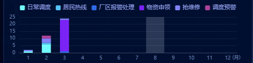
this.state.workChartList的数据结构
const workChartList = [ { name: "居民热线", chartData: [5, 8, 8, 7, 0, 5, 6, 5, 9, 5, 4, 7] }, { name: "日常调度类", chartData: [5, 6, 8, 8, 5, 8, 5, 9, 8, 7, 3, 6] }, { name: "调度预警类", chartData: [6, 8, 8, 7, 4, 6, 6, 9, 6, 8, 5, 3] }, { name: "抢维修类", chartData: [1, 2, 3, 1, 4, 5, 6, 3, 9, 7, 8, 7] }, { name: "物质申请类", chartData: [5, 8, 8, 7, 0, 5, 6, 5, 9, 5, 4, 7] }, { name: "其他类", chartData: [5, 6, 8, 8, 5, 8, 5, 9, 8, 7, 6, 0] }, ];option相关代码 关键是每个serise需要设置同样的stack属性
var colorList = ["#72fbfd", "#56c2f9", "#2e69e9", "#7a23f5", "#8082f7", "#ab4399"]; const xData = ["1", "2", "3", "4", "5", "6", "7", "8", "9", "10", "11", "12"]; var option = { tooltip: { trigger: 'axis', axisPointer: { type: 'shadow' }, backgroundColor: "#030e2d", borderColor: "#030e2d", textStyle: { fontSize: "12px", color: "#96A4F4", }, }, color: colorList, legend: { left: "center", itemWidth: 10, itemHeight: 10, textStyle: { fontSize: "12px", color: "#96A4F4", padding: [3, 0, 0, 0], }, }, grid: { left: 20, bottom: 20, top: 30, right: 20, }, xAxis: { name: "\n\n(月)", type: "category", nameTextStyle: { color: "#7089ba", fontSize: "10px" }, nameGap: -9, axisLabel: { interval: 0, textStyle: { color: "#7089ba", fontSize: "10px" }, margin: 6, //刻度标签与轴线之间的距离。 }, axisLine: { lineStyle: { color: "#414965", }, }, axisTick: { show: false, }, data: xData, }, yAxis: { type: "value", axisLabel: { textStyle: { color: "#7089ba", fontSize: "10px", }, }, axisLine: { show: false, }, axisTick: { show: false, }, splitLine: { lineStyle: { color: "#414965", opacity: 0.3, }, }, }, series: [], }; if (!this.state.workChartList) return; const seriesItem = this.state.workChartList; seriesItem.map((item, index) => { option.series.push({ name: item.name, type: "bar", stack: "总数", barWidth: '50%', label: { show: false, position: "insideRight", }, data: item.value, itemStyle: { normal: { label: { show: false, //开启显示 position: "top", //在上方显示 textStyle: { //数值样式 color: "#fff", fontSize: "12px", fontWeight: 100, }, }, }, }, }); }); this.Chart_init2 = echarts.init(this.Chart_dom2.current); this.Chart_init2.clear(); this.Chart_init2.setOption(option);补充
当然JavaScript不仅能绘制堆叠柱状图,还能绘制折柱混合图
效果图:
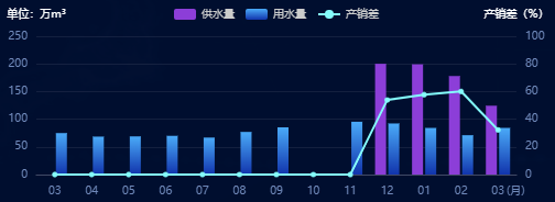
数据结构
const nrwData = [ { label: "10", proviceWater: "100.45", userWater: "55", nrwRate: 80.65 }, { label: "11", proviceWater: "80", userWater: "80", nrwRate: 70 }, { label: "12", proviceWater: "81.45", userWater: "67", nrwRate: 89 }, { label: "01", proviceWater: "145.45", userWater: "140.45", nrwRate: 55 }, { label: "02", proviceWater: "60.45", userWater: "45", nrwRate: 43.65 }, { label: "03", proviceWater: "55", userWater: "50", nrwRate: 85.65 }, { label: "10", proviceWater: "100.45", userWater: "55", nrwRate: 80.65 }, { label: "11", proviceWater: "80", userWater: "80", nrwRate: 70 }, { label: "12", proviceWater: "81.45", userWater: "67", nrwRate: 89 }, { label: "01", proviceWater: "145.45", userWater: "140.45", nrwRate: 55 }, { label: "02", proviceWater: "60.45", userWater: "45", nrwRate: 43.65 }, { label: "03", proviceWater: "55", userWater: "50", nrwRate: 85.65 } ];具体代码
var xData3 = nrwData?.map((item) => item.label); const proviceWater = nrwData?.map((item) => item.proviceWater <= 0 ? 0 : item.proviceWater); const userWater = nrwData?.map((item) => item.userWater <= 0 ? 0 : item.userWater); const lineData = nrwData?.map((item) => item.nrwRate >= 100 ? 0 : item.nrwRate); var option = { tooltip: { trigger: "axis", show: true, backgroundColor: "rgba(16, 34, 79, 0.9)", borderColor: "#274370", textStyle: { color: "#fff", fontSize: 8, } }, legend: { show: true, itemWidth: 20, itemHeight: 10, itemGap: 10, textStyle: { fontSize: 10, color: "#ccc", }, }, grid: { left: 30, bottom: 20, top: 30, right: 30, }, xAxis: { data: xData3, name: "\n\n\n(月)", nameTextStyle: { color: "#7089ba", fontSize: "10px" }, // 坐标轴刻度相关设置 axisTick: { show: false, }, nameGap: -9, // 坐标轴线的相关设置 axisLine: { show: true, lineStyle: { color: "#414965", }, }, // 坐标轴刻度标签的相关设置 axisLabel: { // 可以设置成 0 强制显示所有标签 interval: 0, textStyle: { color: "#7089ba", fontSize: "10px" }, margin: 10, //刻度标签与轴线之间的距离。 }, }, yAxis: [{ type: "value", name: "单位:万m³", nameTextStyle: { color: "#fff", fontSize: "10px" }, // 坐标轴在grid区域中的分隔线 splitLine: { show: false, lineStyle: { color: "#414965", opacity: 0.3, }, }, axisTick: { show: false, }, axisLine: { show: false, }, axisLabel: { textStyle: { color: "#7089ba", fontSize: "10px", }, }, }, { type: "value", name: "产销差(%)", min: 0, max: 100, nameTextStyle: { color: "#fff", fontFamily: "PingFangSC-Light", fontSize: "10px", }, axisLabel: { textStyle: { color: "#7089ba", fontSize: "10px" } }, axisTick: { show: false, }, axisLine: { show: false, }, splitLine: { show: true, lineStyle: { color: "#414965", opacity: 0.3, }, }, }, ], series: [ { name: "供水量", type: "bar", barWidth: 10, itemStyle: { opacity: 0.1, normal: { show: true, color: "#8c3ed8", barBorderRadius: 0, borderWidth: 0, }, }, label: { show: false,//数据不进行显示 position: "top", distance: 10, color: "#fff", }, tooltip: { valueFormatter: function (value) { return value + "万m³"; } }, data: proviceWater, }, { name: "用水量", type: "bar", barWidth: 10, itemStyle: { opacity: 0.1, normal: { show: true, color: new echarts.graphic.LinearGradient(0, 1, 0, 0, [ { offset: 0, color: "#1134ac", }, { offset: 1, color: "#4aaaf8", }, ]), barBorderRadius: 0, borderWidth: 0, }, }, label: { show: false,//数据不进行显示 position: "top", distance: 10, color: "#fff", }, tooltip: { valueFormatter: function (value) { return value + "万m³"; } }, data: userWater, }, /*折线图*/ { name: "产销差", type: "line", yAxisIndex: 1, z: 15, tooltip: { valueFormatter: function (value) { return value + "%"; } }, symbol: "circle", // symbolSize: 10, itemStyle: { normal: { color: "#84fbfb", borderColor: "#84fbfb", //拐点边框颜色 lineStyle: { color: "#84fbfb"//折线的颜色 }, }, }, data: lineData, } ], };感谢各位的阅读,以上就是“怎么利用JavaScript绘制堆叠柱状图”的内容了,经过本文的学习后,相信大家对怎么利用JavaScript绘制堆叠柱状图这一问题有了更深刻的体会,具体使用情况还需要大家实践验证。这里是亿速云,小编将为大家推送更多相关知识点的文章,欢迎关注!
免责声明:本站发布的内容(图片、视频和文字)以原创、转载和分享为主,文章观点不代表本网站立场,如果涉及侵权请联系站长邮箱:is@yisu.com进行举报,并提供相关证据,一经查实,将立刻删除涉嫌侵权内容。


