这篇文章将为大家详细讲解有关纯HTML5+CSS3怎么制作生日蛋糕,小编觉得挺实用的,因此分享给大家做个参考,希望大家阅读完这篇文章后可以有所收获。
先发个效果图吧
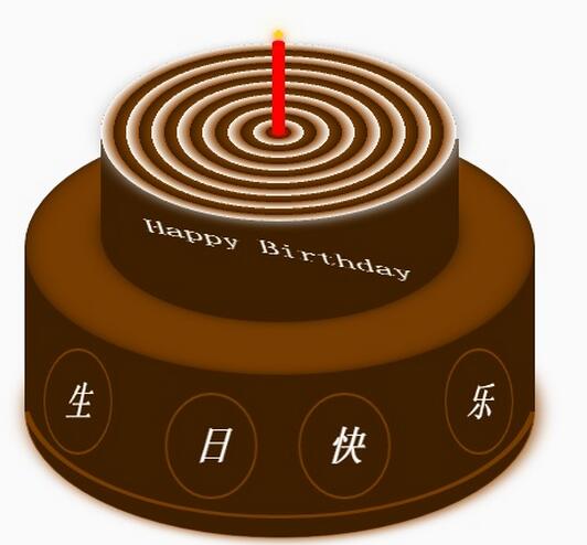
蛋糕分为三个部分,底部蛋糕,顶层蛋糕和蜡烛部分。HTML的布局结构也是按照这三部分布局的。另外就是使用CSS定位和CSS3的rotate,内外阴影等效果调整部分DOM元素样式。比较简单,相信码农都懂的。
不赘述其它有的没的了。
下面给出完整的的HTML代码和CSS代码
<!DOCTYPE html> <html> <head lang="en"> <meta charset="UTF-8"> <title></title> <style> .birthday .container{ width:600px; height:600px; margin:0px auto; background: #fafafa; border-radius:5px; position: relative; } /** ** 顶层的 **/ .birthday .top-one{ position: absolute; width:280px; height: 280px; bottom: 200px; left:160px; } .birthday .top-one .bottom{ position: absolute; width:280px; height: 280px; bottom:-30px; border:1px solid #3e2001; border-radius: 140px; transform: rotateX(60deg); z-index: 4; background: #3e2001; box-shadow: 0px 0px 20px #3e2001; } .birthday .top-one .top{ position: absolute; width:280px; height: 280px; top:-50px; border-radius: 140px; background: #FFFFFF; transform: rotateX(60deg); box-shadow: 2px 2px 20px #b7b7b7; z-index: 6; background: -webkit-repeating-radial-gradient(circle, #783d01, #3e2001 10px, #914909 10px,white 20px); background: -moz-repeating-radial-gradient(circle, #783d01, #3e2001 10px,#914909 10px,white 20px); } .birthday .top-one .side{ position: absolute; top:95px; width:280px; height: 70px; border:1px solid #3e2001; border-top-width: 0px; border-bottom-width: 0px; background: #FFFFFF; z-index: 5; background: #3e2001; } /** ** 底层的 **/ .birthday .bottom-one{ position: absolute; width:400px; height: 400px; bottom: 0px; left:100px; } .birthday .bottom-one .bottom{ position: absolute; width:400px; height: 400px; bottom:-30px; border:1px solid #914909; border-radius: 200px; transform: rotateX(60deg); box-shadow: 2px 2px 20px #914909; z-index: 1; background: #3e2001; overflow: hidden; } .birthday .bottom-one .line{ position: absolute; width:400px; height: 400px; border-radius: 200px; z-index: 1; } .birthday .bottom-one .line1{ bottom: 30px; border:5px solid #783d01; left:-5px; z-index: 1; } .birthday .bottom-one .top{ position: absolute; width:400px; height: 400px; top:-100px; border:1px solid #3e2001; border-radius: 200px; background: #FFFFFF; transform: rotateX(60deg); z-index: 3; background: #783d01; box-shadow: inset 0px 0px 20px #3e2001; } .birthday .bottom-one .side{ position: absolute; top:100px; width:400px; height: 130px; border:1px solid #3e2001; border-top-width: 0px; border-bottom-width: 0px; background: #3e2001; z-index: 2; } /** ** 底层的文字 **/ .birthday .flower{ position: relative; text-align: justify; z-index: 9; top:200px; font-size: 32px; font-family: "Helvetica Neue", "Noto Sans CJK SC", "Source Han Sans CN"; color:#FFFFFF; font-weight: bold; } .birthday .flower:after{ content:""; display:inline-block; position: relative; width:100%; } .birthday .flower i{ position: relative; width:80px; line-height: 80px; display: inline-block; border-radius: 50%; border:2px solid #783d01; text-align: center; } /** ** 顶层的文字 **/ .birthday .top-one .text{ width:100%; text-align: center; position: absolute; top:165px; z-index: 9; margin:0px auto; font-size: 30px; color:#FFFFFF; transform: rotateX(60deg) skew(10deg,20deg); } /** ** 蜡烛 **/ .birthday .candle{ width:10px; height:80px; margin:0px auto; position: absolute; left:295px; top:130px; z-index: 9; } .birthday .candle .body{ width:10px; height:70px; margin:0px auto; background: red; border-bottom-width: 0px; } .birthday .candle .top{ width:10px; height: 10px; border-radius: 5px; transform: rotateX(60deg); position: relative; top:5px; background: red; } .birthday .candle .bottom{ width:10px; height: 10px; border-radius: 5px; transform: rotateX(60deg); position: relative; bottom:5px; background: red; box-shadow: 1px 1px 10px red; } .birthday .candle .fire{ position: absolute; width:6px; height: 6px; left:2px; transform: rotate(45deg); background: #ffd507; box-shadow: 0px 0px 20px #ffff00, 2px 2px 10px red; } </style> </head> <body> <div class="birthday"> <div class="container"> <div class="candle"> <div class="fire"></div> <div class="top"></div> <div class="body"></div> <div class="bottom"></div> </div> <div class="top-one"> <div class="top"></div> <div class="side"></div> <div class="bottom"></div> <div class="text"> Happy Birthday </div> </div> <div class="bottom-one"> <div class="top"></div> <div class="side"></div> <div class="bottom"> <div class="line line1"></div> </div> <div class="flower"> <i style="top:-20px;transform: rotateY(50deg)">生</i> <i style="top:15px;transform: rotateY(30deg)">日</i> <i style="top:15px;transform: rotateY(30deg)">快</i> <i style="top:-20px;transform: rotateY(50deg)">乐</i> </div> </div> </div> </div> </body> </html>okay,庆生开发的小Demo,以后可以尝试用Canvas画布或SVG试着在做一下,感谢阅读。
关于“纯HTML5+CSS3怎么制作生日蛋糕”这篇文章就分享到这里了,希望以上内容可以对大家有一定的帮助,使各位可以学到更多知识,如果觉得文章不错,请把它分享出去让更多的人看到。
免责声明:本站发布的内容(图片、视频和文字)以原创、转载和分享为主,文章观点不代表本网站立场,如果涉及侵权请联系站长邮箱:is@yisu.com进行举报,并提供相关证据,一经查实,将立刻删除涉嫌侵权内容。


