小编给大家分享一下如何使用纯CSS实现3D按钮效果,相信大部分人都还不怎么了解,因此分享这篇文章给大家参考一下,希望大家阅读完这篇文章后大有收获,下面让我们一起去了解一下吧!
css巧妙利用了box-shadow来实现3D物体的立体感,当按钮按下的时候再去修改box-shadow和top值。
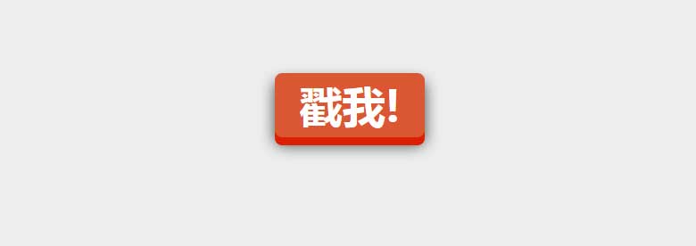
让人感觉有一种按钮被按下的感觉。css代码非常少,如下所示
a.css-3d-btn{ position: relative; color: rgba(255, 255, 255, 1); text-decoration: none; background-color: rgba(219, 87, 51, 1); font-family: "Microsoft YaHei", 微软雅黑, 宋体; font-weight: 700; font-size: 3em; display: block; padding: 4px; border-radius: 8px; /* let's use box shadows to make the button look more 3-dimensional */ box-shadow: 0px 9px 0px rgba(219, 31, 5, 1), 0px 9px 25px rgba(0, 0, 0, .7); margin: 100px auto; width: 160px; text-align: center; -webkit-transition: all .1s ease; -moz-transition: all .1s ease; transition: all .1s ease; } /* now if we make the box shadows smaller when the button is clicked, it'll look like the button has been "pushed" */ a.css-3d-btn:active{ box-shadow: 0px 3px 0px rgba(219, 31, 5, 1), 0px 3px 6px rgba(0, 0, 0, .9); position: relative; top: 6px; }效果如下:
以上是“如何使用纯CSS实现3D按钮效果”这篇文章的所有内容,感谢各位的阅读!相信大家都有了一定的了解,希望分享的内容对大家有所帮助,如果还想学习更多知识,欢迎关注亿速云行业资讯频道!
免责声明:本站发布的内容(图片、视频和文字)以原创、转载和分享为主,文章观点不代表本网站立场,如果涉及侵权请联系站长邮箱:is@yisu.com进行举报,并提供相关证据,一经查实,将立刻删除涉嫌侵权内容。


