檩鶮жПРз§Ї√Ч
жВ®е•љпЉМзЩїељХеРОжЙНиГљдЄЛиЃҐеНХеУ¶пЉБ
еѓЖз†БзЩїељХ√Ч
зЩїељХж≥®еЖМ√Ч
зВєеЗї зЩїељХж≥®еЖМ еН≥и°®з§ЇеРМжДПгАКдЇњйАЯдЇСзФ®жИЈжЬНеК°жЭ°жђЊгАЛ
зФ®жИЈзЩїељХ√Ч
жВ®е•љпЉМзЩїељХеРОжЙНиГљдЄЛиЃҐеНХеУ¶пЉБ
ињЩзѓЗжЦЗзЂ†е∞ЖдЄЇе§ІеЃґиѓ¶зїЖиЃ≤иІ£жЬЙеЕ≥зЇѓcssжАОж†ЈеЃЮзО∞е§ЪзЇІжКШеП†иПЬеНХжКШеП†ж†СжХИжЮЬпЉМе∞ПзЉЦиІЙеЊЧжМЇеЃЮзФ®зЪДпЉМеЫ†ж≠§еИЖдЇЂзїЩе§ІеЃґеБЪдЄ™еПВиАГпЉМеЄМжЬЫе§ІеЃґйШЕиѓїеЃМињЩзѓЗжЦЗзЂ†еРОеПѓдї•жЬЙжЙАжФґиОЈгАВ
1гАБињРзФ®checkboxзЪДcheckedеАЉжЭ•еИ§жЦ≠дЄЛзЇІж†ПзЫЃжШѓеР¶е±ХеЉАпЉМCSS3зЪДйАЙжЛ©еЩ®дЄ≠жПРдЊЫдЇЖ:checked ињЩдЄ™дЉ™з±їпЉМињЩдЄ™дЉ™з±їжПРдЊЫжИСдїђпЉМељУеЕГзі†жЛ•жЬЙcheckedињЩдЄ™еАЉзЪДжЧґеАЩе∞±жЙІи°Мдљ†зЪДCSSгАВ
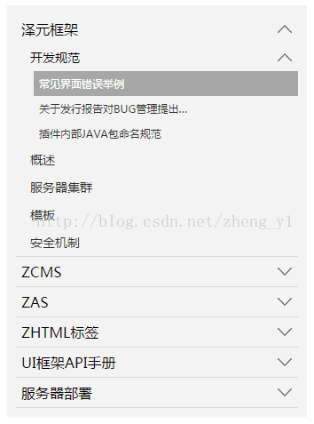
ељУжЬЙе≠РиПЬеНХжЧґпЉМиПЬеНХй°єеП≥дЊІжЬЙеРСдЄЛзЪДзЃ≠е§іпЉМељУжФґиµЈиПЬеНХй°єжЧґпЉМзЃ≠е§іжЬЭдЄКгАВеЫЊзЙЗеПѓдї•иЗ™еЈ±жЫњжНҐгАВ
2гАБжХИжЮЬеЫЊ
3гАБдї£з†БзЙЗжЃµ
<ol class="tree"> <li> <label for="folder1" class="folderOne">ж≥љеЕГж°ЖжЮґ</label> <input type="checkbox" id="folder1" /> <ol> <li> <label for="subfolder1"class="folderTwo">еЉАеПСиІДиМГ</label> <input type="checkbox" id="subfolder1" /> <ol> <li class="file folderThree"><a href="#">еЄЄиІБзХМйЭҐйФЩиѓѓдЄЊдЊЛ</a></li> <li class="file folderThree"><a href="#">еЕ≥дЇОеПСи°МжК•еСКеѓєBUGзЃ°зРЖжПРеЗЇ…</a></li> <li class="file folderThree"><a href="#">жПТдїґеЖЕйГ®JAVAеМЕеСљеРНиІДиМГ</a></li> </ol> </li> <li class="file folderTwo"><a href="#">ж¶Вињ∞</a></li> <li class="file folderTwo"><a href="#">жЬНеК°еЩ®йЫЖзЊ§</a></li> <li class="file folderTwo"><a href="#">ж®°жЭњ</a></li> <li class="file folderTwo"><a href="#">еЃЙеЕ®жЬЇеИґ</a></li> </ol> </li> <li> <label for="folder2" class="folderOne" >ZCMS</label> <input type="checkbox" id="folder2" /> <ol> <li class="file folderTwo"><a href="#">еЃЮжЧґжХ∞жНЃ</a></li> <li> <label for="subfolder2" class="folderTwo">еЃЮжЧґжХ∞жНЃ</label> <input type="checkbox" id="subfolder2" /> <ol> <li class="file folderThree"><a href="#">еЃЮжЧґжХ∞жНЃ</a></li> <li class="file folderThree"><a href="#">еЃЮжЧґжХ∞жНЃ</a></li> <li class="file folderThree"><a href="#">еЃЮжЧґжХ∞жНЃ</a></li> </ol> </li> </ol> </li> <li> <label for="folder3" class="folderOne">ZAS</label> <input type="checkbox" id="folder3" /> <ol> <li class="file folderTwo"><a href="#">еЃЮжЧґжХ∞жНЃ</a></li> <li class="file folderTwo"><a href="#">еЃЮжЧґжХ∞жНЃ</a></li> </ol> </li> <li> <label for="folder4" class="folderOne">ZHTMLж†Зз≠Њ</label> <input type="checkbox" id="folder4"/> <ol> <li class="file folderTwo"><a href="#">еЃЮжЧґжХ∞жНЃ</a></li> <li class="file folderTwo"><a href="#">еЃЮжЧґжХ∞жНЃ</a></li> </ol> </li> <li> <label for="folder5" class="folderOne">UIж°ЖжЮґAPIжЙЛеЖМ</label> <input type="checkbox" id="folder5"/> <ol> <li class="file folderTwo"><a href="#">еЃЮжЧґжХ∞жНЃ</a></li> <li class="file folderTwo"><a href="#">еЃЮжЧґжХ∞жНЃ</a></li> </ol> </li> </ol> <style type="text/css"> .tree {margin: 0;padding: 0;background-color:#f2f2f2;overflow: hidden;} /*йЪРиЧПinput*/ .tree li input{position: absolute;left: 0;opacity: 0;z-index: 2;cursor: pointer;height: 1em;width:1em;top: 0;} /*жЙАжЬЙиПЬеНХй°єиЃЊзљЃзїЯдЄАж†ЈеЉП*/ .tree li {position: relative;list-style: none;} /*дЄАзЇІиПЬеНХеК†дЄЛиЊєзЇњ*/ .tree>li{border-bottom: 1px solid #d9d9d9;} /*зїЩжЬЙе≠РиПЬеНХзЪДиПЬеНХй°єжЈїеК†иГМжЩѓеЫЊж†З*/ .tree li label {max-width:999px;cursor: pointer;display: block;margin:0 0 0 -50px;padding: 15px 10px 15px 70px;background: url(../../images/cp-detail-arrow-b.png) no-repeat right center;background-position:95% 50%;white-space:nowrap;overflow:hidden;text-overflow: ellipsis; } .tree li label:hover,li label:focus{background-color:#a7a7a7;color:#fff;} /*жЄЕйЩ§жЙАжЬЙе±ХеЉАзЪДе≠РиПЬеНХзЪДdisplay*/ .tree li input + ol{display: none;} /*ељУinput襀йАЙдЄ≠жЧґпЉМзїЩжЙАжЬЙе±ХеЉАзЪДе≠РиПЬеНХиЃЊзљЃж†ЈеЉП*/ .tree input:checked + ol {padding-left:14px;height: auto;display: block;} .tree input:checked + ol > li { height: auto;} /*жЬЂе±ВиПЬеНХдЄЇAж†Зз≠ЊпЉМиЃЊзљЃж†ЈеЉП*/ .tree li.file a{margin:0 -10px 0 -50px;padding: 15px 20px 15px 70px;text-decoration:none;display: block;color:#333333;white-space:nowrap;overflow:hidden;text-overflow: ellipsis;} .tree li.file a:hover,li.file a:focus{background-color:#a7a7a7;color:#fff;} /*дЄНеРМе±ВзЇІзЪДиПЬеНХе≠ЧдљУе§Іе∞ПдЄНеРМ*/ .tree .folderOne{font-size: 18px;} .tree .folderTwo{font-size:16px;} .tree .folderThree{font-size:14px;} </style> <script type="text/javascript"> $(document).ready(function() { //жѓПдЄ™жЬЙе≠РиПЬеНХзЪДиПЬеНХй°єжЈїеК†зВєеЗїдЇЛдїґ $(".tree label").click(function(){ //иОЈеПЦељУеЙНиПЬеНХжЧБиЊєinputзЪДcheckзКґжАБ var isChecked = $(this).next("input[type='checkbox']").is(':checked'); //е±ХеЉАеТМжФґйљРзЪДдЄНеРМзКґжАБдЄЛжЫіжНҐеП≥дЊІе∞ПеЫЊж†З if(isChecked){ $(this).css( "background-image","url(../images/cp-detail-arrow-b.png)" ); }else{ $(this).css( "background-image","url(../images/cp-detail-arrow-t.png)" ); } }); }); </script>
дЄЛйЭҐдїЛзїНдЄЛCSS иПЬеНХжКШеП†
еЕИзїЩе§ІеЃґе±Хз§ЇжХИжЮЬеЫЊпЉЪ
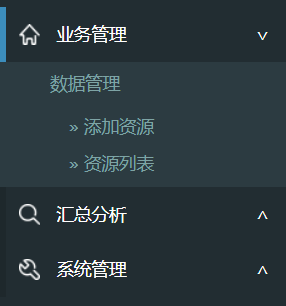
е¶ВдЄКпЉМеБЗиЃЊдЄАзЇІиПЬеНХжШѓ divпЉМдЇМзЇІиПЬеНХжШѓ ulгАВ嚥е¶ВпЉЪ
<div>дЄЪеК°зЃ°зРЖ<span></span></div> <ul> ... <ul> <div class="collapsed">ж±ЗжАїеИЖжЮР<span></span></</div> <ul> ... <ul> <div class="collapsed">>з≥їзїЯзЃ°зРЖ<span></span></</div> <ul> ... <ul>
ељУиПЬеНХе±ХеЉАжЧґпЉМеЈ¶иЊєжЬЙдЄАдЄ™иУЭиЙ≤зЪДж†ЗиЃ∞пЉМеП≥иЊєжШѓжКШеП†ж†ЗиЃ∞гАВ
еЈ¶иЊєиУЭиЙ≤ж†ЗиЃ∞иЗ™дЄНзФ®и°®пЉМCSS иЃЊзљЃ border еН≥еПѓпЉМеП≥иЊєеИ©зФ® CSS дєЯиґЕжЦєдЊњгАВ
div span { float:right; padding-right:20px; } div span:after { content: "∨" } div.collapsed span:after { content: "∧" }зДґеРОеЖНиѓіе≠РиПЬеНХзЪДжКШеП†жХИжЮЬпЉМжЬЙеК®зФїеЩҐпЉЪ
div.collapsed + ul { height: 0px; transition: height 0.5s ease-out; } div ul { height: 80px; transition: height 0.5s ease-in; }ж≥®жДП ul дЄАеЃЪи¶БжЬЙ height зЪДеЕЈдљУеАЉпЉМе¶ВжЮЬж≤°жЬЙеЕЈдљУжМЗжШОе§Ъе∞С pxпЉМеИЩиЩљзДґиГљжКШеП†пЉМдљЖжШѓж≤°жЬЙеК®зФїжХИжЮЬгАВ
жЬАеРОе∞±жШѓеИ©зФ® jQuery жИЦ ezj еИЗжНҐ className дЇЖпЉМељУзВєеЗї div зЪДжЧґеАЩ toggleClass("collapsed")гАВ
еЕ≥дЇОвАЬзЇѓcssжАОж†ЈеЃЮзО∞е§ЪзЇІжКШеП†иПЬеНХжКШеП†ж†СжХИжЮЬвАЭињЩзѓЗжЦЗзЂ†е∞±еИЖдЇЂеИ∞ињЩйЗМдЇЖпЉМеЄМжЬЫдї•дЄКеЖЕеЃєеПѓдї•еѓєе§ІеЃґжЬЙдЄАеЃЪзЪДеЄЃеК©пЉМдљњеРДдљНеПѓдї•е≠¶еИ∞жЫіе§ЪзЯ•иѓЖпЉМе¶ВжЮЬиІЙеЊЧжЦЗзЂ†дЄНйФЩпЉМиѓЈжККеЃГеИЖдЇЂеЗЇеОїиЃ©жЫіе§ЪзЪДдЇЇзЬЛеИ∞гАВ
еЕНиі£е£∞жШОпЉЪжЬђзЂЩеПСеЄГзЪДеЖЕеЃєпЉИеЫЊзЙЗгАБиІЖйҐСеТМжЦЗе≠ЧпЉЙдї•еОЯеИЫгАБиљђиљљеТМеИЖдЇЂдЄЇдЄїпЉМжЦЗзЂ†иІВзВєдЄНдї£и°®жЬђзљСзЂЩзЂЛеЬЇпЉМе¶ВжЮЬжґЙеПКдЊµжЭГиѓЈиБФз≥їзЂЩйХњйВЃзЃ±пЉЪis@yisu.comињЫи°МдЄЊжК•пЉМеєґжПРдЊЫзЫЄеЕ≥иѓБжНЃпЉМдЄАзїПжЯ•еЃЮпЉМе∞ЖзЂЛеИїеИ†йЩ§жґЙеЂМдЊµжЭГеЖЕеЃєгАВ

дЇњйАЯдЇСеЕђдЉЧеПЈ

жЙЛжЬЇзљСзЂЩдЇМзїіз†Б


