小编给大家分享一下如何通过css3背景控制属性+使用颜色过渡实现渐变效果,相信大部分人都还不怎么了解,因此分享这篇文章给大家参考一下,希望大家阅读完这篇文章后大有收获,下面让我们一起去了解一下吧!
css3背景图像相关
background-clip 背景图片绘制区域
background-clip:border-box; 内容区
<!DOCTYPE html> <html lang="en" manifest="index.manifest"> <head> <meta charset="UTF-8"> <title>Document</title> <style> div{ width: 500px; height: 500px; background:url(source/p3.jpg) center; padding:50px; border:50px solid transparent; background-clip:content-box; /*background-clip:padding-box;*/ /*background-clip:border-box;*/ } </style> </head> <body> <div></div> </body> </html>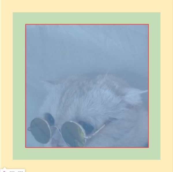
background-clip:padding-box; padding区域
<!DOCTYPE html> <html lang="en" manifest="index.manifest"> <head> <meta charset="UTF-8"> <title>Document</title> <style> div{ width: 500px; height: 500px; background:url(source/p3.jpg) center; padding:50px; border:50px solid transparent; background-clip:padding-box; /*background-clip:border-box;*/ } </style> </head> <body> <div></div> </body> </html>
background-clip:border-box; border区域
<!DOCTYPE html> <html lang="en" manifest="index.manifest"> <head> <meta charset="UTF-8"> <title>Document</title> <style> div{ width: 500px; height: 500px; background:url(source/p3.jpg) 50px 50px no-repeat; padding:50px; border:50px solid transparent; background-origin:border-box; } </style> </head> <body> <div></div> </body> </html>
background-origin: content-box | padding-box | border-box; 背景图片起始位置
背景图片从border-box开始水平垂直向下偏移50px
<!DOCTYPE html> <html lang="en" manifest="index.manifest"> <head> <meta charset="UTF-8"> <title>Document</title> <style> div{ width: 500px; height: 500px; background:url(source/p3.jpg) 50px 50px no-repeat; padding:50px; border:50px solid transparent; background-origin:padding-box; } </style> </head> <body> <div></div> </body> </html>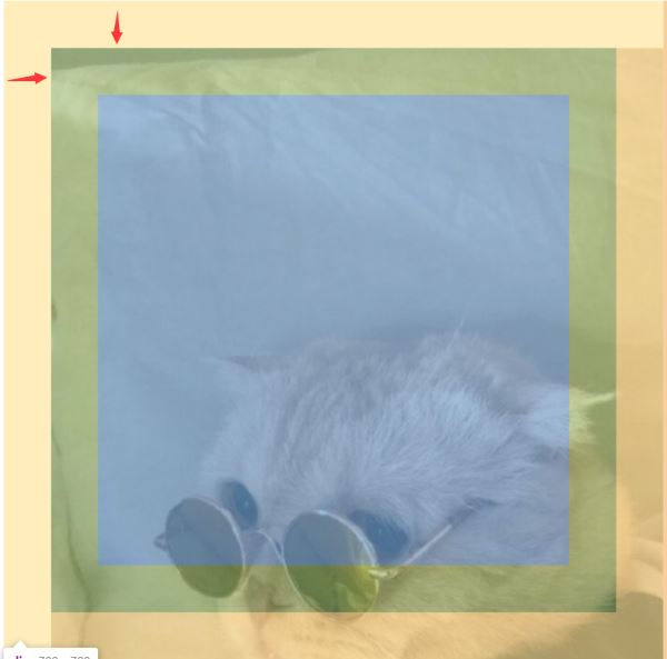
背景图片从padding-box开始水平垂直向下偏移50px
<!DOCTYPE html> <html lang="en" manifest="index.manifest"> <head> <meta charset="UTF-8"> <title>Document</title> <style> div{ width: 500px; height: 500px; background:url(source/p3.jpg) 50px 50px no-repeat; padding:50px; border:50px solid transparent; background-origin:content-box; } </style> </head> <body> <div></div> </body> </html>
背景图片从content-box开始水平垂直向下偏移50px
<!DOCTYPE html> <html lang="en" manifest="index.manifest"> <head> <meta charset="UTF-8"> <title>Document</title> <style> div{ width: 500px; height: 500px; background:url(source/p2.jpg) 50px 50px no-repeat; background-size:100%;/*宽度为容器宽度的100%,高度按图片比例来*/ background-size:100% 100%;/*宽度为容器宽度的100%,高度为容器高度的100%*/ background-size:cover; background-size:contain; } </style> </head> <body> <div></div> </body> </html>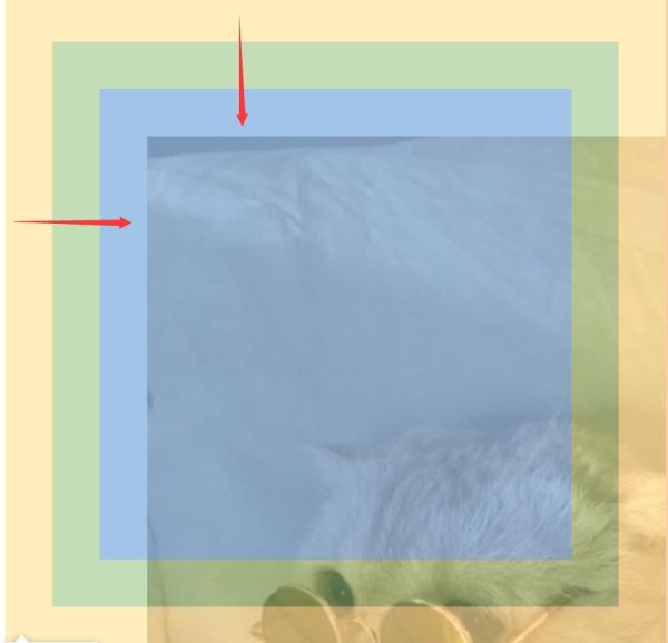
background-size: 填写数值或者百分比时,如果只填写一个值,另一个值默认为auto
cover 等比缩放填满容器
contain 等比缩放至一边碰到容器边
<!DOCTYPE html> <html lang="en" manifest="index.manifest"> <head> <meta charset="UTF-8"> <title>Document</title> <style> div{ width: 500px; height: 500px; background:url(source/p2.jpg) 50px 50px no-repeat; background-size:100%;/*宽度为容器宽度的100%,高度按图片比例来*/ background-size:100% 100%;/*宽度为容器宽度的100%,高度为容器高度的100%*/ background-size:cover; background-size:contain; } </style> </head> <body> <div></div> </body> </html>多重背景图片
background-image:url(),url();
前面的图片会覆盖后面的图片
<!DOCTYPE html> <html lang="en" manifest="index.manifest"> <head> <meta charset="UTF-8"> <title>Document</title> <style> div{ width: 500px; height: 500px; background-image:url(source/shuiyin.png), url(source/cat.jpg); } </style> </head> <body> <div></div> </body> </html>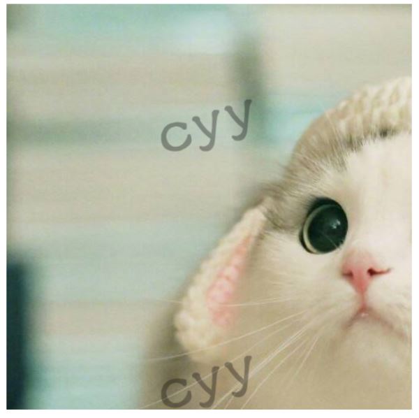
颜色设置为透明:transparent
css3渐变
兼容性:IE10
<!DOCTYPE html> <html lang="en" manifest="index.manifest"> <head> <meta charset="UTF-8"> <title>Document</title> <style> div{ width: 500px; height: 500px; background:-webkit-linear-gradient(pink, orange, #abcdef);/*默认是垂直方向*/ background: -moz-linear-gradient(pink, orange, #abcdef);/*默认是垂直方向*/ background: -o-linear-gradient(pink, orange, #abcdef);/*默认是垂直方向*/ background: linear-gradient(pink, orange, #abcdef);/*默认是垂直方向*/ background:-webkit-linear-gradient(left, pink, orange, #abcdef);/*从左到右*/ background: -moz-linear-gradient(right, pink, orange, #abcdef); background: -o-linear-gradient(right, pink, orange, #abcdef); background: linear-gradient(to right, pink, orange, #abcdef); background:-webkit-linear-gradient(left top, pink, orange, #abcdef);/*从左上到右下*/ background: -moz-linear-gradient(right bottom, pink, orange, #abcdef); background: -o-linear-gradient(right bottom, pink, orange, #abcdef); background: linear-gradient(to right bottom, pink, orange, #abcdef); } </style> </head> <body> <div></div> </body> </html>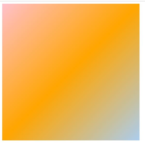
正常情况下线性渐变的角度
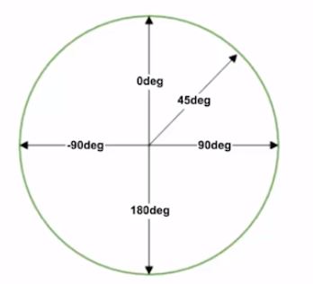
webkit内核下线性渐变的角度
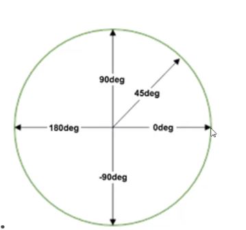
解决方法:兼容浏览器的前缀按顺序书写,正常情况下无前缀的放在最后
颜色可以具体分配位置
第一个颜色不写默认是0%的位置;最后一个颜色默认是100%的位置
<!DOCTYPE html> <html lang="en" manifest="index.manifest"> <head> <meta charset="UTF-8"> <title>Document</title> <style> div{ width: 500px; height: 500px; background:-webkit-linear-gradient(45deg, pink, orange, #abcdef);/*具体角度表示*/ background: -moz-linear-gradient(45deg, pink, orange, #abcdef); background: -o-linear-gradient(45deg, pink, orange, #abcdef); background: linear-gradient(45deg, pink, orange, #abcdef); background:-webkit-linear-gradient(90deg, orange, pink 30%, purple 70%, #abcdef); background: -moz-linear-gradient(90deg, orange, pink 30%, purple 70%, #abcdef); background: -o-linear-gradient(90deg, orange, pink 30%, purple 70%, #abcdef); background: linear-gradient(90deg, orange, pink 30%, purple 70%, #abcdef); } </style> </head> <body> <div></div> </body> </html>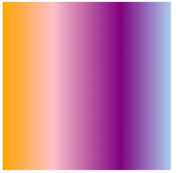
rgba() 可以设置带透明色的渐变
<!DOCTYPE html> <html lang="en" manifest="index.manifest"> <head> <meta charset="UTF-8"> <title>Document</title> <style> div{ width: 500px; height: 500px; background:-webkit-linear-gradient(90deg, rgba(255,0,0,0), rgba(255,0,0,1));/*具体角度表示*/ background: -moz-linear-gradient(90deg, rgba(255,0,0,0), rgba(255,0,0,1)); background: -o-linear-gradient(90deg, rgba(255,0,0,0), rgba(255,0,0,1)); background: linear-gradient(90deg, rgba(255,0,0,0), rgba(255,0,0,1)); } </style> </head> <body> <div></div> </body> </html>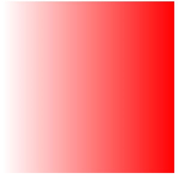
重复渐变
repeating-linear-gradient
<!DOCTYPE html> <html lang="en" manifest="index.manifest"> <head> <meta charset="UTF-8"> <title>Document</title> <style> div{ width: 500px; height: 500px; background:-webkit-repeating-linear-gradient(90deg, rgba(255,0,0,0), rgba(255,0,0,1) 20%); background: -moz-repeating-linear-gradient(90deg, rgba(255,0,0,0), rgba(255,0,0,1) 20%); background: -o-repeating-linear-gradient(90deg, rgba(255,0,0,0), rgba(255,0,0,1) 20%); background: repeating-linear-gradient(90deg, rgba(255,0,0,0), rgba(255,0,0,1) 20%); } </style> </head> <body> <div></div> </body> </html>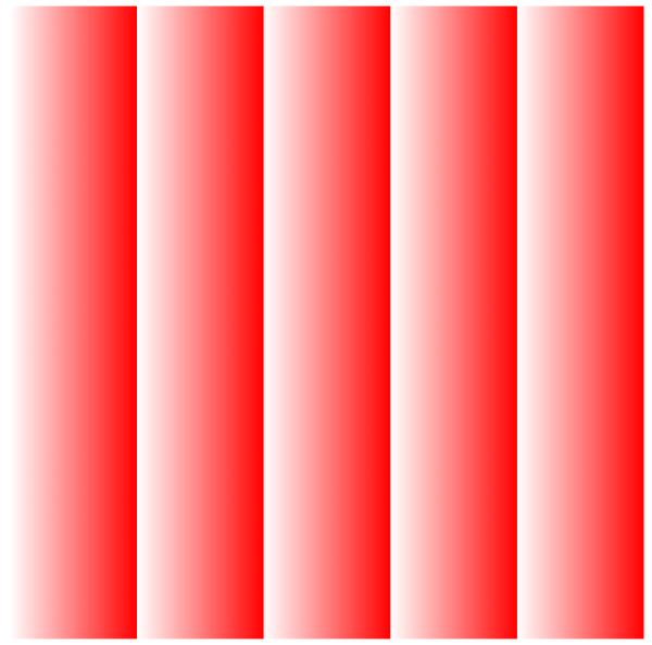
径向渐变 radial-gradient
<!DOCTYPE html> <html lang="en" manifest="index.manifest"> <head> <meta charset="UTF-8"> <title>Document</title> <style> div{ width: 400px; height: 200px; border-radius:50%; background:-webkit-radial-gradient(pink, #abcdef); background: -moz-radial-gradient(pink, #abcdef); background: -o-radial-gradient(pink, #abcdef); background: radial-gradient(pink, #abcdef); } </style> </head> <body> <div></div> </body> </html>
保持圆形渐变
<!DOCTYPE html> <html lang="en" manifest="index.manifest"> <head> <meta charset="UTF-8"> <title>Document</title> <style> div{ width: 400px; height: 200px; border-radius:50%; background:-webkit-radial-gradient(circle, pink, #abcdef); background: -moz-radial-gradient(circle, pink, #abcdef); background: -o-radial-gradient(circle, pink, #abcdef); background: radial-gradient(circle, pink, #abcdef); } </style> </head> <body> <div></div> </body> </html>
尺寸大小 closest-side closest-corner farthest-side farthest-corner
<!DOCTYPE html> <html lang="en" manifest="index.manifest"> <head> <meta charset="UTF-8"> <title>Document</title> <style> div{ width: 200px; height: 100px; border-radius:50%; margin-bottom:50px; line-height: 100px; text-align: center; /* background:-webkit-radial-gradient(circle, pink, #abcdef); background: -moz-radial-gradient(circle, pink, #abcdef); background: -o-radial-gradient(circle, pink, #abcdef); background: radial-gradient(circle, pink, #abcdef);*/ } div:nth-child(1){ background:-webkit-radial-gradient(closest-side circle, pink, #abcdef); background: -moz-radial-gradient(closest-side circle, pink, #abcdef); background: -o-radial-gradient(closest-side circle, pink, #abcdef); background: radial-gradient(closest-side circle, pink, #abcdef); } div:nth-child(2){ background:-webkit-radial-gradient(closest-corner circle, pink, #abcdef); background: -moz-radial-gradient(closest-corner circle, pink, #abcdef); background: -o-radial-gradient(closest-corner circle, pink, #abcdef); background: radial-gradient(closest-corner circle, pink, #abcdef); } div:nth-child(3){ background:-webkit-radial-gradient(farthest-side circle, pink, #abcdef); background: -moz-radial-gradient(farthest-side circle, pink, #abcdef); background: -o-radial-gradient(farthest-side circle, pink, #abcdef); background: radial-gradient(farthest-side circle, pink, #abcdef); } div:nth-child(4){ background:-webkit-radial-gradient(farthest-corner circle, pink, #abcdef); background: -moz-radial-gradient(farthest-corner circle, pink, #abcdef); background: -o-radial-gradient(farthest-corner circle, pink, #abcdef); background: radial-gradient(farthest-corner circle, pink, #abcdef); } </style> </head> <body> <div>closest-side</div> <div>closest-corner</div> <div>farthest-side</div> <div>farthest-corner</div> </body> </html>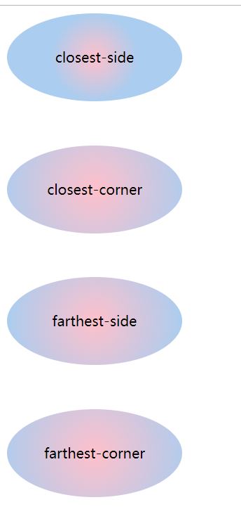
设置渐变的圆心位置
水平方向为宽度的10%,垂直方向为高度的20%
<!DOCTYPE html> <html lang="en" manifest="index.manifest"> <head> <meta charset="UTF-8"> <title>Document</title> <style> div{ width: 200px; height: 100px; margin-bottom:50px; line-height: 100px; text-align: center; /* background:-webkit-radial-gradient(circle, pink, #abcdef); background: -moz-radial-gradient(circle, pink, #abcdef); background: -o-radial-gradient(circle, pink, #abcdef); background: radial-gradient(circle, pink, #abcdef);*/ } div:nth-child(1){ background:-webkit-radial-gradient(10% 20%, closest-side circle, pink, #abcdef); background: -moz-radial-gradient(10% 20%, closest-side circle, pink, #abcdef); background: -o-radial-gradient(10% 20%, closest-side circle, pink, #abcdef); background: radial-gradient(10% 20%, closest-side circle, pink, #abcdef); } div:nth-child(2){ background:-webkit-radial-gradient(10% 20%, closest-corner circle, pink, #abcdef); background: -moz-radial-gradient(10% 20%, closest-corner circle, pink, #abcdef); background: -o-radial-gradient(10% 20%, closest-corner circle, pink, #abcdef); background: radial-gradient(10% 20%, closest-corner circle, pink, #abcdef); } div:nth-child(3){ background:-webkit-radial-gradient(10% 20%, farthest-side circle, pink, #abcdef); background: -moz-radial-gradient(10% 20%, farthest-side circle, pink, #abcdef); background: -o-radial-gradient(10% 20%, farthest-side circle, pink, #abcdef); background: radial-gradient(10% 20%, farthest-side circle, pink, #abcdef); } div:nth-child(4){ background:-webkit-radial-gradient(10% 20%, farthest-corner circle, pink, #abcdef); background: -moz-radial-gradient(10% 20%, farthest-corner circle, pink, #abcdef); background: -o-radial-gradient(10% 20%, farthest-corner circle, pink, #abcdef); background: radial-gradient(10% 20%, farthest-corner circle, pink, #abcdef); } </style> </head> <body> <div>closest-side</div> <div>closest-corner</div> <div>farthest-side</div> <div>farthest-corner</div> </body> </html>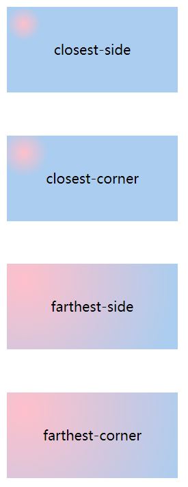
repeating-radial-gradient 重复径向渐变
<!DOCTYPE html> <html lang="en" manifest="index.manifest"> <head> <meta charset="UTF-8"> <title>Document</title> <style> div{ width: 200px; height: 100px; margin-bottom:50px; line-height: 100px; text-align: center; background:-webkit-repeating-radial-gradient(circle, pink, #abcdef 20%); background: -moz-repeating-radial-gradient(circle, pink, #abcdef 20%); background: -o-repeating-radial-gradient(circle, pink, #abcdef 20%); background: repeating-radial-gradient(circle, pink, #abcdef 20%); } </style> </head> <body> <div></div> </body> </html>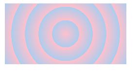
IE浏览器渐变
IE10+ 支持gradient 渐变
IE6-8 使用filter
<!DOCTYPE html> <html lang="en" manifest="index.manifest"> <head> <meta charset="UTF-8"> <title>Document</title> <style> div{ width: 200px; height: 100px; margin-bottom:50px; line-height: 100px; text-align: center; background:-webkit-repeating-radial-gradient(circle, pink, #abcdef 20%); background: -moz-repeating-radial-gradient(circle, pink, #abcdef 20%); background: -o-repeating-radial-gradient(circle, pink, #abcdef 20%); background: repeating-radial-gradient(circle, pink, #abcdef 20%); filter: progid:DXImageTransform.Microsoft.gradient(startcolorstr=pink,endcolorstr=#abcdef,gradientType=1); } </style> </head> <body> <div></div> </body> </html>
使用IE控制台可切换IE浏览器版本
IE filter
0 从左到右线性渐变
1 从上到下线性渐变
实际案例:
<!DOCTYPE html> <html lang="en" manifest="index.manifest"> <head> <meta charset="UTF-8"> <title>Document</title> <style> div{ width: 600px; height: 300px; background-color:#abcdef; background-size:100px 100px; background-image:-webkit-linear-gradient(45deg, pink 25%, transparent 25%), -webkit-linear-gradient(-45deg, pink 25%, transparent 25%), -webkit-linear-gradient(45deg, transparent 75%, pink 75%), -webkit-linear-gradient(-45deg, transparent 75%, pink 75%); background-image:-moz-linear-gradient(45deg, pink 25%, transparent 25%), -moz-linear-gradient(-45deg, pink 25%, transparent 25%), -moz-linear-gradient(45deg, transparent 75%, pink 75%), -moz-linear-gradient(-45deg, transparent 75%, pink 75%); background-image:-o-linear-gradient(45deg, pink 25%, transparent 25%), -o-linear-gradient(-45deg, pink 25%, transparent 25%), -o-linear-gradient(45deg, transparent 75%, pink 75%), -o-linear-gradient(-45deg, transparent 75%, pink 75%); background-image:linear-gradient(45deg, pink 25%, transparent 25%), linear-gradient(-45deg, pink 25%, transparent 25%), linear-gradient(45deg, transparent 75%, pink 75%), linear-gradient(-45deg, transparent 75%, pink 75%); } </style> </head> <body> <div></div> </body> </html>
以上是“如何通过css3背景控制属性+使用颜色过渡实现渐变效果”这篇文章的所有内容,感谢各位的阅读!相信大家都有了一定的了解,希望分享的内容对大家有所帮助,如果还想学习更多知识,欢迎关注亿速云行业资讯频道!
免责声明:本站发布的内容(图片、视频和文字)以原创、转载和分享为主,文章观点不代表本网站立场,如果涉及侵权请联系站长邮箱:is@yisu.com进行举报,并提供相关证据,一经查实,将立刻删除涉嫌侵权内容。


