这篇文章主要介绍了svg+css或者js怎么制作打钩的动画效果,具有一定借鉴价值,感兴趣的朋友可以参考下,希望大家阅读完这篇文章之后大有收获,下面让小编带着大家一起了解一下。
效果图: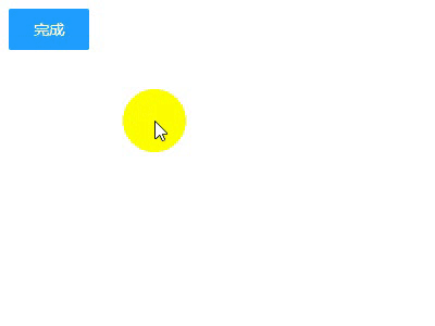
html代码
<!DOCTYPE html> <html lang="en"> <head> <meta charset="UTF-8"> <title>打钩动画</title> </head> <body> <div id="d1"> <input type="checkbox" style="display: none" id="love1" /> <label for="love1" id="btn1" >完成</label> <svg width="200px" height="200px"> <circle r="90" class="circle" fill="none" stroke="#2de540" stroke-width="10" cx="100" cy="100" stroke-linecap="round" transform="rotate(-90 100 100) " ></circle> <polyline fill="none" stroke="#2de540" stroke-width="10" points="44,107 86,137 152,69" stroke-linecap="round" stroke-linejoin="round" class="tick" ></polyline> </svg> <h3 style="text-align: center;width: 200px">成功</h3> </div> </body> <!--这里引入你本地的jq--> <script src="http://libs.baidu.com/jquery/2.0.0/jquery.min.js"></script> </html>
css代码
h3 { font-family: Helvetica; font-size: 30px; margin-top: 20px; color: #333; opacity: 0; } input[type="checkbox"]:checked+ label ~ h3 { animation: .6s title ease-in-out; animation-delay: 1.2s; animation-fill-mode: forwards; } .circle { stroke-dasharray: 1194; stroke-dashoffset: 1194; } input[type="checkbox"]:checked + label + svg .circle { animation: circle 1s ease-in-out; animation-fill-mode: forwards; } .tick { stroke-dasharray: 350; stroke-dashoffset: 350; } input[type="checkbox"]:checked + label+ svg .tick { animation: tick .8s ease-out; animation-fill-mode: forwards; animation-delay: .95s; } @keyframes circle { from { stroke-dashoffset: 1194; } to { stroke-dashoffset: 2388; } } @keyframes tick { from { stroke-dashoffset: 350; } to { stroke-dashoffset: 0; } } @keyframes title { from { opacity: 0; } to { opacity: 1; } } label { display: inline-block; height: 38px; width: 38px; line-height: 38px; padding: 0 18px; background-color: #1E9FFF; color: #fff; white-space: nowrap; text-align: center; font-size: 14px; border: none; border-radius: 2px; cursor: pointer; } #d1 { display: flex; justify-content: center; min-height: 100px; flex-direction: column; }写到这里本来应该就结束了 但是我们在真正实现功能的时候 不太可能用 checkbox切换动画效果的显示 一般还是需要按钮操作动画效果 下面是jq操作的代码 其实用jq的.animate()更好一些但是我是小白所以就偷了个懒 (ps:好吧其实是不会)直接用.css()
JavaScript代码
$("#btn1").on("click",function () { if($(this).text()==="完成"){ $(".circle").css({'animation':'circle 1s ease-in-out','animation-fill-mode':'forwards'}); $(".tick").css({'animation':'tick .8s ease-out','animation-fill-mode':'forwards','animation-delay':'.95s'}); $("h3").css({'animation':'.6s title ease-in-out','animation-fill-mode':'forwards','animation-delay':'1.2s'}) $(this).text("取消") }else{ $(".circle").css({'animation':'none','animation-fill-mode':'none'}); $(".tick").css({'animation':'none','animation-fill-mode':'none'}); $("h3").css({'animation':'none','animation-fill-mode':'none'}) $(this).text("完成") } });感谢你能够认真阅读完这篇文章,希望小编分享的“svg+css或者js怎么制作打钩的动画效果”这篇文章对大家有帮助,同时也希望大家多多支持亿速云,关注亿速云行业资讯频道,更多相关知识等着你来学习!
免责声明:本站发布的内容(图片、视频和文字)以原创、转载和分享为主,文章观点不代表本网站立场,如果涉及侵权请联系站长邮箱:is@yisu.com进行举报,并提供相关证据,一经查实,将立刻删除涉嫌侵权内容。


