这篇文章主要介绍使用css实现数据热点效果的案例,文中介绍的非常详细,具有一定的参考价值,感兴趣的小伙伴们一定要看完!
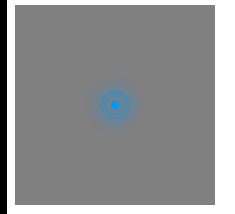
效果如下:

分析
1.这里看到的大概有三个圈 围着点在做放大动画
所以我们写四个盒子 点+3个圈
<!DOCTYPE html> <html lang="en"> <head> <meta charset="UTF-8"> <meta name="viewport" content="width=device-width, initial-scale=1.0"> <title>Document</title> <style> .city { width: 200px; height: 200px; background-color: gray; position: relative; } .pul { width: 8px; height: 8px; background-color: #09f; border-radius: 50%; top: 0; bottom: 0; left: 0; right: 0; margin: auto; position: absolute; } /* 选择类名有pul开头的属性 */ .city div[class^="pul"] { /* 居中 */ top: 0; bottom: 0; left: 0; right: 0; margin: auto; position: absolute; width: 8px; height: 8px; border-radius: 50%; box-shadow: 0px 0px 10px #09f; } </style> </head> <body> <div class="city"> <div class="pul"></div> <div class="pul1"></div> <div class="pul2"></div> <div class="pul3"></div> </div> </body> </html>
写完后 我们是需要给这三个圈 加放大的动画 但是可以看到 三个圈并不是同时触发动画的 所以需要给三个圈 设置不同的延迟时间 定义动画
/*定义动画*/ @keyframes pul { 0% {} 50% { width: 20px; height: 20px; opacity: 1; } 100% { width: 50px; height: 50px; opacity: 0; } }使用动画
.city>div:nth-child(2) { animation: pul 2s .5s linear infinite; } .city>div:nth-child(3) { animation: pul 2s 1s linear infinite; } .city>div:nth-child(4) { animation: pul 2s 1.5s linear infinite; }效果如下:
以上是“使用css实现数据热点效果的案例”这篇文章的所有内容,感谢各位的阅读!希望分享的内容对大家有帮助,更多相关知识,欢迎关注亿速云行业资讯频道!
免责声明:本站发布的内容(图片、视频和文字)以原创、转载和分享为主,文章观点不代表本网站立场,如果涉及侵权请联系站长邮箱:is@yisu.com进行举报,并提供相关证据,一经查实,将立刻删除涉嫌侵权内容。


