这篇文章给大家分享的是有关WPF自定义TabControl控件样式的案例的内容。小编觉得挺实用的,因此分享给大家做个参考,一起跟随小编过来看看吧。
一、前言
程序中经常会用到TabControl控件,默认的控件样式很普通。而且样式或功能不一定符合我们的要求。比如:我们需要TabControl的标题能够居中、或平均分布;或者我们希望TabControl的标题能够进行关闭。要实现这些功能我们需要对TabControl的样式进行定义。
二、实现TabControl的标题平均分布
默认的TabControl标题是使用TabPanel容器包含的。要想实现TabControl标题头平均分布,需要把TabPanel替换成UniformGrid;
替换后的TabControl样式如下:
<Style x:Key="TabControlStyle" TargetType="{x:Type TabControl}"> <Setter Property="Padding" Value="2"/> <Setter Property="HorizontalContentAlignment" Value="Center"/> <Setter Property="VerticalContentAlignment" Value="Center"/> <Setter Property="Background" Value="White"/> <Setter Property="BorderBrush" Value="#FFACACAC"/> <Setter Property="BorderThickness" Value="1"/> <Setter Property="Foreground" Value="{DynamicResource {x:Static SystemColors.ControlTextBrushKey}}"/> <Setter Property="Template"> <Setter.Value> <ControlTemplate TargetType="{x:Type TabControl}"> <Grid x:Name="templateRoot" ClipToBounds="True" SnapsToDevicePixels="True" KeyboardNavigation.TabNavigation="Local"> <Grid.ColumnDefinitions> <ColumnDefinition x:Name="ColumnDefinition0"/> <ColumnDefinition x:Name="ColumnDefinition1" Width="0"/> </Grid.ColumnDefinitions> <Grid.RowDefinitions> <RowDefinition x:Name="RowDefinition0" Height="Auto"/> <RowDefinition x:Name="RowDefinition1" Height="*"/> </Grid.RowDefinitions> <UniformGrid x:Name="HeaderPanel" Rows="1" Background="Transparent" Grid.Column="0" IsItemsHost="True" Margin="0" Grid.Row="0" KeyboardNavigation.TabIndex="1" Panel.ZIndex="1"/> <Line X1="0" X2="{Binding ActualWidth, RelativeSource={RelativeSource Self}}" Stroke="White" StrokeThickness="0.1" VerticalAlignment="Bottom" Margin="0 0 0 1" SnapsToDevicePixels="True"/> <Border x:Name="ContentPanel" BorderBrush="{TemplateBinding BorderBrush}" BorderThickness="{TemplateBinding BorderThickness}" Background="{TemplateBinding Background}" Grid.Column="0" KeyboardNavigation.DirectionalNavigation="Contained" Grid.Row="1" KeyboardNavigation.TabIndex="2" KeyboardNavigation.TabNavigation="Local"> <ContentPresenter x:Name="PART_SelectedContentHost" ContentTemplate="{TemplateBinding SelectedContentTemplate}" Content="{TemplateBinding SelectedContent}" ContentStringFormat="{TemplateBinding SelectedContentStringFormat}" ContentSource="SelectedContent" Margin="0" SnapsToDevicePixels="{TemplateBinding SnapsToDevicePixels}"/> </Border> </Grid> <ControlTemplate.Triggers> <Trigger Property="TabStripPlacement" Value="Bottom"> <Setter Property="Grid.Row" TargetName="HeaderPanel" Value="1"/> <Setter Property="Grid.Row" TargetName="ContentPanel" Value="0"/> <Setter Property="Height" TargetName="RowDefinition0" Value="*"/> <Setter Property="Height" TargetName="RowDefinition1" Value="Auto"/> </Trigger> <Trigger Property="TabStripPlacement" Value="Left"> <Setter Property="Grid.Row" TargetName="HeaderPanel" Value="0"/> <Setter Property="Grid.Row" TargetName="ContentPanel" Value="0"/> <Setter Property="Grid.Column" TargetName="HeaderPanel" Value="0"/> <Setter Property="Grid.Column" TargetName="ContentPanel" Value="1"/> <Setter Property="Width" TargetName="ColumnDefinition0" Value="Auto"/> <Setter Property="Width" TargetName="ColumnDefinition1" Value="*"/> <Setter Property="Height" TargetName="RowDefinition0" Value="*"/> <Setter Property="Height" TargetName="RowDefinition1" Value="0"/> </Trigger> <Trigger Property="TabStripPlacement" Value="Right"> <Setter Property="Grid.Row" TargetName="HeaderPanel" Value="0"/> <Setter Property="Grid.Row" TargetName="ContentPanel" Value="0"/> <Setter Property="Grid.Column" TargetName="HeaderPanel" Value="1"/> <Setter Property="Grid.Column" TargetName="ContentPanel" Value="0"/> <Setter Property="Width" TargetName="ColumnDefinition0" Value="*"/> <Setter Property="Width" TargetName="ColumnDefinition1" Value="Auto"/> <Setter Property="Height" TargetName="RowDefinition0" Value="*"/> <Setter Property="Height" TargetName="RowDefinition1" Value="0"/> </Trigger> <Trigger Property="IsEnabled" Value="False"> <Setter Property="TextElement.Foreground" TargetName="templateRoot" Value="{DynamicResource {x:Static SystemColors.GrayTextBrushKey}}"/> </Trigger> </ControlTemplate.Triggers> </ControlTemplate> </Setter.Value> </Setter> </Style>即使这样设置了,TabControl的标题还是很丑,这个时候就需要通过设置TabItem来更改标题样式了。
TabItem样式如下:
<Style x:Key="TabItemStyle" TargetType="{x:Type TabItem}"> <Setter Property="Foreground" Value="White"/> <Setter Property="Background" Value="Transparent"/> <Setter Property="BorderBrush" Value="#FFACACAC"/> <Setter Property="Margin" Value="0"/> <Setter Property="HorizontalContentAlignment" Value="Stretch"/> <Setter Property="VerticalContentAlignment" Value="Stretch"/> <Setter Property="Template"> <Setter.Value> <ControlTemplate TargetType="{x:Type TabItem}"> <Grid x:Name="templateRoot" SnapsToDevicePixels="True" Background="Transparent"> <TextBlock x:Name="txt" Visibility="Visible" VerticalAlignment="Center" HorizontalAlignment="Center" Text="{TemplateBinding Header}" ToolTip="{TemplateBinding Header}" Foreground="{TemplateBinding Foreground}" TextTrimming="CharacterEllipsis" /> </Grid> <ControlTemplate.Triggers> <MultiDataTrigger> <MultiDataTrigger.Conditions> <Condition Binding="{Binding IsMouseOver, RelativeSource={RelativeSource Self}}" Value="true"/> <Condition Binding="{Binding TabStripPlacement, RelativeSource={RelativeSource FindAncestor, AncestorLevel=1, AncestorType={x:Type TabControl}}}" Value="Top"/> </MultiDataTrigger.Conditions> <Setter Property="Foreground" TargetName="txt" Value="#fffea1"/> </MultiDataTrigger> <MultiDataTrigger> <MultiDataTrigger.Conditions> <Condition Binding="{Binding IsEnabled, RelativeSource={RelativeSource Self}}" Value="false"/> <Condition Binding="{Binding TabStripPlacement, RelativeSource={RelativeSource FindAncestor, AncestorLevel=1, AncestorType={x:Type TabControl}}}" Value="Left"/> </MultiDataTrigger.Conditions> <Setter Property="Opacity" TargetName="templateRoot" Value="0.56"/> </MultiDataTrigger> <MultiDataTrigger> <MultiDataTrigger.Conditions> <Condition Binding="{Binding IsEnabled, RelativeSource={RelativeSource Self}}" Value="false"/> <Condition Binding="{Binding TabStripPlacement, RelativeSource={RelativeSource FindAncestor, AncestorLevel=1, AncestorType={x:Type TabControl}}}" Value="Bottom"/> </MultiDataTrigger.Conditions> <Setter Property="Opacity" TargetName="templateRoot" Value="0.56"/> </MultiDataTrigger> <MultiDataTrigger> <MultiDataTrigger.Conditions> <Condition Binding="{Binding IsEnabled, RelativeSource={RelativeSource Self}}" Value="false"/> <Condition Binding="{Binding TabStripPlacement, RelativeSource={RelativeSource FindAncestor, AncestorLevel=1, AncestorType={x:Type TabControl}}}" Value="Right"/> </MultiDataTrigger.Conditions> <Setter Property="Opacity" TargetName="templateRoot" Value="0.56"/> </MultiDataTrigger> <MultiDataTrigger> <MultiDataTrigger.Conditions> <Condition Binding="{Binding IsEnabled, RelativeSource={RelativeSource Self}}" Value="false"/> <Condition Binding="{Binding TabStripPlacement, RelativeSource={RelativeSource FindAncestor, AncestorLevel=1, AncestorType={x:Type TabControl}}}" Value="Top"/> </MultiDataTrigger.Conditions> <Setter Property="Opacity" TargetName="templateRoot" Value="0.56"/> </MultiDataTrigger> <MultiDataTrigger> <MultiDataTrigger.Conditions> <Condition Binding="{Binding IsSelected, RelativeSource={RelativeSource Self}}" Value="true"/> <Condition Binding="{Binding TabStripPlacement, RelativeSource={RelativeSource FindAncestor, AncestorLevel=1, AncestorType={x:Type TabControl}}}" Value="Top"/> </MultiDataTrigger.Conditions> <Setter Property="Panel.ZIndex" Value="1"/> <Setter Property="Foreground" TargetName="txt" Value="#fffea1"/> </MultiDataTrigger> </ControlTemplate.Triggers> </ControlTemplate> </Setter.Value> </Setter> </Style>至此,样式已经设置完毕,引用示例:
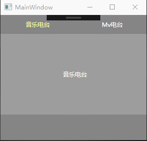
<Grid Background="#858586"> <TabControl Style="{StaticResource TabControlStyle}" Width="300" Height="200" Background="Transparent" BorderBrush="Transparent" BorderThickness="0"> <TabItem Style="{StaticResource TabItemStyle}" Cursor="Hand" Header="音乐电台" Height="38" > <Grid Background="#33ffffff"> <TextBlock Text="音乐电台" VerticalAlignment="Center" HorizontalAlignment="Center"/> </Grid> </TabItem> <TabItem Style="{StaticResource TabItemStyle}" Cursor="Hand" Header="Mv电台" Height="38" > <Grid Background="#33ffffff"> <TextBlock Text="Mv电台" VerticalAlignment="Center" HorizontalAlignment="Center"/> </Grid> </TabItem> </TabControl> </Grid>效果如下:
三、实现TabControl标题居中显示(不平均分布)
同理需要更改TabControl的样式和TabItem的样式。需要把使用TabPanel作为标题的容器,设置HorizontalAlignment为Center;
TabControl的样式如下:
<Style x:Key="TabControlWithUnderLineStyle" TargetType="{x:Type TabControl}"> <Setter Property="Padding" Value="2"/> <Setter Property="HorizontalContentAlignment" Value="Center"/> <Setter Property="VerticalContentAlignment" Value="Center"/> <Setter Property="Background" Value="White"/> <Setter Property="BorderBrush" Value="#FFACACAC"/> <Setter Property="BorderThickness" Value="1"/> <Setter Property="Foreground" Value="{DynamicResource {x:Static SystemColors.ControlTextBrushKey}}"/> <Setter Property="Template"> <Setter.Value> <ControlTemplate TargetType="{x:Type TabControl}"> <Grid x:Name="templateRoot" ClipToBounds="True" SnapsToDevicePixels="True" KeyboardNavigation.TabNavigation="Local"> <Grid.ColumnDefinitions> <ColumnDefinition x:Name="ColumnDefinition0"/> <ColumnDefinition x:Name="ColumnDefinition1" Width="0"/> </Grid.ColumnDefinitions> <Grid.RowDefinitions> <RowDefinition x:Name="RowDefinition0" Height="Auto"/> <RowDefinition x:Name="RowDefinition1" Height="*"/> </Grid.RowDefinitions> <TabPanel x:Name="HeaderPanel" HorizontalAlignment="Center" Background="Transparent" Grid.Column="0" IsItemsHost="True" Margin="0" Grid.Row="0" KeyboardNavigation.TabIndex="1" Panel.ZIndex="1"/> <Line X1="0" X2="{Binding ActualWidth, RelativeSource={RelativeSource Self}}" Stroke="Gray" StrokeThickness="0.1" VerticalAlignment="Bottom" Margin="0 0 0 1" SnapsToDevicePixels="True"/> <Border x:Name="ContentPanel" BorderBrush="{TemplateBinding BorderBrush}" BorderThickness="{TemplateBinding BorderThickness}" Background="{TemplateBinding Background}" Grid.Column="0" KeyboardNavigation.DirectionalNavigation="Contained" Grid.Row="1" KeyboardNavigation.TabIndex="2" KeyboardNavigation.TabNavigation="Local"> <ContentPresenter x:Name="PART_SelectedContentHost" ContentTemplate="{TemplateBinding SelectedContentTemplate}" Content="{TemplateBinding SelectedContent}" ContentStringFormat="{TemplateBinding SelectedContentStringFormat}" ContentSource="SelectedContent" Margin="0" SnapsToDevicePixels="{TemplateBinding SnapsToDevicePixels}"/> </Border> </Grid> <ControlTemplate.Triggers> <Trigger Property="TabStripPlacement" Value="Bottom"> <Setter Property="Grid.Row" TargetName="HeaderPanel" Value="1"/> <Setter Property="Grid.Row" TargetName="ContentPanel" Value="0"/> <Setter Property="Height" TargetName="RowDefinition0" Value="*"/> <Setter Property="Height" TargetName="RowDefinition1" Value="Auto"/> </Trigger> <Trigger Property="TabStripPlacement" Value="Left"> <Setter Property="Grid.Row" TargetName="HeaderPanel" Value="0"/> <Setter Property="Grid.Row" TargetName="ContentPanel" Value="0"/> <Setter Property="Grid.Column" TargetName="HeaderPanel" Value="0"/> <Setter Property="Grid.Column" TargetName="ContentPanel" Value="1"/> <Setter Property="Width" TargetName="ColumnDefinition0" Value="Auto"/> <Setter Property="Width" TargetName="ColumnDefinition1" Value="*"/> <Setter Property="Height" TargetName="RowDefinition0" Value="*"/> <Setter Property="Height" TargetName="RowDefinition1" Value="0"/> </Trigger> <Trigger Property="TabStripPlacement" Value="Right"> <Setter Property="Grid.Row" TargetName="HeaderPanel" Value="0"/> <Setter Property="Grid.Row" TargetName="ContentPanel" Value="0"/> <Setter Property="Grid.Column" TargetName="HeaderPanel" Value="1"/> <Setter Property="Grid.Column" TargetName="ContentPanel" Value="0"/> <Setter Property="Width" TargetName="ColumnDefinition0" Value="*"/> <Setter Property="Width" TargetName="ColumnDefinition1" Value="Auto"/> <Setter Property="Height" TargetName="RowDefinition0" Value="*"/> <Setter Property="Height" TargetName="RowDefinition1" Value="0"/> </Trigger> <Trigger Property="IsEnabled" Value="False"> <Setter Property="TextElement.Foreground" TargetName="templateRoot" Value="{DynamicResource {x:Static SystemColors.GrayTextBrushKey}}"/> </Trigger> </ControlTemplate.Triggers> </ControlTemplate> </Setter.Value> </Setter> </Style>TabItem样式如下:
<Style x:Key="TabItemExWithUnderLineStyle" TargetType="{x:Type TabItem}"> <Setter Property="Foreground" Value="White"/> <Setter Property="Background" Value="Transparent"/> <Setter Property="BorderBrush" Value="#FFACACAC"/> <Setter Property="Margin" Value="0"/> <Setter Property="HorizontalContentAlignment" Value="Stretch"/> <Setter Property="VerticalContentAlignment" Value="Stretch"/> <Setter Property="Template"> <Setter.Value> <ControlTemplate TargetType="{x:Type TabItem}"> <Grid x:Name="templateRoot" SnapsToDevicePixels="True" Background="Transparent"> <Border x:Name="_underline" BorderBrush="#37aefe" BorderThickness="0" Margin="{TemplateBinding Margin}"/> <Grid> <TextBlock x:Name="txt" Visibility="Visible" VerticalAlignment="Center" HorizontalAlignment="Center" Text="{TemplateBinding Header}" ToolTip="{TemplateBinding Header}" Foreground="{TemplateBinding Foreground}" TextTrimming="CharacterEllipsis" /> </Grid> </Grid> <ControlTemplate.Triggers> <MultiDataTrigger> <MultiDataTrigger.Conditions> <Condition Binding="{Binding IsMouseOver, RelativeSource={RelativeSource Self}}" Value="true"/> <Condition Binding="{Binding TabStripPlacement, RelativeSource={RelativeSource FindAncestor, AncestorLevel=1, AncestorType={x:Type TabControl}}}" Value="Top"/> </MultiDataTrigger.Conditions> <Setter Property="Foreground" TargetName="txt" Value="#37aefe"/> </MultiDataTrigger> <MultiDataTrigger> <MultiDataTrigger.Conditions> <Condition Binding="{Binding IsEnabled, RelativeSource={RelativeSource Self}}" Value="false"/> <Condition Binding="{Binding TabStripPlacement, RelativeSource={RelativeSource FindAncestor, AncestorLevel=1, AncestorType={x:Type TabControl}}}" Value="Left"/> </MultiDataTrigger.Conditions> <Setter Property="Opacity" TargetName="templateRoot" Value="0.56"/> </MultiDataTrigger> <MultiDataTrigger> <MultiDataTrigger.Conditions> <Condition Binding="{Binding IsEnabled, RelativeSource={RelativeSource Self}}" Value="false"/> <Condition Binding="{Binding TabStripPlacement, RelativeSource={RelativeSource FindAncestor, AncestorLevel=1, AncestorType={x:Type TabControl}}}" Value="Bottom"/> </MultiDataTrigger.Conditions> <Setter Property="Opacity" TargetName="templateRoot" Value="0.56"/> </MultiDataTrigger> <MultiDataTrigger> <MultiDataTrigger.Conditions> <Condition Binding="{Binding IsEnabled, RelativeSource={RelativeSource Self}}" Value="false"/> <Condition Binding="{Binding TabStripPlacement, RelativeSource={RelativeSource FindAncestor, AncestorLevel=1, AncestorType={x:Type TabControl}}}" Value="Right"/> </MultiDataTrigger.Conditions> <Setter Property="Opacity" TargetName="templateRoot" Value="0.56"/> </MultiDataTrigger> <MultiDataTrigger> <MultiDataTrigger.Conditions> <Condition Binding="{Binding IsEnabled, RelativeSource={RelativeSource Self}}" Value="false"/> <Condition Binding="{Binding TabStripPlacement, RelativeSource={RelativeSource FindAncestor, AncestorLevel=1, AncestorType={x:Type TabControl}}}" Value="Top"/> </MultiDataTrigger.Conditions> <Setter Property="Opacity" TargetName="templateRoot" Value="0.56"/> </MultiDataTrigger> <MultiDataTrigger> <MultiDataTrigger.Conditions> <Condition Binding="{Binding IsSelected, RelativeSource={RelativeSource Self}}" Value="true"/> <Condition Binding="{Binding TabStripPlacement, RelativeSource={RelativeSource FindAncestor, AncestorLevel=1, AncestorType={x:Type TabControl}}}" Value="Top"/> </MultiDataTrigger.Conditions> <Setter Property="Panel.ZIndex" Value="1"/> <Setter Property="Foreground" TargetName="txt" Value="#37aefe"/> <Setter Property="BorderThickness" TargetName="_underline" Value="0 0 0 2"/> </MultiDataTrigger> </ControlTemplate.Triggers> </ControlTemplate> </Setter.Value> </Setter> </Style>引用示例:
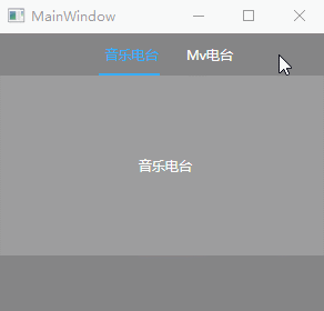
<Grid Background="#858586"> <TabControl Style="{StaticResource TabControlWithUnderLineStyle}" Foreground="Black" Width="300" Height="200" Background="Transparent" BorderBrush="Transparent" BorderThickness="0"> <TabItem Style="{StaticResource TabItemExWithUnderLineStyle}" Cursor="Hand" Header="音乐电台" Height="38" Width="70" Margin="5 0"> <Grid Background="#33ffffff"> <TextBlock Text="音乐电台" VerticalAlignment="Center" HorizontalAlignment="Center"/> </Grid> </TabItem> <TabItem Style="{StaticResource TabItemExWithUnderLineStyle}" Cursor="Hand" Header="Mv电台" Height="38" Width="70" Margin="5 0"> <Grid Background="#33ffffff"> <TextBlock Text="Mv电台" VerticalAlignment="Center" HorizontalAlignment="Center"/> </Grid> </TabItem> </TabControl> </Grid>效果如下:
四、带关闭按钮的TabControl
带关闭按钮的TabControl其实就是就是扩展TabItem,需要新建WPF自定义控件,命名为TabItemClose吧;
C#代码如下:
public class TabItemClose : TabItem { static TabItemClose() { DefaultStyleKeyProperty.OverrideMetadata(typeof(TabItemClose), new FrameworkPropertyMetadata(typeof(TabItemClose))); } private static void OnPropertyChanged(DependencyObject d, DependencyPropertyChangedEventArgs e) { d.SetValue(e.Property, e.NewValue); } /// <summary> /// 是否可以关闭 /// </summary> public bool IsCanClose { get { return (bool)GetValue(IsCanCloseProperty); } set { SetValue(IsCanCloseProperty, value); } } public static readonly DependencyProperty IsCanCloseProperty = DependencyProperty.Register("IsCanClose", typeof(bool), typeof(TabItemClose), new PropertyMetadata(true, OnPropertyChanged)); /// <summary> /// 关闭的图标 /// </summary> public ImageSource CloseIcon { get { return (ImageSource)GetValue(CloseIconProperty); } set { SetValue(CloseIconProperty, value); } } public static readonly DependencyProperty CloseIconProperty = DependencyProperty.Register("CloseIcon", typeof(ImageSource), typeof(TabItemClose), new PropertyMetadata(null, OnPropertyChanged)); /// <summary> /// 正常背景色 /// </summary> public SolidColorBrush NormalBackground { get { return (SolidColorBrush)GetValue(NormalBackgroundProperty); } set { SetValue(NormalBackgroundProperty, value); } } public static readonly DependencyProperty NormalBackgroundProperty = DependencyProperty.Register("NormalBackground", typeof(SolidColorBrush), typeof(TabItemClose), new PropertyMetadata(null, OnPropertyChanged)); /// <summary> /// 悬浮背景色 /// </summary> public SolidColorBrush OverBackgound { get { return (SolidColorBrush)GetValue(OverBackgoundProperty); } set { SetValue(OverBackgoundProperty, value); } } public static readonly DependencyProperty OverBackgoundProperty = DependencyProperty.Register("OverBackgound", typeof(SolidColorBrush), typeof(TabItemClose), new PropertyMetadata(null, OnPropertyChanged)); /// <summary> /// 选中背景色 /// </summary> public SolidColorBrush SelectedBackgound { get { return (SolidColorBrush)GetValue(SelectedBackgoundProperty); } set { SetValue(SelectedBackgoundProperty, value); } } public static readonly DependencyProperty SelectedBackgoundProperty = DependencyProperty.Register("SelectedBackgound", typeof(SolidColorBrush), typeof(TabItemClose), new PropertyMetadata(null, OnPropertyChanged)); /// <summary> /// 默认前景色 /// </summary> public SolidColorBrush NormalForeground { get { return (SolidColorBrush)GetValue(NormalForegroundProperty); } set { SetValue(NormalForegroundProperty, value); } } public static readonly DependencyProperty NormalForegroundProperty = DependencyProperty.Register("NormalForeground", typeof(SolidColorBrush), typeof(TabItemClose), new PropertyMetadata(null, OnPropertyChanged)); /// <summary> /// 悬浮前景色 /// </summary> public SolidColorBrush OverForeground { get { return (SolidColorBrush)GetValue(OverForegroundProperty); } set { SetValue(OverForegroundProperty, value); } } public static readonly DependencyProperty OverForegroundProperty = DependencyProperty.Register("OverForeground", typeof(SolidColorBrush), typeof(TabItemClose), new PropertyMetadata(null, OnPropertyChanged)); /// <summary> /// 选中前景色 /// </summary> public SolidColorBrush SelectedForeground { get { return (SolidColorBrush)GetValue(SelectedForegroundProperty); } set { SetValue(SelectedForegroundProperty, value); } } public static readonly DependencyProperty SelectedForegroundProperty = DependencyProperty.Register("SelectedForeground", typeof(SolidColorBrush), typeof(TabItemClose), new PropertyMetadata(null, OnPropertyChanged)); /// <summary> /// 控件圆角 /// </summary> public CornerRadius CornerRadius { get { return (CornerRadius)GetValue(CornerRadiusProperty); } set { SetValue(CornerRadiusProperty, value); } } public static readonly DependencyProperty CornerRadiusProperty = DependencyProperty.Register("CornerRadius", typeof(CornerRadius), typeof(TabItemClose), new PropertyMetadata(new CornerRadius(0), OnPropertyChanged)); /// <summary> /// 前置Logo /// </summary> public ImageSource LogoIcon { get { return (ImageSource)GetValue(LogoIconProperty); } set { SetValue(LogoIconProperty, value); } } public static readonly DependencyProperty LogoIconProperty = DependencyProperty.Register("LogoIcon", typeof(ImageSource), typeof(TabItemClose), new PropertyMetadata(null, OnPropertyChanged)); /// <summary> /// 前置Logo宽度 /// </summary> public double LogoIconWidth { get { return (double)GetValue(LogoIconWidthProperty); } set { SetValue(LogoIconWidthProperty, value); } } public static readonly DependencyProperty LogoIconWidthProperty = DependencyProperty.Register("LogoIconWidth", typeof(double), typeof(TabItemClose), new PropertyMetadata(double.Parse("0"), OnPropertyChanged)); /// <summary> /// 前置Logo高度 /// </summary> public double LogoIconHeigth { get { return (double)GetValue(LogoIconHeigthProperty); } set { SetValue(LogoIconHeigthProperty, value); } } public static readonly DependencyProperty LogoIconHeigthProperty = DependencyProperty.Register("LogoIconHeigth", typeof(double), typeof(TabItemClose), new PropertyMetadata(double.Parse("0"), OnPropertyChanged)); /// <summary> /// LogoPadding /// </summary> public Thickness LogoPadding { get { return (Thickness)GetValue(LogoPaddingProperty); } set { SetValue(LogoPaddingProperty, value); } } public static readonly DependencyProperty LogoPaddingProperty = DependencyProperty.Register("LogoPadding", typeof(Thickness), typeof(TabItemClose), new PropertyMetadata(new Thickness(0), OnPropertyChanged)); /// <summary> /// 关闭item事件 /// </summary> public event RoutedEventHandler CloseItem { add { AddHandler(CloseItemEvent, value); } remove { RemoveHandler(CloseItemEvent, value); } } public static readonly RoutedEvent CloseItemEvent = EventManager.RegisterRoutedEvent("CloseItem", RoutingStrategy.Bubble, typeof(RoutedEventHandler), typeof(TabItemClose)); /// <summary> /// 关闭项的右键菜单 /// </summary> public ContextMenu ItemContextMenu { get; set; } Border ItemBorder; public override void OnApplyTemplate() { base.OnApplyTemplate(); ItemBorder = Template.FindName("_bordertop", this) as Border; if (ItemContextMenu != null) { ItemBorder.ContextMenu = ItemContextMenu; } } }这里面我们添加了很多扩展功能,包括右键菜单,图标显示和控件圆角,以及各种背景色属性。
然后为TabItemClose设置样式
<Style TargetType="{x:Type local:TabItemClose}"> <Setter Property="HorizontalContentAlignment" Value="Stretch"/> <Setter Property="VerticalContentAlignment" Value="Stretch"/> <Setter Property="Foreground" Value="#666666"/> <Setter Property="Margin" Value="0 0 0 0"/> <Setter Property="Padding" Value="0"/> <Setter Property="BorderThickness" Value="0"/> <Setter Property="CloseIcon" Value="/Images/close2.png"/> <Setter Property="NormalBackground" Value="White"/> <Setter Property="OverBackgound" Value="#33ca5100"/> <Setter Property="SelectedBackgound" Value="#ca5100"/> <Setter Property="NormalForeground" Value="#555558"/> <Setter Property="OverForeground" Value="White"/> <Setter Property="SelectedForeground" Value="White"/> <Setter Property="Template"> <Setter.Value> <ControlTemplate TargetType="{x:Type local:TabItemClose}"> <Border x:Name="_bordertop" Width="{TemplateBinding Width}" MaxWidth="{TemplateBinding MaxWidth}" Height="{TemplateBinding Height}" CornerRadius="{TemplateBinding CornerRadius}" Background="{TemplateBinding NormalBackground}" BorderThickness="{TemplateBinding BorderThickness}" BorderBrush="{TemplateBinding BorderBrush}" ToolTip="{TemplateBinding Header}" > <DockPanel> <Image x:Name="_logo" DockPanel.Dock="Left" Visibility="Visible" Margin="{TemplateBinding LogoPadding}" Source="{TemplateBinding LogoIcon}" VerticalAlignment="Center" HorizontalAlignment="Center" Stretch="Uniform" Width="{TemplateBinding LogoIconWidth}" Height="{TemplateBinding LogoIconHeigth}" /> <Grid Name="_grid" SnapsToDevicePixels="True"> <Grid.ColumnDefinitions> <ColumnDefinition Width="*" /> <ColumnDefinition x:Name="_col_close" Width="20" /> </Grid.ColumnDefinitions> <Border Grid.ColumnSpan="2" Background="White" Opacity="0"/> <TextBlock x:Name="_txt" VerticalAlignment="Center" TextTrimming="CharacterEllipsis" Margin="3 0 3 0" Foreground="{TemplateBinding NormalForeground}" TextAlignment="Center" HorizontalAlignment="Center" Text="{TemplateBinding Header}" /> <Grid x:Name="_gridclose" Grid.Column="1" > <Border x:Name="_borderbg" Background="Black" Opacity="0" /> <local:ButtonEx x:Name="PART_Close_TabItem" HorizontalAlignment="Center" VerticalAlignment="Center" Background="Transparent" Visibility="Visible" Icon="{TemplateBinding CloseIcon}" ButtonType="Icon" /> </Grid> </Grid> </DockPanel> </Border> <ControlTemplate.Triggers> <Trigger Property="LogoIcon" Value="{x:Null}"> <Setter TargetName="_logo" Property="Visibility" Value="Collapsed" /> </Trigger> <Trigger Property="IsCanClose" Value="false"> <Setter TargetName="_gridclose" Property="Visibility" Value="Collapsed"/> <Setter TargetName="_col_close" Property="Width" Value="0"/> </Trigger> <Trigger Property="IsSelected" Value="true"> <Setter TargetName="_bordertop" Property="Background" Value="{Binding SelectedBackgound,RelativeSource={RelativeSource TemplatedParent}}" /> <Setter TargetName="_txt" Property="Foreground" Value="{Binding SelectedForeground,RelativeSource={RelativeSource TemplatedParent}}"/> </Trigger> <MultiTrigger> <MultiTrigger.Conditions> <Condition Property="IsMouseOver" Value="true"/> <Condition Property="IsSelected" Value="false"/> </MultiTrigger.Conditions> <Setter TargetName="_txt" Property="Foreground" Value="{Binding OverForeground,RelativeSource={RelativeSource TemplatedParent}}"/> <Setter TargetName="_bordertop" Property="Background" Value="{Binding OverBackgound,RelativeSource={RelativeSource TemplatedParent}}"/> </MultiTrigger> </ControlTemplate.Triggers> </ControlTemplate> </Setter.Value> </Setter> </Style>这里面使用了一个close的图标

TabControl的图标可设置可不设置,看自己需要。
这里面还用到了前面讲的控件ButtonEx,定义方法我就不重复赘述了。大家可以通过这个链接跳转查看:https://www.jb51.net/article/138475.htm。ButtonEx.cs里面还要添加几个方法用来支持关闭TabItem:
protected override void OnClick() { base.OnClick(); if (!string.IsNullOrEmpty(Name) && Name == "PART_Close_TabItem") { TabItemClose itemclose = FindVisualParent<TabItemClose>(this); (itemclose.Parent as TabControl).Items.Remove(itemclose); RoutedEventArgs args = new RoutedEventArgs(TabItemClose.CloseItemEvent, itemclose); itemclose.RaiseEvent(args); } } public static T FindVisualParent<T>(DependencyObject obj) where T : class { while (obj != null) { if (obj is T) return obj as T; obj = VisualTreeHelper.GetParent(obj); } return null; }引用示例:
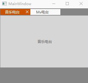
<Grid Background="#858586"> <TabControl Foreground="Black" Width="300" Height="200" Background="Transparent" BorderBrush="Transparent" BorderThickness="0"> <local:TabItemClose Cursor="Hand" Header="音乐电台" Height="20" Width="100"> <Grid Background="#aaffffff"> <TextBlock Text="音乐电台" VerticalAlignment="Center" HorizontalAlignment="Center"/> </Grid> </local:TabItemClose> <local:TabItemClose Cursor="Hand" Header="Mv电台" Height="20" Width="100"> <Grid Background="#aaffffff"> <TextBlock Text="Mv电台" VerticalAlignment="Center" HorizontalAlignment="Center"/> </Grid> </local:TabItemClose> </TabControl> </Grid>
效果如下:
感谢各位的阅读!关于“WPF自定义TabControl控件样式的案例”这篇文章就分享到这里了,希望以上内容可以对大家有一定的帮助,让大家可以学到更多知识,如果觉得文章不错,可以把它分享出去让更多的人看到吧!
免责声明:本站发布的内容(图片、视频和文字)以原创、转载和分享为主,文章观点不代表本网站立场,如果涉及侵权请联系站长邮箱:is@yisu.com进行举报,并提供相关证据,一经查实,将立刻删除涉嫌侵权内容。


