本篇文章为大家展示了如何在vue项目中引入highcharts图表,内容简明扼要并且容易理解,绝对能使你眼前一亮,通过这篇文章的详细介绍希望你能有所收获。
npm进行highchars的导入,导入完成后就可以进行highchars的可视化组件开发了
npm install highcharts --save
1、components目录下新建一个chart.vue组件
<template> <div class="chart" id="myChart" > <div class="emcs_charts" :id="id" ></div> </div> </template> <script> // 引入highCharts模块 import HighCharts from 'highcharts' // 引入这个图表的外部资源数据 import data from '../echarts_data/chart.js' export default { data() { // 将引入的数据写在自己的组件中 let dataObj = data.bar return{ id: 'chart', dataObj: dataObj } }, mounted() {//钩子函数挂载时实例化这个图表 // chart(参数1,参数2);第一个参数挂载组件的容器,第二个参数为图表所需要的数据对象 HighCharts.chart(this.id,this.dataObj) } } </script> <style scoped lang='stylus'> .chart{ float left ; background-color #fff; padding 10px 0; margin-top 20px; border-radius 6px width 49.5%; .emcs_charts{ min-width 890px; height 280px; } } </style>2、chart组件建好后,开始创建chart-options目录,里面创建一个chart.js用来存放模拟的chart数据
如下图我写的一个面积图的数据
module.exports = { bar: { chart: {//图表样式 type:'area',//指定图表的类型,这里是面积图 }, //是否启用Labels。x,y轴默认值都是true,如果想禁用(或不显示)Labels,设置该属性为false即可 credits: { enabled:false }, title: {//指定图表标题 text: ' 设备监控', align: 'left', style:{ color: '#666', fontSize:'16px', } }, colors: ['rgba(86,199,99,1)','rgba(226,188,37,1)','rgba(255,133,133,1)'], xAxis: {//图表的横坐标,一个轴为{ } title:{//横坐标标题 text:'' }, //x坐标轴的刻度值 categories: ['4:40','4:41','4:42','4:43','4:44', '4:45', '4:46', '4:47', '4:48', '4:49', '4:50','4:51','4:52','4:53','4:54', '4:55', '4:56', '4:57', '4:58', '4:59', '5:00', '5:01', '5:02', '5:03', '5:04', '5:05', '5:06', '5:07', '5:08', '5:09', '5:10', '5:11', '5:12', '5:13', '5:14', '5:15', '5:16', '5:17', '5:18', '5:19', '5:20', '5:21', '5:22', '5:23', '5:24', '5:25', '5:26', '5:27', '5:28', '5:29', '5:30', '5:31', '5:32', '5:33', '5:34', '5:35', '5:36', '5:37', '5:38', '5:39', '5:40'], //指定x轴分组 labels: {//坐标轴上的刻度值(显示间隔、样式、单位) style: { color: '#999999' }, format:'{value}pm',//刻度值的单位 align: 'center' }, lineColor: '#dfdfdf',//坐标轴的颜色 tickColor: '#dfdfdf',//坐标轴上的刻度线的颜色 tickLength: 5,//坐标轴上刻度线的长度 gridLineWidth:1,//网格线宽度。x轴默认为0,y轴默认为1px。 gridLineColor:'#f2f2f2',//网格线颜色。默认为:#C0C0C0。 // gridLineDashStyle: 'Dash',//网格线线条样式。和Css border-style类似,常用的有:Solid、Dot、Dash tickInterval: 5,//刻度间隔 tickmarkPlacement: 'between',//刻度线对齐方式,有between和on可选,默认是between style: { color: '#999999', fontSize:10 }, crosshair:{//鼠标放上后显示纵轴的数据 color:'#999', width:1 } }, yAxis: [{//图表的纵坐标,多个轴[{轴一},{轴二}] gridLineWidth: 1, gridLineColor:'#f2f2f2', tickPositions: [0, 25, 50, 75, 100],//y轴刻度值 tickLength:0, title: {//纵坐标标题 text: ' ', margin:0, style: { color: '#999999', fontSize:10 } }, labels:{//坐标轴上刻度的样式及单位 style: { color: '#999999', fontSize:10 }, format:'{value}%',//坐标轴上的单位 }, offset:-10,//距离坐标轴的距离 },{ gridLineWidth: 1, gridLineColor:'#f2f2f2', tickColor: '#fff', tickInterval:25, tickLength:0, title: { text: '', margin:0, style: { color: '#999999', fontSize:10 } }, labels:{ style: { color: '#999999', fontSize:10 }, format:'{value}℃' }, opposite:true,//设置opposite: true表示该轴位置反转,即为y轴时显示在右侧 offset:-10 }], tooltip: {//数据提示框 headerFormat: '<small>{point.key}</small><br/>',//标题格式 pointFormat: '<span >{series.name}</span>:{point.y}<br/>', shared: true, followPointer:true,//跟随鼠标 followPointerMove:true,//是否跟随手指移动 // footerFormat: 'muzi',//尾部格式化字符串 style:{ fontSize:10, fontFamily:'微软雅黑', fontWeight:'normal', color:'#666' } }, //标示线总是垂直于它属于的轴。它可单独定义在x轴或y轴,也可以同时定义在x轴和y轴 plotOptions: { area: { //pointStart: 1940, marker: { enabled: false, symbol: 'circle', radius: 2, states: { hover: { enabled: true } } }, fillOpacity:0.2, lineWidth:1 } }, legend: {//图例居中显示在图表下方 align: 'center', symbolRadius:5,//图标圆角 symbolWidth:10,//图标宽度 symbolHeight:10,//图标高度 itemStyle: { color: '#999999', fontWeight:'normal', fontSize:12 }, itemMarginBottom: -14,//图例项底部外边距 }, series: [{//数据列是一组数据集合 name: 'CPU',//name 代表数据列的名字,并且会显示在数据提示框(Tooltip)及图例(Legend)中 data: [ 5, 6, 10, 20, 50, 45, 30, 20, 10, 15, 16, 17, 18, 18, 30, 26, 25, 24, 20, 26, 36, 46, 50, 51, 52, 40, 30, 20, 19, 18, 30, 50, 55, 56, 70, 72, 73, 60, 55, 54, 53, 40, 39, 35, 32, 30, 20, 18, 3, 5, 10, 12, 13, 23, 34, 56, 60, 70, 80, 90, 80 ], tooltip: { valueSuffix:'%' } }, { name: 'RAM', data:[ 16, 17, 18, 18, 30, 26, 25, 24, 20, 26, 36, 46, 50, 51, 52, 40, 30, 20, 19, 18, 30, 50, 55, 56, 70, 72, 73, 60, 55, 54, 53, 40, 39, 35, 32, 30, 20, 18, 3, 5, 10, 12, 13, 23, 34, 56, 60, 70, 80, 90, 5, 6, 10, 20, 50, 45, 30, 20, 10, 15, 20 ], tooltip: { valueSuffix:'%' } }, { name: '温度', data:[ 10, 11, 11, 12, 12, 13, 14, 15, 16, 16, 16, 16, 16, 16, 16, 16, 16, 16, 16, 16, 16, 16, 16, 16, 16, 16, 16, 16, 16, 16, 16, 16, 16, 16, 16, 16, 16, 16, 16, 16, 16, 16, 16, 16, 16, 16, 16, 16, 16, 16, 16, 16, 16, 16, 16, 16, 16, 16, 16, 16, 16 ], tooltip: { valueSuffix:'℃'//值的前缀、后缀及小数点 }, yAxis:1 }] } }3、父组件引用chart.vue子组件
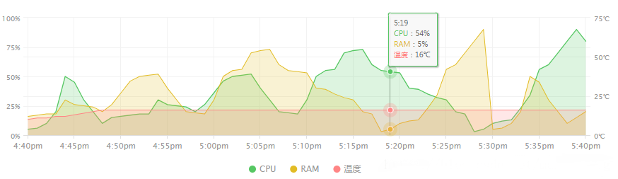
<template> <div class="charts" id="myChart" > <x-chart ></x-chart> </div> </template> <script> // 导入chart.vue子组件 import XChart from './chart.vue' export default { components: { XChart } } </script> <style scoped lang='stylus'> </style>效果如下图所示
上述内容就是如何在vue项目中引入highcharts图表,你们学到知识或技能了吗?如果还想学到更多技能或者丰富自己的知识储备,欢迎关注亿速云行业资讯频道。
免责声明:本站发布的内容(图片、视频和文字)以原创、转载和分享为主,文章观点不代表本网站立场,如果涉及侵权请联系站长邮箱:is@yisu.com进行举报,并提供相关证据,一经查实,将立刻删除涉嫌侵权内容。


