plotly可以制作交互式图表,直接上代码:
import plotly.offline as py from plotly.graph_objs import Scatter, Layout import plotly.graph_objs as go py.init_notebook_mode(connected=True) import pandas as pd import numpy as np
In [412]:
#读取数据 df=pd.read_csv('seaborn.csv',sep=',',encoding='utf-8',index_col=0) #展示数据 df.head() Out[412]: | Name | Type 1 | Type 2 | Total | HP | Attack | Defense | Sp. Atk | Sp. Def | Speed | Stage | Legendary | |
|---|---|---|---|---|---|---|---|---|---|---|---|---|
| # | ||||||||||||
| 1 | Bulbasaur | Grass | Poison | 318 | 45 | 49 | 49 | 65 | 65 | 45 | 1 | False |
| 2 | Ivysaur | Grass | Poison | 405 | 60 | 62 | 63 | 80 | 80 | 60 | 2 | False |
| 3 | Venusaur | Grass | Poison | 525 | 80 | 82 | 83 | 100 | 100 | 80 | 3 | False |
| 4 | Charmander | Fire | NaN | 309 | 39 | 52 | 43 | 60 | 50 | 65 | 1 | False |
| 5 | Charmeleon | Fire | NaN | 405 | 58 | 64 | 58 | 80 | 65 | 80 | 2 | False |
In [413]:
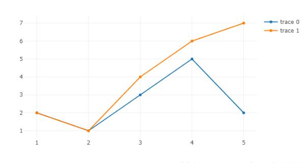
#plotly折线图,trace就代表折现的条数 trace1=go.Scatter(x=df['Attack'],y=df['Defense']) trace1=go.Scatter(x=[1,2,3,4,5],y=[2,1,3,5,2]) trace2=go.Scatter(x=[1,2,3,4,5],y=[2,1,4,6,7]) py.iplot([trace1,trace2])
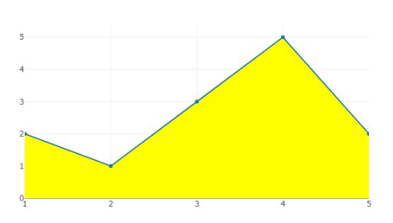
#填充区域 trace1=go.Scatter(x=[1,2,3,4,5],y=[2,1,3,5,2],fill="tonexty",fillcolor="#FF0") py.iplot([trace1])
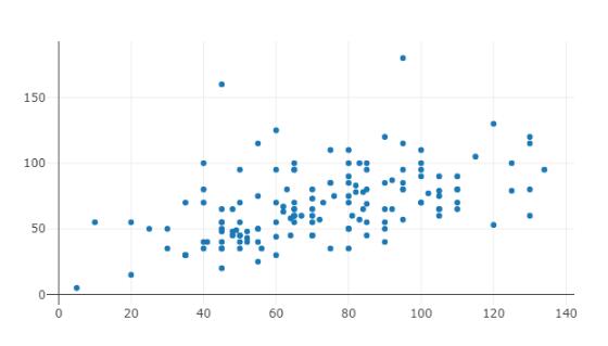
# 散点图 trace1=go.Scatter(x=[1,2,3,4,5],y=[2,1,3,5,2],mode='markers') trace1=go.Scatter(x=df['Attack'],y=df['Defense'],mode='markers') py.iplot([trace1],filename='basic-scatter')
#气泡图 x=df['Attack'] y=df['Defense'] colors = np.random.rand(len(x))#set color equal to a variable sz =df['Defense'] fig = go.Figure() fig.add_scatter(x=x,y=y,mode='markers',marker={'size': sz,'color': colors,'opacity': 0.7,'colorscale': 'Viridis','showscale': True}) py.iplot(fig) 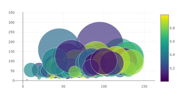
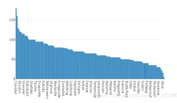
#bar 柱状图 df1=df[['Name','Defense']].sort_values(['Defense'],ascending=[0]) data = [go.Bar(x=df1['Name'],y=df1['Defense'])] py.iplot(data, filename='jupyter-basic_bar')
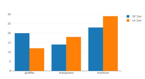
#组合bar group trace1 = go.Bar(x=['giraffes', 'orangutans', 'monkeys'],y=[20, 14, 23],name='SF Zoo') trace2 = go.Bar(x=['giraffes', 'orangutans', 'monkeys'],y=[12, 18, 29],name='LA Zoo') data = [trace1, trace2] layout = go.Layout( barmode='group') fig = go.Figure(data=data, layout=layout) py.iplot(fig, filename='grouped-bar')
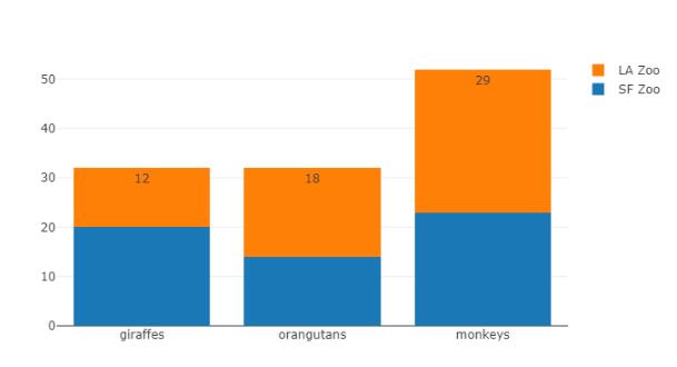
#组合bar gstack上下组合 trace1 = go.Bar(x=['giraffes', 'orangutans', 'monkeys'],y=[20, 14, 23],name='SF Zoo') trace2 = go.Bar(x=['giraffes', 'orangutans', 'monkeys'],y=[12, 18, 29],name='LA Zoo',text=[12, 18, 29],textposition = 'auto') data = [trace1, trace2] layout = go.Layout( barmode='stack') fig = go.Figure(data=data, layout=layout) py.iplot(fig, filename='grouped-bar')
#饼图 fig = { "data": [ { "values": df['Defense'][0:3], "labels": df['Name'][0:3], "domain": {"x": [0,1]}, "name": "GHG Emissions", "hoverinfo":"label+percent+name", "hole": .4, "type": "pie" } ], "layout": { "title":"Global Emissions 1990-2011", "annotations": [ { "font": {"size": 20}, "showarrow": False, "text": "GHG", "x": 0.5, "y": 0.5 } ] } } py.iplot(fig, filename='donut') 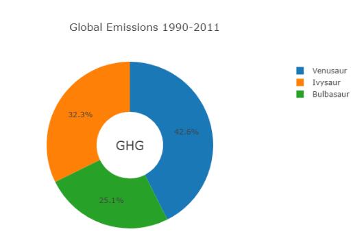
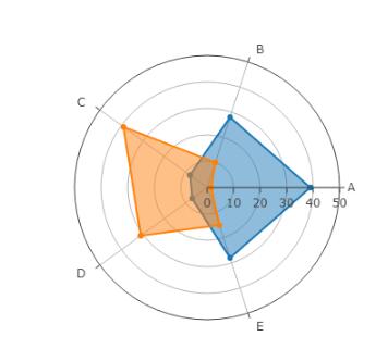
# Learn about API authentication here: https://plot.ly/pandas/getting-started # Find your api_key here: https://plot.ly/settings/api #雷达图 data = [ go.Scatterpolar( r = [39, 28, 8, 7, 28, 39], theta = ['A','B','C', 'D', 'E', 'A'], fill = 'toself', name = 'Group A' ), go.Scatterpolar( r = [1.5, 10, 39, 31, 15, 1.5], theta = ['A','B','C', 'D', 'E', 'A'], fill = 'toself', name = 'Group B' ) ] layout = go.Layout( polar = dict( radialaxis = dict( visible = True, range = [0, 50] ) ), showlegend = False ) fig = go.Figure(data=data, layout=layout) py.iplot(fig, filename = "radar/multiple")
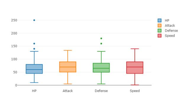
#box 箱子图 df_box=df[['HP','Attack','Defense','Speed']] data = [] for col in df_box.columns: data.append(go.Box(y=df_box[col], name=col, showlegend=True ) ) #data.append( go.Scatter(x= df_box.columns, y=df.mean(), mode='lines', name='mean' ) ) py.iplot(data, filename='pandas-box-plot')
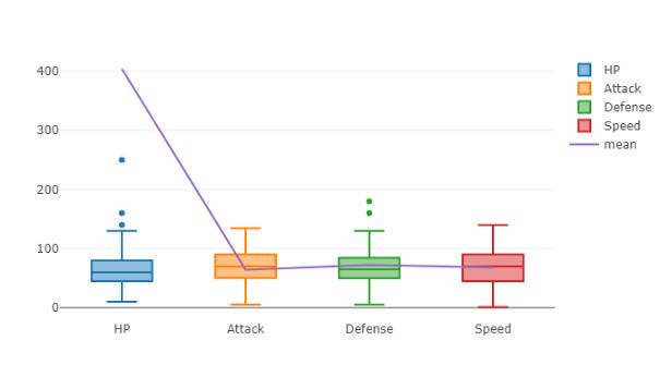
#箱子图加平均线 df_box=df[['HP','Attack','Defense','Speed']] data = [] for col in df_box.columns: data.append(go.Box(y=df_box[col], name=col, showlegend=True) ) data.append( go.Scatter(x= df_box.columns, y=df.mean(), mode='lines', name='mean' ) ) py.iplot(data, filename='pandas-box-plot')
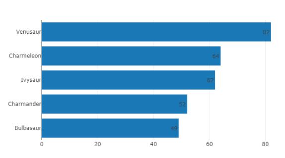
#Basic Horizontal Bar Chart 条形图 plotly条形图 df_hb=df[['Name','Attack','Defense','Speed']][0:5].sort_values(['Attack'],ascending=[1]) data = [ go.Bar( y=df_hb['Name'], # assign x as the dataframe column 'x' x=df_hb['Attack'], orientation='h', text=df_hb['Attack'], textposition = 'auto' ) ] py.iplot(data, filename='pandas-horizontal-bar')
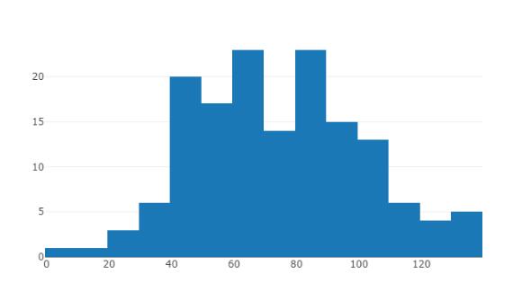
#直方图Histogram data = [go.Histogram(x=df['Attack'])] py.iplot(data, filename='basic histogram')
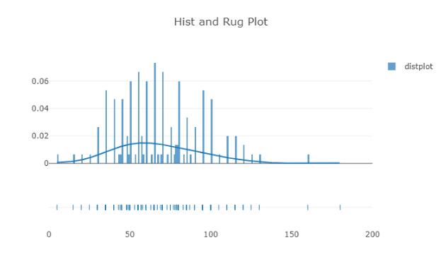
#distplot import plotly.figure_factory as ff hist_data =[df['Defense']] group_labels = ['distplot'] fig = ff.create_distplot(hist_data, group_labels) # Add title fig['layout'].update(title='Hist and Rug Plot',xaxis=dict(range=[0,200])) py.iplot(fig, filename='Basic Distplot')
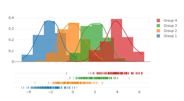
# Add histogram data x1 = np.random.randn(200)-2 x2 = np.random.randn(200) x3 = np.random.randn(200)+2 x4 = np.random.randn(200)+4 # Group data together hist_data = [x1, x2, x3, x4] group_labels = ['Group 1', 'Group 2', 'Group 3', 'Group 4'] # Create distplot with custom bin_size fig = ff.create_distplot(hist_data, group_labels,) # Plot! py.iplot(fig, filename='Distplot with Multiple Datasets')
好了,以上就是我研究的plotly,欢迎朋友们评论,补充,一起学习!
以上这篇基于python plotly交互式图表大全就是小编分享给大家的全部内容了,希望能给大家一个参考,也希望大家多多支持亿速云。
免责声明:本站发布的内容(图片、视频和文字)以原创、转载和分享为主,文章观点不代表本网站立场,如果涉及侵权请联系站长邮箱:is@yisu.com进行举报,并提供相关证据,一经查实,将立刻删除涉嫌侵权内容。


