жё©йҰЁжҸҗзӨәГ—
жӮЁеҘҪпјҢзҷ»еҪ•еҗҺжүҚиғҪдёӢи®ўеҚ•е“ҰпјҒ
еҜҶз Ғзҷ»еҪ•Г—
зҷ»еҪ•жіЁеҶҢГ—
зӮ№еҮ» зҷ»еҪ•жіЁеҶҢ еҚіиЎЁзӨәеҗҢж„ҸгҖҠдәҝйҖҹдә‘з”ЁжҲ·жңҚеҠЎжқЎж¬ҫгҖӢ
з”ЁжҲ·зҷ»еҪ•Г—
жӮЁеҘҪпјҢзҷ»еҪ•еҗҺжүҚиғҪдёӢи®ўеҚ•е“ҰпјҒ
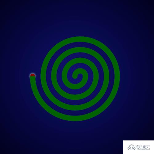
жҖҺд№ҲдҪҝз”ЁзәҜCSSе®һзҺ°иҡҠйҰҷзҮғзғ§зҡ„ж•ҲжһңпјҹиҝҷдёӘй—®йўҳеҸҜиғҪжҳҜжҲ‘们ж—ҘеёёеӯҰд№ жҲ–е·ҘдҪңз»Ҹеёёи§ҒеҲ°зҡ„гҖӮеёҢжңӣйҖҡиҝҮиҝҷдёӘй—®йўҳиғҪи®©дҪ 收иҺ·йўҮж·ұгҖӮдёӢйқўжҳҜе°Ҹзј–з»ҷеӨ§е®¶еёҰжқҘзҡ„еҸӮиҖғеҶ…е®№пјҢи®©жҲ‘们дёҖиө·жқҘзңӢзңӢеҗ§пјҒ
жҜҸж—ҘеүҚз«Ҝе®һжҲҳзі»еҲ—зҡ„е…ЁйғЁжәҗд»Јз ҒиҜ·д»Һ github дёӢиҪҪпјҡ
https://github.com/comehope/front-end-daily-challenges
е®ҡд№ү domпјҢе®№еҷЁдёӯеҢ…еҗ« 8 дёӘеӯҗе…ғзҙ пјҡ
<div class="coil"> <span></span> <span></span> <span></span> <span></span> <span></span> <span></span> <span></span> <span></span> </div>
еұ…дёӯжҳҫзӨәпјҡ
body { margin: 0; height: 100vh; display: flex; align-items: center; justify-content: center; background: radial-gradient(circle at center, midnightblue, black); }з”»еҮәзә№йҰҷзӣҳиҰҒз”Ёзҡ„жЎҶзәҝпјҡ
.coil { position: relative; display: flex; justify-content: center; } .coil span { position: absolute; width: calc((var(--n) * 2 - 1) * 1em); height: calc((var(--n) - 0.5) * 1em); border: 1em solid darkgreen; } .coil span:nth-child(1) { --n: 1; } .coil span:nth-child(2) { --n: 2; } .coil span:nth-child(3) { --n: 3; } .coil span:nth-child(4) { --n: 4; } .coil span:nth-child(5) { --n: 5; } .coil span:nth-child(6) { --n: 6; } .coil span:nth-child(7) { --n: 7; } .coil span:nth-child(8) { --n: 8; }жҠҠдёҖеҚҠжЎҶзәҝж”ҫзҪ®еҲ°дёҠж–№пјҡ
.coil span:nth-child(odd) { align-self: flex-end; }еҲ йҷӨжҺүдёҠж–№жЎҶзәҝзҡ„дёӢиҫ№жЎҶпјҢе’ҢдёӢж–№жЎҶзәҝзҡ„дёҠиҫ№жЎҶпјҡ
.coil span:nth-child(odd) { border-bottom: none; } .coil span:nth-child(even) { border-top: none; }еҜ№йҪҗдёҠдёӢиҫ№жЎҶпјҡ
.coil span:nth-child(even) { transform: translateX(-1em); }жҠҠиҫ№жЎҶж”№дёәжӣІзәҝпјҡ
.coil span:nth-child(odd) { border-radius: 50% 50% 0 0 / 100% 100% 0 0; } .coil span:nth-child(even) { border-radius: 0 0 50% 50% / 0 0 100% 100%; }з”ЁдјӘе…ғзҙ з”»еҮәиҡҠйҰҷжңҖдёӯй—ҙзҡ„йғЁеҲҶпјҡ
.coil::before { content: ''; position: absolute; width: 1em; height: 1em; background-color: darkgreen; border-radius: 50%; left: -1.5em; top: -0.5em; }з”ЁдјӘе…ғзҙ з”»еҮәиҡҠйҰҷзҡ„зҮғзӮ№пјҡ
.coil::after { content: ''; position: absolute; width: 1em; height: 1em; border-radius: 50%; top: -0.5em; background-color: darkred; left: -9.5em; z-index: -1; transform: scale(0.9); box-shadow: 0 0 1em white; }жңҖеҗҺпјҢдёәзҮғзӮ№еўһеҠ й—ӘеҠЁзҡ„ж•Ҳжһңпјҡ
.coil::after { animation: blink 1s linear infinite alternate; } @keyframes blink { to { box-shadow: 0 0 0 white; } }ж„ҹи°ўеҗ„дҪҚзҡ„йҳ…иҜ»пјҒзңӢе®ҢдёҠиҝ°еҶ…е®№пјҢдҪ 们еҜ№жҖҺд№ҲдҪҝз”ЁзәҜCSSе®һзҺ°иҡҠйҰҷзҮғзғ§зҡ„ж•ҲжһңеӨ§жҰӮдәҶи§ЈдәҶеҗ—пјҹеёҢжңӣж–Үз« еҶ…е®№еҜ№еӨ§е®¶жңүжүҖеё®еҠ©гҖӮеҰӮжһңжғідәҶи§ЈжӣҙеӨҡзӣёе…іж–Үз« еҶ…е®№пјҢж¬ўиҝҺе…іжіЁдәҝйҖҹдә‘иЎҢдёҡиө„и®Ҝйў‘йҒ“гҖӮ
е…ҚиҙЈеЈ°жҳҺпјҡжң¬з«ҷеҸ‘еёғзҡ„еҶ…е®№пјҲеӣҫзүҮгҖҒи§Ҷйў‘е’Ңж–Үеӯ—пјүд»ҘеҺҹеҲӣгҖҒиҪ¬иҪҪе’ҢеҲҶдә«дёәдё»пјҢж–Үз« и§ӮзӮ№дёҚд»ЈиЎЁжң¬зҪ‘з«ҷз«ӢеңәпјҢеҰӮжһңж¶үеҸҠдҫөжқғиҜ·иҒ”зі»з«ҷй•ҝйӮ®з®ұпјҡis@yisu.comиҝӣиЎҢдёҫжҠҘпјҢ并жҸҗдҫӣзӣёе…іиҜҒжҚ®пјҢдёҖз»ҸжҹҘе®һпјҢе°Ҷз«ӢеҲ»еҲ йҷӨж¶үе«ҢдҫөжқғеҶ…е®№гҖӮ

дәҝйҖҹдә‘е…¬дј—еҸ·

жүӢжңәзҪ‘з«ҷдәҢз»ҙз Ғ


