小编给大家分享一下实现CSS圆环的方法有哪些,希望大家阅读完这篇文章后大所收获,下面让我们一起去探讨吧!
1. 两个标签的嵌套:
<p class="element1"> <p class="child1"></p> </p>
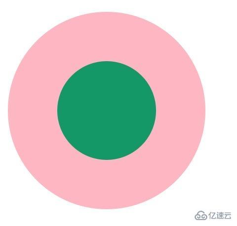
.element1{ width: 200px; height: 200px; background-color: lightpink; border-radius: 50%; } .child1{ width: 100px; height: 100px; border-radius: 50%; background-color: #009966; position: relative; top: 50px; left: 50px; }2. 使用伪元素,before/after
<p class="element2"></p>
.element2{ width: 200px; height: 200px; background-color: lightpink; border-radius: 50%; } .element2:after{ content: ""; display: block; width: 100px; height: 100px; border-radius: 50%; background-color: #009966; position: relative; top: 50px; left: 50px; }3. 使用border:
<p class="element3"></p>
.element3{ width: 100px; height: 100px; background-color: #009966; border-radius: 50%; border: 50px solid lightpink ; }4. 使用border-shadow
<p class="element4"></p>
.element4{ width: 100px; height: 100px; background-color: #009966; border-radius: 50%; box-shadow: 0 0 0 50px lightpink ; margin: auto; }<p class="element5">
.element5{ width: 200px; height: 200px; background-color: #009966; border-radius: 50%; box-shadow: 0 0 0 50px lightpink inset; margin: auto; }5. 使用radial-gradient
<p class="element6"></p>
.element6{ width: 200px; height: 200px; border-radius: 50%; background: -webkit-radial-gradient( circle closest-side,#009966 50%,lightpink 50%); }看完了这篇文章,相信你对实现CSS圆环的方法有哪些有了一定的了解,想了解更多相关知识,欢迎关注亿速云行业资讯频道,感谢各位的阅读!
免责声明:本站发布的内容(图片、视频和文字)以原创、转载和分享为主,文章观点不代表本网站立场,如果涉及侵权请联系站长邮箱:is@yisu.com进行举报,并提供相关证据,一经查实,将立刻删除涉嫌侵权内容。


