
 Data Structure
 Networking
 RDBMS
RDBMS Operating System
 Java
Java MS Excel
 iOS
iOS HTML
HTML CSS
CSS Android
 Python
 C Programming
 C++
C++ C#
C# MongoDB
 MySQL
MySQL Javascript
 PHP
PHP
- Selected Reading
- UPSC IAS Exams Notes
- Developer's Best Practices
- Questions and Answers
- Effective Resume Writing
- HR Interview Questions
- Computer Glossary
- Who is Who
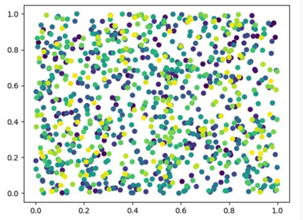
Scatter plot and Color mapping in Python
We can create a scatter plot using the scatter() method and we can set the color for every data point.
Steps
Create random values (for x and y) in a given shape, using np.random.rand() method.
Create a scatter plot of *y* vs. *x* with varying marker size and/or color, using the scatter method where color range would be in the range of (0, 1000).
Show the figure using plt.show().
Example
import matplotlib.pyplot as plt import numpy as np x = np.random.rand(1000) y = np.random.rand(1000) plt.scatter(x, y, c=[i for i in range(1000)]) plt.show()
Output

Updated on: 2021-03-16T10:07:43+05:30
786 Views

Advertisements