
 Data Structure
 Networking
 RDBMS
RDBMS Operating System
 Java
Java MS Excel
 iOS
iOS HTML
HTML CSS
CSS Android
 Python
 C Programming
 C++
C++ C#
C# MongoDB
 MySQL
MySQL Javascript
 PHP
PHP
- Selected Reading
- UPSC IAS Exams Notes
- Developer's Best Practices
- Questions and Answers
- Effective Resume Writing
- HR Interview Questions
- Computer Glossary
- Who is Who
Python Plotly – How to hide legend entries in a Plotly figure?
Plotly is an open-source plotting library in Python that can generate several different types of charts. Python users can use Plotly to create interactive web-based visualizations including scientific charts, 3D graphs, statistical charts, financial charts, etc. Plotly can also be used in static document publishing and desktop editors such as PyCharm and Spyder.
In this tutorial, we will show how you can use Plotly to hide legend entries for a particular field. Follow the steps given below to hide the legend entries.
Step 1
Import the plotly.offline module and alias as py.
import plotly.offline as py
Step 2
Import the plotly.graphs_objs module and alias as go.
import plotly.graphs_objs as go
Step 3
Create a dataset with the following values ?
data = { 'one':[1,2,3,4,5], 'two':[5,6,7,8,9], 'three':[3,4,5,6,7] } df = pd.DataFrame(data) Step 4
Create a scatter plot as follows ?
# generate scatter plot fig = df.iplot(kind='scatter', asFigure=True)
Step 5
Set the "for" loop and "if" condition to hide the legend for the first and third columns.
# set for loop for figure data for trace in fig['data']: # Hide legend column names not equal to 'two' if(trace['name'] != 'two'): trace['showlegend'] = False
Example
The complete code to hide legend entries is as follows ?
import pandas as pd import plotly.offline as py import cufflinks as cf cf.go_offline() # Create a dataset data = { 'one':[1,2,3,4,5], 'two':[5,6,7,8,9], 'three':[3,4,5,6,7] } # Generate dataframe df = pd.DataFrame(data) # generate scatter plot fig = df.iplot(kind='scatter', asFigure=True) # set for loop for figure data for trace in fig['data']: # hide legend column names not equal to 'two' if(trace['name'] != 'two'): trace['showlegend'] = False # generate webpage py.plot(fig)
Output
It will show the following output on the browser ?
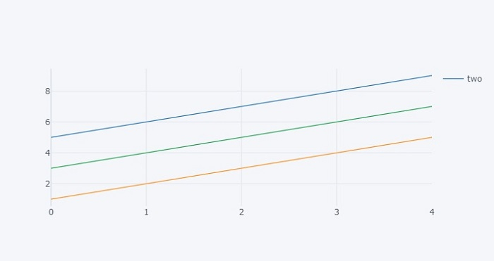
Observe that the legend entries for the first two lines are hidden.

2K+ Views
