
 Data Structure
 Networking
 RDBMS
RDBMS Operating System
 Java
Java MS Excel
 iOS
iOS HTML
HTML CSS
CSS Android
 Python
 C Programming
 C++
C++ C#
C# MongoDB
 MySQL
MySQL Javascript
 PHP
PHP
- Selected Reading
- UPSC IAS Exams Notes
- Developer's Best Practices
- Questions and Answers
- Effective Resume Writing
- HR Interview Questions
- Computer Glossary
- Who is Who
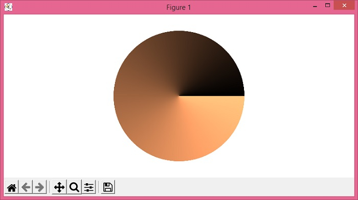
Plot a polar color wheel based on a colormap using Python/Matplotlib
To plot a color wheel based on a colormap using Python/Matplotlib, we can use the colorbar class and can use copper colormap.
Steps
Set the figure size and adjust the padding between and around the subplots.
Create a new figure or activate an existing figure using figure() method.
Add an axes to the figure using add_axes() method.
Set the direction of the axes.
Linearly normalize the data using Normalize class.
Draw a colorbar in an existing axes.
Set the artist's visibility.
Turn the X- and Y-axis off.
To display the figure, use show() method.
Example
import numpy as np from matplotlib import pyplot as plt, cm, colors, colorbar plt.rcParams["figure.figsize"] = [7.50, 3.50] plt.rcParams["figure.autolayout"] = True fig = plt.figure() display_axes = fig.add_axes([0.1, 0.1, 0.8, 0.8], projection='polar') display_axes._direction = 2 * np.pi norm = colors.Normalize(0.0, 2 * np.pi) cb = colorbar.ColorbarBase(display_axes, cmap=cm.get_cmap('copper', 2056), norm=norm, orientation='horizontal') cb.outline.set_visible(False) display_axes.set_axis_off() plt.show() Output

Updated on: 2021-06-01T12:13:13+05:30
1K+ Views

Advertisements