
 Data Structure
 Networking
 RDBMS
RDBMS Operating System
 Java
Java MS Excel
 iOS
iOS HTML
HTML CSS
CSS Android
 Python
 C Programming
 C++
C++ C#
C# MongoDB
 MySQL
MySQL Javascript
 PHP
PHP
- Selected Reading
- UPSC IAS Exams Notes
- Developer's Best Practices
- Questions and Answers
- Effective Resume Writing
- HR Interview Questions
- Computer Glossary
- Who is Who
Matplotlib – How to plot the FFT of signal with correct frequencies on the X-axis?
To plot the FFT (Fast Fourier Transform) of a signal with correct frequencies on the X-axis in matplotlib, we can take the following steps −
Steps
Set the figure size and adjust the padding between and around the subplots.
Initialize two variables, N and m, to calculate nu.
Create the signal (a sine wave) using numpy. Compute the one-dimensional discrete Fourier Transform.
Return the Discrete Fourier Transform sample frequencies.
Plot the freq and fourier transform data points.
To display the figure, use Show() method.
Example
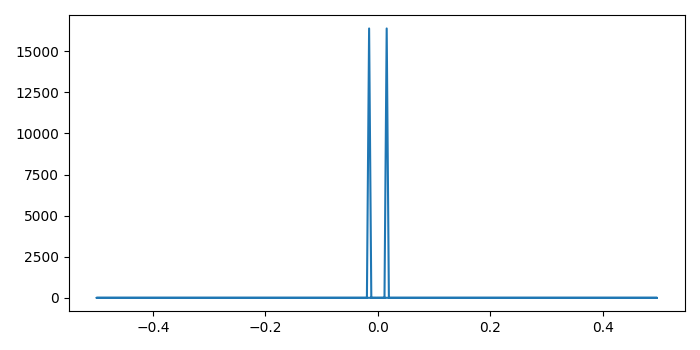
import numpy as np import matplotlib.pyplot as plt plt.rcParams["figure.figsize"] = [7.00, 3.50] plt.rcParams["figure.autolayout"] = True N = 256 t = np.arange(N) m = 4 nu = float(m)/N signal = np.sin(2*np.pi*nu*t) ft = np.fft.fft(signal) freq = np.fft.fftfreq(N) plt.plot(freq, ft.real**2 + ft.imag**2) plt.show()
Output
It will produce the following output −

Updated on: 2021-10-11T08:12:10+05:30
3K+ Views

Advertisements