
 Data Structure
 Networking
 RDBMS
RDBMS Operating System
 Java
Java MS Excel
 iOS
iOS HTML
HTML CSS
CSS Android
 Python
 C Programming
 C++
C++ C#
C# MongoDB
 MySQL
MySQL Javascript
 PHP
PHP
- Selected Reading
- UPSC IAS Exams Notes
- Developer's Best Practices
- Questions and Answers
- Effective Resume Writing
- HR Interview Questions
- Computer Glossary
- Who is Who
How to plot bar graphs with same X coordinates side by side in Matplotlib?
To plot bar graphs with same X coordinates (G1, G2, G3, G4 and G5), side by side in matplotlib, we can take the following steps −
Create the following lists – labels, men_means and women_means with different data elements.
Return evenly spaced values within a given interval, using numpy.arrange() method.
Set the width variable, i.e., width=0.35.
Create fig and ax variables using subplots method, where default nrows and ncols are 1.
The bars are positioned at *x* with the given *align*\ment. Their dimensions are given by *height* and *width*. The vertical baseline is *bottom* (default 0), so create rect1 and rect2 using plt.bar() method.
Set the Y-axis label using plt.ylabel() method.
Set a title for the axes using set_title() method.
Get or set the current tick locations and labels of the X-axis using set_xticks() method.
Set X-axis tick labels of the grid using set_xticklabels() method.
Place a legend on the figure using legend() method.
Annotate the created bars (rect1 and rect2) with some label using autolabel() method (user-defined method).
To show the figure, use the plt.show() method.
Example
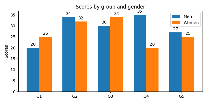
import matplotlib.pyplot as plt import numpy as np plt.rcParams["figure.figsize"] = [7.00, 3.50] plt.rcParams["figure.autolayout"] = True labels = ['G1', 'G2', 'G3', 'G4', 'G5'] men_means = [20, 34, 30, 35, 27] women_means = [25, 32, 34, 20, 25] x = np.arange(len(labels)) width = 0.35 fig, ax = plt.subplots() rects1 = ax.bar(x - width / 2, men_means, width, label='Men') rects2 = ax.bar(x + width / 2, women_means, width, label='Women') ax.set_ylabel('Scores') ax.set_title('Scores by group and gender') ax.set_xticks(x) ax.set_xticklabels(labels) ax.legend() def autolabel(rects): for rect in rects: height = rect.get_height() ax.annotate('{}'.format(height), xy=(rect.get_x() + rect.get_width() / 2, height), xytext=(0, 3), # 3 points vertical offset textcoords="offset points", ha='center', va='bottom') autolabel(rects1) autolabel(rects2) plt.show() Output

2K+ Views
