
 Data Structure
 Networking
 RDBMS
RDBMS Operating System
 Java
Java MS Excel
 iOS
iOS HTML
HTML CSS
CSS Android
 Python
 C Programming
 C++
C++ C#
C# MongoDB
 MySQL
MySQL Javascript
 PHP
PHP
- Selected Reading
- UPSC IAS Exams Notes
- Developer's Best Practices
- Questions and Answers
- Effective Resume Writing
- HR Interview Questions
- Computer Glossary
- Who is Who
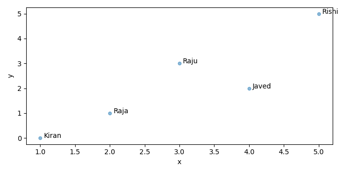
How to label bubble chart/scatter plot with column from Pandas dataframe?
To label bubble charts/scatter plot with column from Pandas dataframe, we can take the following steps −
- Set the figure size and adjust the padding between and around the subplots.
- Create a data frame, df, of two-dimensional, size-mutable, potentially heterogeneous tabular data.
- Create a scatter plot with df.
- Annotate each data point with a text.
- To display the figure, use show() method.
Example
import pandas as pd from matplotlib import pyplot as plt # Set the figure size plt.rcParams["figure.figsize"] = [7.00, 3.50] plt.rcParams["figure.autolayout"] = True # Create a dataframe df = pd.DataFrame( dict( x=[1, 3, 2, 4, 5], y=[0, 3, 1, 2, 5], points=['Kiran', 'Raju', 'Raja', 'Javed', 'Rishi'] ) ) # Scatter plot ax = df.plot.scatter(x='x', y='y', alpha=0.5) # Annotate each data point for i, txt in enumerate(df.points): ax.annotate(txt, (df.x.iat[i]+0.05, df.y.iat[i])) plt.show()
Output
It will produce the following output


Updated on: 2021-09-22T06:38:49+05:30
2K+ Views

Advertisements