
 Data Structure
 Networking
 RDBMS
RDBMS Operating System
 Java
Java MS Excel
 iOS
iOS HTML
HTML CSS
CSS Android
 Python
 C Programming
 C++
C++ C#
C# MongoDB
 MySQL
MySQL Javascript
 PHP
PHP
- Selected Reading
- UPSC IAS Exams Notes
- Developer's Best Practices
- Questions and Answers
- Effective Resume Writing
- HR Interview Questions
- Computer Glossary
- Who is Who
How to create plotly bar chart with values on top of bars in R?
To create plotly bar chart with values on top of bars in R, we can follow the below steps −
- First of all, create two vectors one having categories and one counts and create the bar chart using plotly.
- Then, create the same bar chart with add_text function of plotly package.
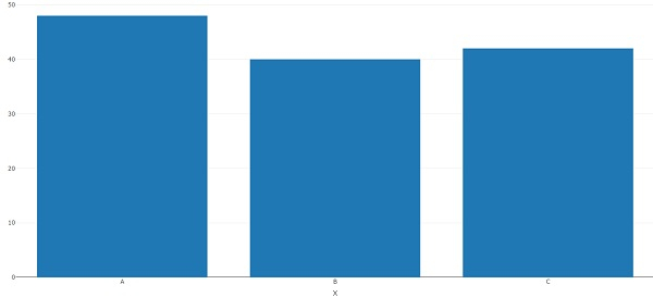
Create the vectors and plotly bar chart
Using c function to create the vectors and plotly function with layout function to create the bar chart with axes titles −
x<-c("A","B","C") freq<-c(48,40,42) library(plotly) plot_ly(x=x,y=freq,type="bar")%>%layout(xaxis=list(title="X"),yaxis=list(title="Y")) Output
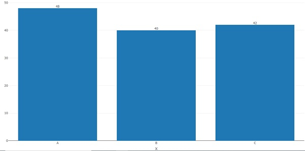
Create the bar chart with counts on top of the bars
Using add_text function to create the bar chart with counts on top of the bars −
x<-c("A","B","C") freq<-c(48,40,42) library(plotly) plot_ly(x=x,y=freq,type="bar")%>%layout(xaxis=list(title="X"),yaxis=list(title="Y"))% >%add_text(x=x,y=freq,text=freq,textposition="top") Output

Updated on: 2021-08-13T10:42:02+05:30
1K+ Views

Advertisements