
 Data Structure
 Networking
 RDBMS
RDBMS Operating System
 Java
Java MS Excel
 iOS
iOS HTML
HTML CSS
CSS Android
 Python
 C Programming
 C++
C++ C#
C# MongoDB
 MySQL
MySQL Javascript
 PHP
PHP
- Selected Reading
- UPSC IAS Exams Notes
- Developer's Best Practices
- Questions and Answers
- Effective Resume Writing
- HR Interview Questions
- Computer Glossary
- Who is Who
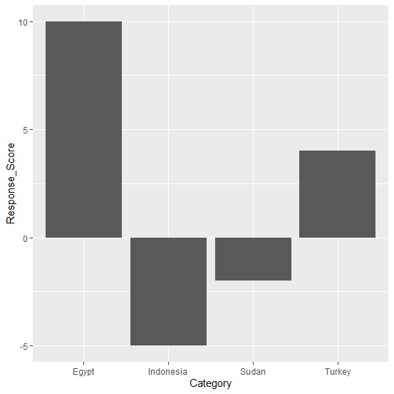
How to create bar plot with positive and negative values in R?
To create bar plot with positive and negative values, we can make use of ggplot function.
For example, if we have a data frame called df that contains a categorical column say C and a numerical column Num which has some positive and some negative values then the bar plot for this data can be created by using the below command −
ggplot(df,aes(C,Num))+geom_bar(stat="identity")
Example
Following snippet creates a sample data frame −
Category<-c("Egypt","Sudan","Turkey","Indonesia") Response_Score<-c(10,-2,4,-5) df<-data.frame(Category,Response_Score) df Output
The following dataframe is created −
Category Response_Score 1 Egypt 10 2 Sudan -2 3 Turkey 4 4 Indonesia -5
To load ggplot2 package and create bar chart for data stored in df, add the following code to the above snippet −
library(ggplot2) ggplot(df,aes(Category,Response_Score))+geom_bar(stat="identity")
Output
If you execute all the above given snippets as a single program, it generates the following output −

Updated on: 2021-11-06T06:29:56+05:30
5K+ Views

Advertisements