
 Data Structure
 Networking
 RDBMS
RDBMS Operating System
 Java
Java MS Excel
 iOS
iOS HTML
HTML CSS
CSS Android
 Python
 C Programming
 C++
C++ C#
C# MongoDB
 MySQL
MySQL Javascript
 PHP
PHP
- Selected Reading
- UPSC IAS Exams Notes
- Developer's Best Practices
- Questions and Answers
- Effective Resume Writing
- HR Interview Questions
- Computer Glossary
- Who is Who
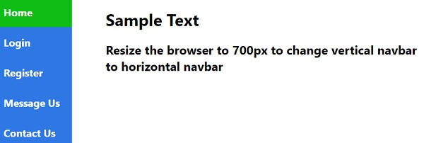
How to create a responsive side navigation menu with CSS?
Following is the code to create a responsive side navigation menu with CSS −
Example
<!DOCTYPE html> <html> <head> <meta name="viewport" content="width=device-width, initial-scale=1.0"> <style> body { margin: 0; font-family: 'Segoe UI', Tahoma, Geneva, Verdana, sans-serif; } nav { margin: 0; padding: 0; width: 150px; background-color: #2f77e4; position: fixed; height: 100%; overflow: auto; } nav a { display: block; color: rgb(255, 255, 255); font-weight: bolder; font-size: 20px; padding: 16px; text-decoration: none; } nav a.selected { background-color: rgb(15, 189, 20); color: rgb(255, 255, 255); } nav a:hover:not(.selected) { background-color: white; color: #2f77e4; } div.content { margin-left: 200px; padding: 1px 16px; height: 1000px; } @media screen and (max-width: 700px) { nav { width: 100%; height: auto; position: relative; } nav a {float: left;} div.content {margin-left: 0;} } </style> </head> <body> <nav class="sideBar"> <a class="selected" href="#">Home</a> <a href="#">Login</a> <a href="#">Register</a> <a href="#">Message Us</a> <a href="#">Contact Us</a> </nav> <div class="content"> <h1>Sample Text</h1> <h2>Resize the browser to 700px to change vertical navbar to horizontal navbar</h2> </div> </body> </html> Output
This will produce the following output −
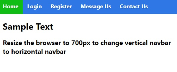
On resizing the window to 700px −

Updated on: 2020-04-03T08:51:56+05:30
824 Views

Advertisements