
 Data Structure
 Networking
 RDBMS
RDBMS Operating System
 Java
Java MS Excel
 iOS
iOS HTML
HTML CSS
CSS Android
 Python
 C Programming
 C++
C++ C#
C# MongoDB
 MySQL
MySQL Javascript
 PHP
PHP
- Selected Reading
- UPSC IAS Exams Notes
- Developer's Best Practices
- Questions and Answers
- Effective Resume Writing
- HR Interview Questions
- Computer Glossary
- Who is Who
How to create a flip card with CSS?
To create a flip card with CSS, the code is as follows −
Example
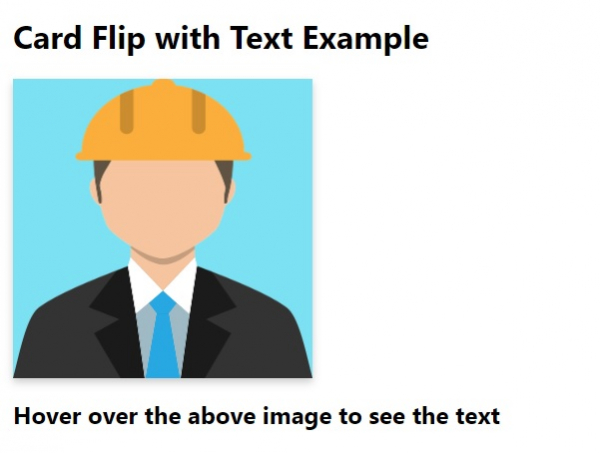
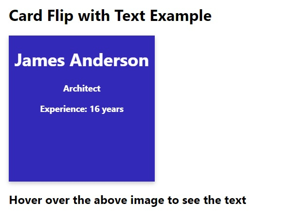
<!DOCTYPE html> <html> <head> <meta name="viewport" content="width=device-width, initial-scale=1"> <style> body { font-family: 'Segoe UI', Tahoma, Geneva, Verdana, sans-serif; margin:20px; } .flipCard { background-color: transparent; width: 300px; height: 300px; perspective: 1000px; } .innerCard { position: relative; width: 100%; height: 100%; text-align: center; transition: transform 0.6s; transform-style: preserve-3d; box-shadow: 0 4px 8px 0 rgba(0,0,0,0.2); } .flipCard:hover .innerCard { transform: rotateY(180deg); } .frontCard, .cardBack { position: absolute; width: 100%; height: 100%; -webkit-backface-visibility: hidden; backface-visibility: hidden; } .frontCard { background-color: rgb(124, 225, 243); color: black; } .cardBack { background-color: #3329b9; color: white; transform: rotateY(180deg); font-size: 18px; font-weight: bold; } </style> </head> <body> <h1>Card Flip with Text Example</h1> <div class="flipCard"> <div class="innerCard"> <div class="frontCard"> <img src="https://cdn.pixabay.com/photo/2016/04/01/11/25/avatar-1300331_960_720.png" alt="Avatar" style="width:300px;height:300px;"> </div> <div class="cardBack"> <h1>James Anderson</h1> <p>Architect</p> <p>Experience: 16 years</p> </div> </div> </div> <h2>Hover over the above image to see the text</h2> </body> </html> Output
The above code will produce the following output −
On hovering over the image −

Updated on: 2020-05-07T12:00:08+05:30
276 Views

Advertisements