
 Data Structure
 Networking
 RDBMS
RDBMS Operating System
 Java
Java MS Excel
 iOS
iOS HTML
HTML CSS
CSS Android
 Python
 C Programming
 C++
C++ C#
C# MongoDB
 MySQL
MySQL Javascript
 PHP
PHP
- Selected Reading
- UPSC IAS Exams Notes
- Developer's Best Practices
- Questions and Answers
- Effective Resume Writing
- HR Interview Questions
- Computer Glossary
- Who is Who
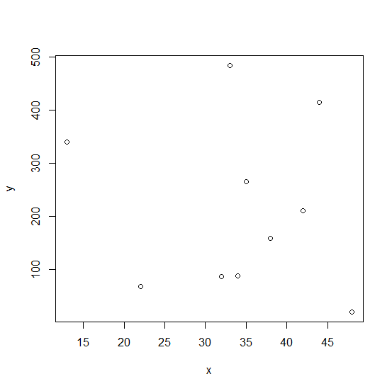
How to change the starting and ending points of axes labels using plot function in R?
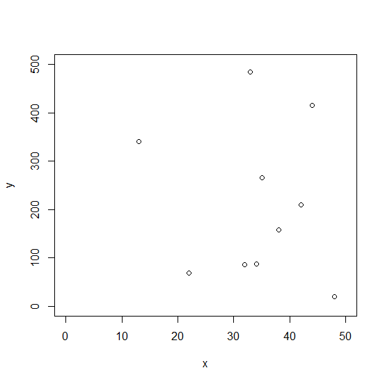
When we create a plot using plot function, the axes labels are automatically created based on the values of the variables that is being plotted. It is possible to set a limit to the labels for both the axes, X-axis and Y-axis and we can do this by using xlim and ylim options. For example, if we have the variable limits from 0 to 50 for variable that is going to be plotted on X-axis then it can be done as xlim = c(0,50).
Example
set.seed(99) x <-sample(1:50,10) y <-sample(1:500,10)
Creating a plot between x and y −
plot(x,y)
Creating a plot between x and y by specifying the axes labels −
Example
plot(x,y,xlim=c(0,50),ylim=c(0,500))
Output

Updated on: 2020-08-24T13:07:17+05:30
827 Views

Advertisements