
 Data Structure
 Networking
 RDBMS
RDBMS Operating System
 Java
Java MS Excel
 iOS
iOS HTML
HTML CSS
CSS Android
 Python
 C Programming
 C++
C++ C#
C# MongoDB
 MySQL
MySQL Javascript
 PHP
PHP
- Selected Reading
- UPSC IAS Exams Notes
- Developer's Best Practices
- Questions and Answers
- Effective Resume Writing
- HR Interview Questions
- Computer Glossary
- Who is Who
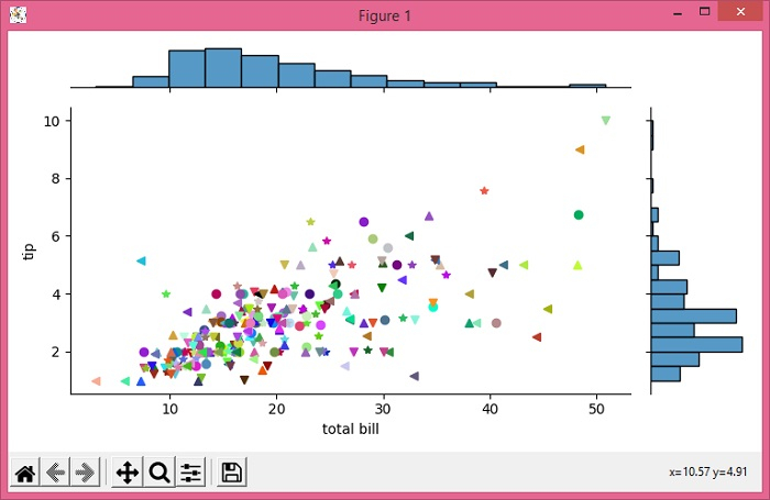
Changing the color and marker of each point using Seaborn jointplot
To change the color and marker of each point using Seaborn jointplot, we can take the following steps −
Set the figure size and adjust the padding between and around the subplots.
Load an example dataset from the online repository (requires Internet).
Use jointplot() method to plot tips data.
Use cla() method to clear the current axes.
Make a list of colors and markers for each point.
Set the axes labels using set_axis_labels() method.
To display the figure, use show() method.
Example
from matplotlib import pyplot as plt import seaborn as sns import numpy as np plt.rcParams["figure.figsize"] = [7.50, 3.50] plt.rcParams["figure.autolayout"] = True tips = sns.load_dataset("tips") g = sns.jointplot("total_bill", "tip", data=tips, height=4.50) g.ax_joint.cla() colors = np.random.random((len(tips), 3)) markers = ['v', '^', '<', '*', 'o'] * 100 for i, row in enumerate(tips.values): g.ax_joint.plot(row[0], row[1], color=colors[i], marker=markers[i]) g.set_axis_labels('total bill', 'tip', fontsize=10) plt.show() Output

Updated on: 2021-06-03T12:38:49+05:30
1K+ Views

Advertisements