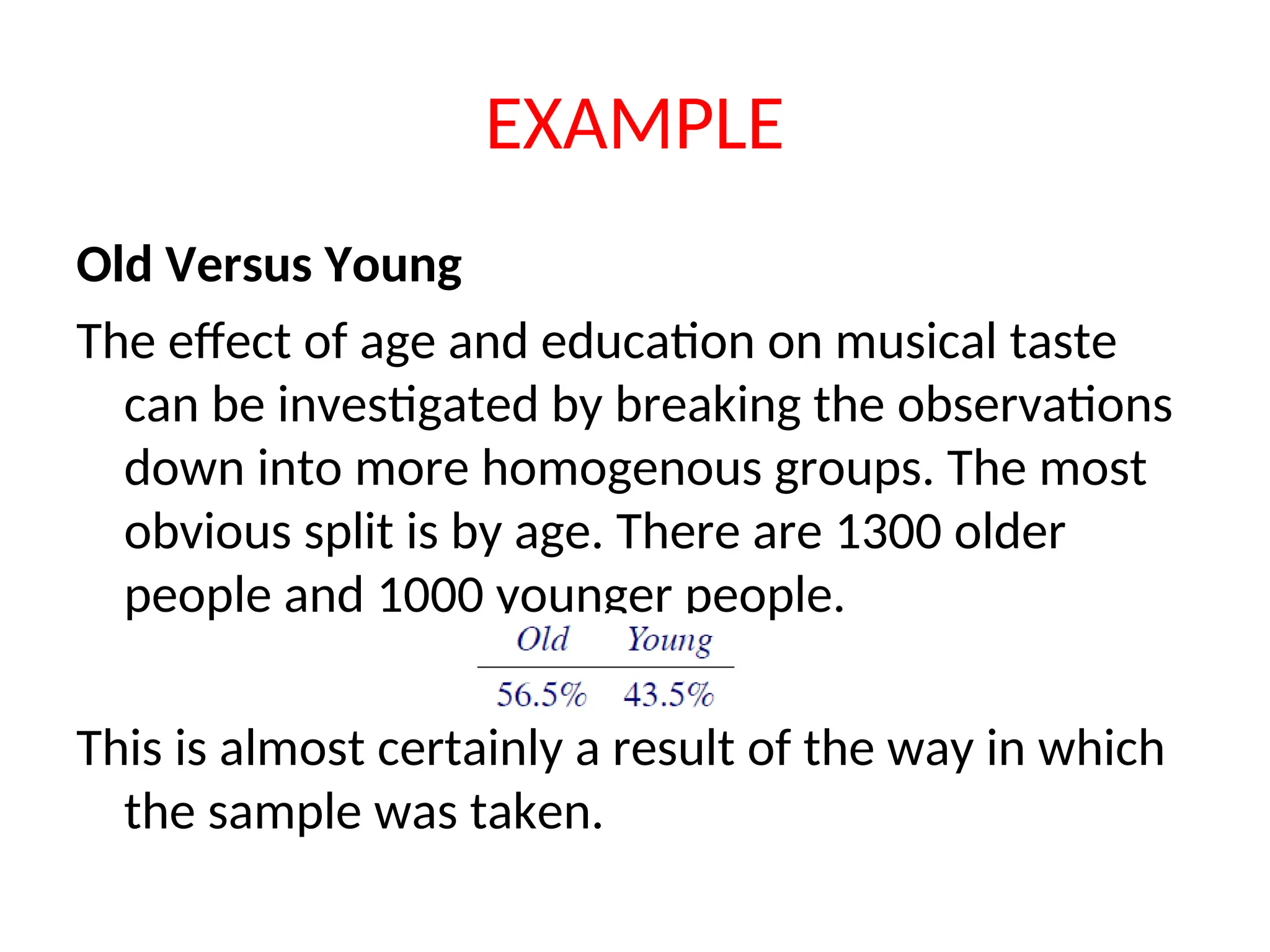
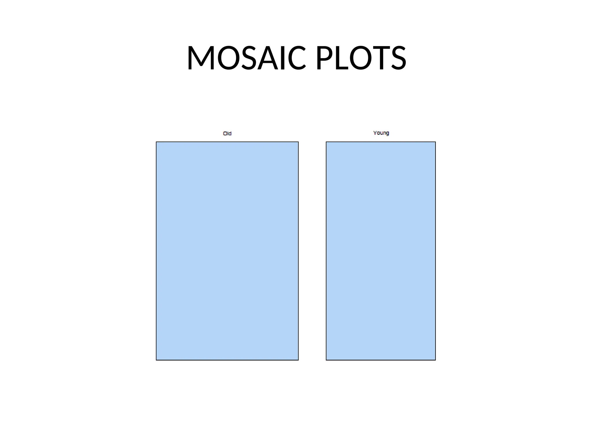
EXAMPLE Old Versus Young Theeffect of age and education on musical taste can be investigated by breaking the observations down into more homogenous groups. The most obvious split is by age. There are 1300 older people and 1000 younger people. This is almost certainly a result of the way in which the sample was taken.
3.
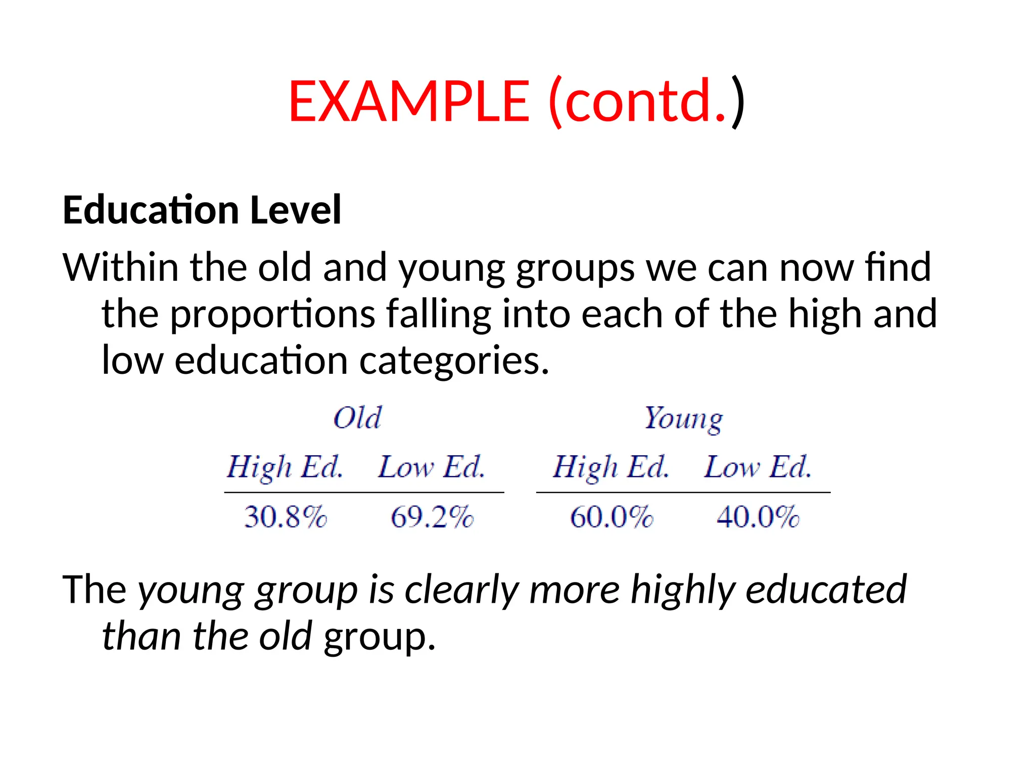
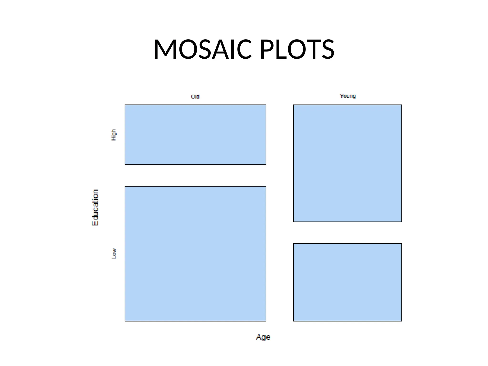
EXAMPLE (contd.) Education Level Withinthe old and young groups we can now find the proportions falling into each of the high and low education categories. The young group is clearly more highly educated than the old group.
4.
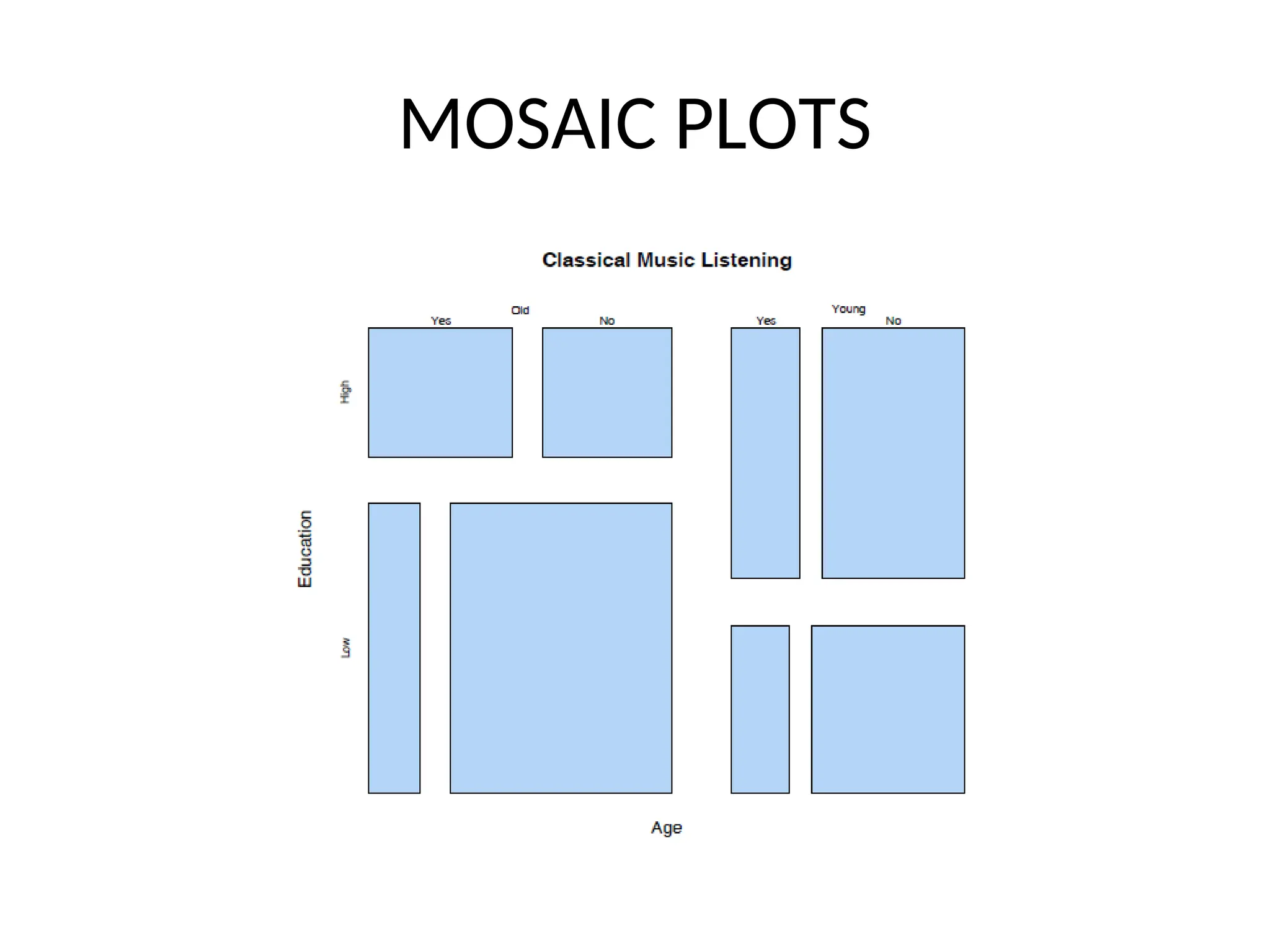
EXAMPLE (contd.) Summary The resultof our “analysis” is a series of tables. From these tables we can see: 1. There are slightly more old people than young people in the sampled group. 2. The younger people are more highly educated than the older ones. 3. The likelihood of listening to classical music depends on both age and education level.
5.
MOSAIC PLOTS • Mosaicplots give a graphical representation of these successive decompositions. • Counts are represented by rectangles. • At each stage of plot creation, the rectangles are split parallel to one of the two axes.
6.
MOSAIC PLOTS Creating MosaicPlots • In order to produce a mosaic plot it is necessary to have: – A contingency table containing the data. – A preferred ordering of the variables, with the “response” variable last.
7.
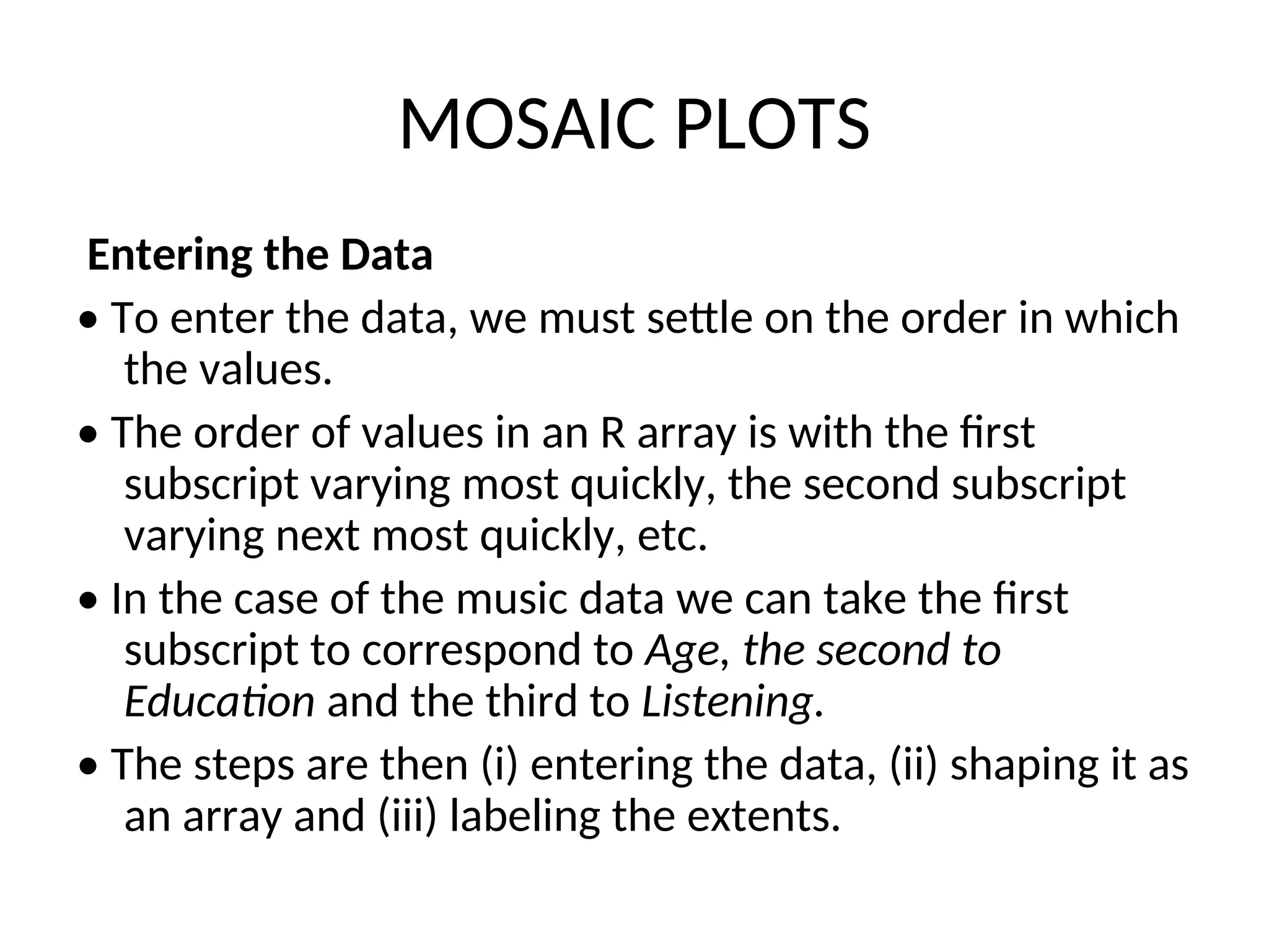
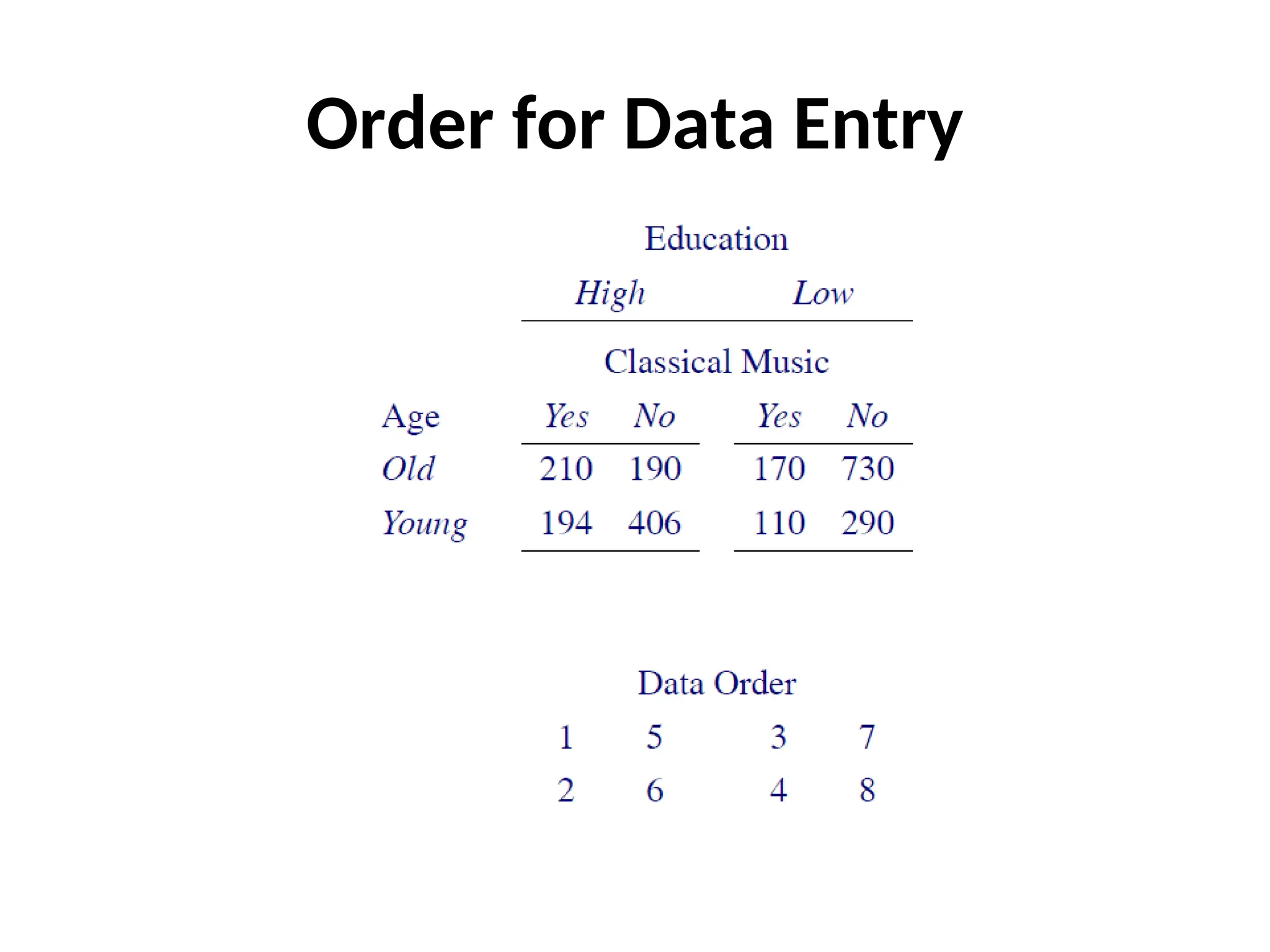
MOSAIC PLOTS Entering theData • To enter the data, we must settle on the order in which the values. • The order of values in an R array is with the first subscript varying most quickly, the second subscript varying next most quickly, etc. • In the case of the music data we can take the first subscript to correspond to Age, the second to Education and the third to Listening. • The steps are then (i) entering the data, (ii) shaping it as an array and (iii) labeling the extents.
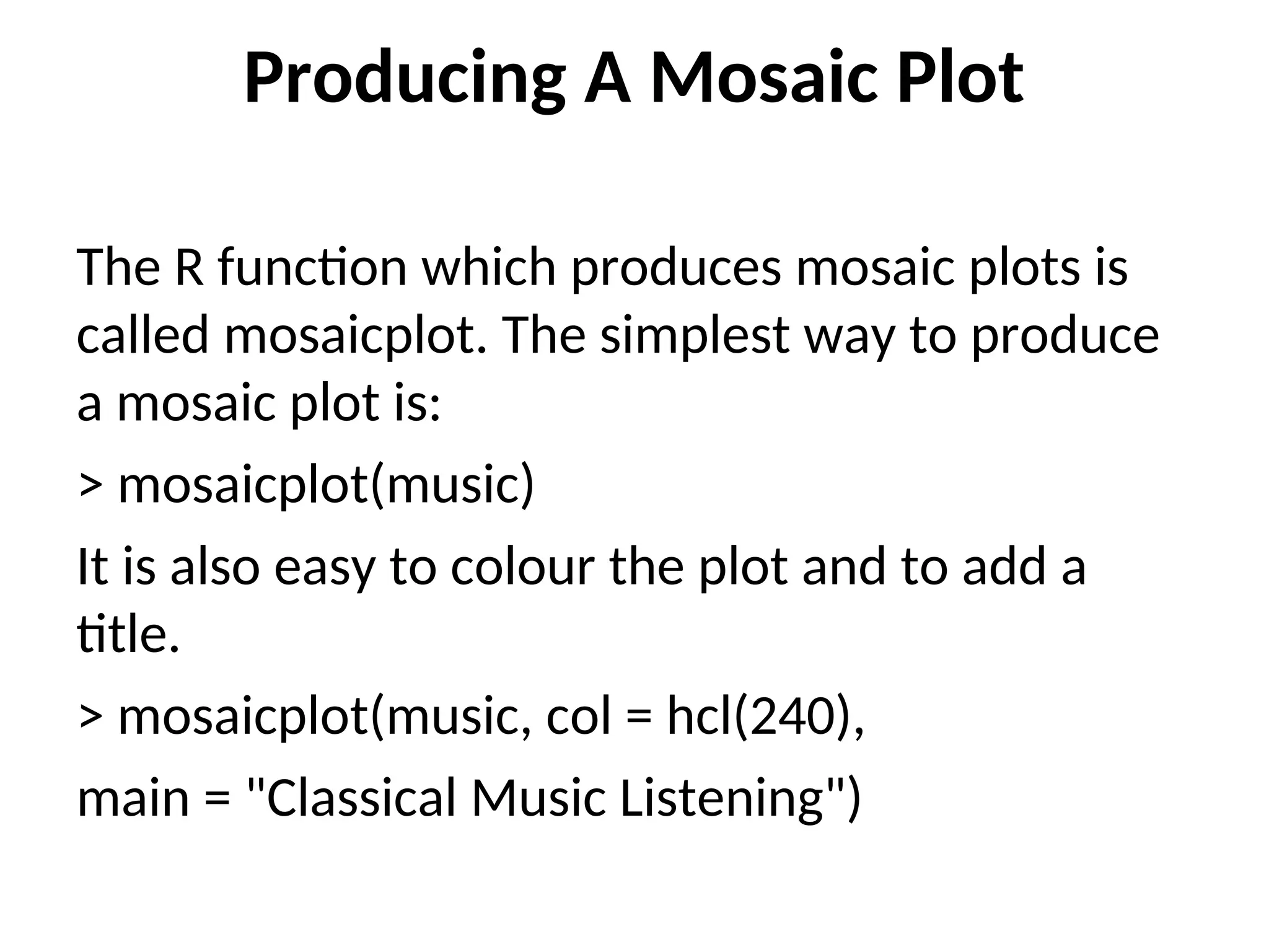
Producing A MosaicPlot The R function which produces mosaic plots is called mosaicplot. The simplest way to produce a mosaic plot is: > mosaicplot(music) It is also easy to colour the plot and to add a title. > mosaicplot(music, col = hcl(240), main = "Classical Music Listening")
15.
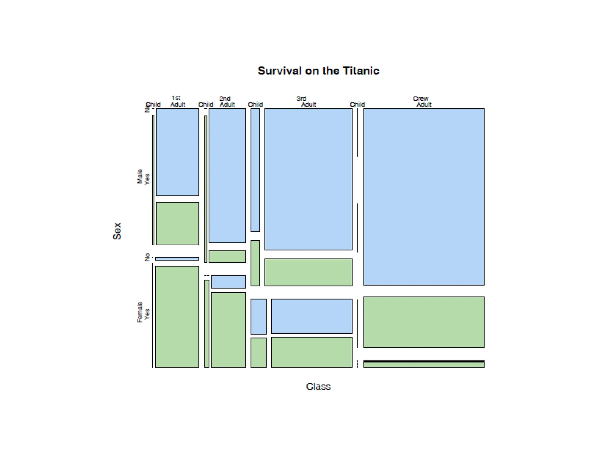
MOSAIC PLOTS • Example:The mortality rates aboard the Titanic, which are influenced strongly by age, sex, and passenger class. If you wanted to compare the mortality rates between men and women using a mosaic plot, you would first divide the unit square according to the overall proportion of males and females.
16.
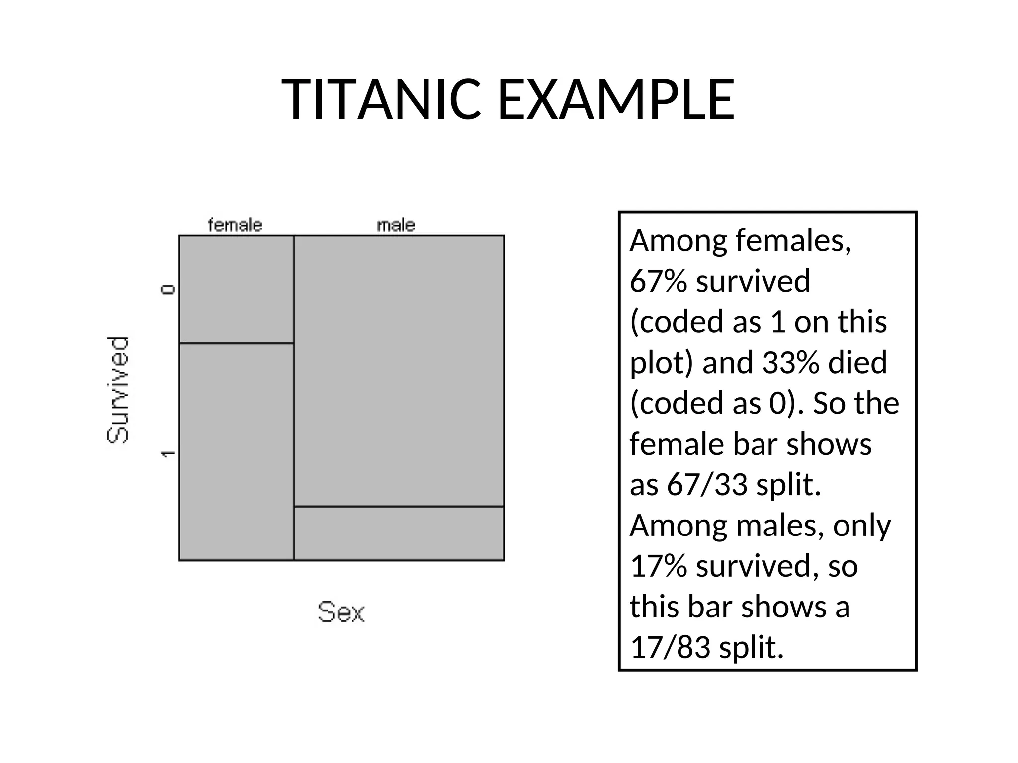
TITANIC EXAMPLE • Themortality rates aboard the Titanic, which are influenced strongly by age, sex, and passenger class. If you wanted to compare the mortality rates between men and women using a mosaic plot, you would first divide the unit square according to the overall proportion of males and females.
17.
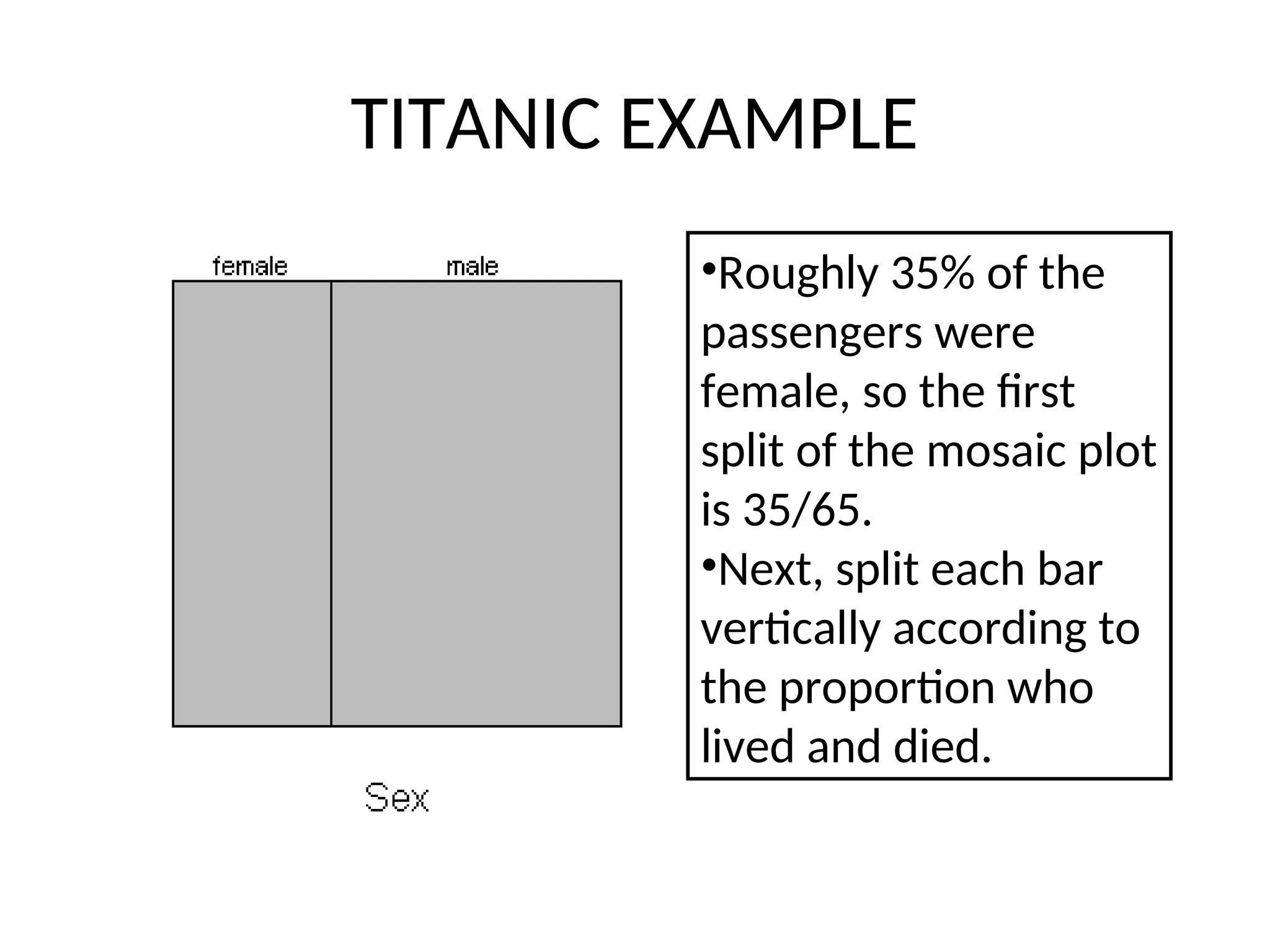
TITANIC EXAMPLE •Roughly 35%of the passengers were female, so the first split of the mosaic plot is 35/65. •Next, split each bar vertically according to the proportion who lived and died.
18.
TITANIC EXAMPLE Among females, 67%survived (coded as 1 on this plot) and 33% died (coded as 0). So the female bar shows as 67/33 split. Among males, only 17% survived, so this bar shows a 17/83 split.
19.
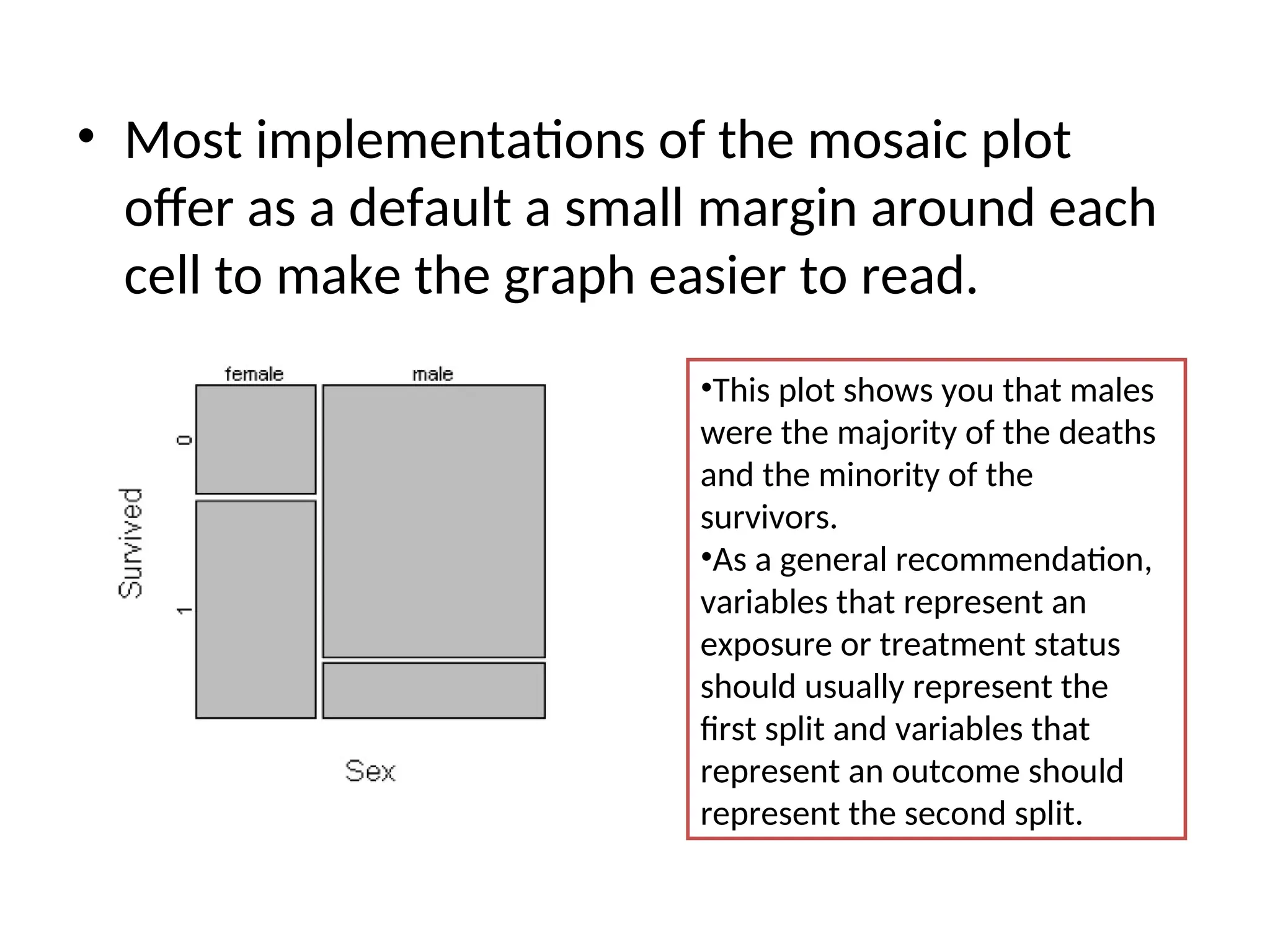
• Most implementationsof the mosaic plot offer as a default a small margin around each cell to make the graph easier to read. •This plot shows you that males were the majority of the deaths and the minority of the survivors. •As a general recommendation, variables that represent an exposure or treatment status should usually represent the first split and variables that represent an outcome should represent the second split.
20.
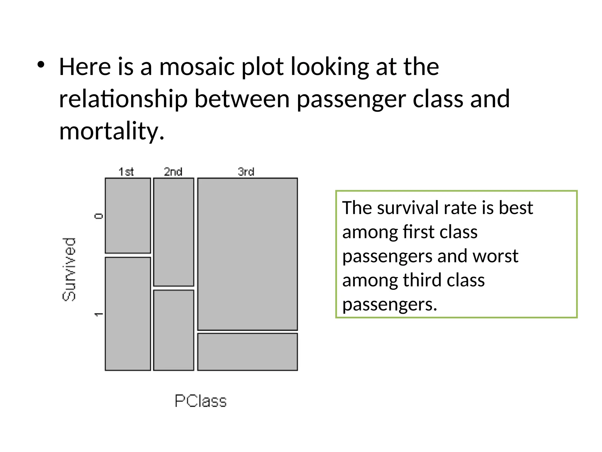
• Here isa mosaic plot looking at the relationship between passenger class and mortality. The survival rate is best among first class passengers and worst among third class passengers.
22.
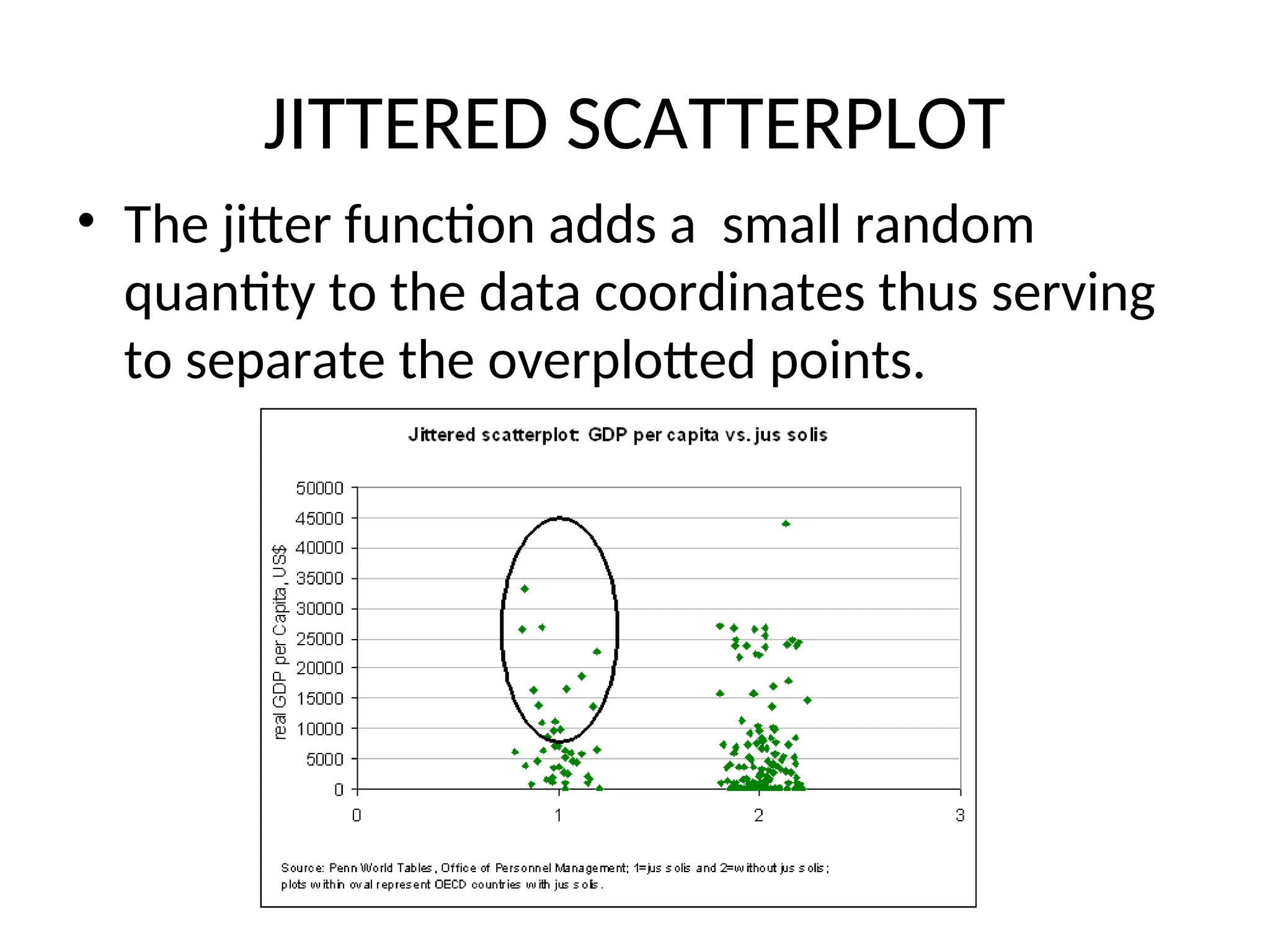
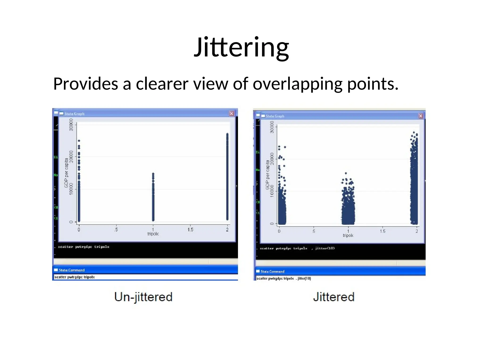
JITTERED SCATTERPLOT • Thejitter function adds a small random quantity to the data coordinates thus serving to separate the overplotted points.
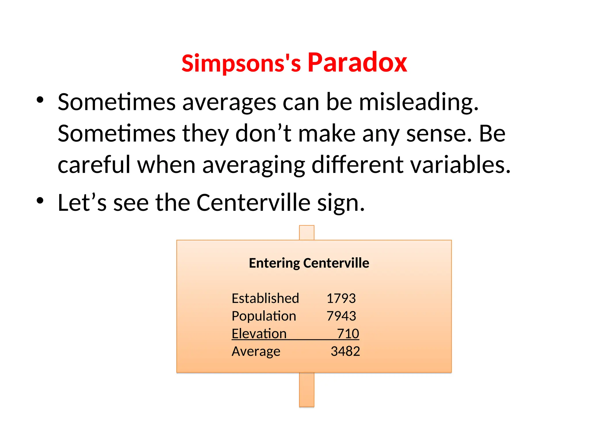
Simpsons's Paradox • Sometimesaverages can be misleading. Sometimes they don’t make any sense. Be careful when averaging different variables. • Let’s see the Centerville sign. Entering Centerville Established 1793 Population 7943 Elevation 710 Average 3482
25.
Simpsons's Paradox -When Big Data Sets Go Bad By Smita Skrivanek, Principal Statistician, MoreSteam.com LLC • It's a well accepted rule of thumb that the larger the data set, the more reliable the conclusions drawn. • Simpson' paradox, however, demonstrates that a great deal of care has to be taken when combining small data sets into a large one. Sometimes conclusions from the large data set are exactly the opposite of conclusion from the smaller sets. Unfortunately, the conclusions from the large set are also usually wrong.
26.
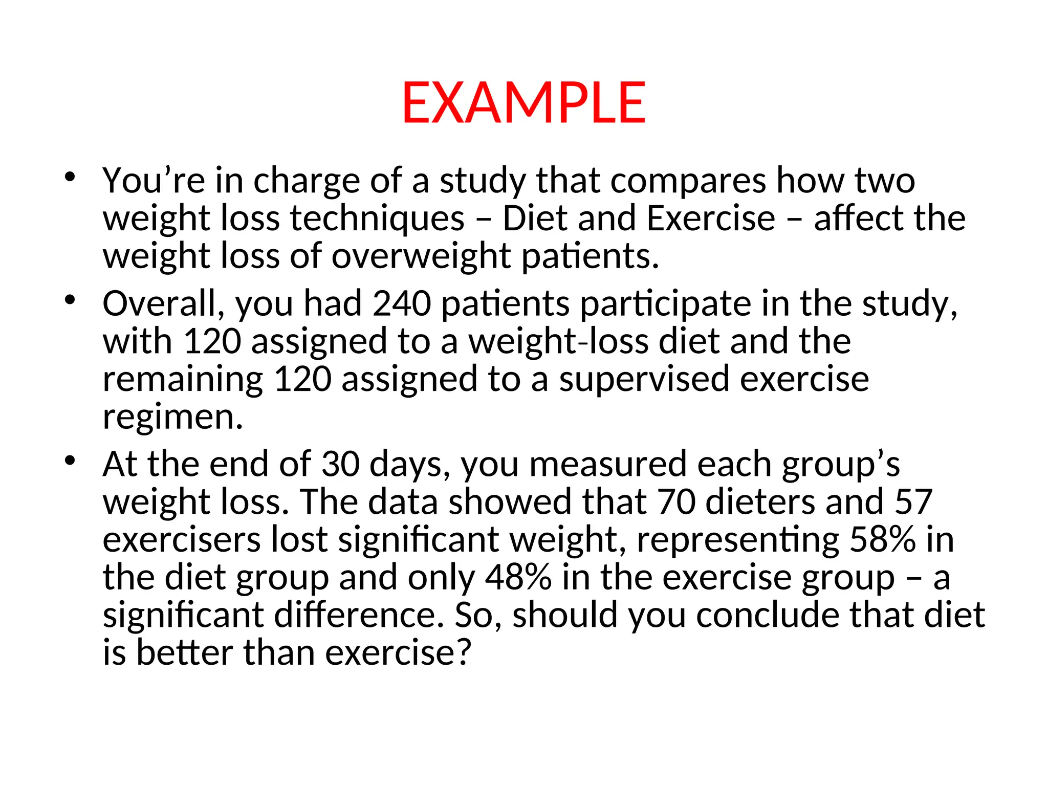
EXAMPLE • You’re incharge of a study that compares how two weight loss techniques – Diet and Exercise – affect the weight loss of overweight patients. • Overall, you had 240 patients participate in the study, with 120 assigned to a weight loss diet and the ‐ remaining 120 assigned to a supervised exercise regimen. • At the end of 30 days, you measured each group’s weight loss. The data showed that 70 dieters and 57 exercisers lost significant weight, representing 58% in the diet group and only 48% in the exercise group – a significant difference. So, should you conclude that diet is better than exercise?
27.
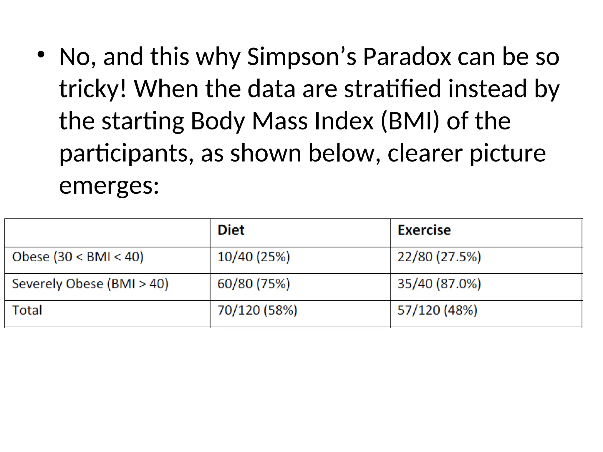
• No, andthis why Simpson’s Paradox can be so tricky! When the data are stratified instead by the starting Body Mass Index (BMI) of the participants, as shown below, clearer picture emerges:
28.
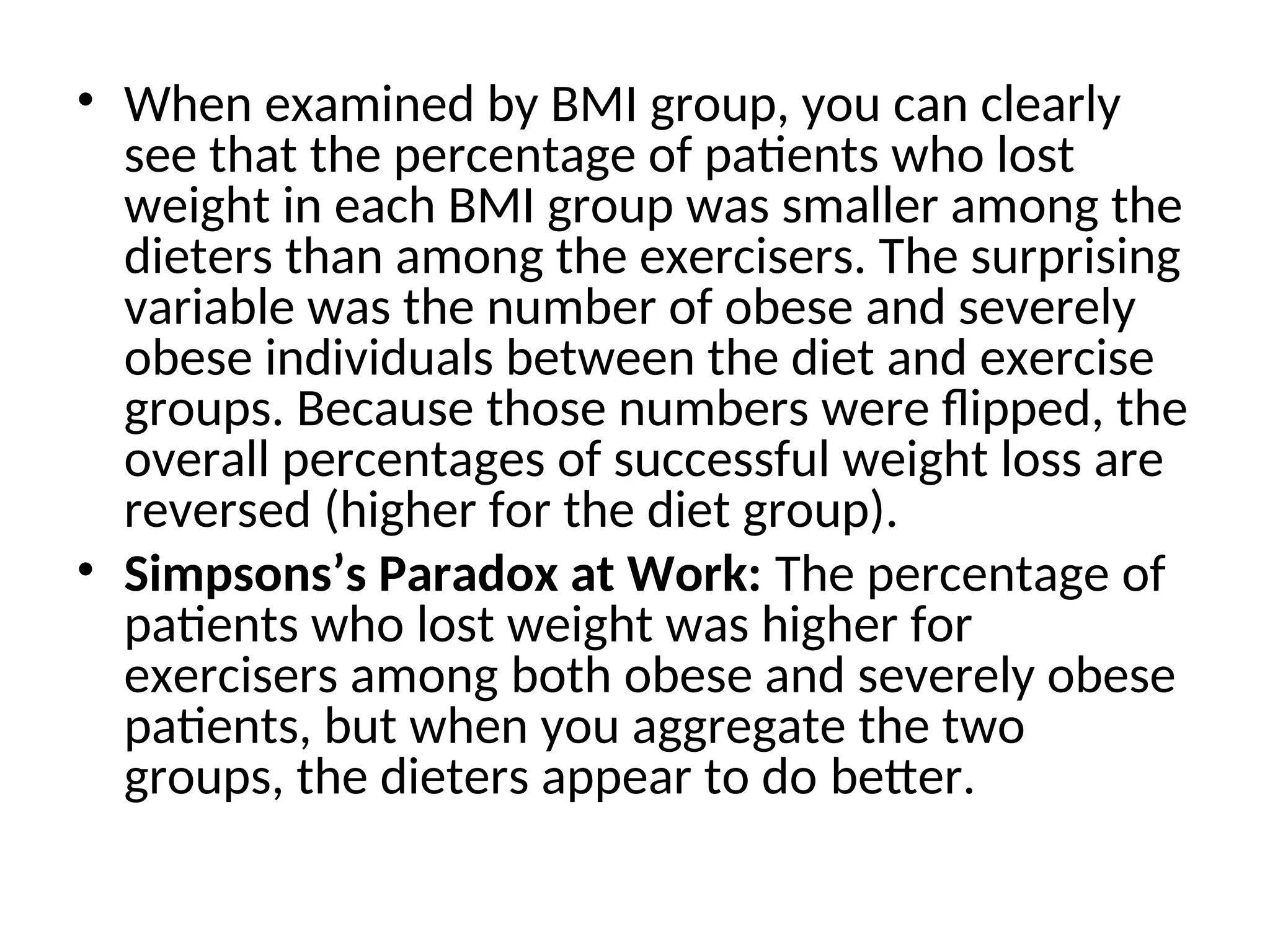
• When examinedby BMI group, you can clearly see that the percentage of patients who lost weight in each BMI group was smaller among the dieters than among the exercisers. The surprising variable was the number of obese and severely obese individuals between the diet and exercise groups. Because those numbers were flipped, the overall percentages of successful weight loss are reversed (higher for the diet group). • Simpsons’s Paradox at Work: The percentage of patients who lost weight was higher for exercisers among both obese and severely obese patients, but when you aggregate the two groups, the dieters appear to do better.
29.
• Why Didthis Happen? • Two factors are at play here. First, there is an overlooked confounding variable (BMI), and second, a disproportionate allocation of BMI levels among the experimental (diet and exercise) groups. We do not know the reason for the disproportionate allocation, but we might guess that the patients somehow self‐ selected themselves into the two groups.
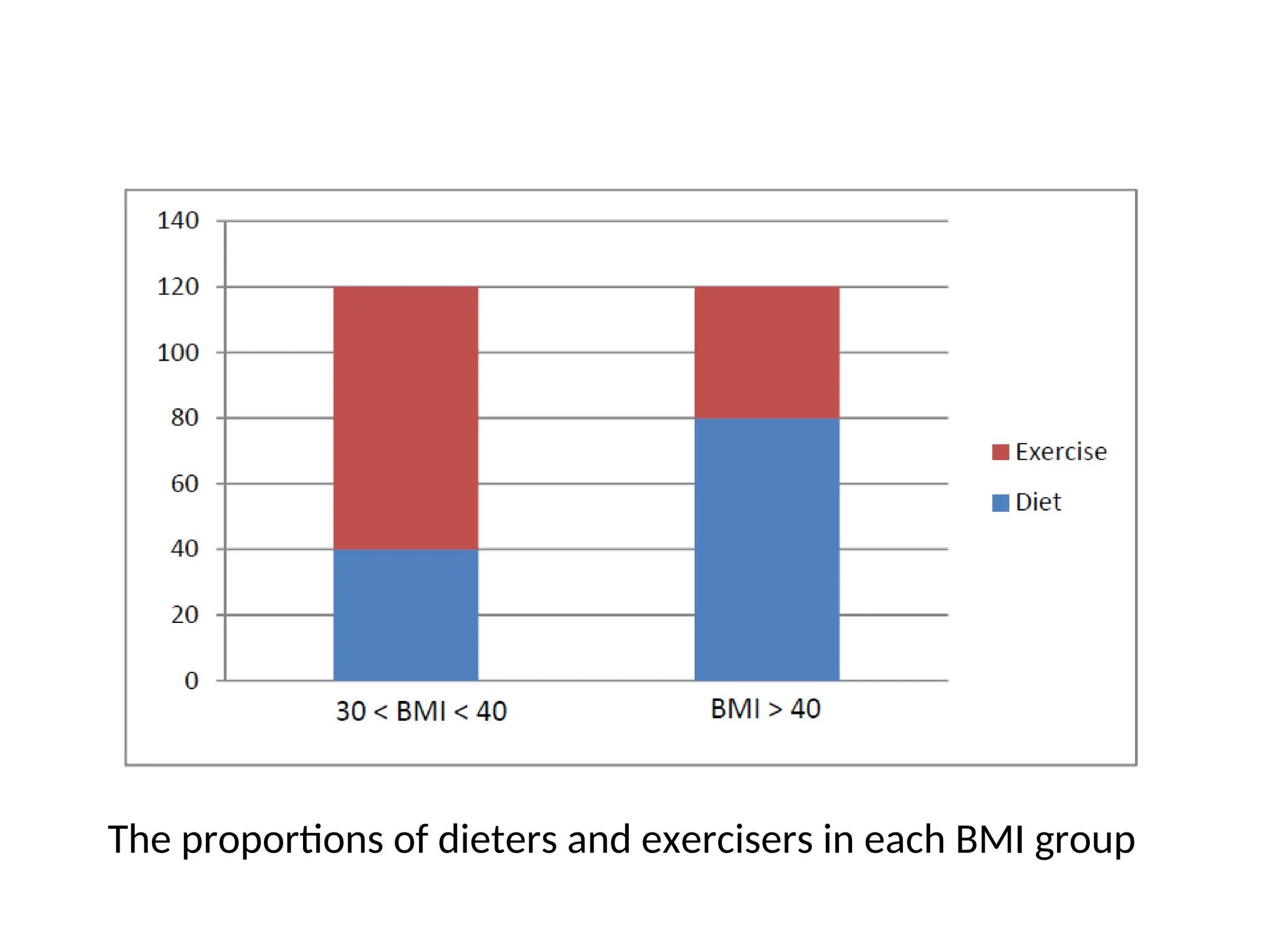
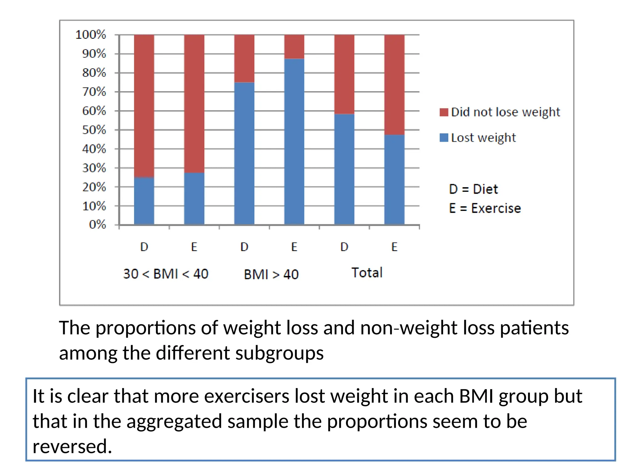
The proportions ofweight loss and non weight loss patients ‐ among the different subgroups It is clear that more exercisers lost weight in each BMI group but that in the aggregated sample the proportions seem to be reversed.
32.
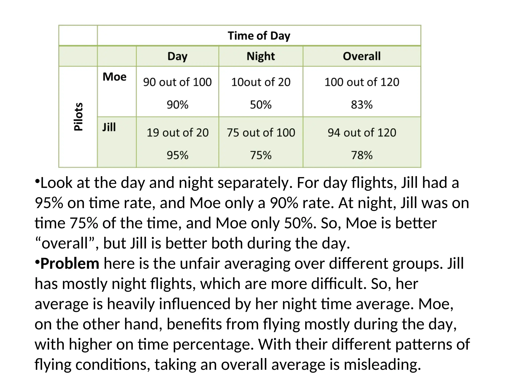
EXAMPLE • Suppose thereare two pilots, Moe and Jill. Moe argues that he is the better pilot of the two, since he managed to land 83% of his last 120 flights on time compared with Jill’s 78%. Let’s look at the data more closely. Here are the results of their last 120 flights, broken down by the time of the day they flew:
33.
•Look at theday and night separately. For day flights, Jill had a 95% on time rate, and Moe only a 90% rate. At night, Jill was on time 75% of the time, and Moe only 50%. So, Moe is better “overall”, but Jill is better both during the day. •Problem here is the unfair averaging over different groups. Jill has mostly night flights, which are more difficult. So, her average is heavily influenced by her night time average. Moe, on the other hand, benefits from flying mostly during the day, with higher on time percentage. With their different patterns of flying conditions, taking an overall average is misleading.
34.
How to Avoidthe Paradox • To avoid spurious results, it is always good practice to examine whether the relationship in the aggregated dataset holds up in it subsets, especially when some groups are not equally represented as others in the data. • Another way may be to weight the samples according to their sizes. • Proper randomization also goes a long way in minimizing the effects of a lurking variable that might have been missed.
35.
• Unfortunately, statisticalanalysis tools are just that – tools to help you organize and analyze the observed data. They cannot tell you anything about data that were not observed or not included in the analysis. • So it is very important to involve a cross functional ‐ team and especially subject matter experts and practitioners in the initial planning and selection of the variables to be measured. After they collect the data, the only way to try to avoid this pitfall is to visually and otherwise examine meaningful subsets of the data. • If you don’t have the option of planning the study but are given the data from a database and asked to “find what you can”, the lesson of Simpson's Paradox is to always look at the data at several levels of aggregation, as in the example above.
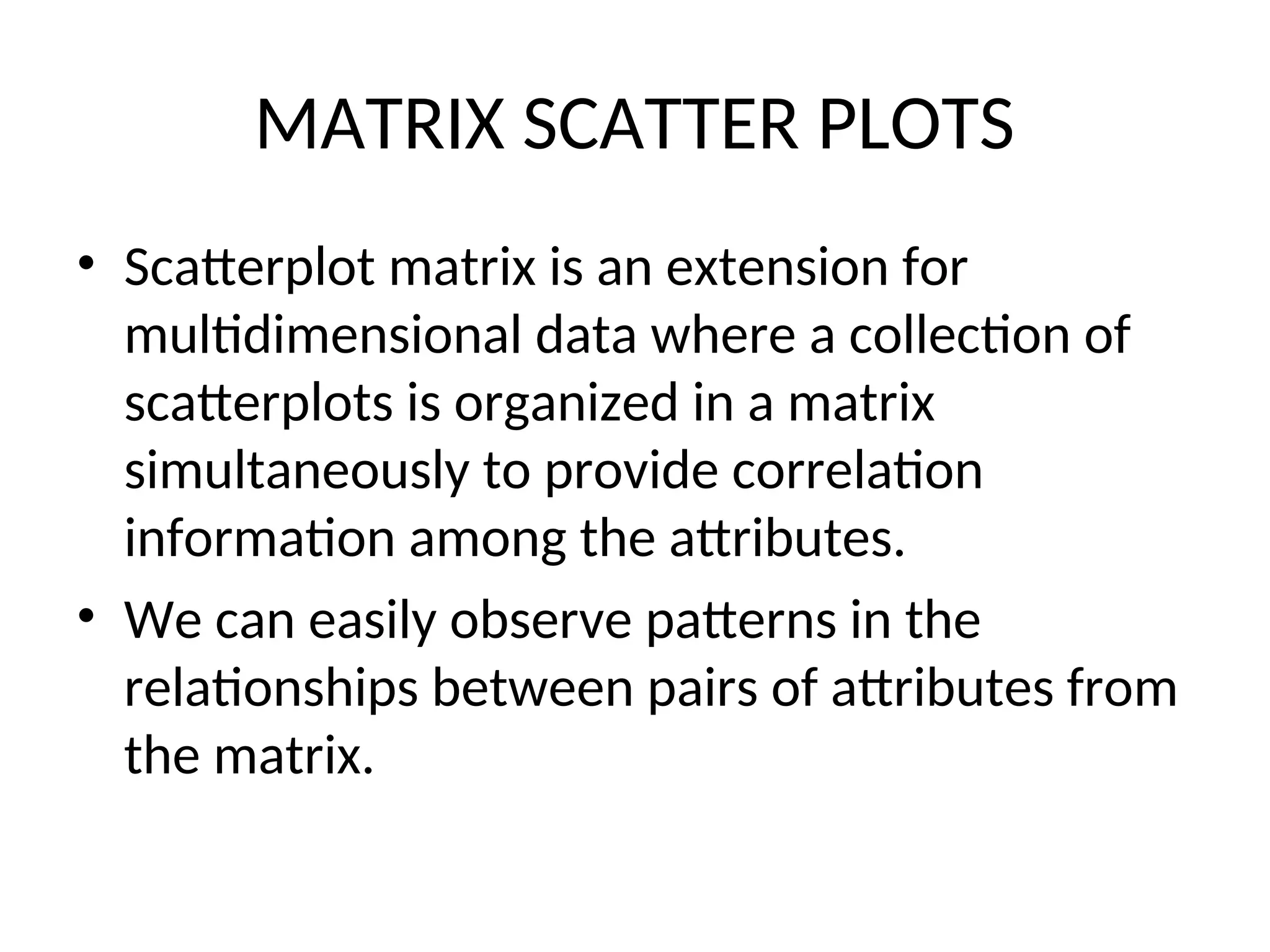
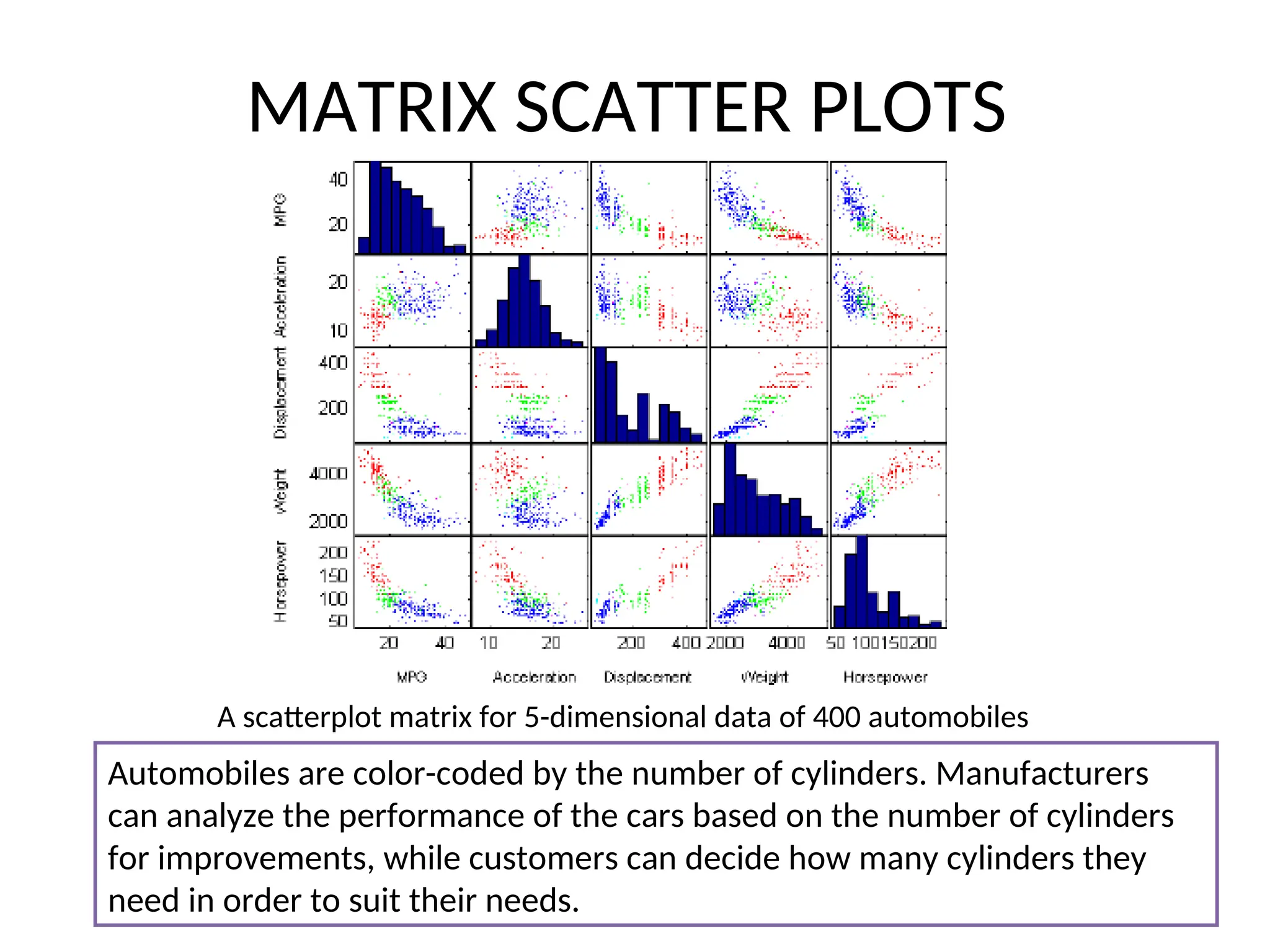
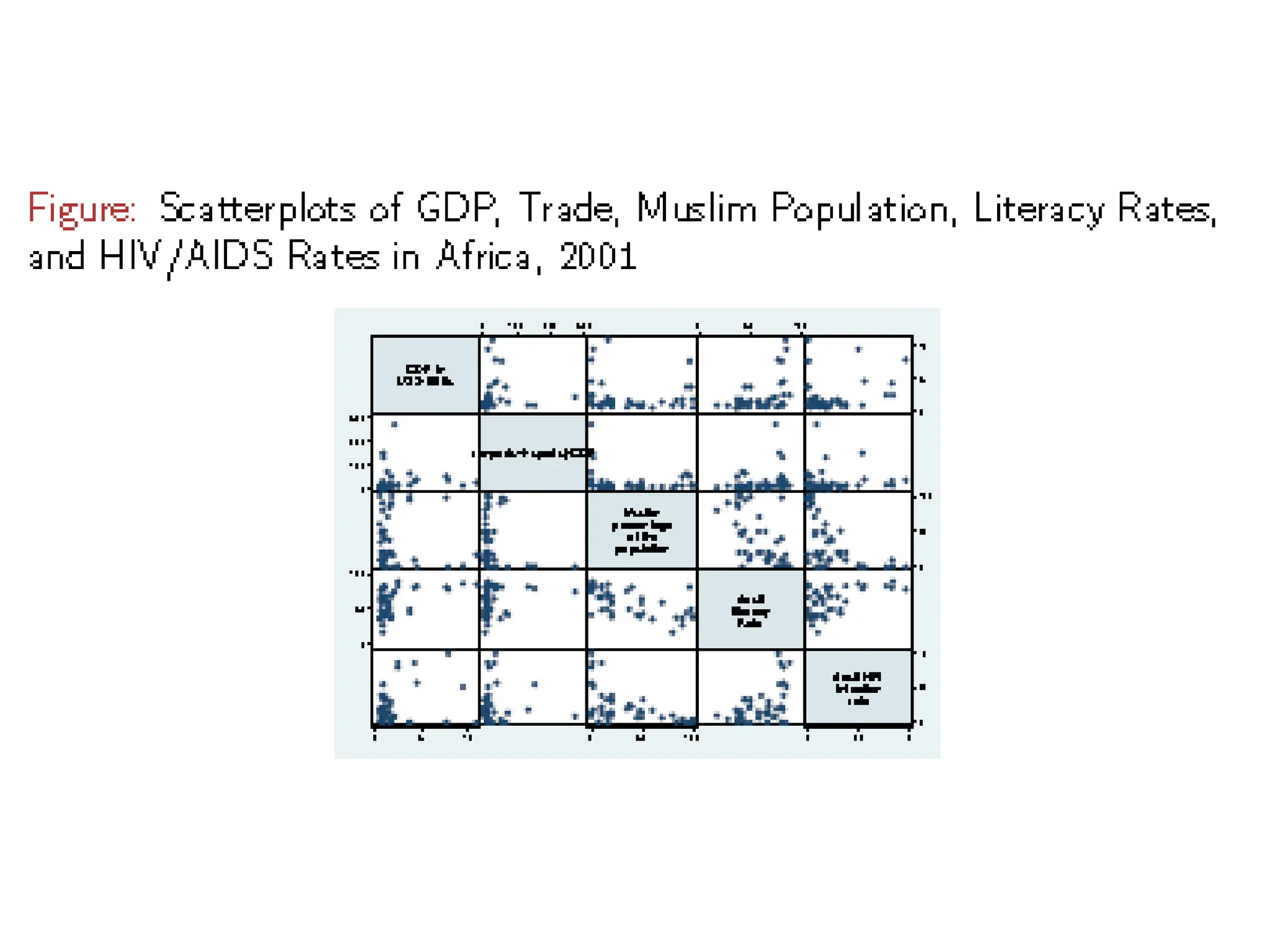
MATRIX SCATTER PLOTS •Scatterplot matrix is an extension for multidimensional data where a collection of scatterplots is organized in a matrix simultaneously to provide correlation information among the attributes. • We can easily observe patterns in the relationships between pairs of attributes from the matrix.
38.
MATRIX SCATTER PLOTS Ascatterplot matrix for 5-dimensional data of 400 automobiles Automobiles are color-coded by the number of cylinders. Manufacturers can analyze the performance of the cars based on the number of cylinders for improvements, while customers can decide how many cylinders they need in order to suit their needs.
39.
LIMITATIONS OF SCATTERPLOTS • There may be important patterns in higher dimensions which are barely recognized in it. • It becomes chaotic when the number of points, that is the number of data items, is too large. • In that case brushing can be applied to address this problem. Brushing aims interpretation by highlighting a particular n-dimensional subspace in the visualization, that is, the respective points of interested are colored or highlighted in each scatterplot in the matrix.
40.
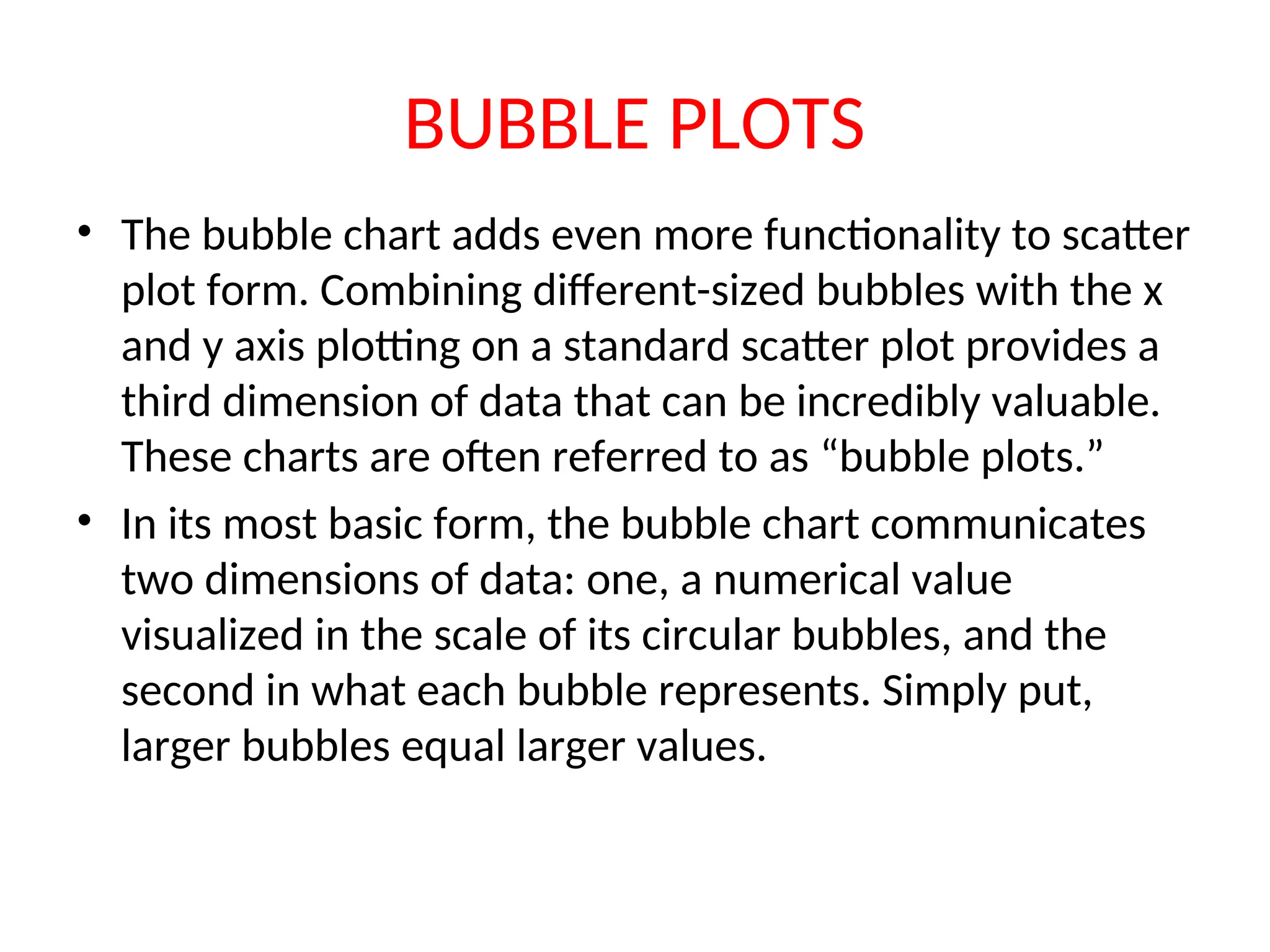
BUBBLE PLOTS • Thebubble chart adds even more functionality to scatter plot form. Combining different-sized bubbles with the x and y axis plotting on a standard scatter plot provides a third dimension of data that can be incredibly valuable. These charts are often referred to as “bubble plots.” • In its most basic form, the bubble chart communicates two dimensions of data: one, a numerical value visualized in the scale of its circular bubbles, and the second in what each bubble represents. Simply put, larger bubbles equal larger values.
41.
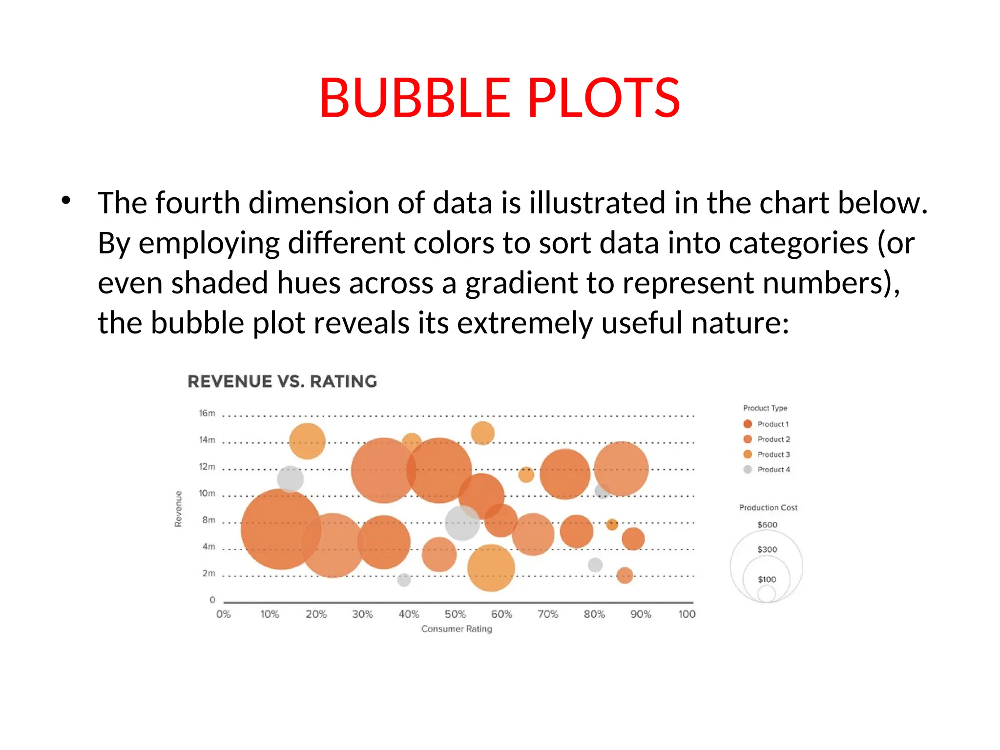
BUBBLE PLOTS • Thefourth dimension of data is illustrated in the chart below. By employing different colors to sort data into categories (or even shaded hues across a gradient to represent numbers), the bubble plot reveals its extremely useful nature:
42.
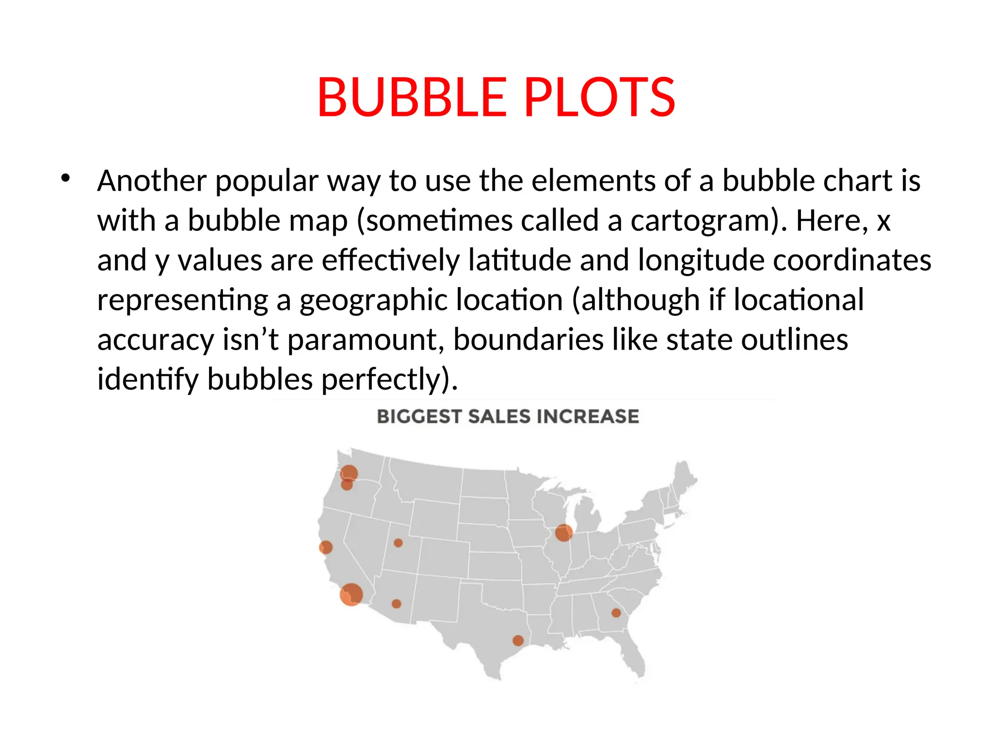
BUBBLE PLOTS • Anotherpopular way to use the elements of a bubble chart is with a bubble map (sometimes called a cartogram). Here, x and y values are effectively latitude and longitude coordinates representing a geographic location (although if locational accuracy isn’t paramount, boundaries like state outlines identify bubbles perfectly).
43.
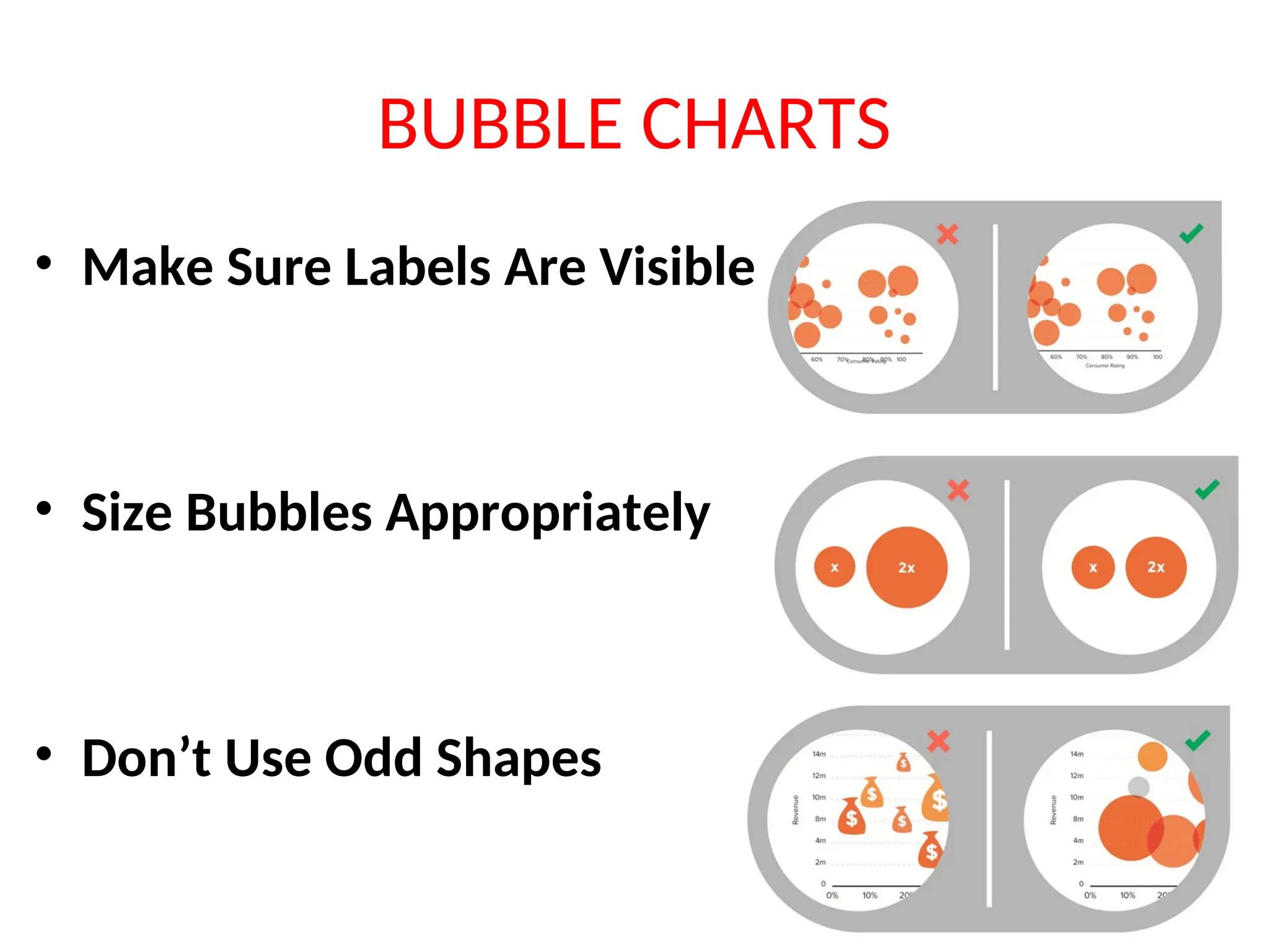
BUBBLE CHARTS • MakeSure Labels Are Visible • Size Bubbles Appropriately • Don’t Use Odd Shapes
44.
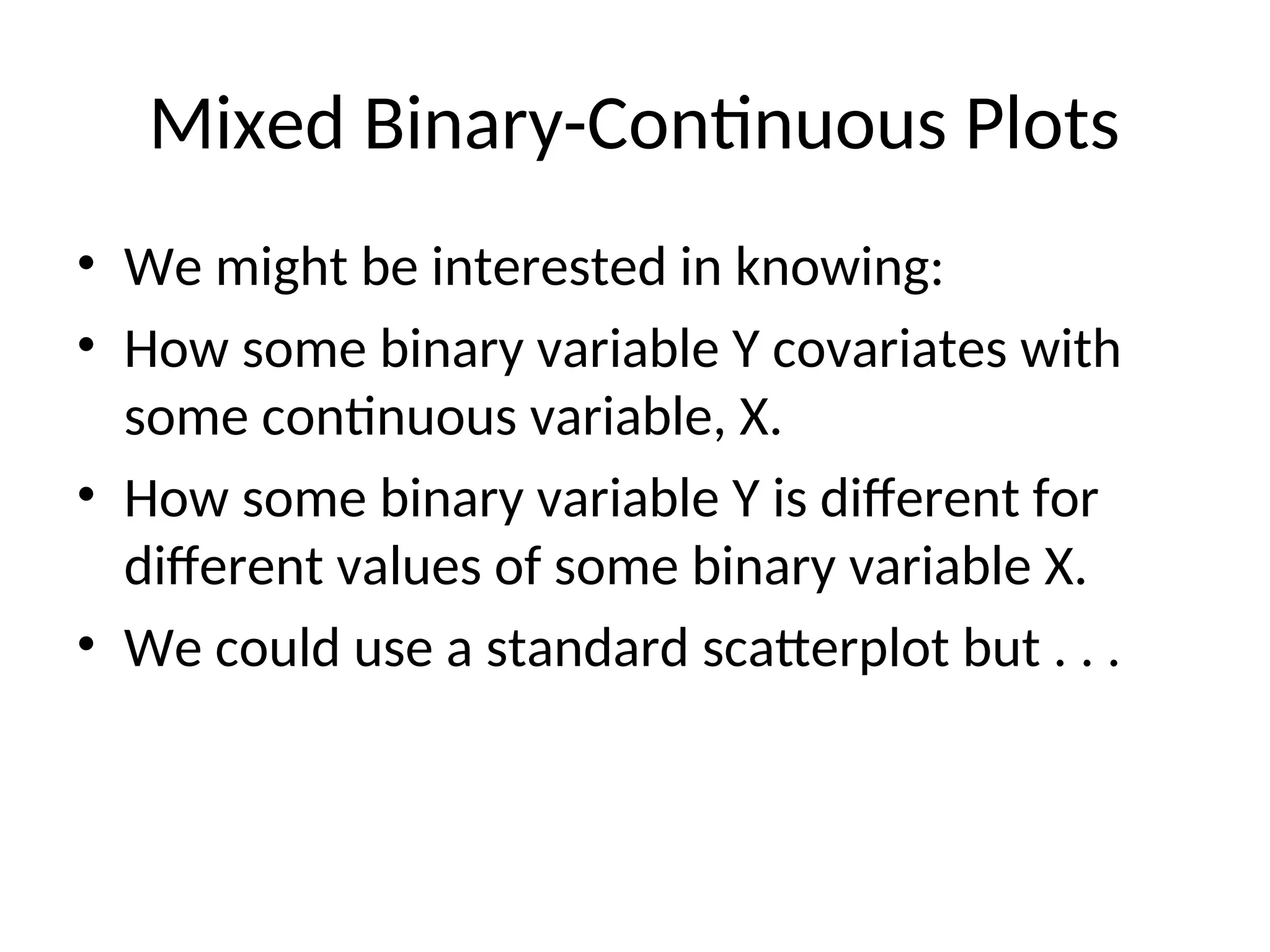
Mixed Binary-Continuous Plots •We might be interested in knowing: • How some binary variable Y covariates with some continuous variable, X. • How some binary variable Y is different for different values of some binary variable X. • We could use a standard scatterplot but . . .
45.
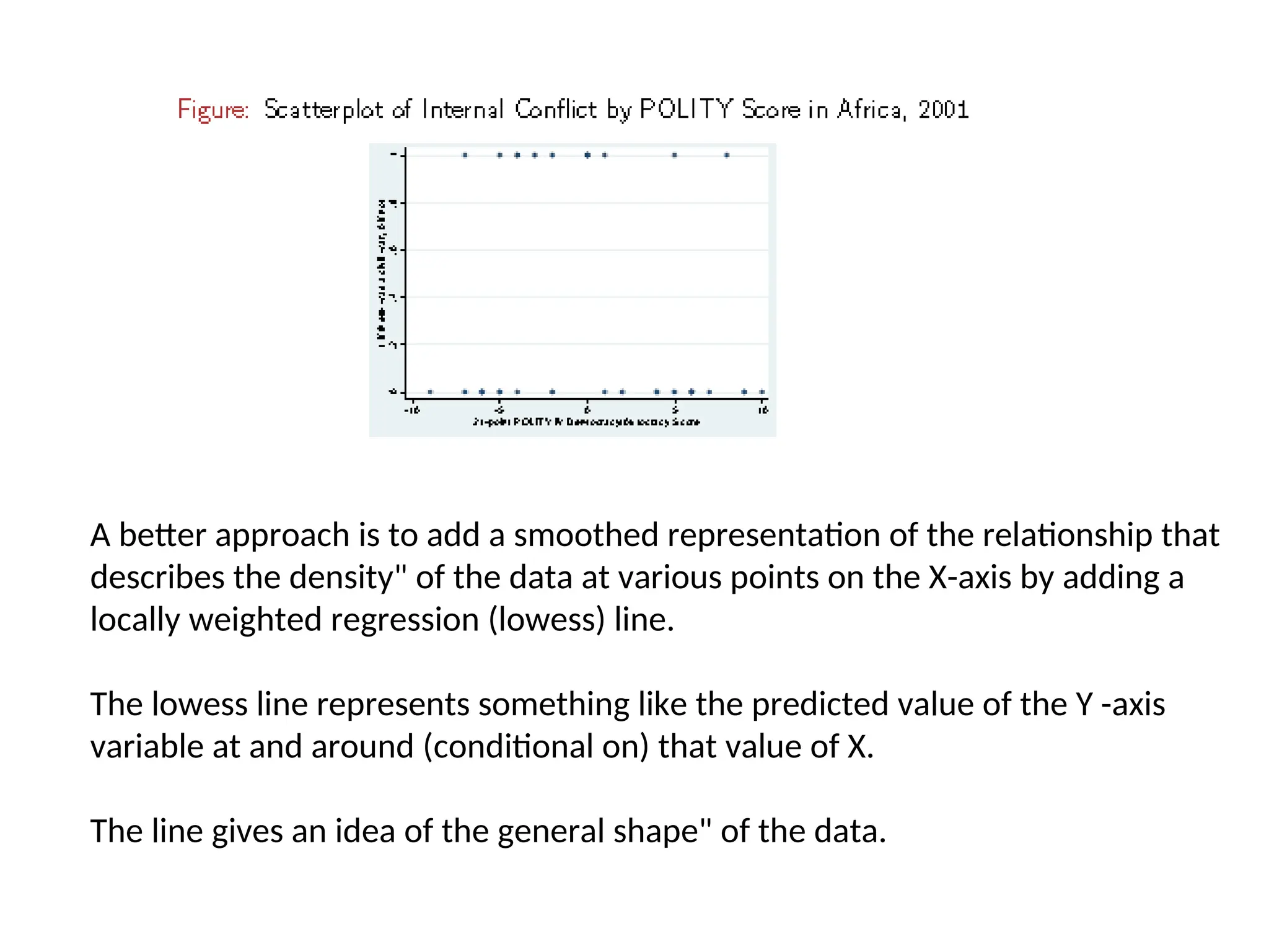
A better approachis to add a smoothed representation of the relationship that describes the density" of the data at various points on the X-axis by adding a locally weighted regression (lowess) line. The lowess line represents something like the predicted value of the Y -axis variable at and around (conditional on) that value of X. The line gives an idea of the general shape" of the data.
46.
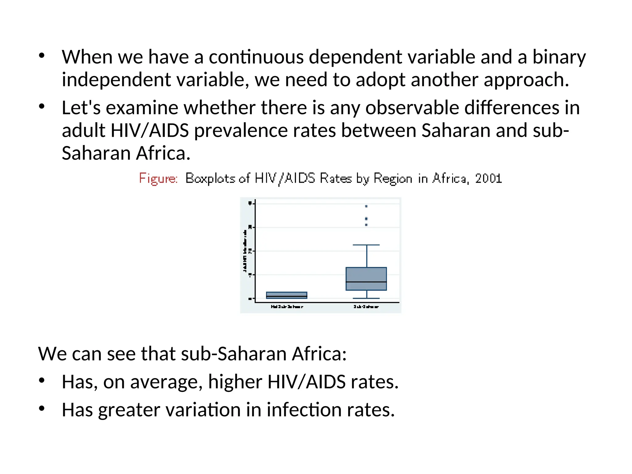
• When wehave a continuous dependent variable and a binary independent variable, we need to adopt another approach. • Let's examine whether there is any observable differences in adult HIV/AIDS prevalence rates between Saharan and sub- Saharan Africa. We can see that sub-Saharan Africa: • Has, on average, higher HIV/AIDS rates. • Has greater variation in infection rates.
48.
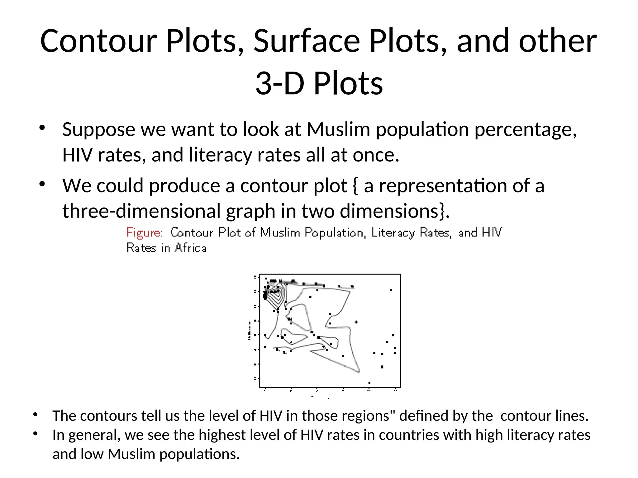
Contour Plots, SurfacePlots, and other 3-D Plots • Suppose we want to look at Muslim population percentage, HIV rates, and literacy rates all at once. • We could produce a contour plot { a representation of a three-dimensional graph in two dimensions}. • The contours tell us the level of HIV in those regions" defined by the contour lines. • In general, we see the highest level of HIV rates in countries with high literacy rates and low Muslim populations.
49.
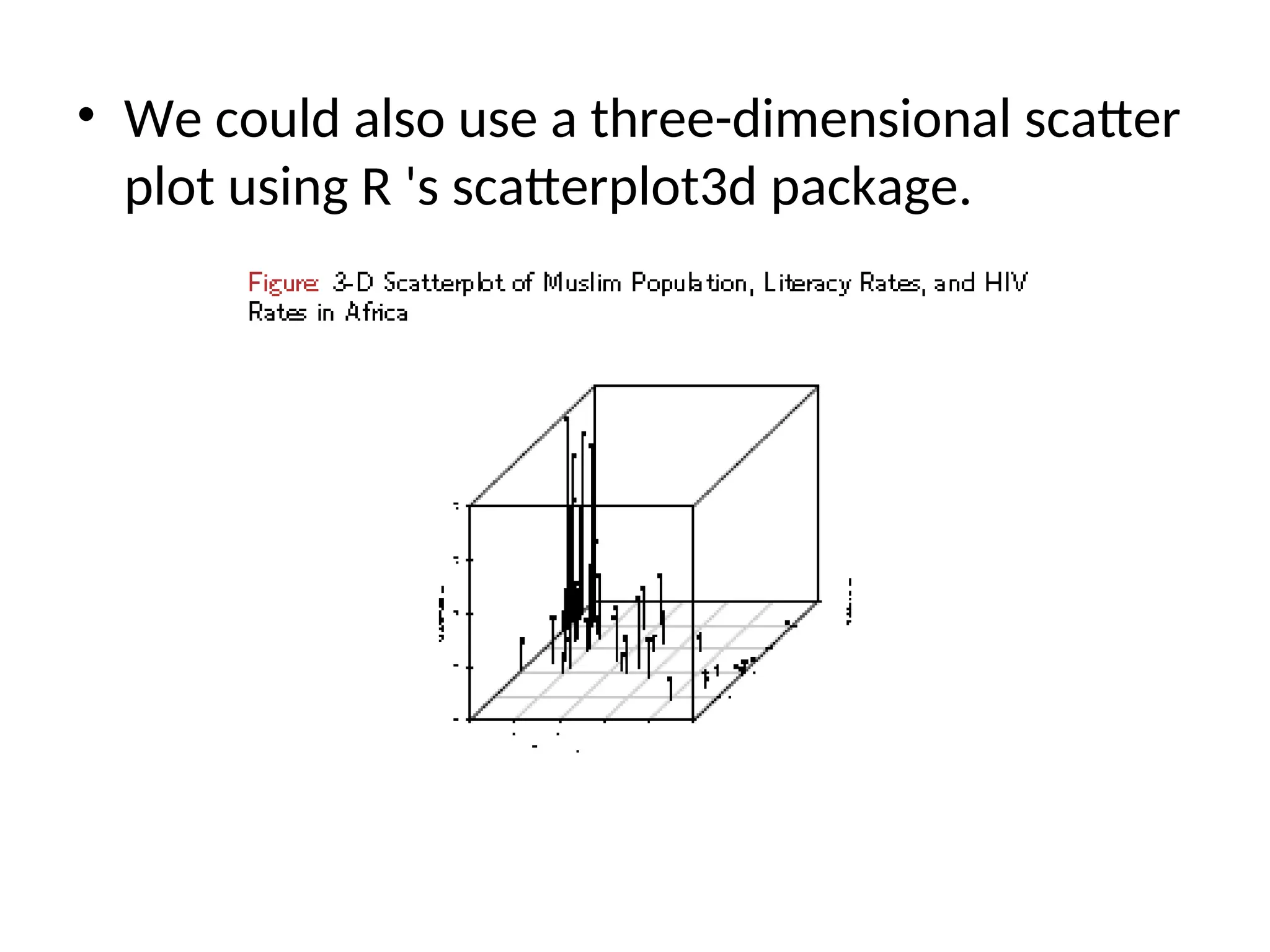
• We couldalso use a three-dimensional scatter plot using R 's scatterplot3d package.
50.
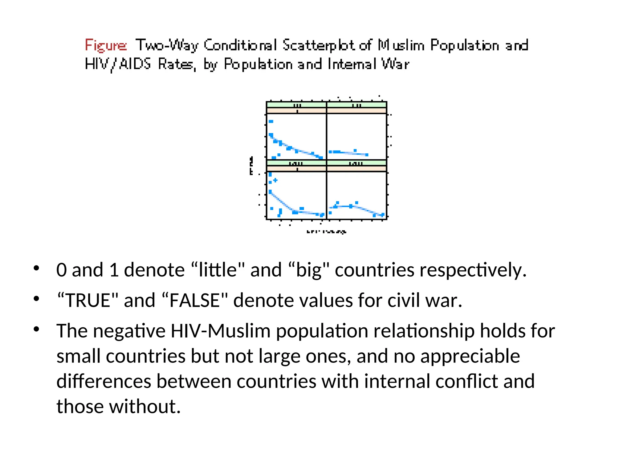
LOTS OF VARIABLES •Things become much harder when we have four or more variables. You might decide to dichotomize or discretize one or more of your variables. • Suppose we want to know whether the relationship between the Muslim percentage of the population and HIV rates is moderated by the presence of civil wars and country size. • We could divide the countries into big and small and produce a four-way scatterplot.
51.
• 0 and1 denote “little" and “big" countries respectively. • “TRUE" and “FALSE" denote values for civil war. • The negative HIV-Muslim population relationship holds for small countries but not large ones, and no appreciable differences between countries with internal conflict and those without.