
- SpreadJS Overview
- Getting Started
- JavaScript Frameworks
- Best Practices
- Features
- Workbook
- Worksheet
- Rows and Columns
- Headers
- Cells
- Work with Cells
- Cell Types
- Cell Format
- Cell States
- Cell Range
- Get Dirty Status
- Cell Buttons
- Cell Dropdowns
- Cell Comments
- Hyperlink
- Auto Merge Cells
- AutoFit
- Auto Fill Data
- Mask Input
- Shrink to Fit
- Cell Overflow
- Ellipsis or Tips for Cell Overflow
- Cell Alignment and Indentation
- Cell Padding and Label Styles
- Cell Span
- Cell Tags
- Styles
- Cell Decoration
- Cell Colors
- Borders, Gridlines and Diagonal Lines
- Quote Prefix
- Insert Cut or Copied Cells
- Rotate Text In Cells
- Vertical Text Direction
- Text Decoration
- Rich Text
- Wrap Text
- Drag and Drop
- Drag and Merge
- Edit Mode Always
- Watermark
- Display Zero as Blank
- IME Mode
- Pattern Fill and Gradient Fill
- Paste Options
- Data Binding
- TableSheet
- GanttSheet
- JSON Schema with SpreadJS
- SpreadJS File Format
- Data Validation
- Conditional Formatting
- Sort
- Group
- Formulas
- Serialization
- Keyboard Actions
- Shapes
- Form Controls
- Floating Objects
- Barcodes
- Charts
- Sparklines
- Tables
- Pivot Table
- Slicer
- Theme
- Culture
- SpreadJS Designer
- SpreadJS Designer Component
- Touch Support
- Formula Reference
- Import and Export Reference
- Frequently Used Events
- API Documentation
- Release Notes
Cell Dropdowns
SpreadJS allows users to add a drop-down cell to the worksheet. Users can use a drop-down menu with specific properties to the cells in a workbook as per their specific requirements and preferences.
They provide a drop-down menu in the cell that can help users in selecting the data easily and quickly. They are also especially helpful in creating input form controls, advanced structured forms, and other interactive forms and dashboards within the spreadsheet.
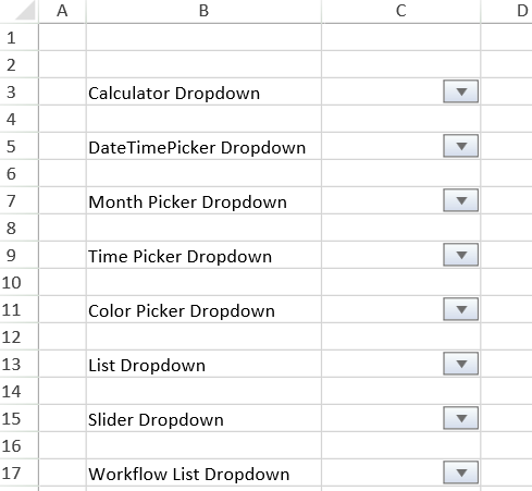
Types of Cell Dropdowns - SpreadJS provides eight different types of built-in dropdown menus while working with spreadsheets. Users can use the DropDownType enumeration to simply specify a value (ranging from 0 to 7) and the corresponding cell dropdown type will be picked as per the following options:
Calculator Dropdown [Enum Value : 6]
Date Time Picker Dropdown [Enum Value : 1]
Month Picker Dropdown [Enum Value : 3 ]
Time Picker Dropdown [Enum Value : 2]
Color Picker Dropdown [Enum Value : 0]
List Dropdown [Enum Value : 4]
Slider Dropdown [Enum Value : 5]
Workflow List Dropdown [Enum Value : 7]
Configuring Cell Dropdowns - Users can configure a dropdown cell with a list of predefined values (using a list dropdown); calculated values (using a calculator dropdown); calendars and events (using date time picker, month picker, and time picker dropdowns); select a color (using color picker dropdown); create range sliders (using a slider dropdown) and automatically repopulate the next available choices based on the earlier choice (using a workflow list dropdown) as shown in the image shared below.
Calculator Dropdown
The calculator dropdown in a cell allows users to compute the values and populate the evaluated result in the cell. The following screenshot depicts the calculator dropdown in cell C3 with a dropdown indicator.
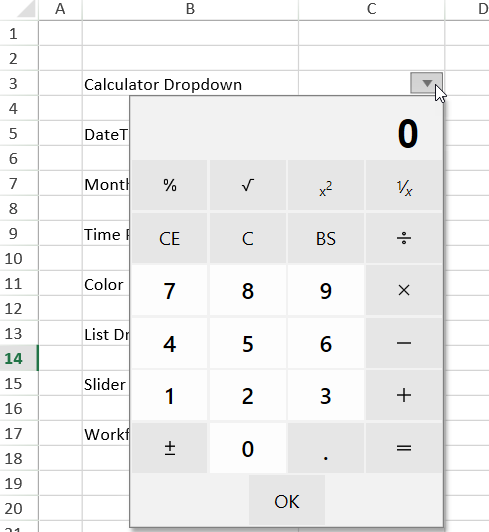
Users can configure the calculator dropdown in a cell by adding a dropdown button using the cellButtons field of the Style class and setting its command parameter to " openCalculator " as shown in the code snippet shared below.
// Set Calculator Dropdown var calStyle = new GC.Spread.Sheets.Style(); calStyle.cellButtons = [ { imageType: GC.Spread.Sheets.ButtonImageType.dropdown, command: "openCalculator", useButtonStyle: true, } ]; activeSheet.setText(2, 3, "Calculator Dropdown"); activeSheet.setStyle(2, 4, calStyle);Date Time Picker Dropdown
The date time picker dropdown in a cell allows users to set the date and time in the selected cell or lets users select a range of dates from the dropdown.
The following image depicts the date time picker dropdown in a cell with a dropdown indicator.
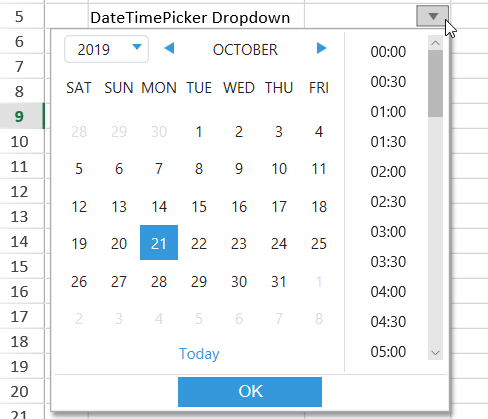
You can configure the date time picker dropdown in a cell by adding a dropdown button using the cellButtons field of the Style class and setting its command parameter to " openDateTimePicker " as shown in the code snippet shared below.
// Set DateTimePicker dropdown var dateTimeStyle = new GC.Spread.Sheets.Style(); dateTimeStyle.cellButtons = [ { imageType: GC.Spread.Sheets.ButtonImageType.dropdown, command: "openDateTimePicker", useButtonStyle: true, } ]; dateTimeStyle.dropDowns = [ { type: GC.Spread.Sheets.DropDownType.dateTimePicker, option: { showTime: true, } } ]; activeSheet.setText(4, 3, "DateTimePicker Dropdown"); activeSheet.setStyle(4, 4, dateTimeStyle);The following image depicts the date range selection done using the date time picker dropdown.
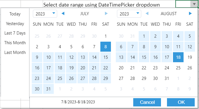
In the above image, the first selected date is the start date, and the second selected date is the end date for the date range selection. You can select a range of dates from the dropdown by setting the showDateRange property to true. If the showDateRange property is set to false, then it will display the date time picker dropdown. The showDateRange property value is false by default.
Note that when you select a date range, the cell returns Date objects for the selected start and end time as shown in the below interface.
{ start: Date end: Date }Additionally, you can also select the build-in date ranges based on the current date, such as "Today", "Yesterday", "Last 7 days", "This Month", or “Last Month”. To accomplish this, set the showBuiltInDateRange property value to true. The built-in date ranges will not be displayed if the property value is false. The showBuiltInDateRange property is true by default.
The following code depicts how to set a number range in the date time picker dropdown.
// Set DateTimePicker dropdown to set number range var dateTimeStyle = new GC.Spread.Sheets.Style(); dateTimeStyle.cellButtons = [ { imageType: GC.Spread.Sheets.ButtonImageType.dropdown, command: "openDateTimePicker", useButtonStyle: true, } ]; dateTimeStyle.dropDowns = [ { type: GC.Spread.Sheets.DropDownType.dateTimePicker, option: { showTime: false, showDateRange: true, showBuiltInDateRange: true, } } ]; activeSheet.setStyle(0, 0, dateTimeStyle);Note: If the value of the showDateRange property is set to true:
The showTime property value will be false and the calenderPage property value will be day.
The keyboard event will be canceled.
Month Picker Dropdown
The month picker dropdown in a cell allows users to configure a specific month in a year to populate the evaluated result in the cell. The following screenshot depicts the month picker dropdown in cell C7 with a dropdown indicator.
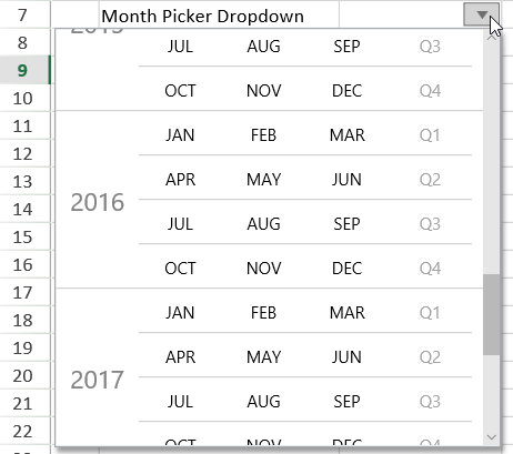
Users can configure the month picker dropdown in a cell by adding a dropdown button using the cellButtons field of the Style class and setting its command parameter to " openMonthPicker " as shown in the code snippet shared below.
// Set MonthPicker Dropdown var monthPickerStyle = new GC.Spread.Sheets.Style(); monthPickerStyle.cellButtons = [ { imageType: GC.Spread.Sheets.ButtonImageType.dropdown, command: "openMonthPicker", useButtonStyle: true, } ]; monthPickerStyle.dropDowns = [ { type: GC.Spread.Sheets.DropDownType.monthPicker, option: { startYear: 2009, stopYear: 2019, height: 300, } } ]; activeSheet.setText(6, 3, "Month Picker Dropdown"); activeSheet.setStyle(6, 4, monthPickerStyle);Time Picker Dropdown
The time picker dropdown in a cell allows users to configure a specific time to populate the evaluated result in the cell. The following screenshot depicts the time picker dropdown in cell C9 with a dropdown indicator.
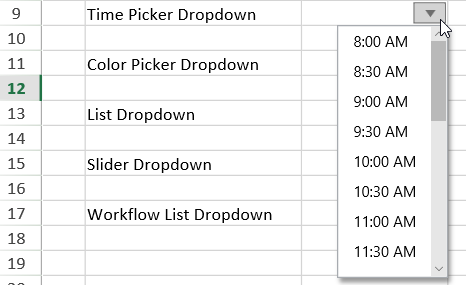
Users can configure the time picker dropdown in a cell by adding a dropdown button using the cellButtons field of the Style class and setting its command parameter to " openTimePicker " as shown in the code snippet shared below.
// Set the TimePicker Dropdown var timePickerStyle = new GC.Spread.Sheets.Style(); timePickerStyle.cellButtons = [ { imageType: GC.Spread.Sheets.ButtonImageType.dropdown, command: "openTimePicker", useButtonStyle: true, } ]; timePickerStyle.dropDowns = [ { type: GC.Spread.Sheets.DropDownType.timePicker, option: { min: { hour: 8 }, max: { hour: 19 }, step: { minute: 30 }, formatString: "h:mm AM/PM", } } ]; activeSheet.setText(8, 3, "Time Picker Dropdown"); activeSheet.setStyle(8, 4, timePickerStyle);Color Picker Dropdown
The color picker dropdown in a cell allows users to choose a specific color to populate the cell value with the hex code of the chosen color. The following screenshot depicts the color picker dropdown in cell C11 with a dropdown indicator.
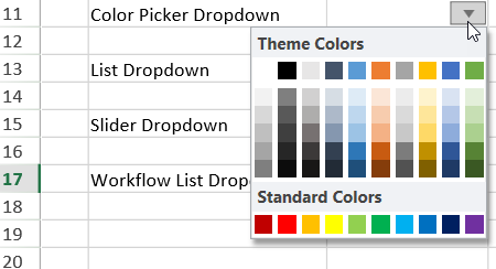
Users can configure the color picker dropdown in a cell by adding a dropdown button using the cellButtons field of the Style class and setting its command parameter to " openColorPicker " as shown in the code snippet shared below.
// Set the ColorPicker Dropdown var colorPickerStyle = new GC.Spread.Sheets.Style(); colorPickerStyle.cellButtons = [ { imageType: GC.Spread.Sheets.ButtonImageType.dropdown, command: "openColorPicker", useButtonStyle: true, } ]; activeSheet.setText(10, 3, "Color Picker Dropdown"); activeSheet.setStyle(10, 4, colorPickerStyle);List Dropdown
The list dropdown in a cell allows users to choose a specific item from the dropdown list to populate the cell value. The following screenshot depicts the list dropdown in cell C13 with a dropdown indicator.
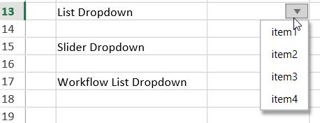
Users can configure the list dropdown in a cell by adding a dropdown button using the cellButtons field of the Style class and setting its command parameter to " openList " as shown in the code snippet shared below.
// Set the List Dropdown var listStyle = new GC.Spread.Sheets.Style(); listStyle.cellButtons = [ { imageType: GC.Spread.Sheets.ButtonImageType.dropdown, command: "openList", useButtonStyle: true, } ]; listStyle.dropDowns = [ { type: GC.Spread.Sheets.DropDownType.list, option: { items: [ { text: 'item1', value: 'item1' }, { text: 'item2', value: 'item2' }, { text: 'item3', value: 'item3' }, { text: 'item4', value: 'item4' } ], } } ]; activeSheet.setText(12, 3, "List Dropdown"); activeSheet.setStyle(12, 4, listStyle);Additionally, SpreadJS also allows users to choose multiple items from the dropdown list to populate the cell value. As can be seen from the below image, when multiple items are selected from the dropdown, they are separated by a comma in between.
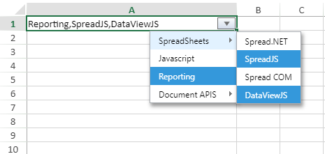
Users can select multiple items from the dropdown list by setting the multiselect property to true as shown in the code snippet shared below.
// set the list data var listData = { multiSelect: true, items: [ { text: 'SpreadSheets', value: 'SpreadSheets', layout: { displayAs: GC.Spread.Sheets.LayoutDisplayAs.popup }, items: [ { text: 'Spread.NET', value: 'Spread.NET' }, { text: 'SpreadJS', value: 'SpreadJS' }, { text: 'Spread COM', value: 'Spread COM' }, { text: 'DataViewJS', value: 'DataViewJS' } ] }, { text: 'Javascript', value: 'Javascript', }, { text: 'Reporting', value: 'Reporting', }, { text: 'Document APIS', value: 'Document APIS', layout: { displayAs: GC.Spread.Sheets.LayoutDisplayAs.popup }, items: [ { text: 'Documents for Excel', value: 'Documents for Excel' }, { text: 'Excel Template Language', value: 'Excel Template Language' }, { text: 'Documents for PDF', value: 'Documents for PDF' }, { text: 'Documents for PDF Viewer', value: 'Documents for PDF Viewer' }, { text: 'Documents for Microsoft Word', value: 'Documents for Microsoft Word' }, { text: 'Documents for Imaging', value: 'Documents for Imaging' } ] } ] }; var style = new GC.Spread.Sheets.Style(); style.cellButtons = [ { imageType: GC.Spread.Sheets.ButtonImageType.dropdown, command: "openList", useButtonStyle: true, } ]; style.dropDowns = [ { type: GC.Spread.Sheets.DropDownType.list, option: listData } ]; activeSheet.setStyle(0, 0, style);Slider Dropdown
The slider dropdown in a cell allows users to add a dynamic range slider in a cell that populates the current value in the cell. The following image depicts the slider dropdown in a cell with a dropdown indicator.
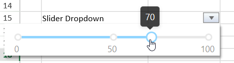
You can configure the slider dropdown in a cell by adding a dropdown button using the cellButtons field of the Style class and setting its command parameter to " openSlider ". The following code snippet allows users to adjust only the end number for the range using the slider dropdown.
// Set the Slider dropdown var horizontalSliderStyle = new GC.Spread.Sheets.Style(); horizontalSliderStyle.cellButtons = [ { imageType: GC.Spread.Sheets.ButtonImageType.dropdown, command: "openSlider", useButtonStyle: true, } ]; horizontalSliderStyle.dropDowns = [ { type: GC.Spread.Sheets.DropDownType.slider, option: { marks: [0, 50, 100], step: 10, direction: GC.Spread.Sheets.LayoutDirection.horizontal, } } ]; activeSheet.setText(14, 3, "Slider Dropdown"); activeSheet.setStyle(14, 4, horizontalSliderStyle);You can also set both the start and end numbers for the range slider as displayed in the image below.
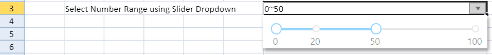
To select the required range of numbers from the slider dropdown, set the showNumberRange property to true. If the showNumberRange property is set to false, the dropdown will be consistent with the previous slider selection.
The following code depicts how to set a number range in the slider dropdown.
// Set the Slider dropdown to set a number range var horizontalSliderStyle = new GC.Spread.Sheets.Style(); horizontalSliderStyle.dropDowns = [ { type: GC.Spread.Sheets.DropDownType.slider, option: { marks: [0, 26, 37, 100], step: 10, direction: GC.Spread.Sheets.LayoutDirection.horizontal, showNumberRange: true } } ]; activeSheet.setStyle(8, 4, horizontalSliderStyle); spread.commandManager().execute({cmd:"openSlider",row:8,col:4,sheetName:"Sheet1"});Workflow List Dropdown
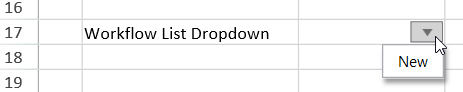
The workflow list dropdown in a cell allows users to select workflow items easily and quickly to populate the chosen value in the cell. The following screenshot depicts the workflow list dropdown in cell C17 with a dropdown indicator.
Users can configure the workflow list dropdown in a cell by adding a dropdown button using the cellButtons field of the Style class and setting its command parameter to " openWorkflowList " as shown in the code snippet shared below.
// Set the Workflow list dropdown let workflowListStyle = new GC.Spread.Sheets.Style(); workflowListStyle.cellButtons = [ { imageType: GC.Spread.Sheets.ButtonImageType.dropdown, command: "openWorkflowList", useButtonStyle: true, } ]; workflowListStyle.dropDowns = [ { type: GC.Spread.Sheets.DropDownType.workflowList, option: { items: [ { value: "New", transitions: [1] }, { value: "Open", transitions: [0, 2, 3, 5] }, { value: "In Progress", transitions: [1, 3, 5] }, { value: "Resolved", transitions: [5, 4] }, { value: "Reopened", transitions: [5, 3, 2] }, { value: "Closed", transitions: [4] }, ] } } ]; activeSheet.setText(16, 3, "Workflow List Dropdown"); activeSheet.setStyle(16, 4, workflowListStyle);Multiple Column Dropdown
Multiple column dropdown in a cell allows users to provide a drop-down list as well as an editable area which will allow them to type in the value as well as choose from a displayed list. You can configure the multi-column dropdown in a cell by setting ButtonImageType enumeration to dropdown and DropDownType enumeration to multiColumn.
The following example depicts the multi-column dropdown in a cell with a dropdown indicator.
You can scroll through the dropdown list and select the item using a mouse and keyboard. When you select any data item from the dropdown list, the data item value will return the current cell value as the object type, and when you re-open the dropdown list, the selected item will be highlighted.
For the returned object value, the user can use the PROPERTY function to parse the object to get the specified property value.
In order to customize the dropdown, you should specify the data source. The following section describes the types of supported data sources.
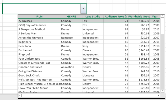
You can define an array in the data source when customizing the dropdown list. The following image depicts the multi-column dropdown when the data source is fetched from an array.
The following code snippet shows how to set a multi-column dropdown with an array data source.
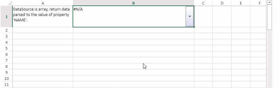
// Initializing Spread var spread = new GC.Spread.Sheets.Workbook(document.getElementById('ss'), { sheetCount: 1 }); // Get the activesheet var sheet = spread.getActiveSheet(); // DataSource is array let dataSource = [ { "NAME": "James Smith", "POSITION": "AVP", "OFFICE": "Fox Studios", "EXTN": 71, "START_DATE": '3/08/2008', "JOINING_YEAR": 2008 } ]; let colInfos = [ { name: "NAME", displayName: "NAME", size: "2*" }, { name: "POSITION", displayName: "POSITION", size: "*" }, { name: "OFFICE", size: "*" }, { name: "EXTN", size: "*" }, { name: "START_DATE", size: 100 }, { name: "JOINING_YEAR", size: 100 } ]; // Create style var style = new GC.Spread.Sheets.Style(); style.cellButtons = [ { imageType: GC.Spread.Sheets.ButtonImageType.dropdown, command: "openMultiColumn", useButtonStyle: true, } ]; style.dropDowns = [ { type: GC.Spread.Sheets.DropDownType.multiColumn, option: { width: 600, height: 150, dataSource: dataSource, bindingInfos: colInfos } } ]; // Set style's formatter style.formatter = '=PROPERTY(@, "NAME")'; // Set style sheet.setStyle(0, 1, style); // Set text sheet.setText(0, 0, "DataSource is array, return data parsed to the value of property 'NAME'."); // Set wordwrap sheet.getCell(0, 0).wordWrap(true); sheet.getCell(0, 1).wordWrap(true); // Set column width sheet.setColumnWidth(0, 200); sheet.setColumnWidth(1, 400); // Set row height sheet.setRowHeight(0, 70);You can define the formula reference in the data source when customizing the dropdown list. The following image depicts the multi-column dropdown when a data source is fetched from the formula reference.
The following code snippet shows how to set a multi-column dropdown with formula reference data source.
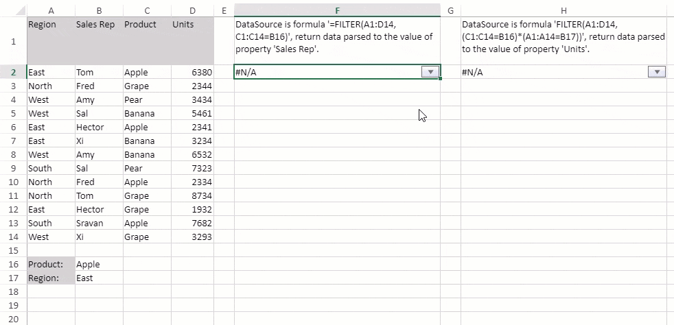
// Initializing Spread var spread = new GC.Spread.Sheets.Workbook(document.getElementById('ss'), { sheetCount: 1 }); // Allow dynamic array spread.options.allowDynamicArray = true; // Get the activesheet var sheet = spread.getActiveSheet(); sheet.suspendPaint(); // Set column widths for (var i = 0; i < 3; i++) sheet.setColumnWidth(i, 70.0, GC.Spread.Sheets.SheetArea.viewport); sheet.setColumnWidth(4, 30.0, GC.Spread.Sheets.SheetArea.viewport); sheet.setColumnWidth(6, 30.0, GC.Spread.Sheets.SheetArea.viewport); // Setting Data in Cells sheet.setText(0, 0, "Region"); sheet.getCell(0, 0).backColor("LightGray"); sheet.setText(1, 0, "East"); sheet.setText(2, 0, "North"); sheet.setText(3, 0, "West"); sheet.setText(4, 0, "West"); sheet.setText(5, 0, "East"); sheet.setText(6, 0, "East"); sheet.setText(7, 0, "West"); sheet.setText(8, 0, "South"); sheet.setText(9, 0, "North"); sheet.setText(10, 0, "North"); sheet.setText(11, 0, "East"); sheet.setText(12, 0, "South"); sheet.setText(13, 0, "West"); sheet.setText(0, 1, "Sales Rep"); sheet.getCell(0, 1).backColor("LightGray"); sheet.setText(1, 1, "Tom"); sheet.setText(2, 1, "Fred"); sheet.setText(3, 1, "Amy"); sheet.setText(4, 1, "Sal"); sheet.setText(5, 1, "Hector"); sheet.setText(6, 1, "Xi"); sheet.setText(7, 1, "Amy"); sheet.setText(8, 1, "Sal"); sheet.setText(9, 1, "Fred"); sheet.setText(10, 1, "Tom"); sheet.setText(11, 1, "Hector"); sheet.setText(12, 1, "Sravan"); sheet.setText(13, 1, "Xi"); sheet.setText(0, 2, "Product"); sheet.getCell(0, 2).backColor("LightGray"); sheet.setText(1, 2, "Apple"); sheet.setText(2, 2, "Grape"); sheet.setText(3, 2, "Pear"); sheet.setText(4, 2, "Banana"); sheet.setText(5, 2, "Apple"); sheet.setText(6, 2, "Banana"); sheet.setText(7, 2, "Banana"); sheet.setText(8, 2, "Pear"); sheet.setText(9, 2, "Apple"); sheet.setText(10, 2, "Grape"); sheet.setText(11, 2, "Grape"); sheet.setText(12, 2, "Apple"); sheet.setText(13, 2, "Grape"); sheet.setText(0, 3, "Units"); sheet.getCell(0, 3).backColor("LightGray"); sheet.setText(1, 3, "6380"); sheet.setText(2, 3, "2344"); sheet.setText(3, 3, "3434"); sheet.setText(4, 3, "5461"); sheet.setText(5, 3, "2341"); sheet.setText(6, 3, "3234"); sheet.setText(7, 3, "6532"); sheet.setText(8, 3, "7323"); sheet.setText(9, 3, "2334"); sheet.setText(10, 3, "8734"); sheet.setText(11, 3, "1932"); sheet.setText(12, 3, "7682"); sheet.setText(13, 3, "3293"); sheet.setText(15, 0, "Product:"); sheet.getCell(15, 0).backColor("LightGray"); sheet.setText(15, 1, "Apple"); sheet.setText(16, 0, "Region:"); sheet.getCell(16, 0).backColor("LightGray"); sheet.setText(16, 1, "East"); // Create colInfos array var colInfos = [ { name: "Region", size: "*" }, { name: "Sales Rep", size: "*" }, { name: "Product", size: "*" }, { name: "Units", size: "*" } ]; // Create style var style = new GC.Spread.Sheets.Style(); // Setting "Filter" Formula( with one condition) wherein we filter range A1:D14 // based upon criteria wherein range C1:C14 is equal to value in cell B16 var dataSource = "FILTER(A1:D14, C1:C14=B16)"; style.cellButtons = [ { imageType: GC.Spread.Sheets.ButtonImageType.dropdown, command: "openMultiColumn", useButtonStyle: true } ]; style.dropDowns = [ { type: GC.Spread.Sheets.DropDownType.multiColumn, option: { width: 300, height: 220, dataSource: dataSource, bindingInfos: colInfos } } ]; style.formatter = '=PROPERTY(@, "Sales Rep")'; // Set text sheet.setText(0, 5, "DataSource is formula '=FILTER(A1:D14, C1:C14=B16)', return data parsed to the value of property 'Sales Rep'."); // Set style sheet.setStyle(1, 5, style); // create another style var style1 = new GC.Spread.Sheets.Style(); // Setting "Filter" Formula( with two conditions) wherein we filter range A1:D14 // based upon criteria wherein range C1:C14 is equal to value in cell B16 // and range A1:A14 is equal to value in cell B17 var dataSource1 = "FILTER(A1:D14, (C1:C14=B16)*(A1:A14=B17))"; style1.cellButtons = [ { imageType: GC.Spread.Sheets.ButtonImageType.dropdown, command: "openMultiColumn", useButtonStyle: true } ]; style1.dropDowns = [ { type: GC.Spread.Sheets.DropDownType.multiColumn, option: { width: 300, height: 220, dataSource: dataSource1, bindingInfos: colInfos } } ]; style1.formatter = '=PROPERTY(@, "Units")'; // Set text sheet.setText(0, 7, "DataSource is formula 'FILTER(A1:D14, (C1:C14=B16)*(A1:A14=B17))', return data parsed to the value of property 'Units'."); // Set style sheet.setStyle(1, 7, style1); // Set column width sheet.setColumnWidth(5, 300, GC.Spread.Sheets.SheetArea.viewport); sheet.setColumnWidth(7, 300, GC.Spread.Sheets.SheetArea.viewport); // Set wordwrap to true sheet.getCell(0, 5).wordWrap(true); sheet.getCell(0, 7).wordWrap(true); // Set row height sheet.setRowHeight(0, 70); sheet.resumePaint();You can define the table in the data source when customizing the dropdown list. The following image depicts the multi-column dropdown when a data source is fetched from the table.
The following code snippet shows how to set a multi-column dropdown with a table data source.
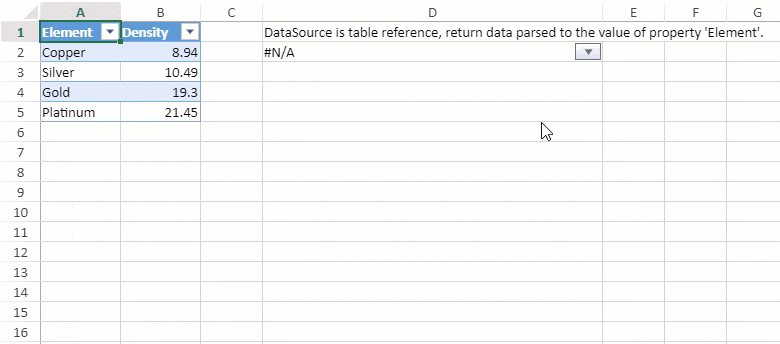
// Initializing Spread var spread = new GC.Spread.Sheets.Workbook(document.getElementById('ss'), { sheetCount: 1 }); // Get the activesheet var sheet = spread.getActiveSheet(); // Set column width sheet.setColumnWidth(0, 80); sheet.setColumnWidth(1, 80); sheet.setColumnWidth(3, 340); sheet.suspendPaint(); // Create data var data = [ { Element: "Copper", Density: 8.94 }, { Element: "Silver", Density: 10.49 }, { Element: "Gold", Density: 19.30 }, { Element: "Platinum", Density: 21.45 } ]; // Set Data Source sheet.setDataSource(new GC.Spread.Sheets.Bindings.CellBindingSource({ ds: data })); // Add table var table = sheet.tables.add("tableSource", 0, 0, 1, 1); // Bind table table.bindingPath("ds"); // Create style var style = new GC.Spread.Sheets.Style(); style.cellButtons = [ { imageType: GC.Spread.Sheets.ButtonImageType.dropdown, command: "openMultiColumn", useButtonStyle: true, } ]; style.dropDowns = [ { type: GC.Spread.Sheets.DropDownType.multiColumn, option: { width: 180, height: 200, dataSource: "tableSource[[#Headers], [#Data]]" } } ]; style.formatter = '=PROPERTY(@, "Element")'; // Set text sheet.setText(0, 3, "DataSource is table reference, return data parsed to the value of property 'Element'."); // Set style sheet.setStyle(1, 3, style); // Set word wrap to true sheet.getCell(1, 3).wordWrap(true); sheet.resumePaint();You can define the range reference in the data source when customizing the dropdown list. The following image depicts the multi-column dropdown when a data source is fetched from a range reference.
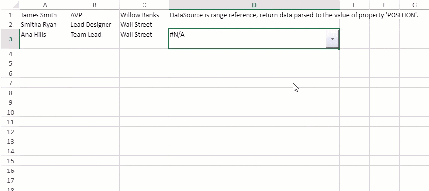
The following code snippet shows how to set a multi-column dropdown with a range of reference data sources.
// Initializing Spread var spread = new GC.Spread.Sheets.Workbook(document.getElementById('ss'), { sheetCount: 1 }); // Get the activesheet var sheet = spread.getActiveSheet(); // Set column width & row height sheet.setColumnWidth(0, 120); sheet.setColumnWidth(1, 120); sheet.setColumnWidth(2, 120); sheet.setColumnWidth(3, 350); sheet.setRowHeight(2, 40); sheet.suspendPaint(); let colInfos = [ { name: "NAME", displayName: "NAME", size: "*" }, { name: "POSITION", displayName: "POSITION", size: "*" }, { name: "OFFICE", size: "*" } ]; // Set text sheet.setText(0, 0, "James Smith"); sheet.setText(0, 1, "AVP"); sheet.setText(0, 2, "Willow Banks"); sheet.setText(1, 0, "Smitha Ryan"); sheet.setText(1, 1, "Lead Designer"); sheet.setText(1, 2, "Wall Street"); sheet.setText(2, 0, "Ana Hills"); sheet.setText(2, 1, "Team Lead"); sheet.setText(2, 2, "Wall Street"); var dataSource = "Sheet1!$A$1:$C$3"; // Create style var style = new GC.Spread.Sheets.Style(); style.cellButtons = [ { imageType: GC.Spread.Sheets.ButtonImageType.dropdown, command: "openMultiColumn", useButtonStyle: true } ]; style.dropDowns = [ { type: GC.Spread.Sheets.DropDownType.multiColumn, option: { width: 350, height: 200, // Set datasource dataSource: dataSource, bindingInfos: colInfos } } ]; style.formatter = '=PROPERTY(@, "POSITION")'; // Set text sheet.setText(0, 3, "DataSource is range reference, return data parsed to the value of property 'POSITION'."); // Set style sheet.setStyle(2, 3, style); // Set wordwrap to true sheet.getCell(2, 3).wordWrap(true); sheet.resumePaint();You can customize the width and height of the multi-column dropdown using the IMultiColumnOption property.
For the dataSource option in IMultiColumnOption, you should specify the dataSource for binding.
For binding info in IMultiColumnOption, you can customize the bound column information like name, size, display name, etc.
In the case of returnDataType in IMultiColumnOption, the default return type is an object type. If you want to change the return type to string type, the return value of the multiColumn dropdown will stringify the object to a string.