How to use Fade Component in React JS ?
Last Updated : 23 Jul, 2025
The Fade Component, available in Material UI for React, seamlessly adds a fade animation to a child element or component. Integrating this component into a React JS project is straightforward and enhances the user interface with ease.
Prerequisites:
Popper Transitions: The Transition component is used as an animated feature for the open/close state of the popper. This component should follow the following conditions.
- The descendant should be a direct child of the popper.
- When enter transition starts call the onEnter callback prop.
- When the exit transition is completed call the onExited callback prop.
Steps to create React Application And Installing Module:
Step 1: Create a React application using the following command.
npx create-react-app foldername
Step 2: After creating your project folder i.e. foldername, move to it using the following command.
cd foldername
Step 3: After creating the ReactJS application, Install the material-ui modules using the following command.
npm install @material-ui/core
Project Structure:
 Project Structure
The updated dependencies in package.json file will look like:
"dependencies": {
 "@material-ui/core": "^4.12.4",
 "react": "^18.2.0",
 "react-dom": "^18.2.0",
 "react-scripts": "5.0.1",
 "web-vitals": "^2.1.4",
}
Example: Now write down the following code in the App.js file.
JavaScript import React from 'react'; import FormControlLabel from '@material-ui/core/FormControlLabel'; import Paper from '@material-ui/core/Paper'; import Switch from '@material-ui/core/Switch'; import Fade from '@material-ui/core/Fade'; export default function App() { const [isChecked, setIsChecked] = React.useState(false); return ( <div style= { { display: 'block', padding: 30 } }> <h4>How to use Fade Component in ReactJS?</h4> <FormControlLabel control={ <Switch checked={isChecked} onChange={() => { setIsChecked((prev) => !prev); }} />} label="Toggle me to see Fade Effect"/> <div style={{ display: 'flex' }}> <Fade in={isChecked} style={{ transitionDelay: '100ms' }}> <Paper elevation={5} style={{ margin: 5 }} > <svg style={{ width: 100, height: 100 }}> <polygon points="0,50 40,0,50,90" style={{ fill: 'red', stroke: 'dimgrey', strokeWidth: 1, }} /> </svg> </Paper> </Fade> </div> </div> ); } Step to Run Application: Run the application using the following command from the root directory of the project.
npm start
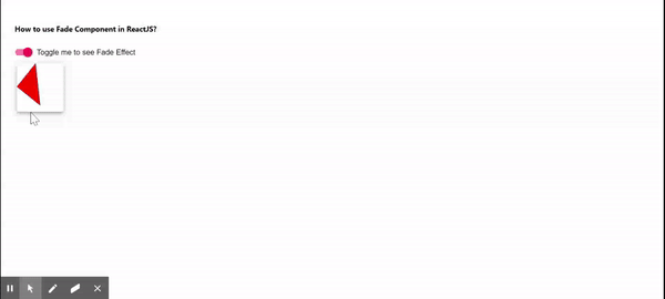
Output: Now open your browser and go to http://localhost:3000