E-commerce Dashboard with NextJS
Last Updated : 23 Jul, 2025
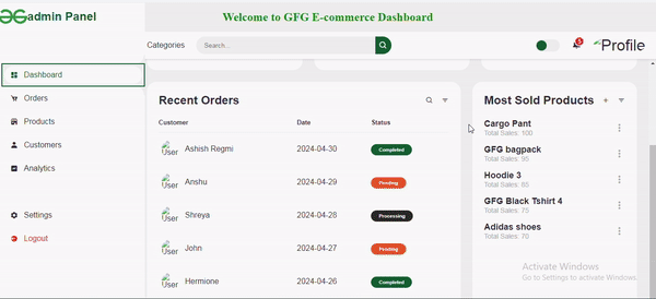
This project is an E-commerce Dashboard built with Next.js, providing features such as a dynamic sidebar, responsive navigation, order analytics, and most sold items of the week. It shows various features such as product analytics, order management, and user interaction.
Output Preview:

Prerequisites:
Approach
- Utilize React and Next.js to develop a robust and efficient dashboard application.
- Implement a sidebar component containing navigation links for easy access to different sections of the dashboard.
- Include a toggle switch for enabling and disabling dark mode to enhance user experience.
- Display order analytics using tables, providing insights into recent orders, including customer names, dates, and order statuses.
- Showcase product insights such as most sold products, highlighting key metrics like total sales for each product.
- Apply custom styling and icons from libraries like Boxicons to enhance the visual appeal and functionality of the dashboard interface.
Steps to Create a NextJS Application
Step 1: Create a nextJS application by using this command
npx create-next-app my-ecommerce-dashboard
Step 2: Navigate to project directory
cd my-ecommerce-dashboard
Step 3: Install the necessary packages/libraries in your project using the following commands.
npm install boxicons
npm install react-icons
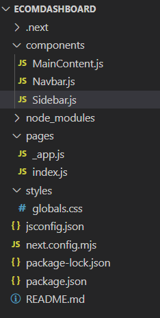
Project Structure:
The updated dependencies in package.json file will look like:
"dependencies": {
 "boxicons": "^2.1.4",
 "next": "14.1.3",
 "react": "^18",
 "react-dom": "^18",
 "react-icons": "^5.2.0"
 }
Example: Implementation to design a e-commerce dashboard with NextJS.
CSS /* styles/globals.css */ * { margin: 0; padding: 0; box-sizing: border-box; } a { text-decoration: none; } li { list-style: none; } nav { box-shadow: 0 2px 4px rgba(0, 0, 0, 0.1); text-align: center; font-size: 2rem; padding: 1rem; } nav h1 { font-size: 1.5rem; color: green; } :root { --poppins: 'Poppins', sans-serif; --lato: 'Lato', sans-serif; --light: #F9F9F9; --blue: #0e5531; --light-blue: #84e6bd; --grey: #eee; --dark-grey: #AAAAAA; --dark: #342E37; --red: #ec2c25; --yellow: #2b2924; --light-yellow: #e9debb; --orange: #ec5b1c; --light-orange: #FFE0D3; } html { overflow-x: hidden; } body.dark { --light: #0C0C1E; --grey: #060714; --dark: #FBFBFB; } body { background: var(--grey); overflow-x: hidden; } /* SIDEBAR */ #sidebar { position: fixed; top: 0; left: 0; width: 300px; height: 100%; background: var(--light); z-index: 2000; font-family: var(--lato); transition: .3s ease; overflow-x: hidden; scrollbar-width: none; } #sidebar::-webkit-scrollbar { display: none; } #sidebar.hide { width: 60px; } #sidebar .brand { font-size: 24px; font-weight: 700; height: 56px; display: flex; align-items: center; color: var(--blue); position: sticky; top: 0; left: 0; background: var(--light); z-index: 500; padding-bottom: 20px; box-sizing: content-box; } #sidebar .brand .bx { min-width: 60px; display: flex; justify-content: center; border: 2px solid var(--blue); border-radius: 50%; padding: 10px; } #sidebar .side-menu { width: 100%; margin-top: 48px; } #sidebar .side-menu li { height: 48px; background: transparent; margin-left: 6px; border: 2px solid transparent; padding: 4px; } #sidebar .side-menu li.active { background: var(--grey); border-color: var(--blue); position: relative; } #sidebar .side-menu li.active::before { content: ''; position: absolute; width: 40px; height: 40px; border-radius: 50%; top: -40px; right: 0; box-shadow: 20px 20px 0 var(--grey); z-index: -1; } #sidebar .side-menu li.active::after { content: ''; position: absolute; width: 40px; height: 40px; border-radius: 50%; bottom: -40px; right: 0; box-shadow: 20px -20px 0 var(--grey); z-index: -1; } #sidebar .side-menu li a { width: 100%; height: 100%; background: var(--light); display: flex; align-items: center; border-radius: 48px; font-size: 16px; color: var(--dark); white-space: nowrap; overflow-x: hidden; } #sidebar .side-menu.top li.active a { color: var(--blue); } #sidebar.hide .side-menu li a { width: calc(48px - (4px * 2)); transition: width .3s ease; } #sidebar .side-menu li a.logout { color: var(--red); } #sidebar .side-menu.top li a:hover { color: var(--blue); } #sidebar .side-menu li a .bx { min-width: calc(60px - ((4px + 6px) * 2)); display: flex; justify-content: center; } /* CONTENT */ #content { position: relative; width: calc(100% - 280px); left: 280px; transition: .3s ease; } #sidebar.hide~#content { width: calc(100% - 60px); left: 60px; } /* NAVBAR */ #content nav { height: 56px; background: var(--light); padding: 0 24px; display: flex; align-items: center; grid-gap: 24px; font-family: var(--lato); position: sticky; top: 0; left: 0; z-index: 1000; } #content nav::before { content: ''; position: absolute; width: 40px; height: 40px; bottom: -40px; left: 0; border-radius: 50%; box-shadow: -20px -20px 0 var(--light); } #content nav a { color: var(--dark); } #content nav .bx.bx-menu { cursor: pointer; color: var(--dark); } #content nav .nav-link { font-size: 16px; transition: .3s ease; } #content nav .nav-link:hover { color: var(--blue); } #content nav form { max-width: 400px; width: 100%; margin-right: auto; } #content nav form .form-input { display: flex; align-items: center; height: 36px; } #content nav form .form-input input { flex-grow: 1; padding: 0 16px; height: 100%; border: none; background: var(--grey); border-radius: 36px 0 0 36px; outline: none; width: 100%; color: var(--dark); } #content nav form .form-input button { width: 36px; height: 100%; display: flex; justify-content: center; align-items: center; background: var(--blue); color: var(--light); font-size: 18px; border: 2px solid var(--blue); border-left: none; border-radius: 0 36px 36px 0; cursor: pointer; transition: background-color 0.3s, color 0.3s; } #content nav form .form-input button:hover { background-color: var(--dark); color: var(--light); } #content nav .notification { font-size: 20px; position: relative; } #content nav .notification .num { position: absolute; top: -6px; right: -6px; width: 20px; height: 20px; border-radius: 50%; border: 2px solid var(--light); background: var(--red); color: var(--light); font-weight: 700; font-size: 12px; display: flex; justify-content: center; align-items: center; } #content nav .profile img { width: 36px; height: 36px; object-fit: cover; border-radius: 50%; } #content nav .switch-mode { display: block; min-width: 50px; height: 25px; border-radius: 25px; background: var(--grey); cursor: pointer; position: relative; } #content nav .switch-mode::before { content: ''; position: absolute; top: 2px; left: 2px; bottom: 2px; width: calc(25px - 4px); background: var(--blue); border-radius: 50%; transition: all .3s ease; } #content nav #switch-mode:checked+.switch-mode::before { left: calc(100% - (25px - 4px) - 2px); } /* MAIN */ #content main { width: 100%; padding: 36px 24px; font-family: var(--poppins); max-height: calc(100vh - 56px); overflow-y: auto; } #content main .head-title { display: flex; align-items: center; justify-content: space-between; grid-gap: 16px; flex-wrap: wrap; } #content main .head-title .left h1 { font-size: 36px; font-weight: 600; margin-bottom: 10px; color: var(--dark); } #content main .head-title .left .breadcrumb { display: flex; align-items: center; grid-gap: 16px; } #content main .head-title .left .breadcrumb li { color: var(--dark); } #content main .head-title .left .breadcrumb li a { color: var(--dark-grey); pointer-events: none; } #content main .head-title .left .breadcrumb li a.active { color: var(--blue); pointer-events: unset; } #content main .head-title .btn-download { height: 36px; padding: 0 16px; border-radius: 36px; background: var(--blue); border: 2px solid var(--blue); color: var(--light); display: flex; justify-content: center; align-items: center; grid-gap: 10px; font-weight: 500; transition: background-color 0.3s, color 0.3s; } #content main .head-title .btn-download:hover { background-color: var(--dark); color: var(--light); } #content main .box-info { display: grid; grid-template-columns: repeat(auto-fit, minmax(240px, 1fr)); grid-gap: 24px; margin-top: 36px; } #content main .box-info li { padding: 24px; background: var(--light); border-radius: 20px; display: flex; align-items: center; grid-gap: 24px; } #content main .box-info li .bx { width: 80px; height: 80px; border-radius: 10px; font-size: 36px; display: flex; justify-content: center; align-items: center; } #content main .box-info li:nth-child(1) .bx { background: var(--light-blue); color: var(--blue); } #content main .box-info li:nth-child(2) .bx { background: var(--light-yellow); color: var(--yellow); } #content main .box-info li:nth-child(3) .bx { background: var(--light-orange); color: var(--orange); } #content main .box-info li .text h3 { font-size: 24px; font-weight: 600; color: var(--dark); } #content main .box-info li .text p { color: var(--dark); } #content main .table-data { display: flex; flex-wrap: wrap; grid-gap: 24px; margin-top: 24px; width: 100%; color: var(--dark); } #content main .table-data>div { border-radius: 20px; background: var(--light); padding: 24px; overflow-x: auto; } #content main .table-data .head { display: flex; align-items: center; grid-gap: 16px; margin-bottom: 24px; } #content main .table-data .head h3 { margin-right: auto; font-size: 24px; font-weight: 600; } #content main .table-data .head .bx { cursor: pointer; } #content main .table-data .order { flex-grow: 1; flex-basis: 500px; } #content main .table-data .order table { width: 100%; border-collapse: collapse; } #content main .table-data .order table th { padding-bottom: 12px; font-size: 13px; text-align: left; border-bottom: 1px solid var(--grey); } #content main .table-data .order table td { padding: 16px 0; } #content main .table-data .order table tr td:first-child { display: flex; align-items: center; grid-gap: 12px; padding-left: 6px; } #content main .table-data .order table td img { width: 36px; height: 36px; border-radius: 50%; object-fit: cover; } #content main .table-data .order table tbody tr:hover { background: var(--grey); } #content main .table-data .order table tr td .status { font-size: 10px; padding: 6px 16px; color: var(--light); border-radius: 20px; font-weight: 700; } #content main .table-data .order table tr td .status.completed { background: var(--blue); } #content main .table-data .order table tr td .status.process { background: var(--yellow); } #content main .table-data .order table tr td .status.pending { background: var(--orange); } /* Most Sold Products */ .most-sold { background-color: var(--light); border-radius: 20px; padding: 24px; } .most-sold .head { display: flex; align-items: center; justify-content: space-between; margin-bottom: 16px; } .most-sold .head h3 { font-size: 24px; font-weight: 600; color: var(--dark); } .most-sold .product-list { list-style: none; padding: 0; margin: 0; } .most-sold .product-list li { display: flex; align-items: center; justify-content: space-between; margin-bottom: 16px; } .most-sold .product-list li .product-info { flex-grow: 1; } .most-sold .product-list li .product-info h4 { font-size: 18px; font-weight: 600; color: var(--dark); } .most-sold .product-list li .product-info p { font-size: 14px; color: var(--dark-grey); } .most-sold .product-list li .bx { font-size: 24px; cursor: pointer; color: var(--dark-grey); transition: color 0.3s; } .most-sold .product-list li:hover .bx { color: var(--blue); } //pages/index.js import React from 'react'; import Sidebar from '../components/Sidebar'; import Navbar from '../components/Navbar'; import MainContent from '../components/MainContent'; const Home = () => { return ( <div> <nav> <h1> Welcome to GFG E-commerce Dashboard </h1> </nav> {/* SIDEBAR */} <Sidebar /> {/* SIDEBAR */} {/* CONTENT */} <section id="content"> {/* NAVBAR */} <Navbar /> {/* NAVBAR */} {/* MAIN */} <MainContent /> {/* MAIN */} </section> {/* CONTENT */} </div> ); }; export default Home; //pages/_app.js import "../styles/globals.css"; export default function App({ Component, pageProps }) { return <Component {...pageProps} />; } //components/MainContent.js import React from 'react'; import { FaUserCircle } from 'react-icons/fa'; const MainContent = () => { return ( <main> <div className="head-title"> <div className="left"> <h1>Dashboard</h1> <ul className="breadcrumb"> <li><a href="#">Dashboard</a></li> <li><i className="bx bx-chevron-right"></i></li> <li><a className="active" href="#">Home</a></li> </ul> </div> <a href="#" className="btn-download"> <i className="bx bxs-cloud-download"></i> <span className="text">Download Report</span> </a> </div> <ul className="box-info"> <li> <i className="bx bxs-cart"></i> <span className="text"> <h3>298</h3> <p>New Orders</p> </span> </li> <li> <i className="bx bxs-user-check"></i> <span className="text"> <h3>389</h3> <p>Customers</p> </span> </li> <li> <i className="bx bxs-dollar"></i> <span className="text"> <h3>$43,570</h3> <p>Total Revenue</p> </span> </li> </ul> <div className="table-data"> <div className="order"> <div className="head"> <h3>Recent Orders</h3> <i className="bx bx-search"></i> <i className="bx bx-filter"></i> </div> <table> <thead> <tr> <th>Customer</th> <th>Date</th> <th>Status</th> </tr> </thead> <tbody> <tr> <td> <FaUserCircle className="user-avatar" /> <p>Ashish Regmi</p> </td> <td>2024-04-30</td> <td> <span className="status completed"> Completed </span> </td> </tr> <tr> <td> <FaUserCircle className="user-avatar" /> <p>Anshu</p> </td> <td>2024-04-29</td> <td> <span className="status pending"> Pending </span> </td> </tr> <tr> <td> <FaUserCircle className="user-avatar" /> <p>Shreya</p> </td> <td>2024-04-28</td> <td> <span className="status process"> Processing </span> </td> </tr> <tr> <td> <FaUserCircle className="user-avatar" /> <p>John</p> </td> <td>2024-04-27</td> <td> <span className="status pending"> Pending </span> </td> </tr> <tr> <td> <FaUserCircle className="user-avatar" /> <p>Hermione</p> </td> <td>2024-04-26</td> <td> <span className="status completed"> Completed </span> </td> </tr> </tbody> </table> </div> <div className="most-sold"> <div className="head"> <h3>Most Sold Products</h3> <i className="bx bx-plus"></i> <i className="bx bx-filter"></i> </div> <ul className="product-list"> <li> <div className="product-info"> <h4>Cargo Pant </h4> <p>Total Sales: 100</p> </div> <i className="bx bx-dots-vertical-rounded"></i> </li> <li> <div className="product-info"> <h4>GFG bagpack</h4> <p>Total Sales: 95</p> </div> <i className="bx bx-dots-vertical-rounded"></i> </li> <li> <div className="product-info"> <h4>Hoodie 3</h4> <p>Total Sales: 85</p> </div> <i className="bx bx-dots-vertical-rounded"></i> </li> <li> <div className="product-info"> <h4>GFG Black Tshirt 4</h4> <p>Total Sales: 75</p> </div> <i className="bx bx-dots-vertical-rounded"></i> </li> <li> <div className="product-info"> <h4>Adidas shoes</h4> <p>Total Sales: 70</p> </div> <i className="bx bx-dots-vertical-rounded"></i> </li> </ul> </div> </div> </main> ); }; export default MainContent; //components/Navbar.js import React, { useState, useEffect } from 'react'; import 'boxicons/css/boxicons.min.css'; const Navbar = () => { const [isDarkMode, setIsDarkMode] = useState(false); useEffect(() => { if (isDarkMode) { document.body.classList.add('dark'); } else { document.body.classList.remove('dark'); } }, [isDarkMode]); const toggleDarkMode = () => { setIsDarkMode(!isDarkMode); }; return ( <nav className="top-navbar"> <a href="#" className="nav-link"> Categories </a> <form action="#"> <div className="form-input"> <input type="search" placeholder="Search..." /> <button type="submit" className="search-btn"> <i className="bx bx-search"></i> </button> </div> </form> <input type="checkbox" id="switch-mode" checked={isDarkMode} onChange={toggleDarkMode} hidden /> <label htmlFor="switch-mode" className="switch-mode"> </label> <a href="#" className="notification"> <i className="bx bxs-bell"></i> <span className="num">5</span> </a> <a href="#" className="profile"> <img src= "https://media.geeksforgeeks.org/gfg-gg-logo.svg " alt="Profile" /> </a> </nav> ); }; export default Navbar; //components/Sidebar.js import React from 'react'; const Sidebar = () => { return ( <section id="sidebar"> <a href="#" className="brand"> <img src= "https://media.geeksforgeeks.org/gfg-gg-logo.svg" alt="GFG Logo" /> <span className="text"> admin Panel</span> </a> <ul className="side-menu top"> <li className="active"> <a href="#"> <i className="bx bxs-dashboard"></i> <span className="text"> Dashboard </span> </a> </li> <li> <a href="#"> <i className="bx bxs-cart-add"></i> <span className="text"> Orders </span> </a> </li> <li> <a href="#"> <i className="bx bxs-store"></i> <span className="text"> Products </span> </a> </li> <li> <a href="#"> <i className="bx bxs-user"></i> <span className="text"> Customers </span> </a> </li> <li> <a href="#"> <i className="bx bxs-chart"></i> <span className="text"> Analytics </span> </a> </li> </ul> <ul className="side-menu"> <li> <a href="#"> <i className="bx bxs-cog"></i> <span className="text"> Settings </span> </a> </li> <li> <a href="#" className="logout"> <i className="bx bxs-log-out-circle"></i> <span className="text"> Logout </span> </a> </li> </ul> </section> ); }; export default Sidebar; Step to Run Application: Run the application using the following command from the root directory of the project
npm run dev
Output: Your project will be shown in the URL http://localhost:3000/